Much of what decides whether a bottle label works is settled before anyone draws it: how many versions it has to become, what it will be printed on, and what the law requires on the bottle. This piece takes those decisions in the order they come up on spirits and wine briefs in Vietnam, using projects of ours where we know what happened at each step.
What the label has to carry
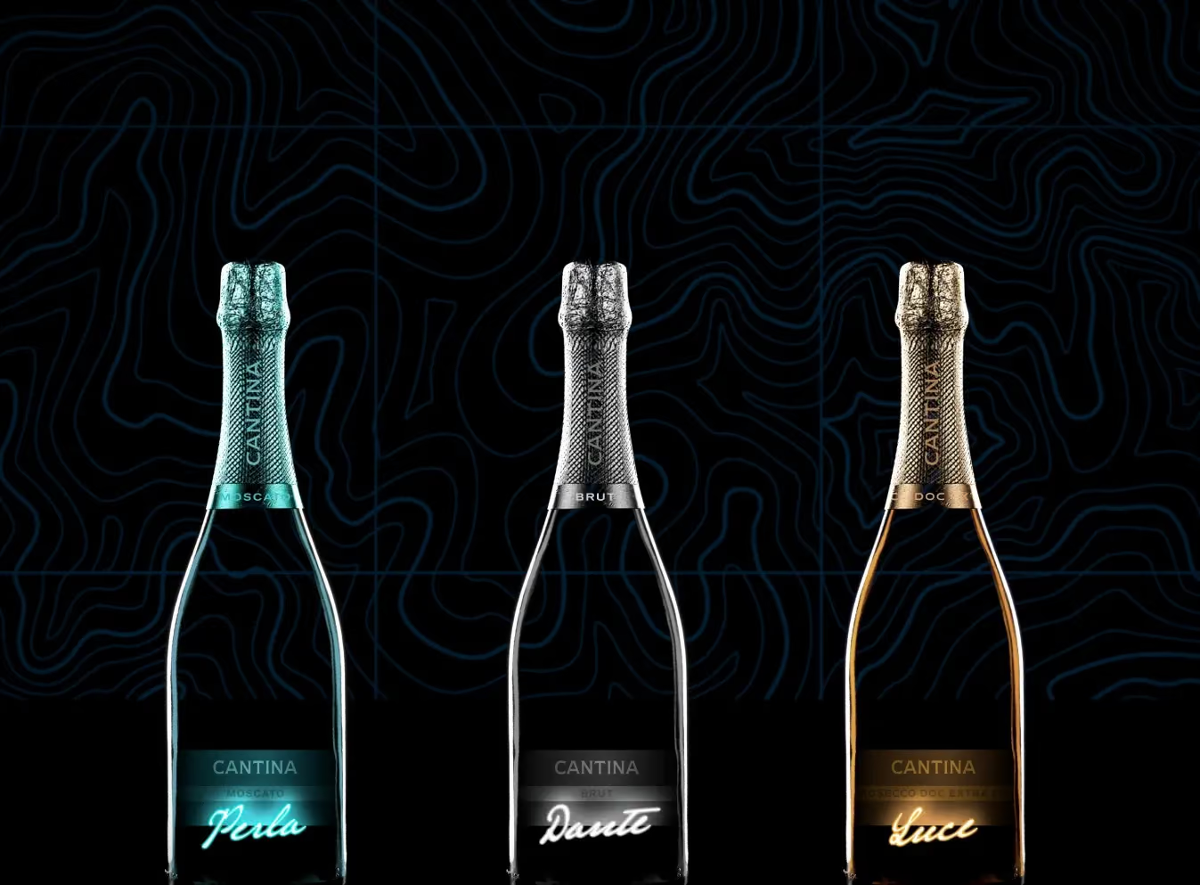
Write the hierarchy down first. The brand comes first, then the variant or expression, then the line that names the product, such as an age statement, a grape or a denomination, and after those everything that has to be there whatever the design. Cantina launched three wines in Vietnam at once, and a shopper had to tell them apart in low light on a gifting shelf. Its hierarchy was a brand line, the variant name in script and a tier line naming the wine, drawn once and specified for all three bottles. The script, which glows off the black label, was what had to carry the difference between them.
What a label must show by law in Vietnam also needs early attention. An imported spirit has to carry its mandatory details in Vietnamese, and a global label seldom does, so the importer normally adds a Vietnamese secondary label once the goods have cleared customs, under the goods labelling decree (Decree 43/2017, amended in 2021). The importer’s compliance team confirms the wording. A designer can leave room for it, usually on the back, and agree who applies it and where it goes, so that it does not end up across the front by default.
One structure for the whole range
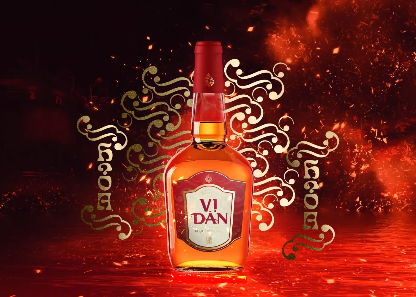
A label is rarely alone. Vị Dân, a red-ginseng liquor sold mostly as a gift, needed four versions for the four elements, Kim, Mộc, Thuỷ and Hoả, without splitting into four products on the shelf. The system has one shield, one seal and one standing column of type, and only the colour changes: white, green, black and red. Setting the two characters of the name as a single column gives the label the look of a plaque.
At a house like Pernod Ricard the same question looks different, since every brand keeps its own world on a shared production calendar: amber and tartan for Chivas, watercolour dots for Jacob’s Creek, copper on lacquer black for Ki No Bi. What the brands share sits underneath, in the grids, the taste charts and the file architecture, so a bottle label and a marketplace listing come out of one system. It held across six Tết seasons.
Finish and stock
Finishing is where a label gets its character, and where it gets complicated. Cantina’s labels are black and embossed with a contour pattern. The variant names are in teal, brushed silver or gold, and the neck bands move from teal to charcoal to gold with the variant. Foil and emboss look different on screen than in the hand, so ask the printer for a proof on the real stock, since the same foil behaves differently on a smooth paper and on a textured one. Each finish should have a job: when the variant name is the only foiled element the eye goes straight to it, and foil spread over four elements divides the attention among them.
Finishes also set the calendar. Adding foil at the proof stage means a new die and another slot on the printer’s calendar, so the finishes belong in the first brief, and what drives the cost of packaging design describes how that reaches a quote. The stock needs testing against the conditions it will meet, which for wine and spirits include an ice bucket and a wet hand.
On the glass
A label that works as a flat file can still fail on the bottle. Lettering that wraps round the shoulder gets cut by the curve, a seam can land on the part of the bottle people hold, and a neck label has to sit over the closure without hiding the main label. Mock the label up on a filled bottle and look at it from the side as well as the front.
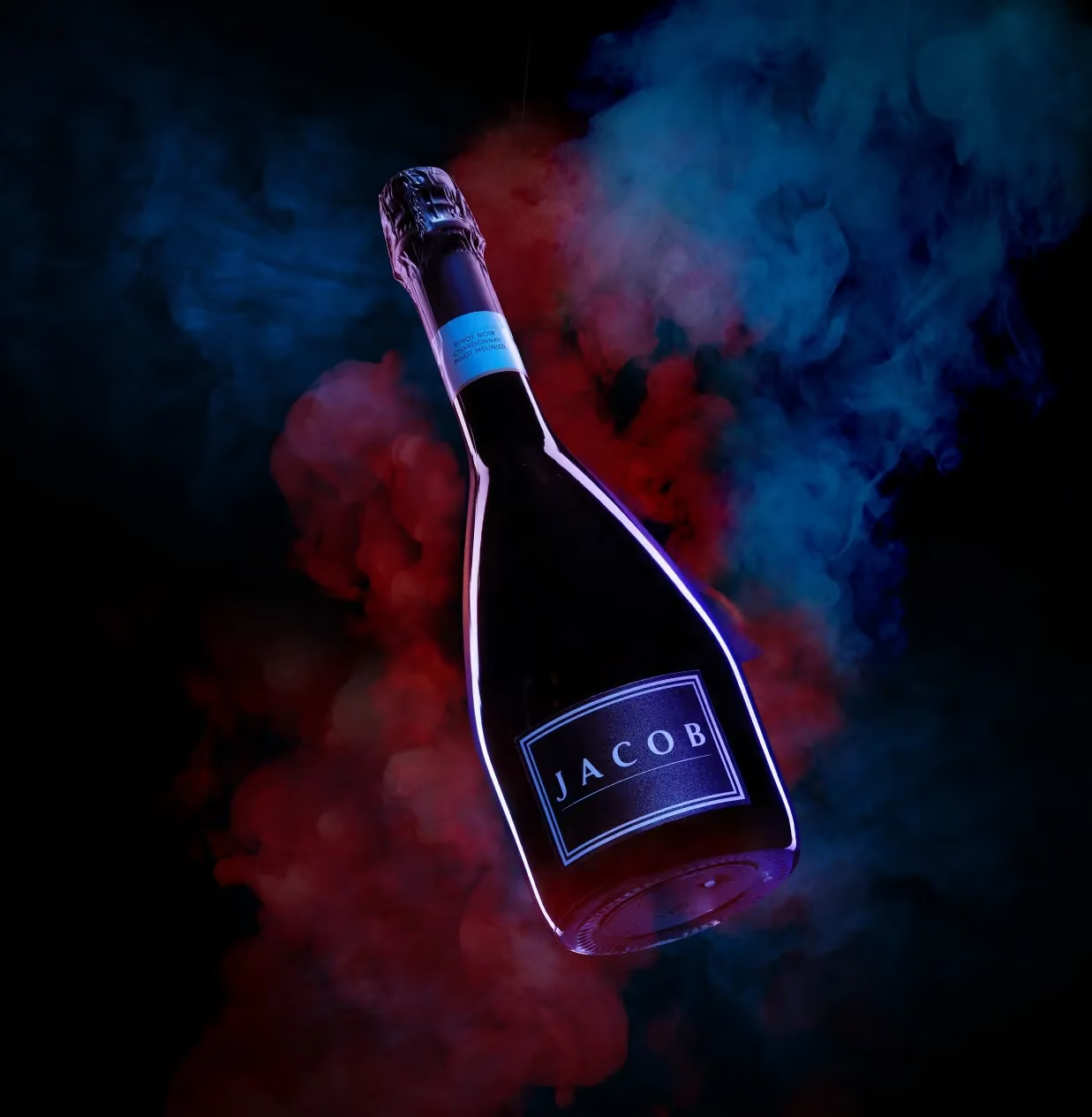
Glass colour is part of the design too. At Jacob’s Creek the cuvée is a sparkling wine in a dark bottle, with a cyan outline on the label that glows against the glass, and the shoot was planned around it. Label position also drifts a little between print runs, which is why we ask for the final artwork, not a sample from the last run, before a bottle is photographed. Our reasoning is in product photography for spirits.
Online, at thumbnail size
For Pernod Ricard Vietnam the labels also had to work as marketplace listings that sell without a shelf. At thumbnail size only the brand and the variant remain readable, so those two carry the identification by themselves. Colour, aroma and pairing notes sit in a panel beside the bottle, and one four-axis taste chart (sweetness, acidity, body, finish) runs across the range. That only works when the hierarchy was consistent from the start, and it is hard to add afterwards.
At the first press run
Proofs go only so far. The first run on press is where colour, foil registration and emboss depth show up on the real material, and we are at the plant for it. Screen colour and printed colour differ, most of all on foil, and a fault found at the first run can be corrected while the machine is still set up, which a fault found at the end of the batch cannot. Who will be standing at that press is a question worth putting to any agency, and it is on the list in what to ask a creative agency in Vietnam before you hire them.
The next edition
Whatever label you approve becomes the template for the next one. At Tết a limited edition changes the label, and that change needs artwork approval, colour matching and often a new print plate, which the VAP, GWP and limited edition glossary compares with gift packs. A label built on a clear hierarchy, with tidy files, turns the following season into production work, and the Tết packaging playbook has the calendar for it.
We run shelf tests before a label is signed off, and they are set out in how to design alcohol packaging that stands out on shelves. More projects in the category are on the spirits and wine page, and the packaging design page describes what a brief can include.