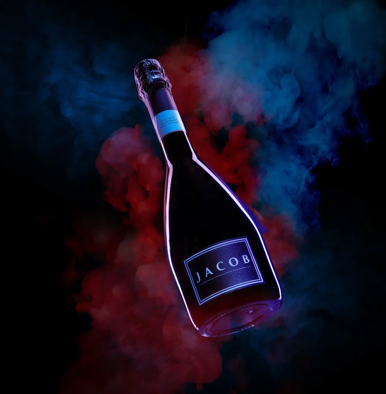
A spirits shoot goes wrong in the same place almost every time: the brief asks for a bottle to look expensive, and the answer arrives as a mood board with fourteen references and no rule. Fourteen references produce fourteen half-shots. One rule produces a set. The rule we ran on the Jacob’s Creek shoot was four words long — the label is the light source — and everything else on set existed to serve it.
Find the one thing the bottle already does
Before any light goes up, look at the product and ask what it is already doing that nobody has photographed yet. On a sparkling cuvée in a dark bottle, the answer was on the glass: a cyan outline that glows on its own. Most category shoots would have treated that as a detail and built a lifestyle scene around the bottle. Making it the reason to look changed the whole plan.
That decision is not styling. It decides the key light, the floor, the palette and the shot list in one move — which is why it has to happen before the studio is booked, not on the day.
Light the label, not the bottle
A single hard key raked along the label edge does the work. Raking means the light travels almost parallel to the surface, so the edge of the print catches and the flat area stays dark — the label separates from the glass instead of sitting on it.
The instinct to add a second and third source to “open up the shadows” is exactly what kills it. Every extra light lowers the contrast that made the label read in the first place. If the bottle is under-lit in the frame, that is usually correct: the eye goes to the brightest thing, and the brightest thing should be the brand.
The floor is half the shot
We put black acrylic under everything. It gives a full mirror, so a single bottle becomes a bottle and its reflection, and the frame gets depth without a set build.
Two practical notes. First, acrylic scratches if you look at it wrong — budget for spares rather than for retouching. Second, a full mirror doubles every mistake: a fingerprint, a dust speck or a crooked label appears twice, so the cleaning pass between takes is not optional.
Keep the set list short enough to finish
On Jacob’s Creek the entire list was five items: crushed ice, cut cubes, dry-ice smoke, blue satin and marble. Palette: near-black, electric blue, one gold accent, nothing else.
Short lists are not a budget compromise, they are how a shoot finishes. Ice melts, smoke drifts and satin creases, so each of those five needs its own lighting setup and its own window of time. A list of twelve materials on a one-day shoot means twelve rushed setups and no hero frame.
Shoot a set, not a frame
The most expensive mistake in product photography is buying one beautiful image. Plan for the adaptations that are already scheduled — a key visual, a gondola header, a vertical cut, a POSM panel — and shoot the elements that make them possible: a wide, a tight, a texture, an element on black.
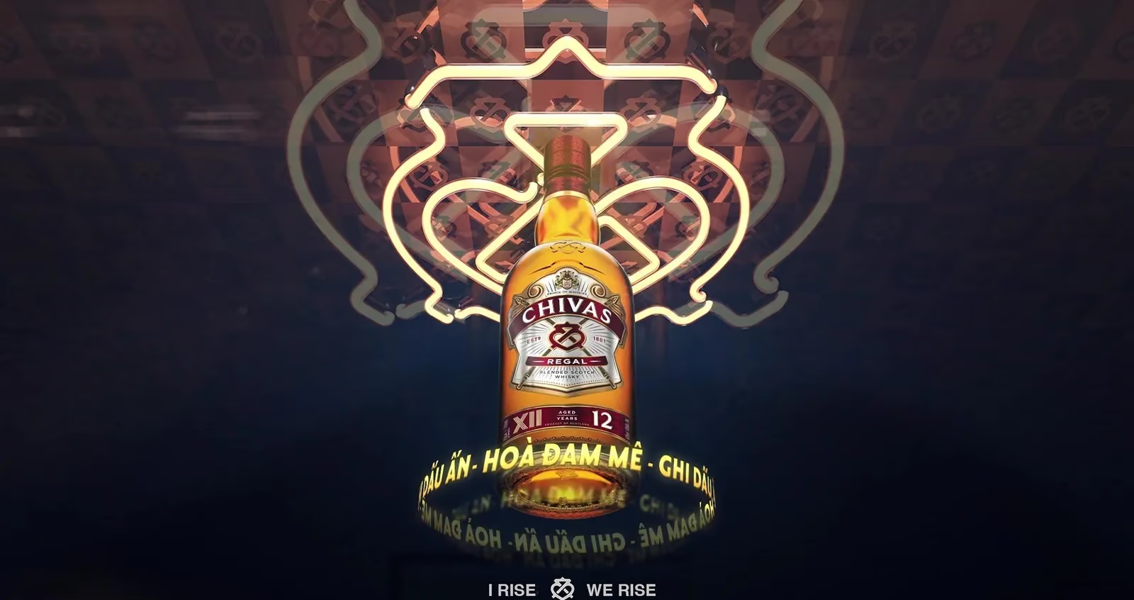
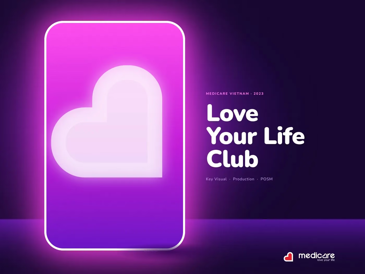
MediCare is the clearest version of this. Because the neon doorway was shot as a built set rather than illustrated, the same asset carried a key visual, a gondola header, a security-gate wrap and a whole shopfront without being redrawn. For Chivas Regal the same discipline ran across two films in one year: one crest, one frame, separated only by material and tempo — red velvet and liquid gold for XII, blue ink and cold gold for XVIII.
What to bring to a spirits shoot
- The final artwork, not a sample from the last run. Label position shifts between print runs and the key light is set to the label edge.
- Three bottles minimum per SKU: one hero, one for handling, one spare for fingerprints and drips.
- The adaptation list, so the shot list covers every crop that has a deadline.
- One decision-maker on set. A shoot run by committee produces the safest frame in the room, which is never the one worth paying for.
None of this makes a bottle look expensive. It makes the frame answer to one idea, which is the only thing that ever reads as expensive.
Everything above assumes the label is already settled. How it is designed for Vietnam, from the hierarchy to the first press run, is in how to design a spirits bottle label for Vietnam.