Work — Vị Dân · BFS Studio, Ho Chi Minh City
Vị Dân— Rượu Hồng Sâm

THE BRIEF
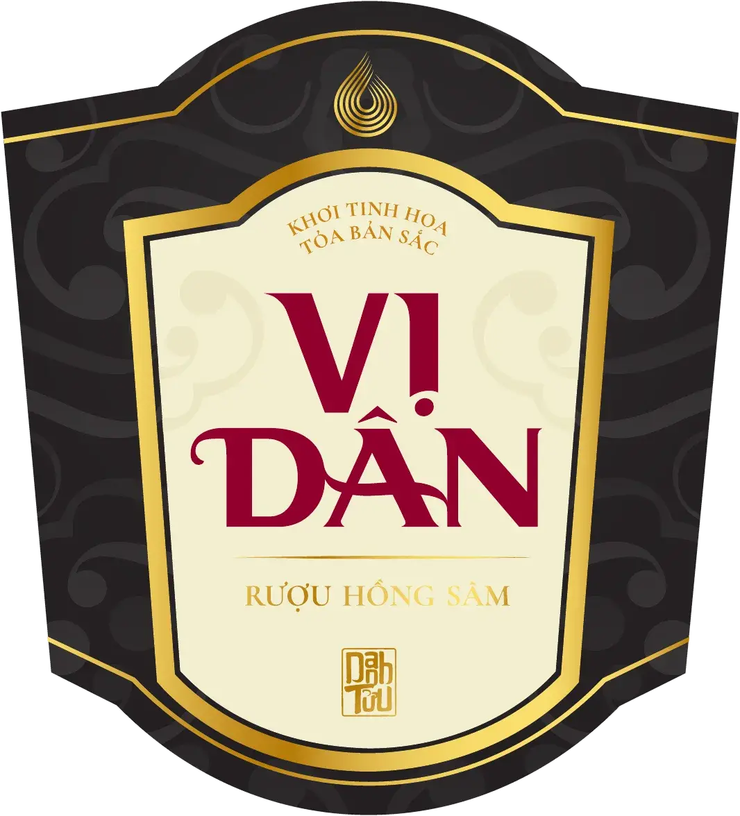
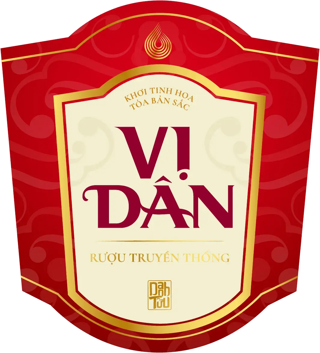
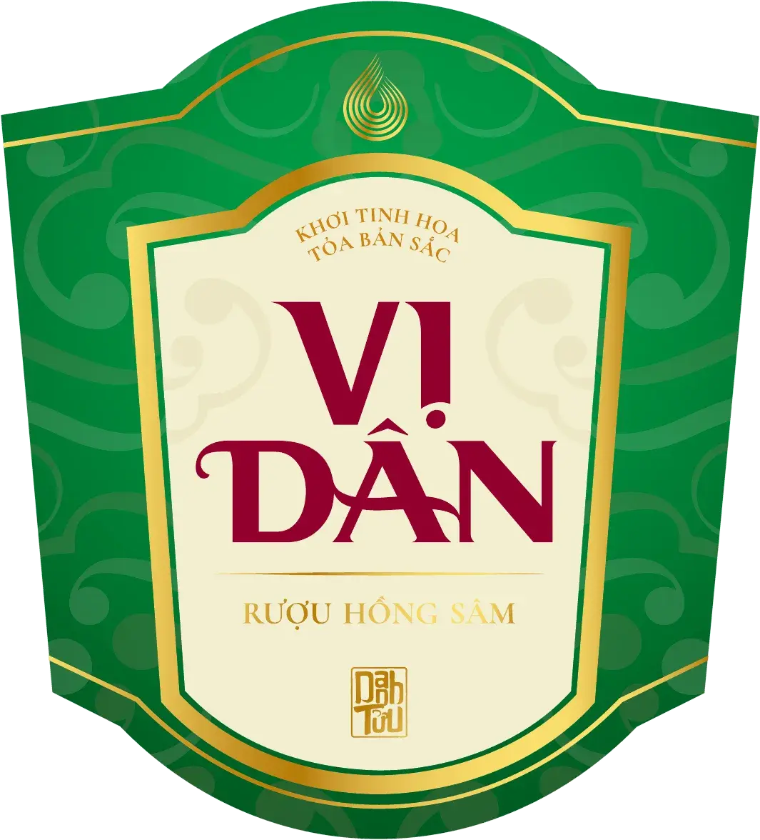
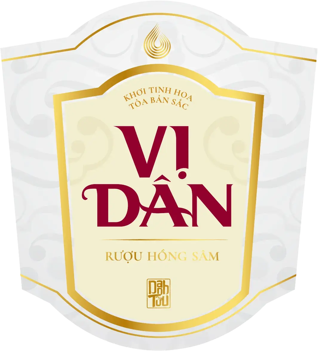
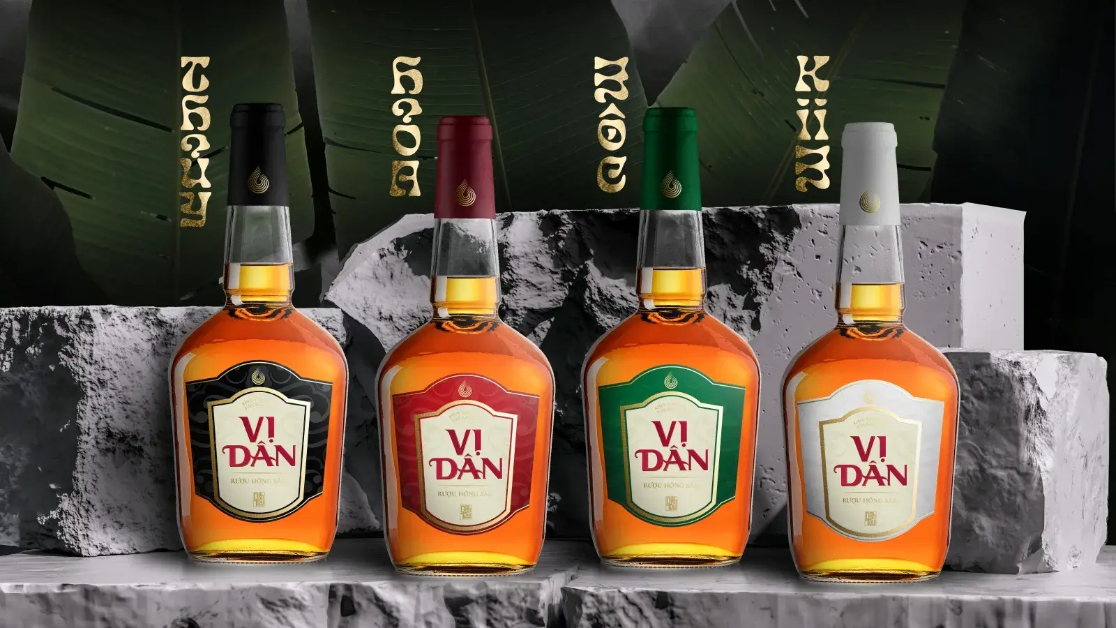
A red-ginseng liquor from a traditional Vietnamese distillery, sold mostly as a gift. Four label versions had to exist for the four elements — Kim, Mộc, Thuỷ, Hoả — without the range splintering into four different products on the shelf.
WHAT WE DID
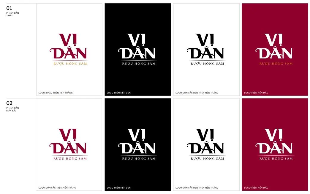
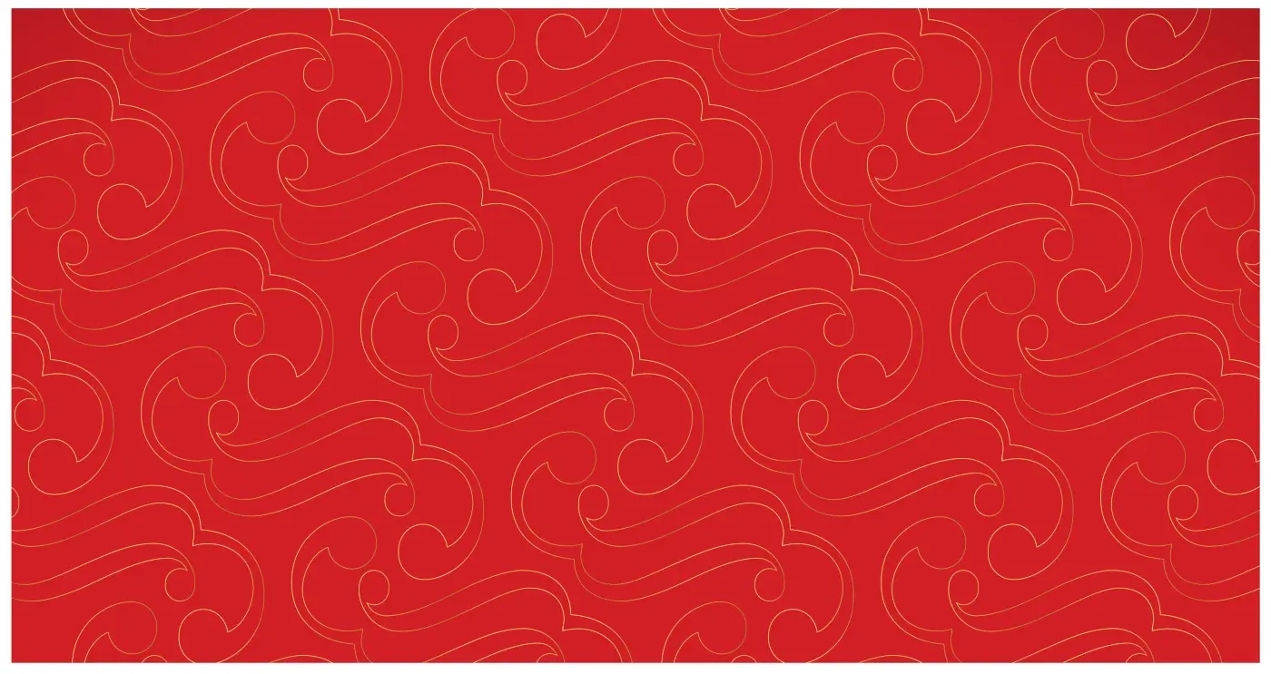
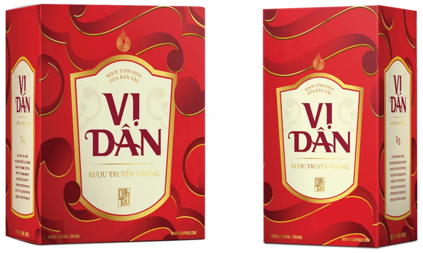
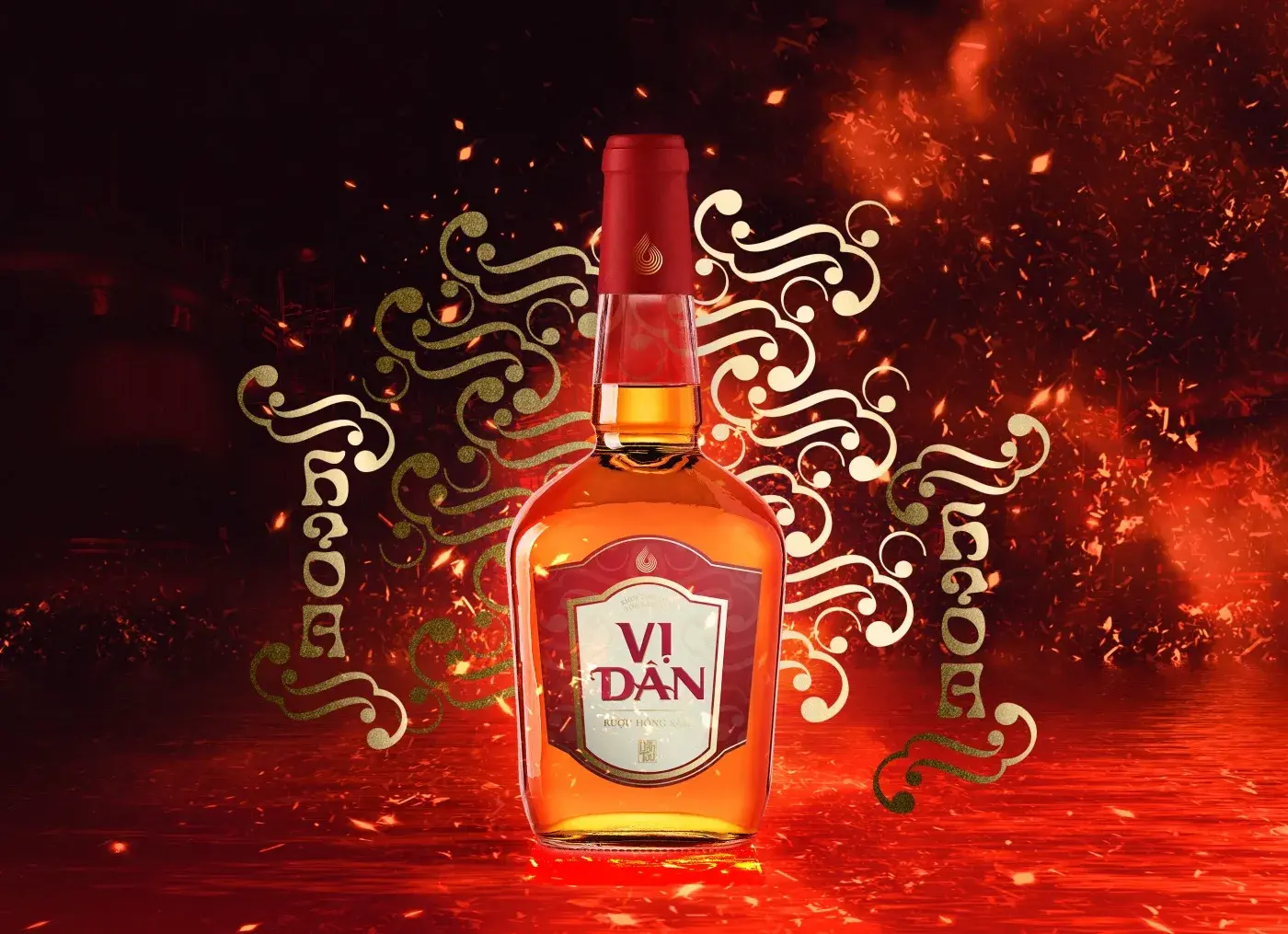
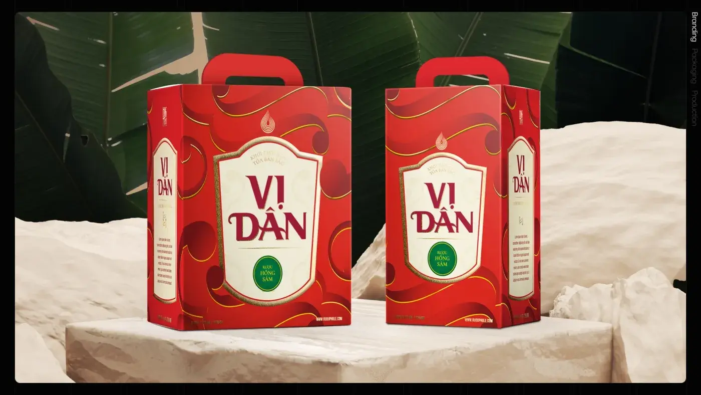
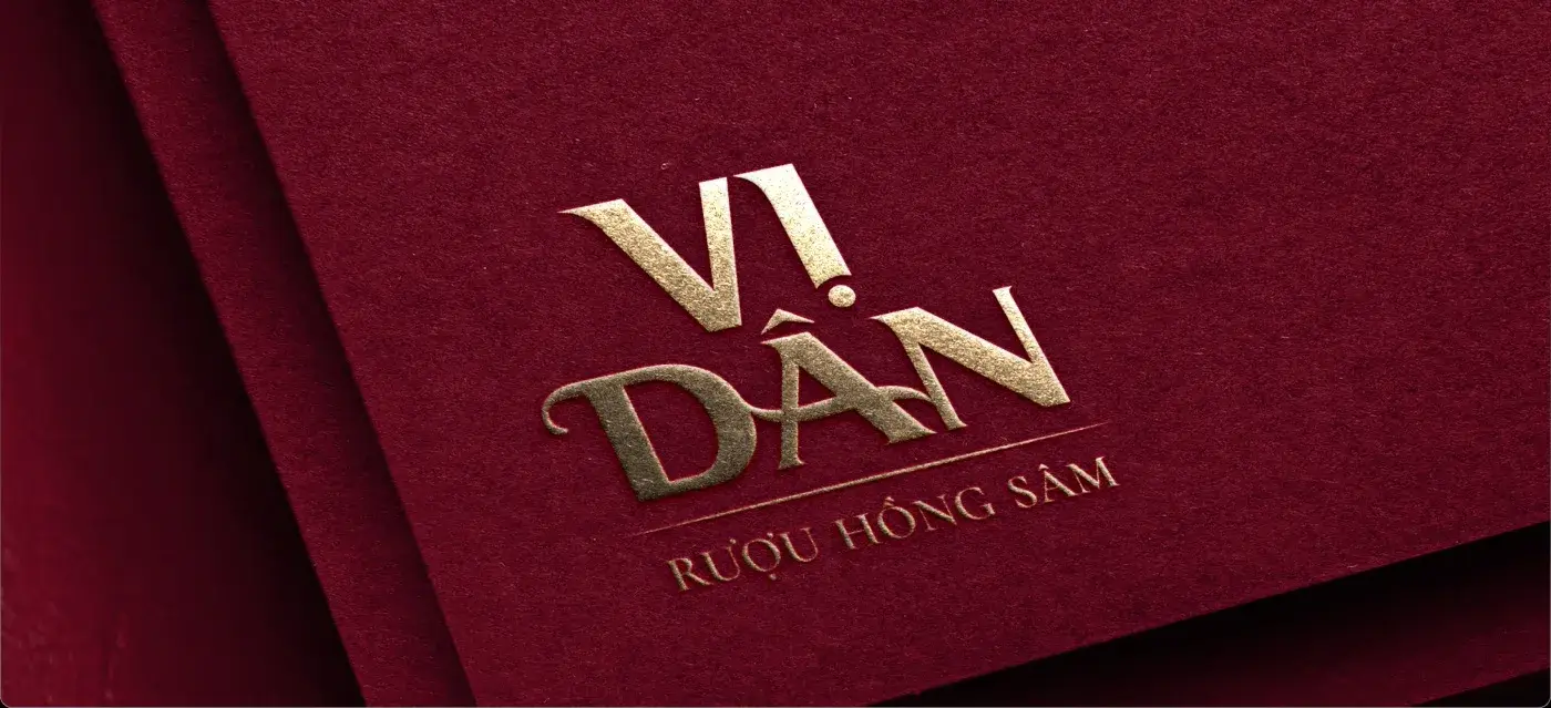
One shield, one seal, one vertical column of type; only the colour changes. The two characters of the name are set as a single standing column so the label reads like a plaque rather than a sticker, and a rolling cloud pattern in gold foil carries across wrapping paper, box faces and the lining. The result is a set that is obviously a set, and a bottle that looks like it was given rather than bought.
OUTCOME
An identity and label system delivered in four Ngũ hành variants, one shield and one seal, with only the colour changing between them.
THE WORK
- Pantone 221 C#900024
- Pantone 7565 C#CB9415
- Deep plum#5C0017
- Pale gold#E5C173
- Cream#F7F2E9
- Ink#14090C

NEXT PROJECT