Real estate marketing sells a photograph of a building that does not exist yet. For a mall or a tower that just about works. For a shophouse row it does not: a shophouse row cannot be photographed into desire — it is bought on belief in a future street.
That belief is a branding problem, not a rendering problem.
Name the address, not the product
In 2024 the Huế property market was still frozen, and An Cựu Galleria had to open in the same week as AEON MALL Huế without being reduced to “the row opposite the mall”.
Being the neighbour of a landmark is the trap. It borrows credibility once and then permanently caps what you are: a satellite. So the work positioned the project as an address rather than a listing — something a person could give as their location, which a listing never is.
That reframing decides everything downstream. An address needs a mark you could imagine on a street sign. A listing needs a hero render and a price.
One shape that survives every surface
Whatever we built also had to survive weekly sales banners, a 7.2-metre site hoarding, and 168 future tenants each hanging their own sign. That last constraint is the one that kills most property identities: the brand ends up as one voice among 168 competing shopfronts.
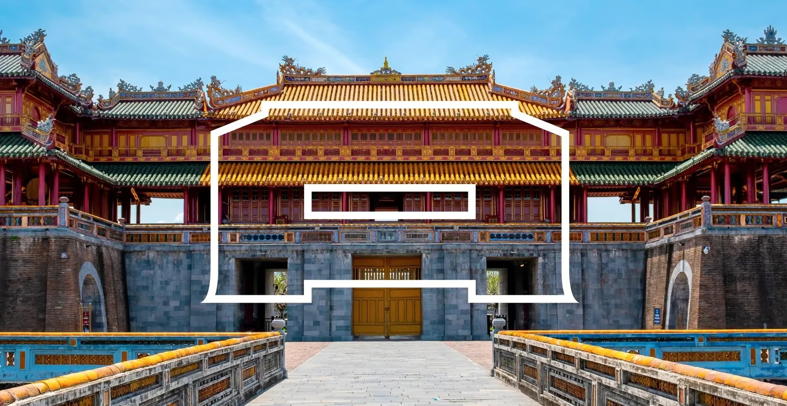
So the mark came from the tiered roofline of the Huế imperial gate, reduced to a single flat trapezoid — an aperture you look through rather than at. That aperture is the system. It stretches into a banner, a hoarding, a storefront or a wayfinding icon with no redraw, and ships as fixed templates so people outside the design team stay on brand.
A shape that can be stretched without being redrawn is worth more than a beautiful mark that needs a designer every time. The weekly sales banner will be made by somebody at 9pm without you.
Take the local reference literally, then abstract it
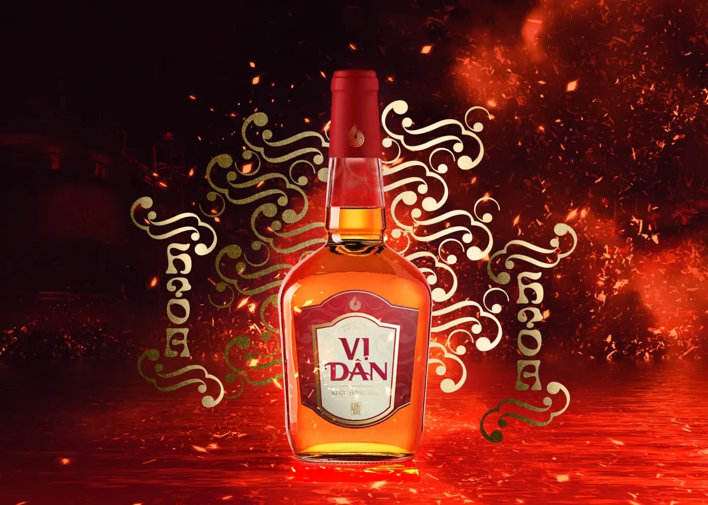
The Huế gate is not decoration here — it is the reason the mark belongs to this address and not to a development in another province. The same principle runs through Vị Dân, where the label range is organised by the five elements rather than by flavour names, so the structure carries the cultural argument instead of a paragraph of copy having to explain it.
Take the reference literally enough that locals recognise it, then abstract it enough that it works at 24 pixels.
Brand the space between the buildings
The last piece is the one property clients rarely brief: the shared realm. A row of shophouses is experienced as the ground between them — the paving, the planting, the way a person walks from the car to a door.
We designed that landscape alongside the identity, for the same reason the mark had to survive 168 tenant signs: the parts of the project the developer controls forever are the parts that will still be saying something about the brand in ten years. The shopfronts will change hands. The street will not.
What to ask before signing off a property identity
- Can it be built by someone else? If the banner needs the studio, the system failed.
- Does it hold at 7 metres and at icon size? Both are real placements, on day one.
- Does it still work when 168 tenants add their own signs? If your identity needs a clean background, it does not survive occupancy.