Work — Joule Power · BFS Studio, Ho Chi Minh City
Joule Power— Brand Identity
THE BRIEF
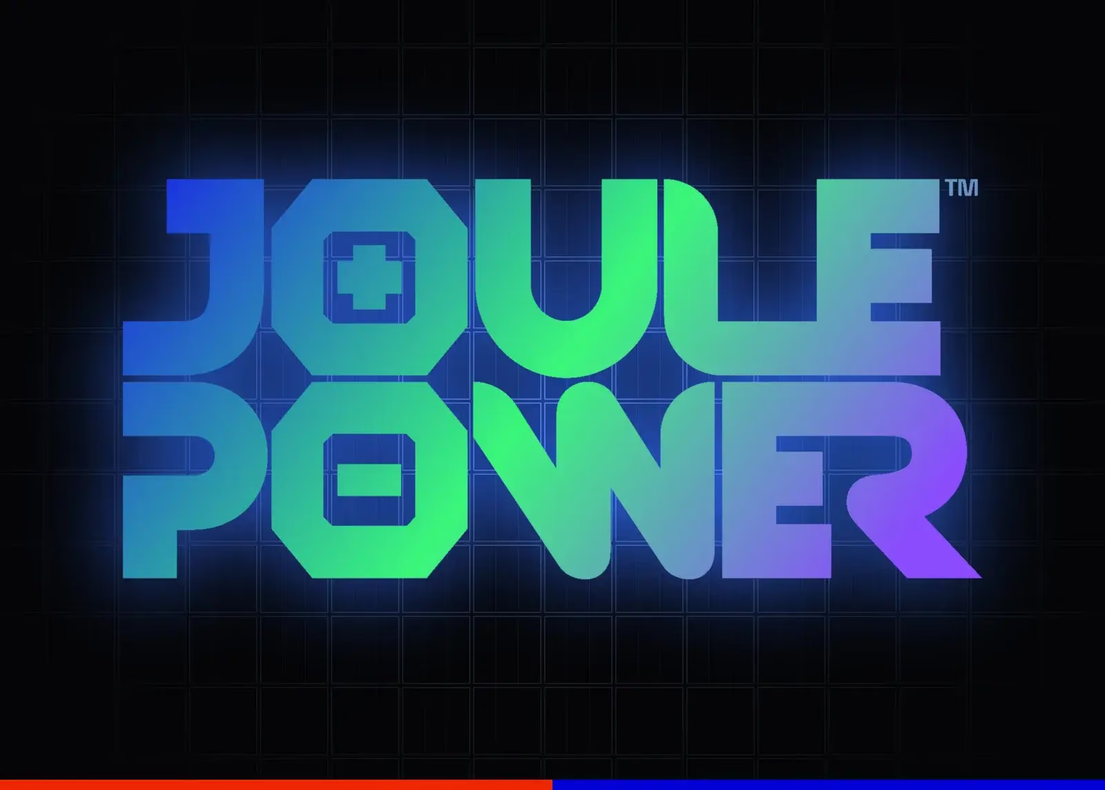
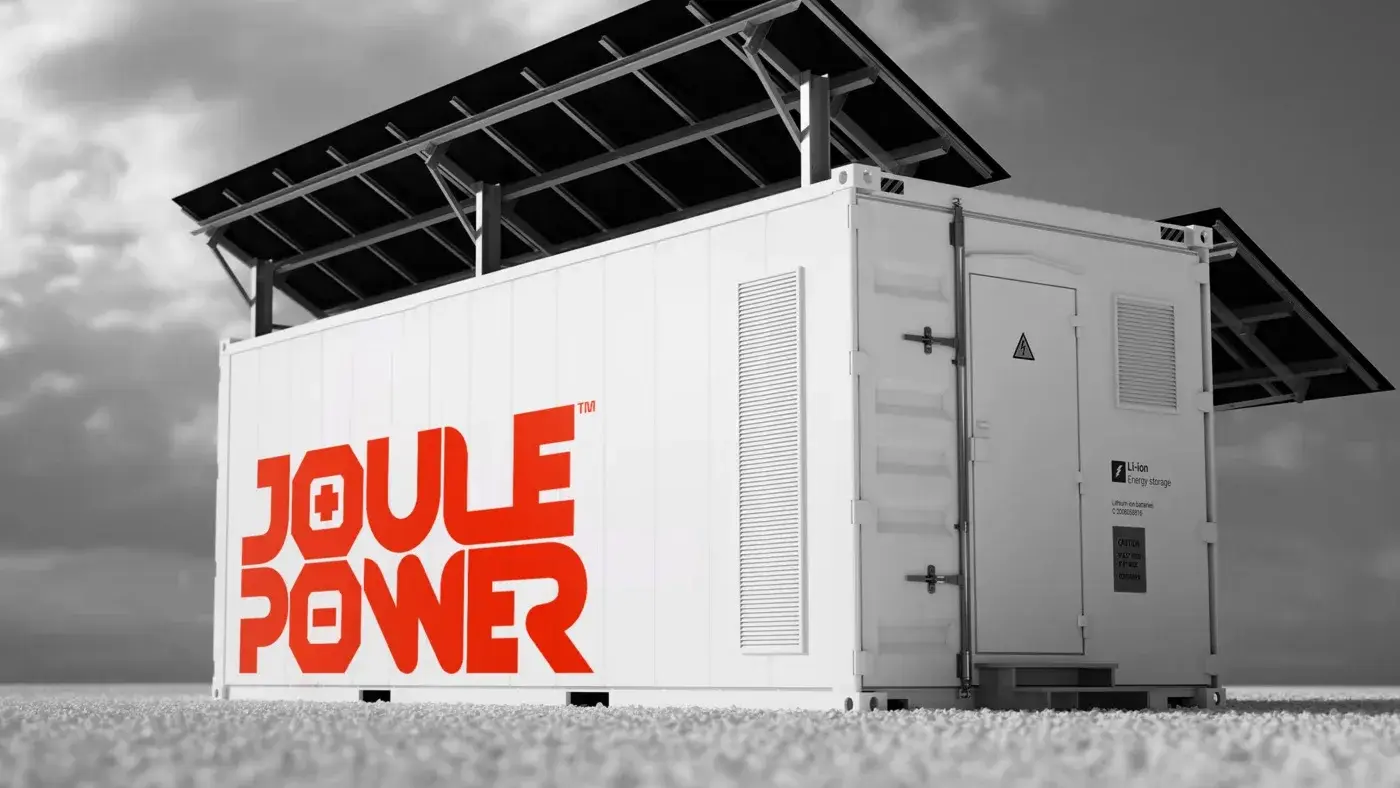
Joule Power sells solar and battery storage — a category where every competitor’s identity is a blue gradient and a leaf. The mark had to survive being printed at the size of a warranty sticker and at the size of a shipping container, and it had to say energy without saying it in the usual words.
WHAT WE DID
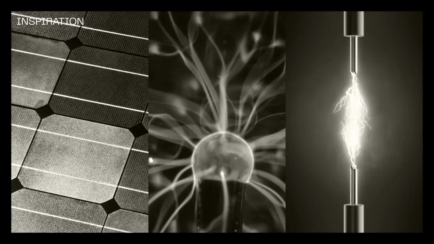
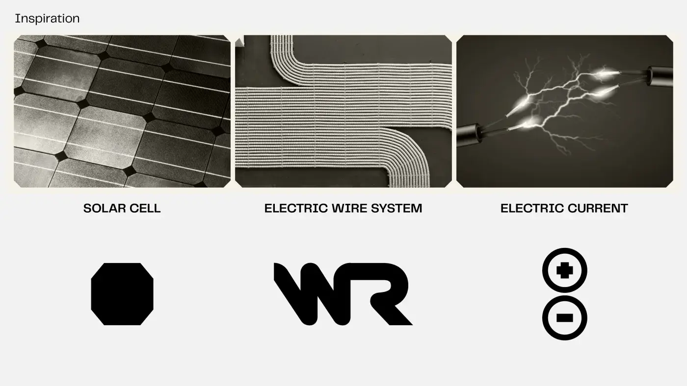
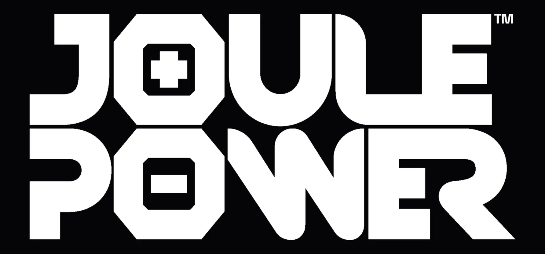
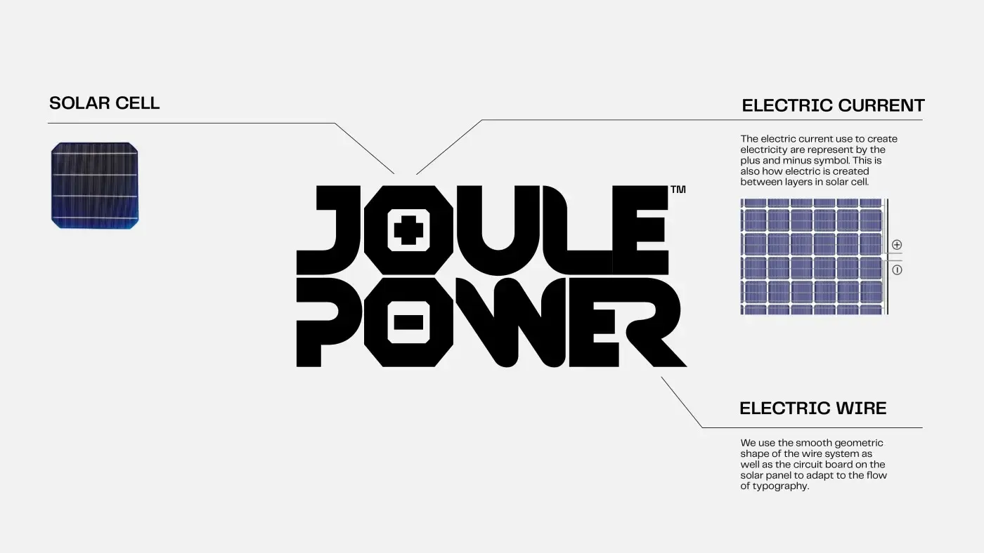
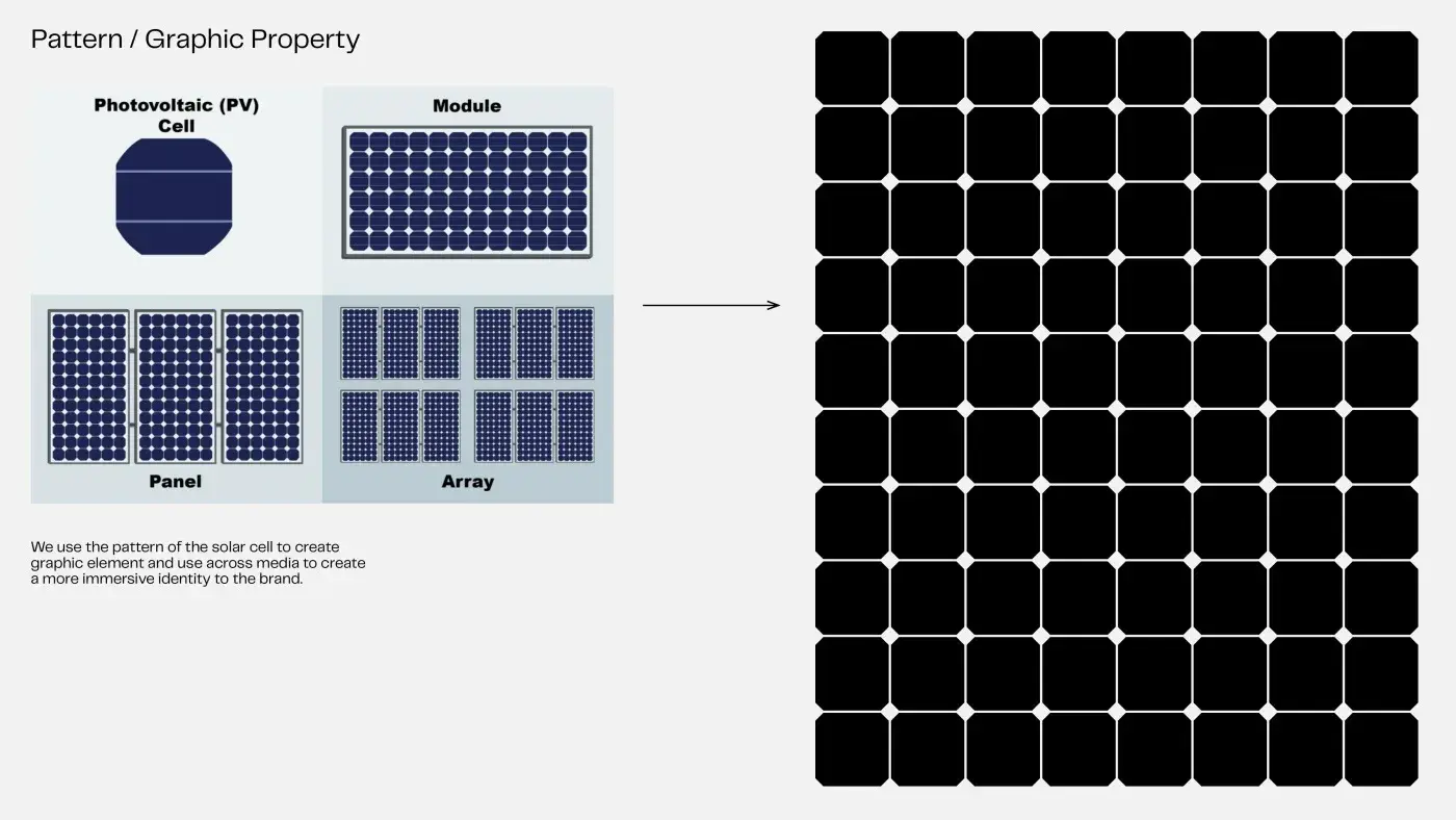
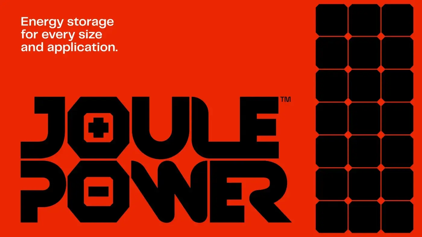
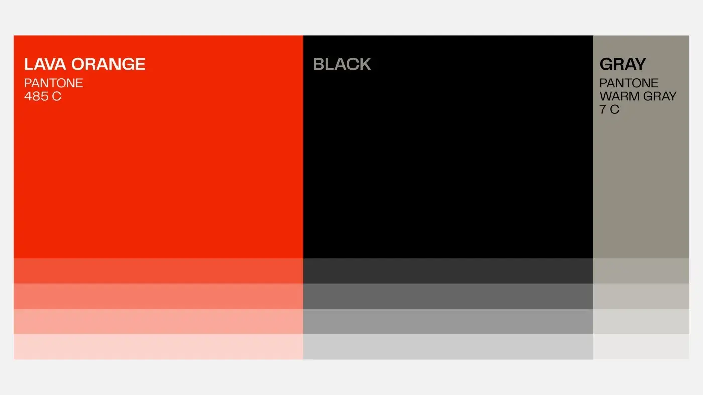
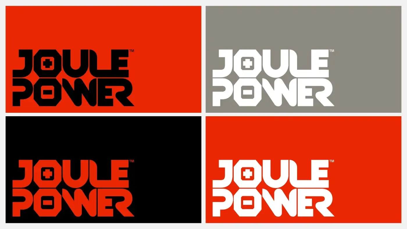
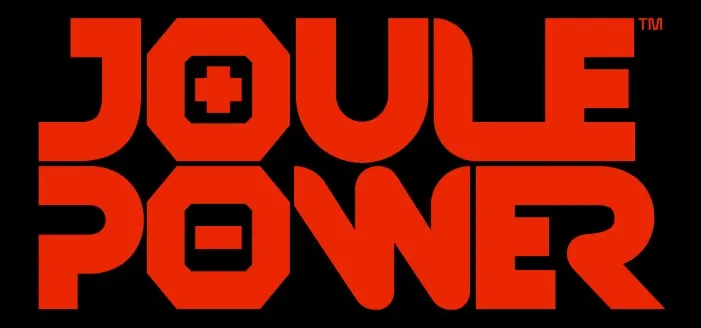
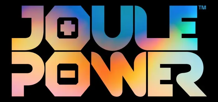
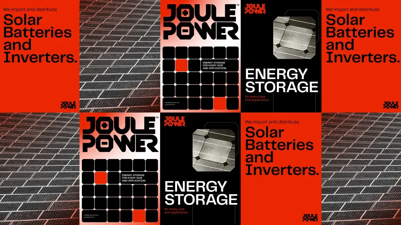
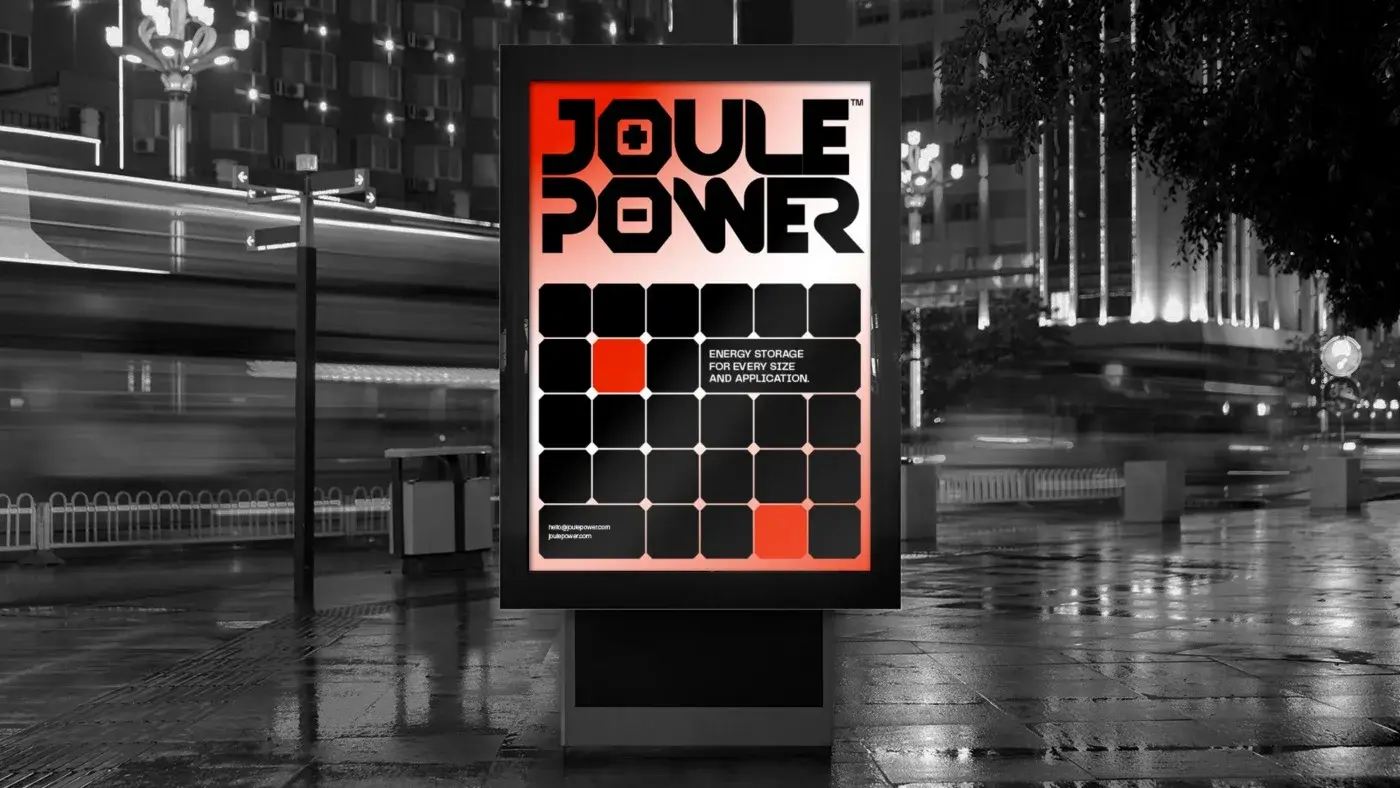
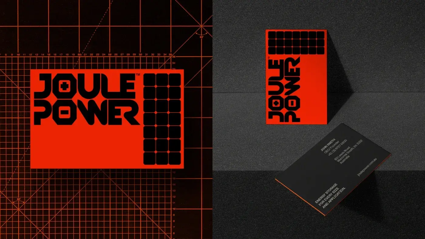
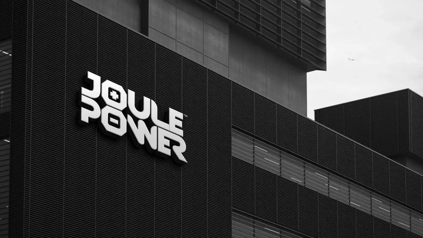
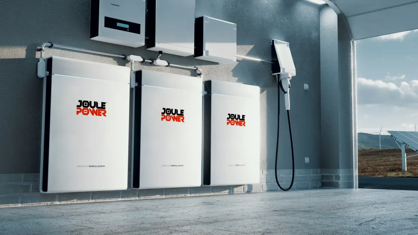
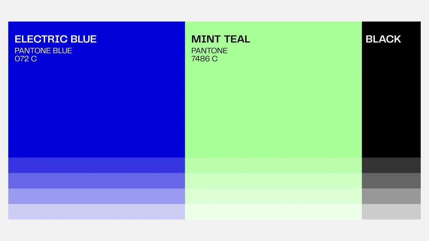
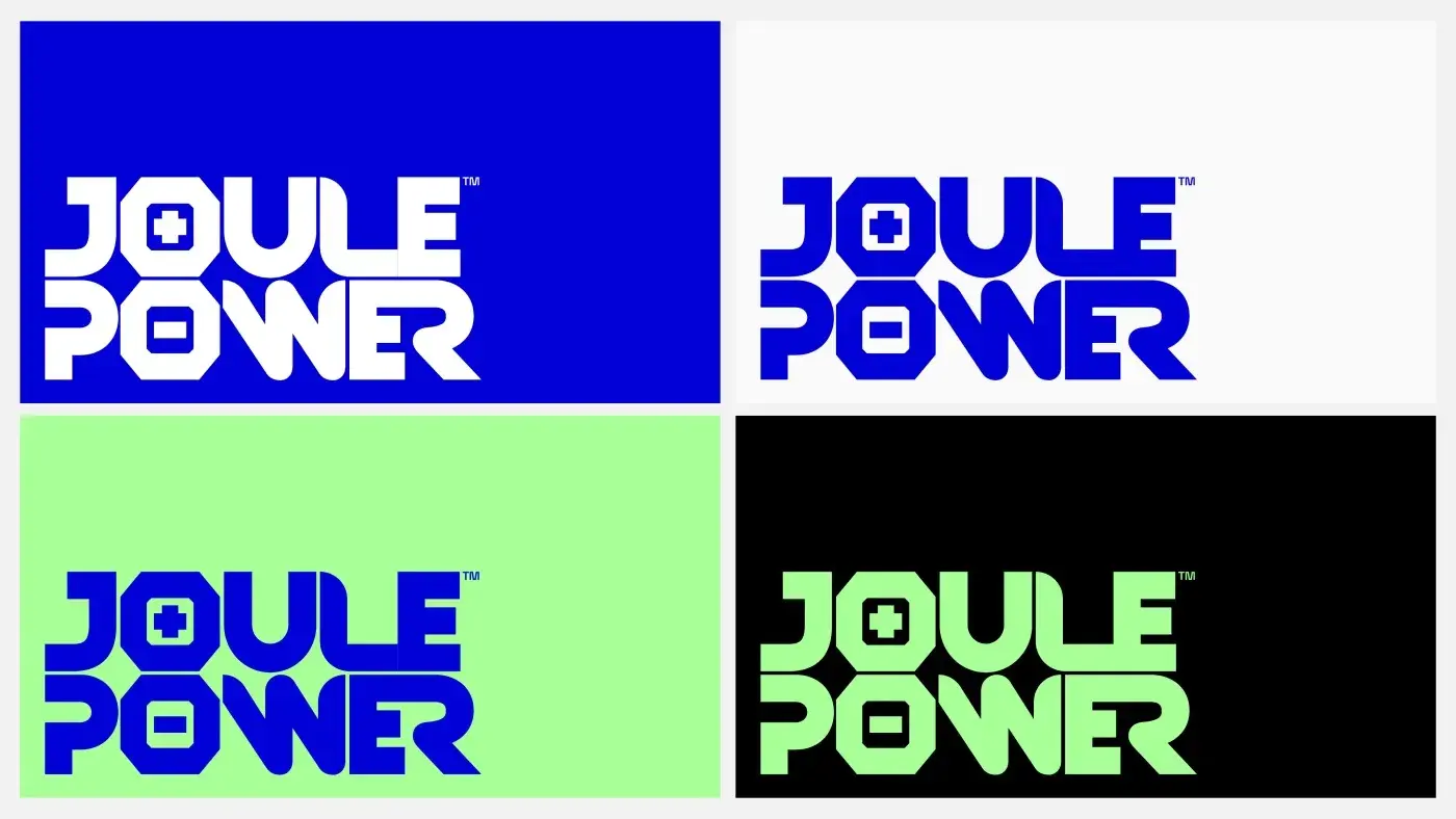
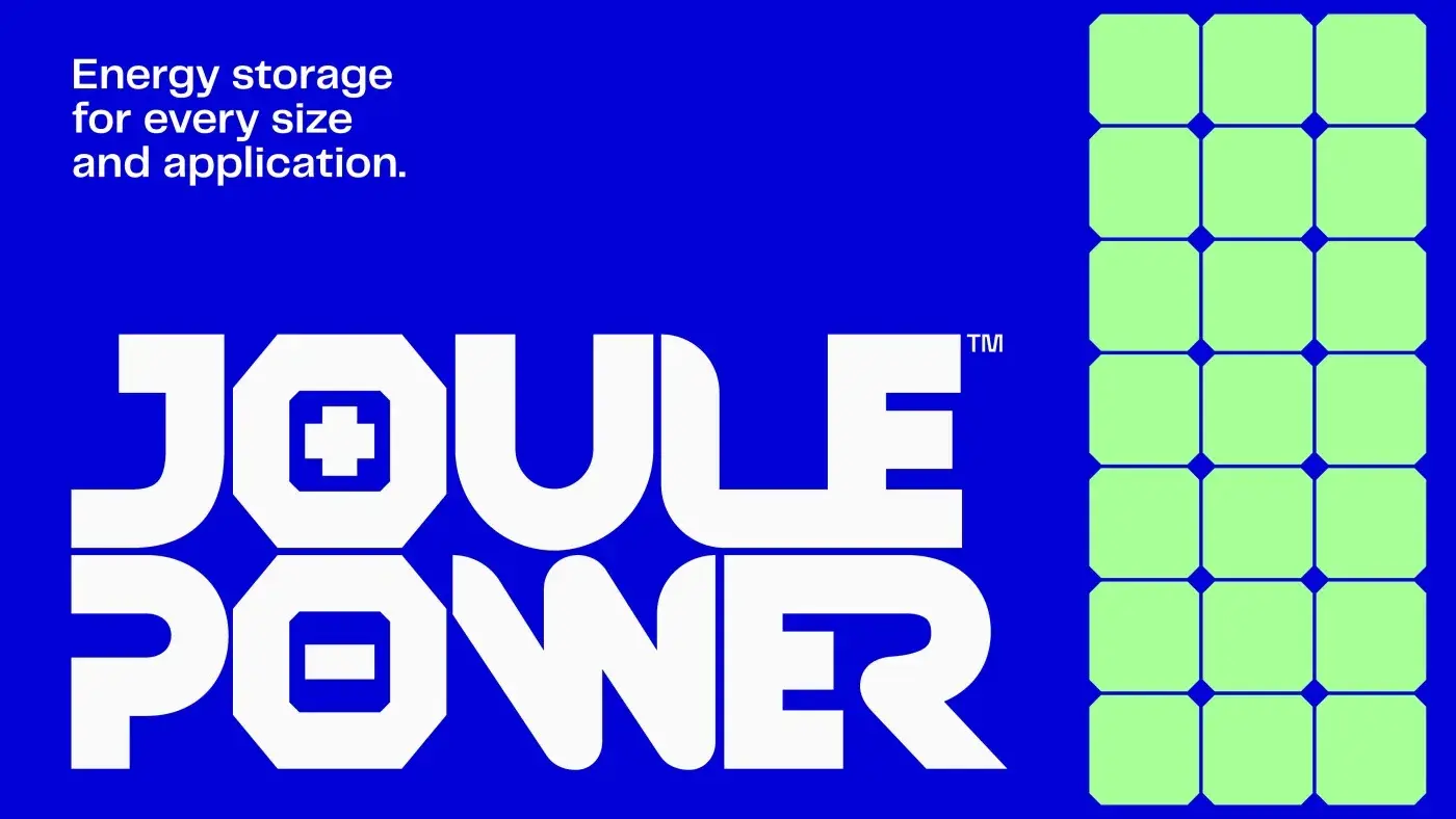
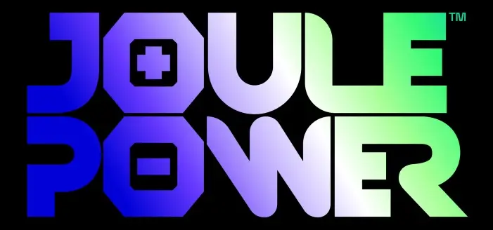
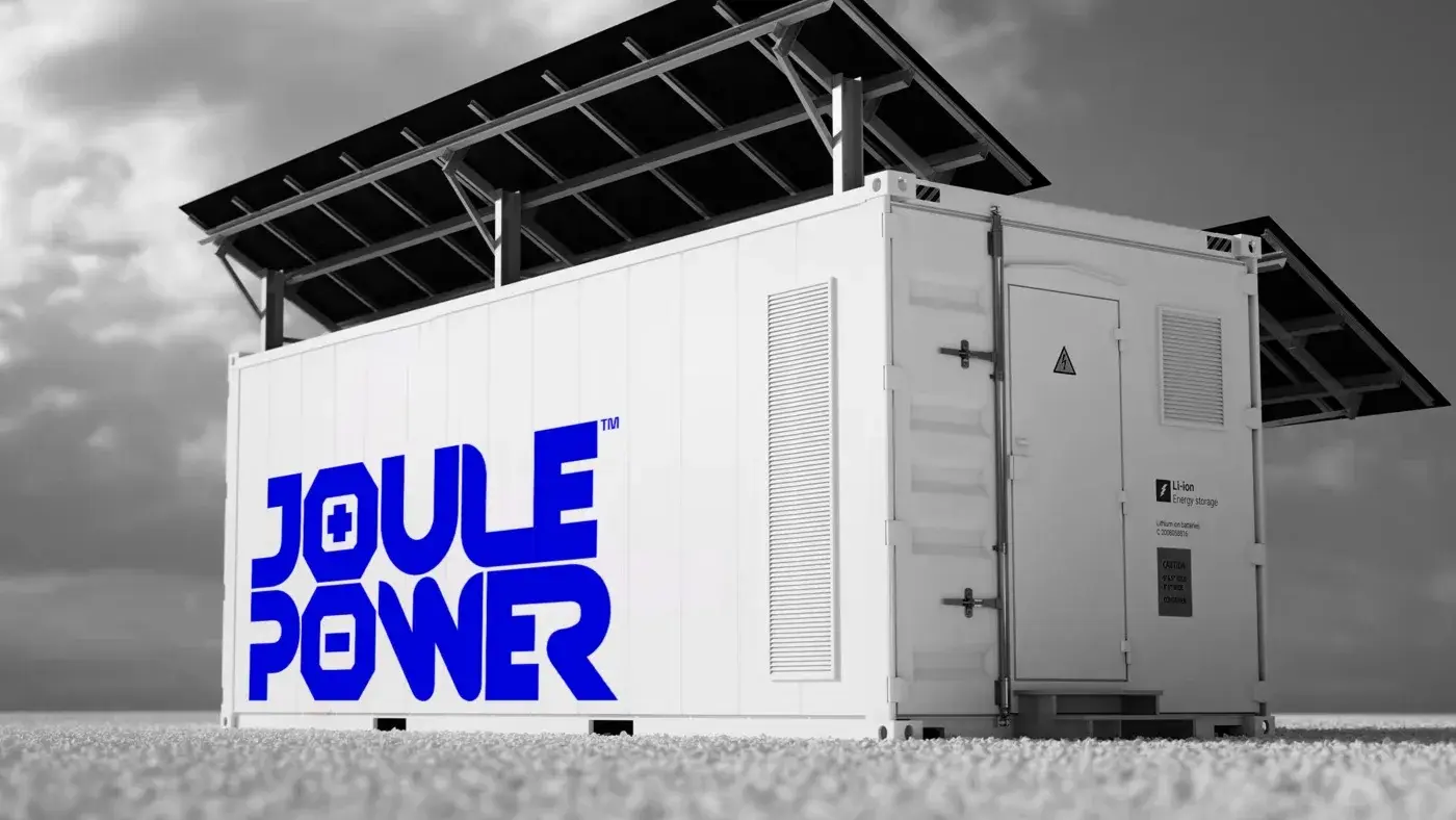
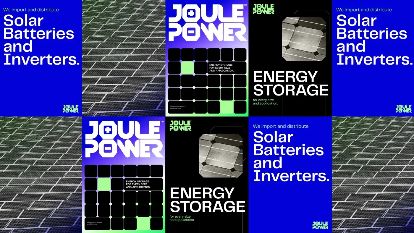
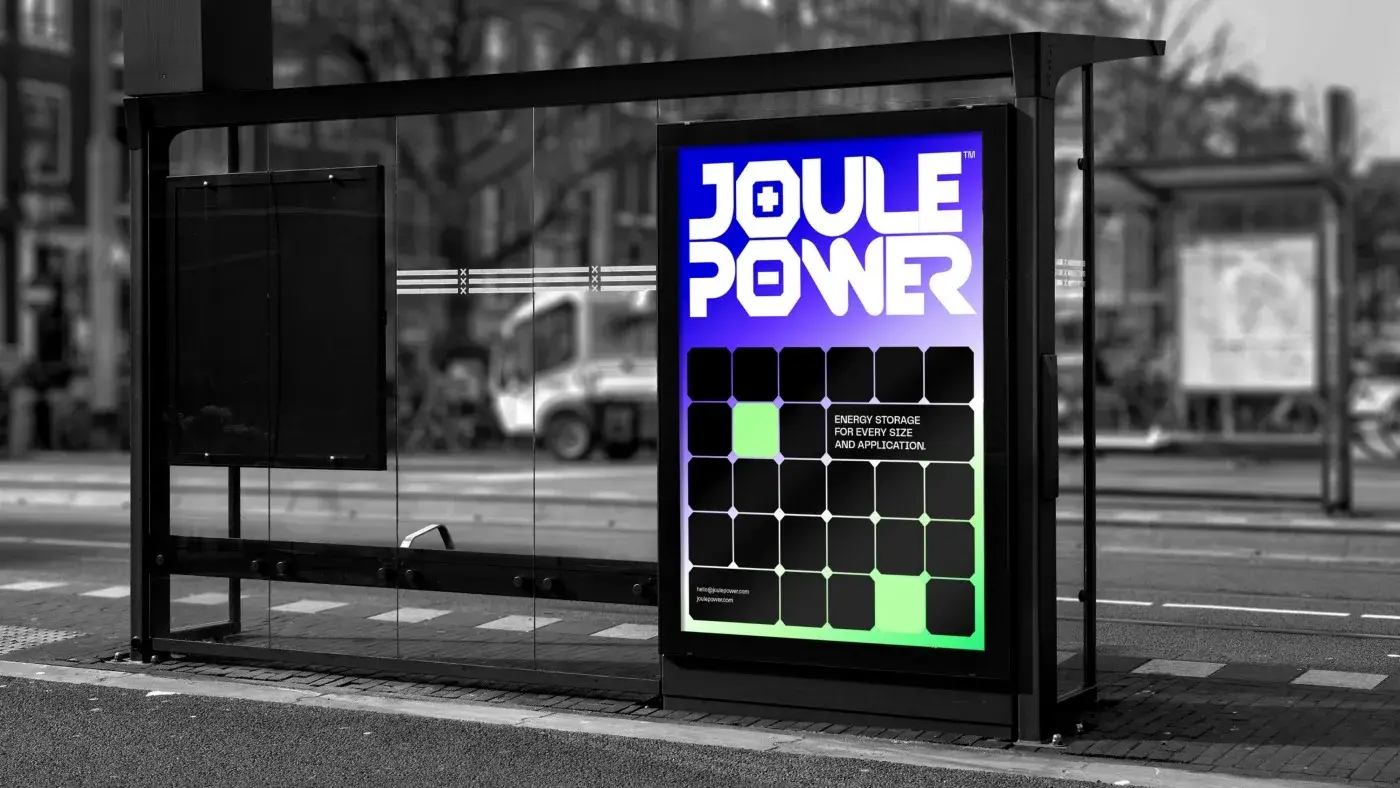
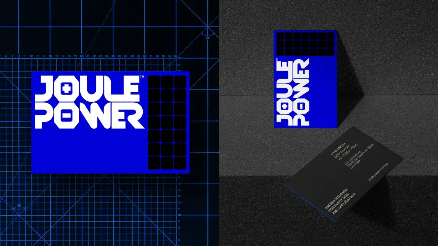
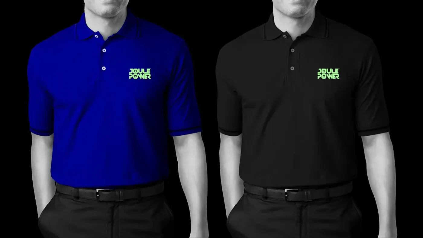
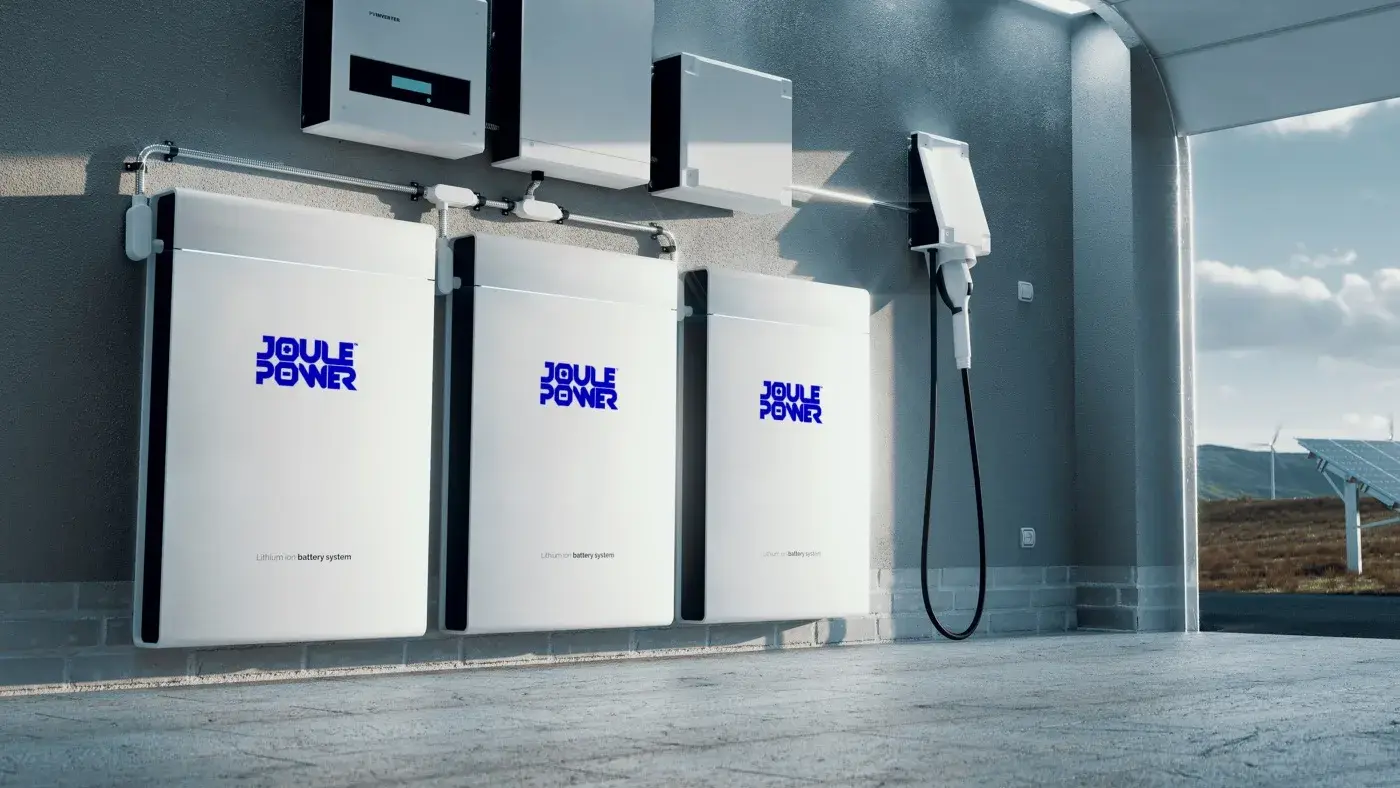
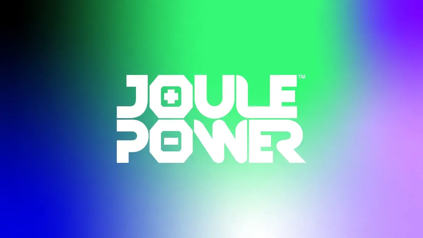
We put the battery inside the name. The two O letters in JOULE and POWER become cells: one carries a plus, one a minus. Around that, a module grid taken from a photovoltaic panel repeats into pattern, poster frame and container livery. Two colour routes were built out in full — Lava Orange and Electric Blue with mint — so the client could choose a temperature, not a logo.
OUTCOME
A complete identity delivered in two parallel colourways, each with logo versions, grid, palette and applications ready for spec sheets and site signage.
THE WORK

NEXT PROJECT