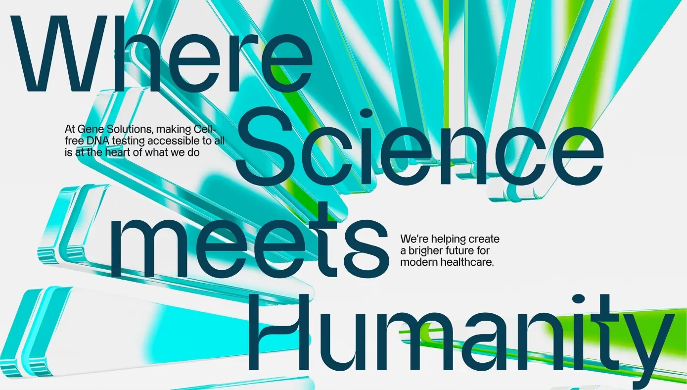
Most brand problems are a question of positioning. A biotech brand has a harder one: the same mark has to be read by a clinician who wants precision and by a patient who is frightened, often on the same day, sometimes on the same document.
Push toward the clinician and the brand becomes cold — a lab supplier. Push toward the patient and the science stops being credible, which is the one thing the company is actually selling.
Build the meaning into the construction
Gene Solutions had built Vietnam’s largest cell-free DNA testing capability and needed the brand to catch up. The mark is not a picture of a helix. It is a fixed construction: twenty-five blades standing for the twenty-three pairs of chromosomes, the sun, and the act of selection.
That matters for a reason that has nothing to do with storytelling. A mark built on a stated construction can be checked. Anyone applying it later can ask whether a version is correct instead of whether it looks right, and the answer is the same whether the file is opened in a hospital signage shop or by a media agency at midnight.
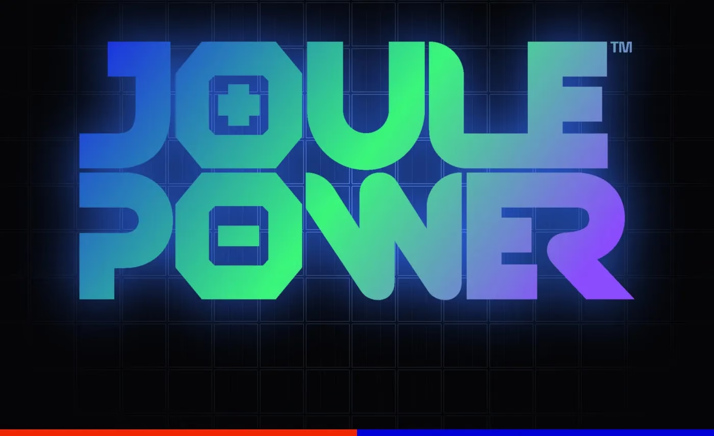
The same discipline shows up in identities with nothing else in common: Joule Power turns the O of the wordmark into a battery cell, one carrying a plus and one a minus, and Relifoods draws its monogram as a hand lifting fruit rather than as a leaf. In each case the idea is inside the geometry, so the geometry cannot be redrawn casually without breaking the meaning — a much stronger guardrail than a paragraph in a PDF. How the Joule Power mark and grid were built is in building a brand identity for a solar energy company.
Design for the worst reproduction, not the best
Identity decks are approved on a large screen in a dark room. The work then lives on a lab print-out.
So the system was written for the worst case first: two primary colours, a gradient family that degrades gracefully, a pattern derived from the mark itself, and a type hierarchy that survives a monochrome laser printer at A4. Nothing in it needs a designer present to be applied correctly.
That is the actual deliverable of a rebrand at this scale — not the logo, but the number of decisions the next person no longer has to make. Every rule exists so the next person can apply it without asking us.
Give the emotion its own room
The clinical system does not have to carry the feeling as well. It just has to make room for it.
For Gene Solutions the emotional register lives in motion and in the manifesto film, where the same construction opens up and the brand is allowed to say what it is for. The static system stays disciplined; the film does the human work. Keeping those two jobs separate is what stops a medical brand from becoming either a greeting card or a spreadsheet.
What to hold the work to
- Can a non-designer apply it? If applying the brand requires taste, the system is not finished.
- Does it survive one colour? A biotech mark that only works in gradient will spend half its life broken.
- Does the construction mean something checkable? “It felt right” is not a guardrail; “twenty-three pairs” is.
Built in 2023, the system is still doing the work through 2026 — across clinical reports, hospital signage and consumer campaigns. That is the only durability test that counts.