Work — Relifoods · BFS Studio, Ho Chi Minh City
Relifoods— Brand Identity System
THE BRIEF
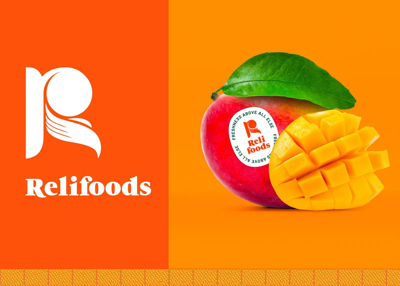
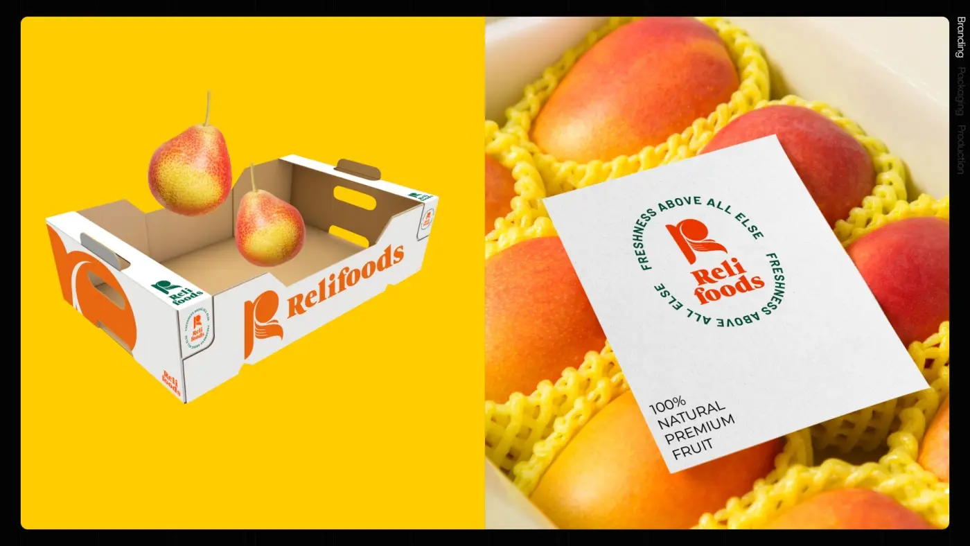
Relifoods grows and ships fruit, and fruit is the hardest thing to brand: the product is identical to everybody else’s until someone tells you it was handled properly. The identity had to travel from a shipping carton to a reception counter to a sticker on a single mango, and be applied by farm staff, not designers.
WHAT WE DID
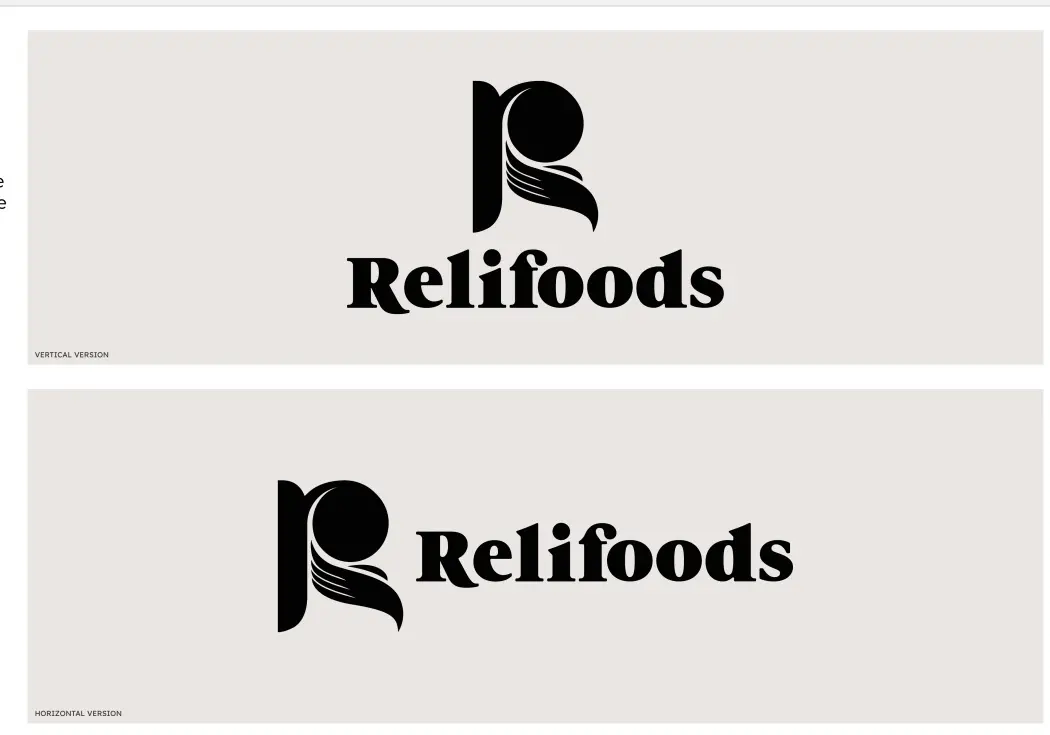
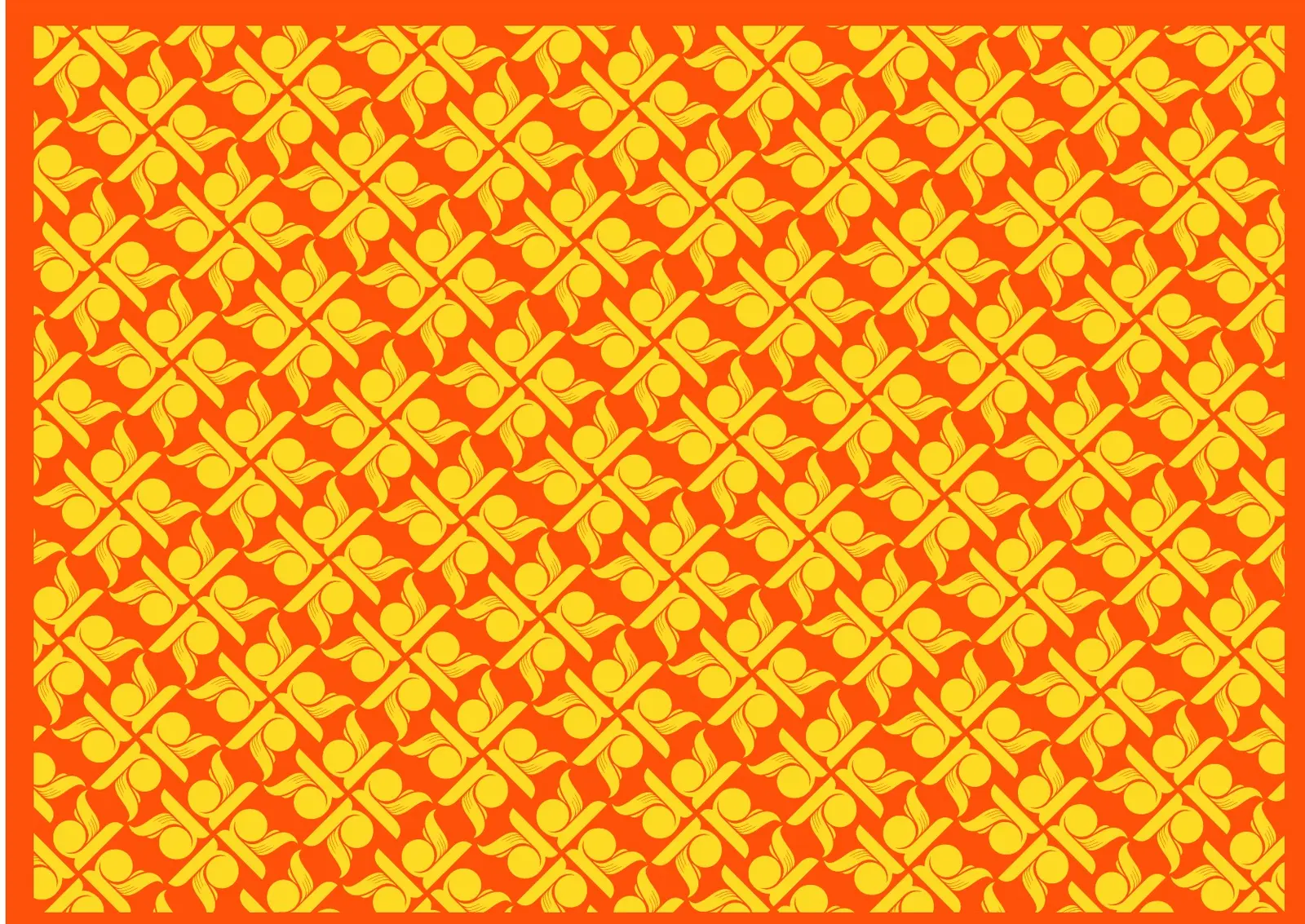
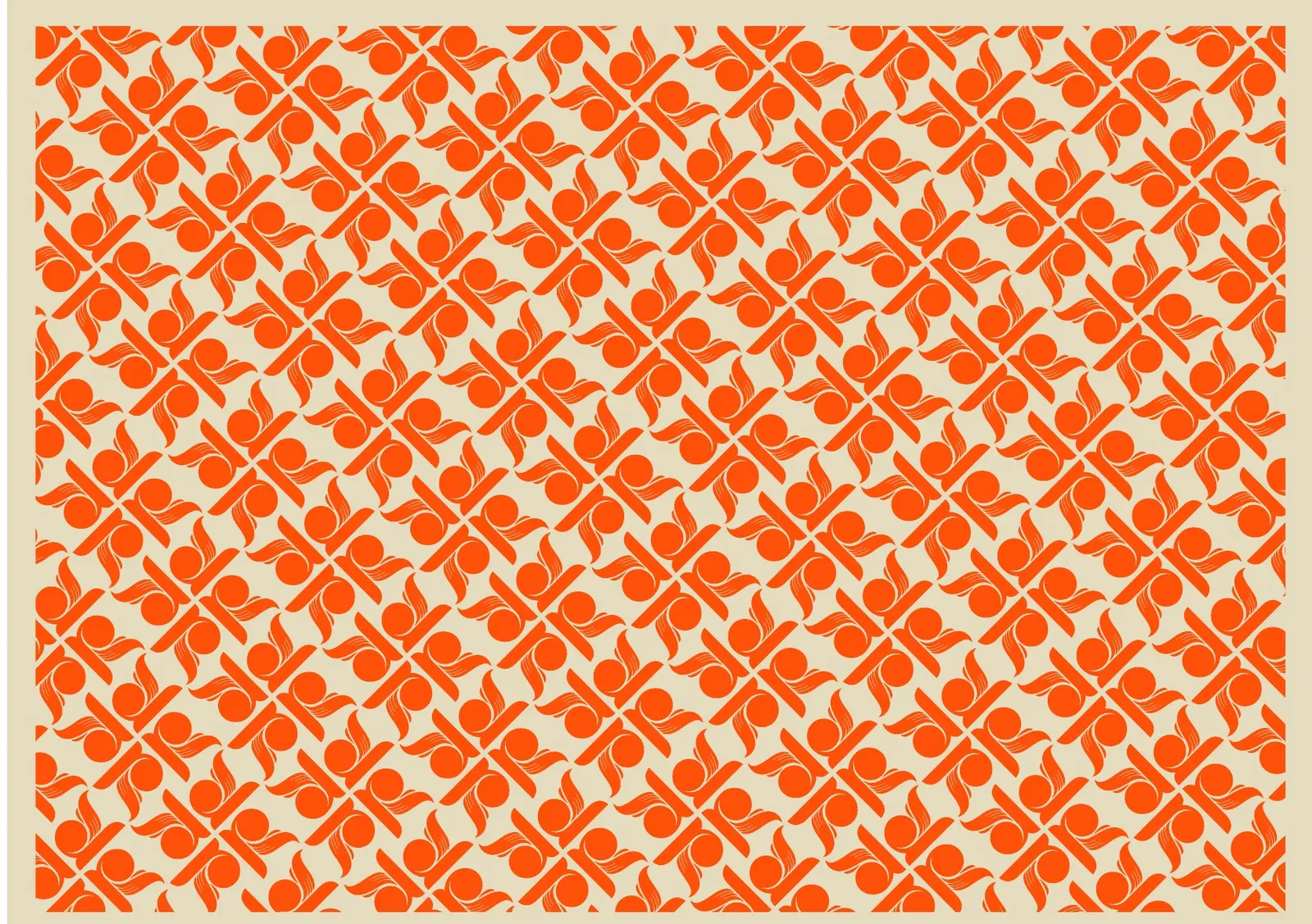
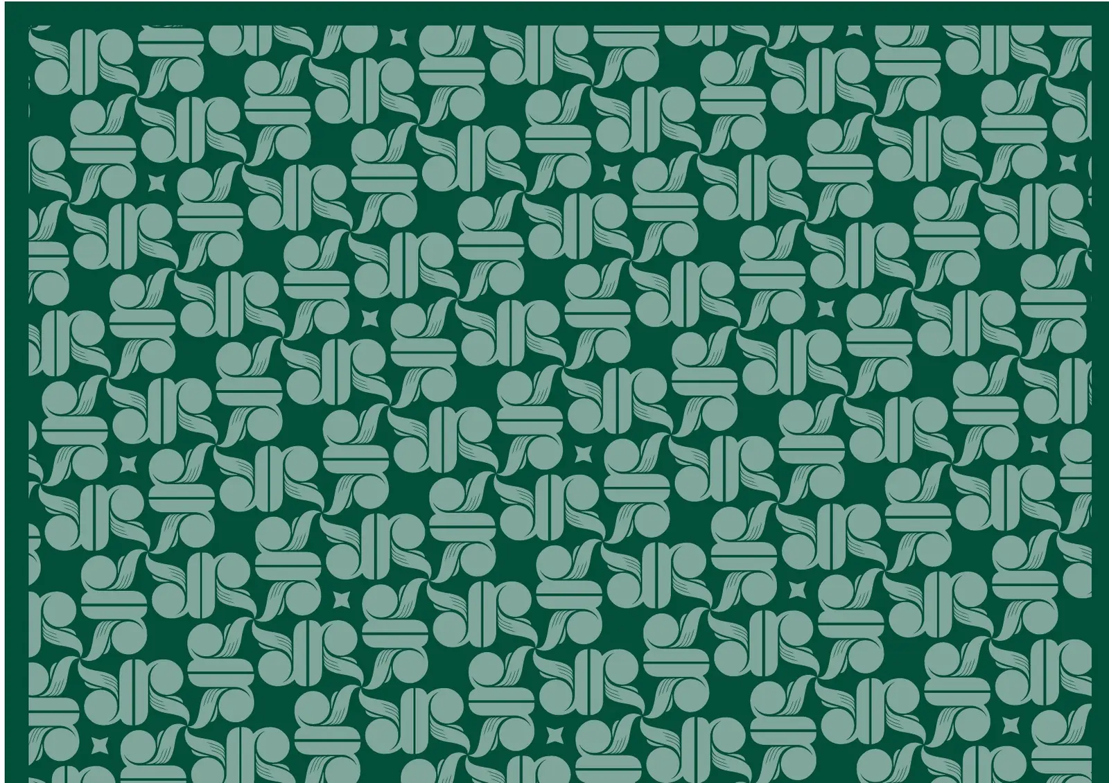
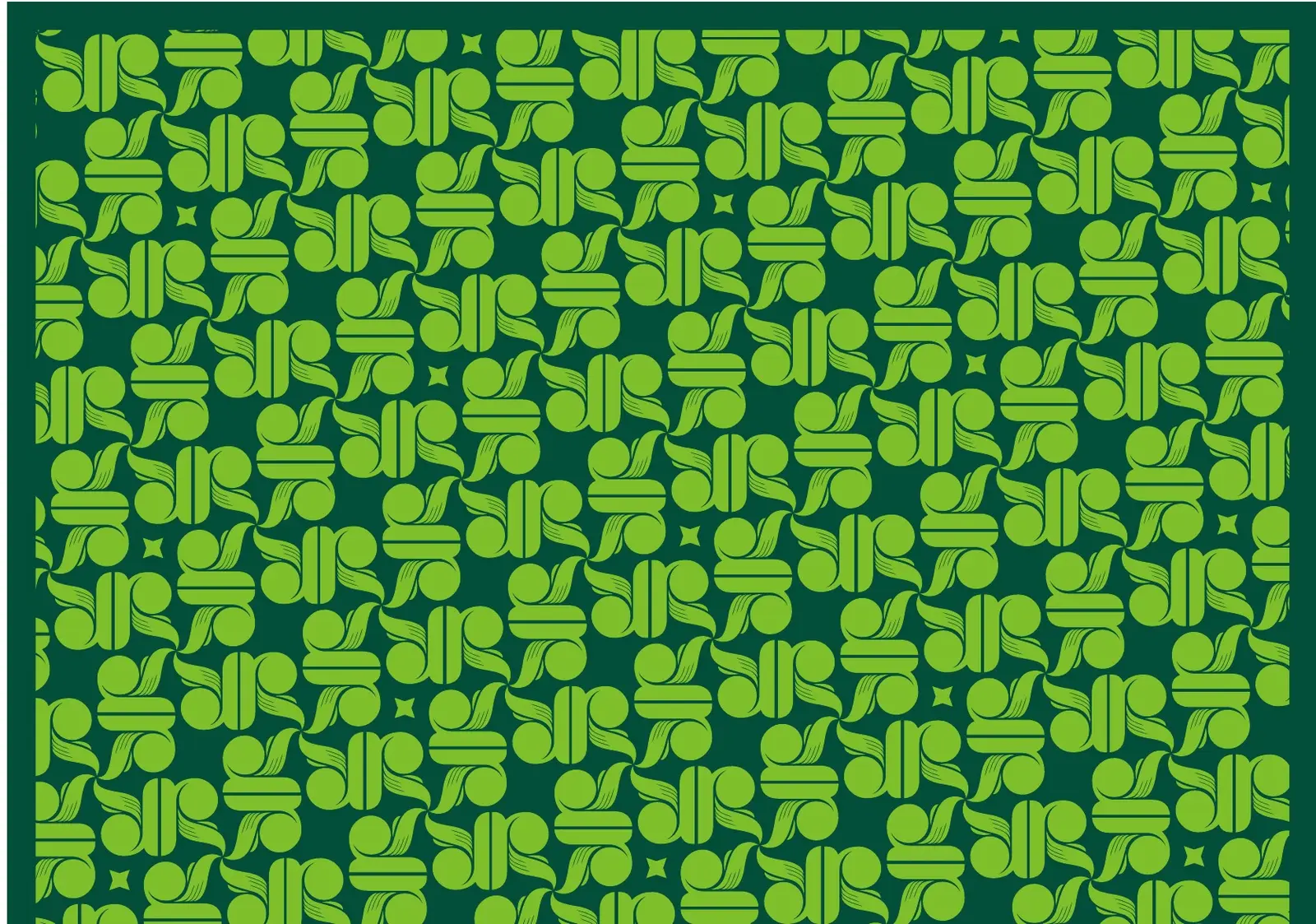
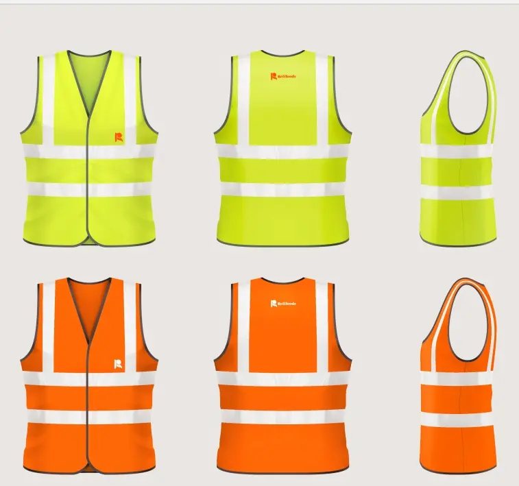
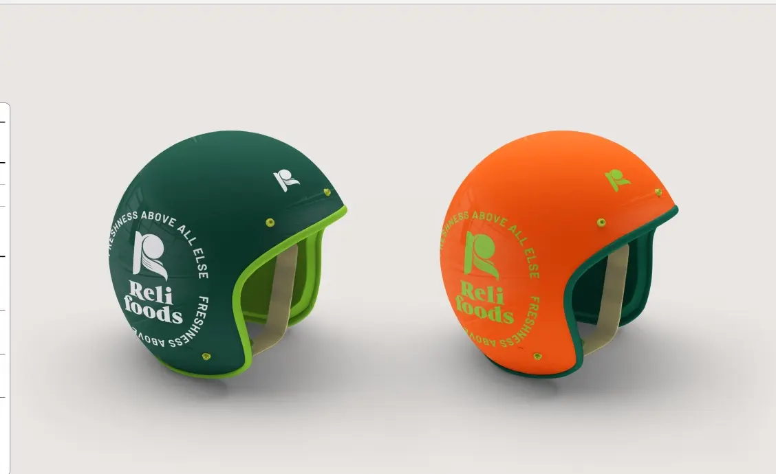
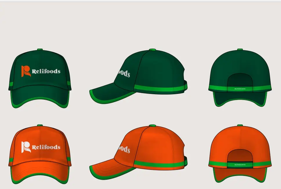
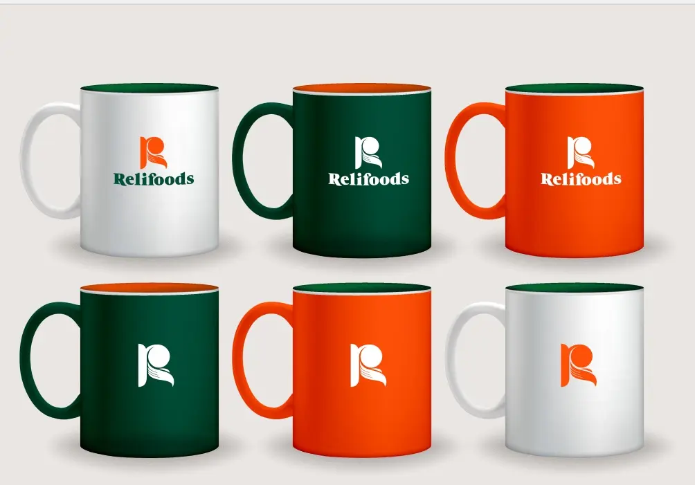
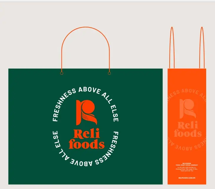
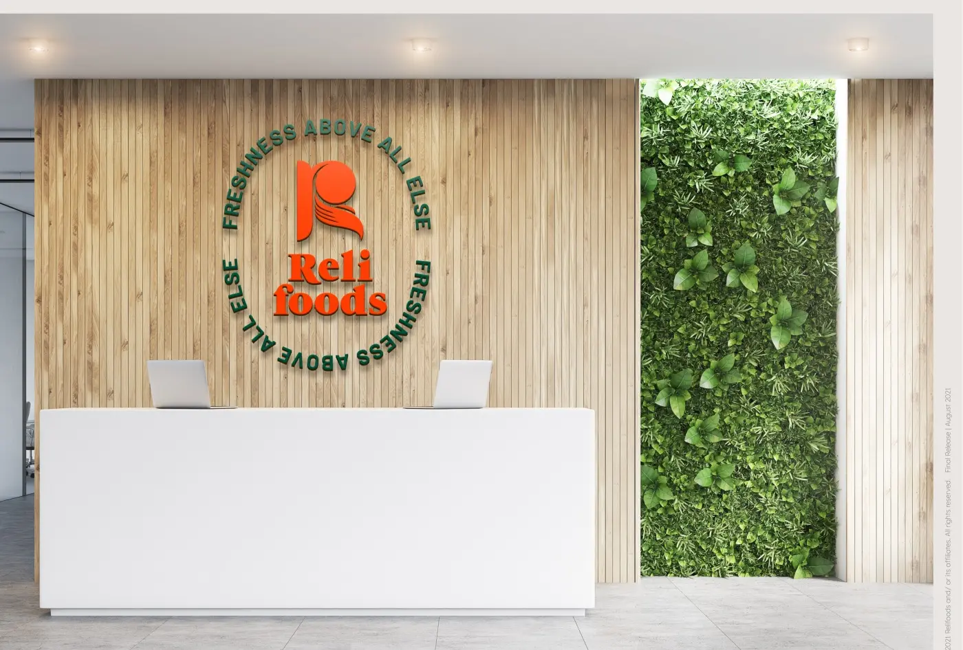
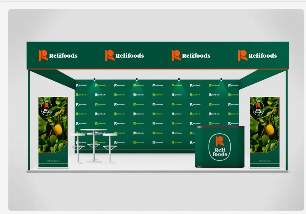
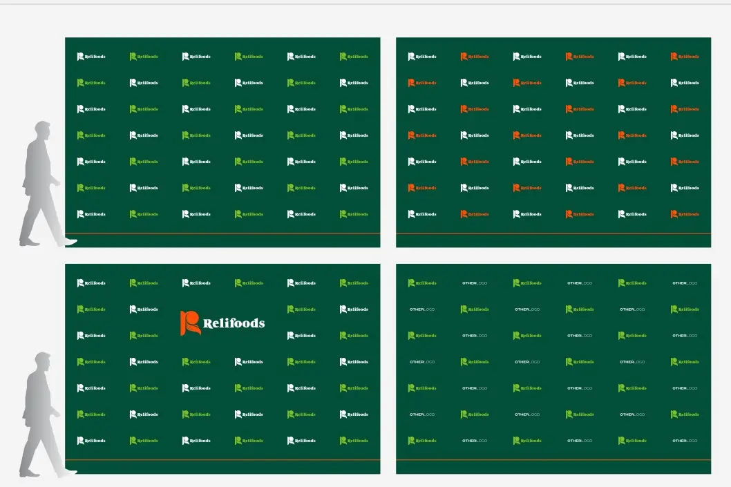
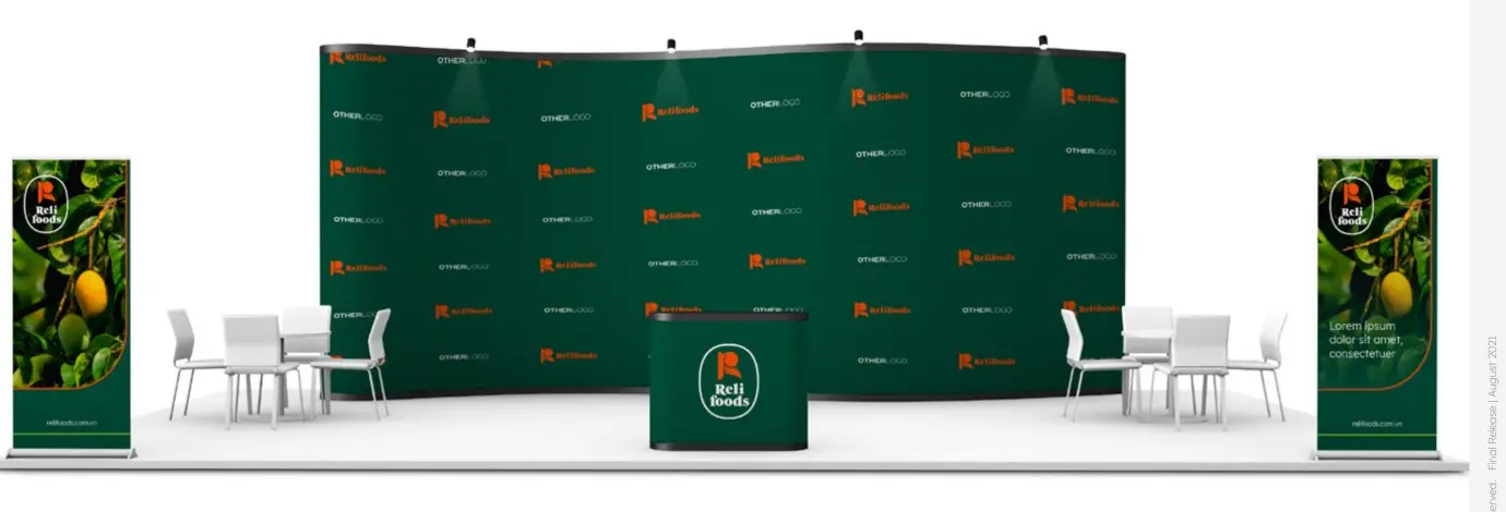
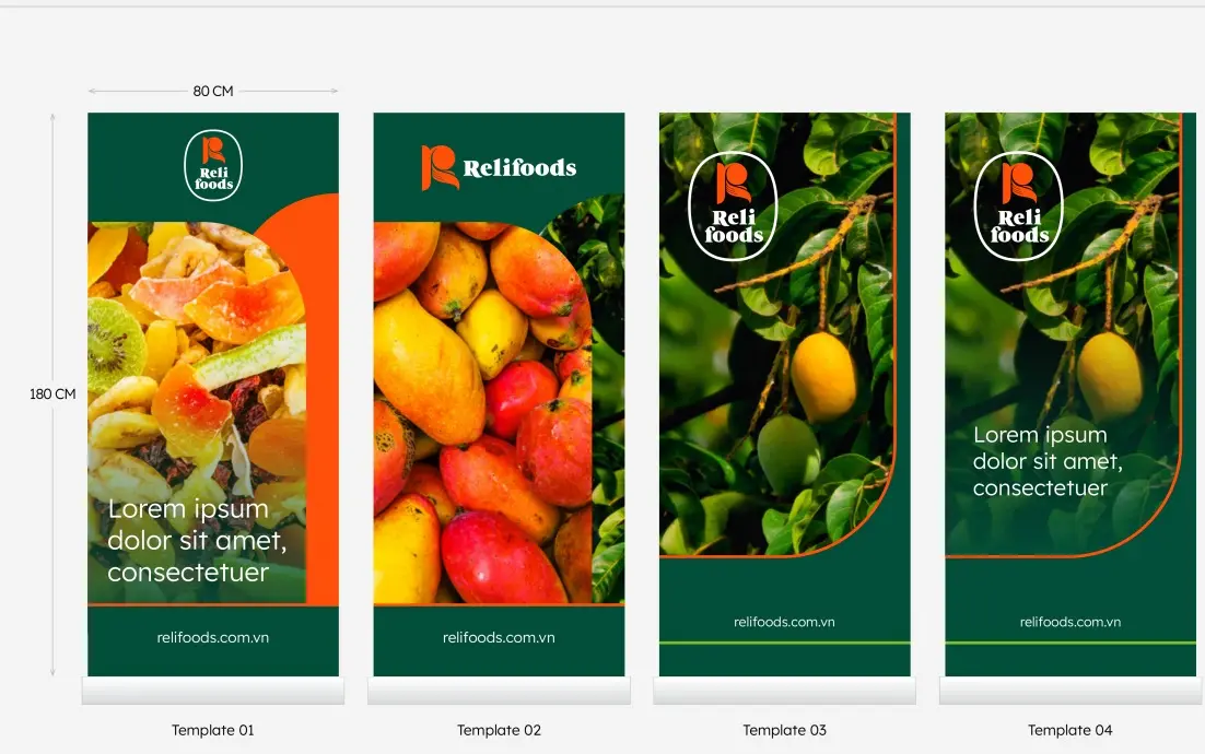
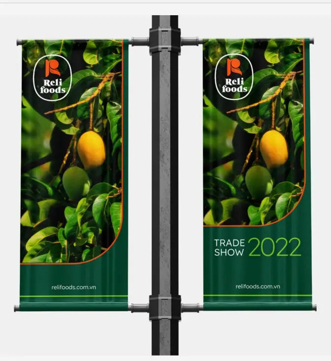
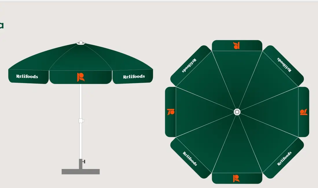
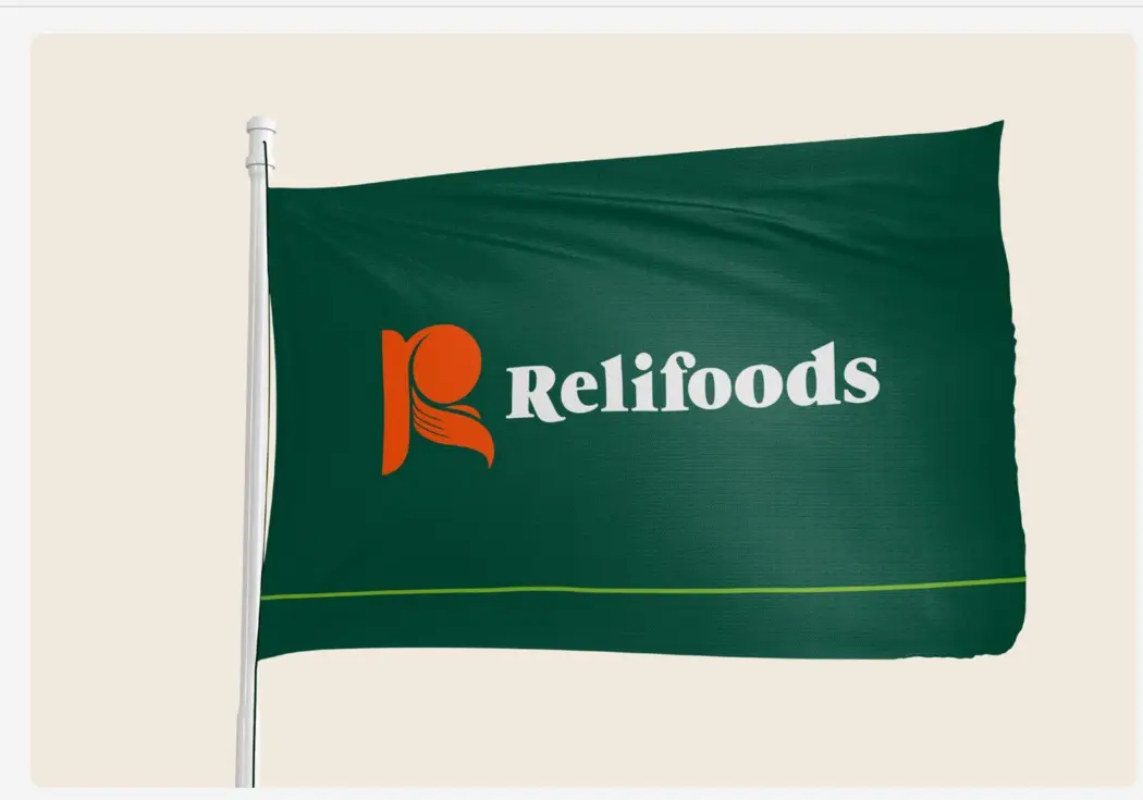
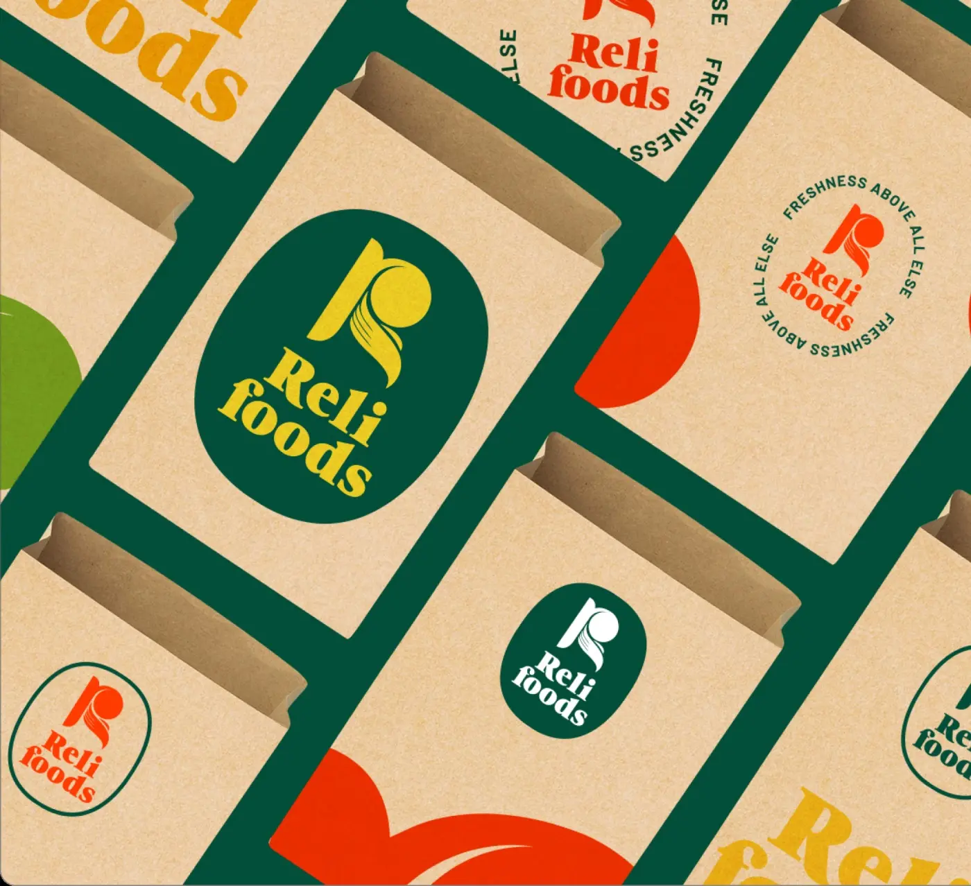
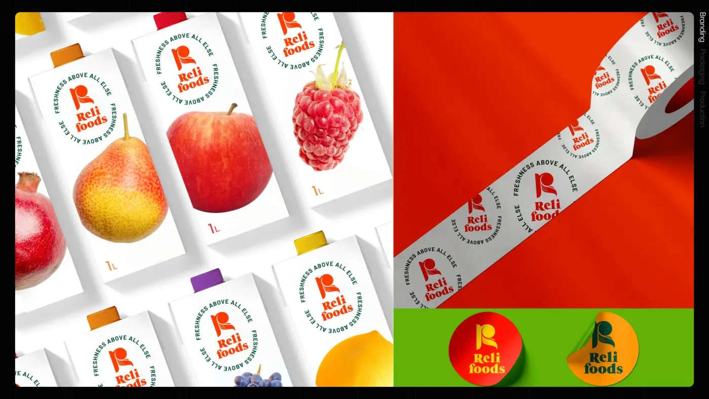
We built the R as a hand. The stem of the letter is a wrist, the curve is a palm and the strokes are fingers taking the weight of the fruit — a mark that says selected and carried before it says anything else. Around it: a round stamp carrying “Freshness above all else”, a two-colour discipline held at 55/40, a four-tone pattern family built from the same hand, and a full standards manual that runs out to uniforms, signage, trade stands and packaging.
OUTCOME
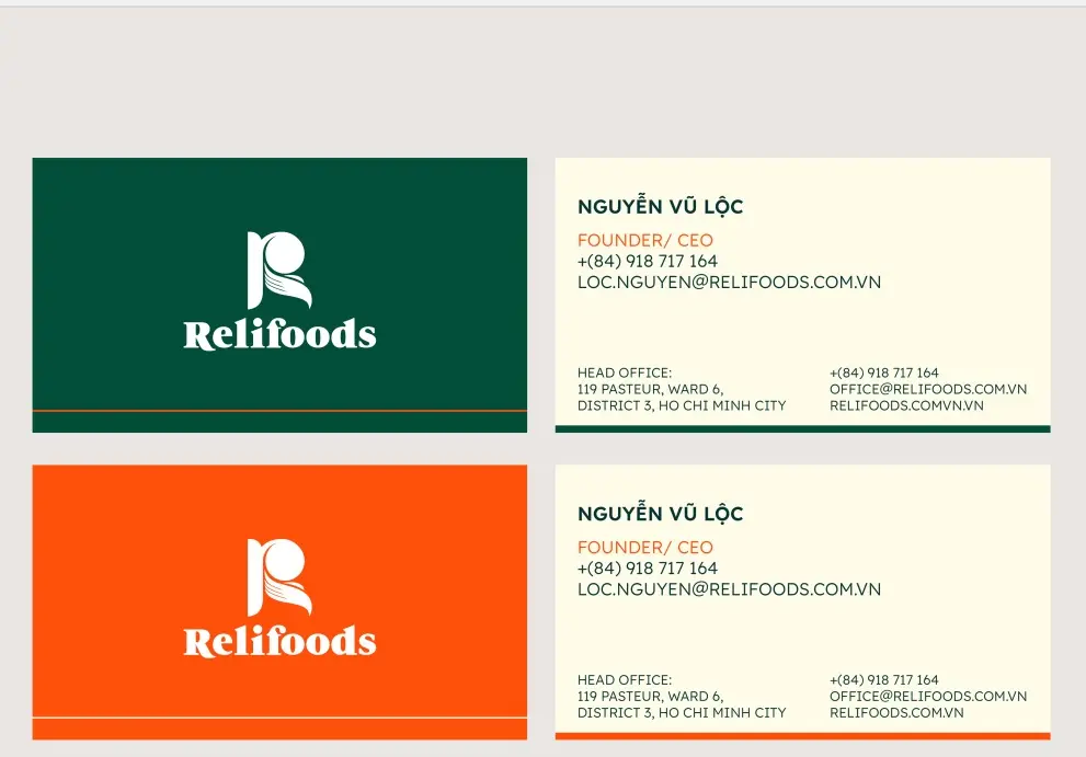
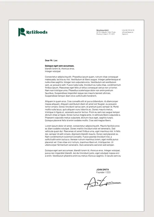
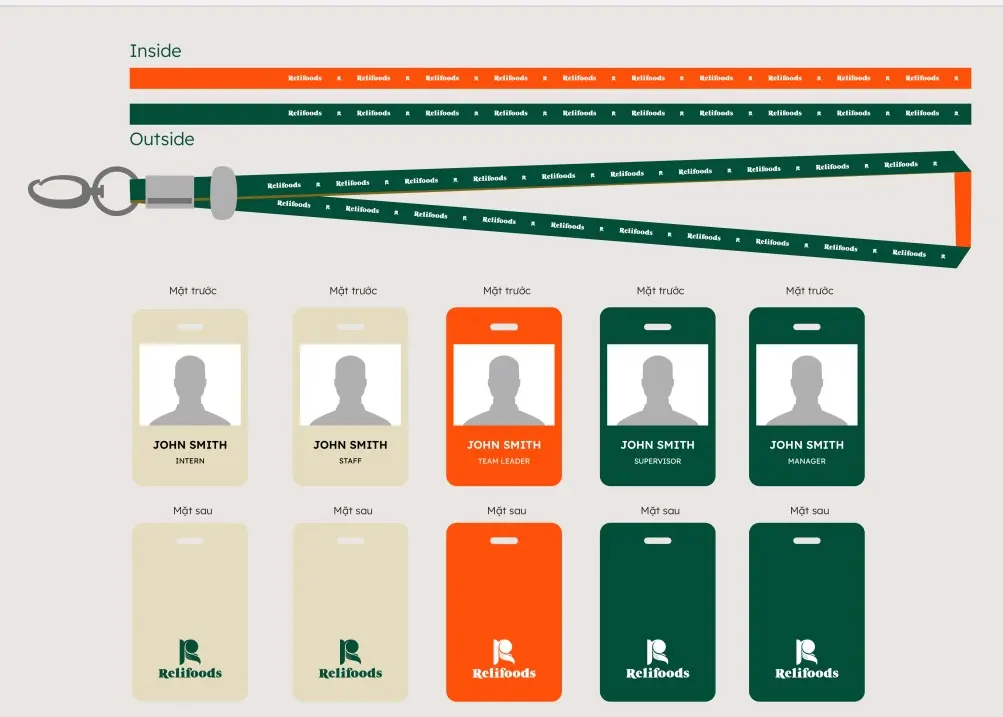
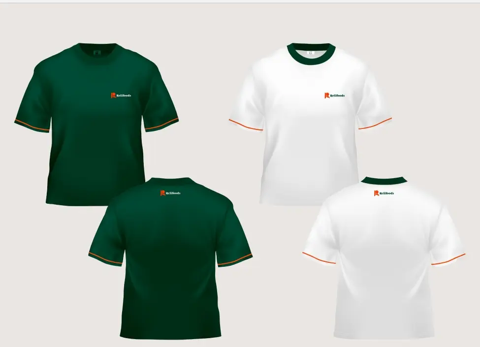
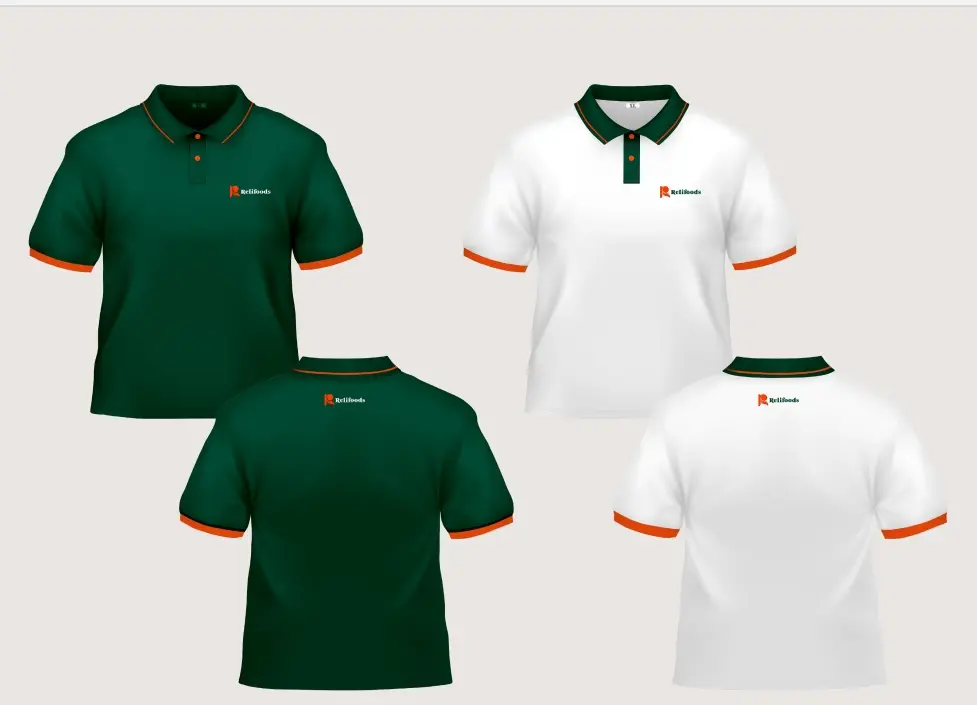
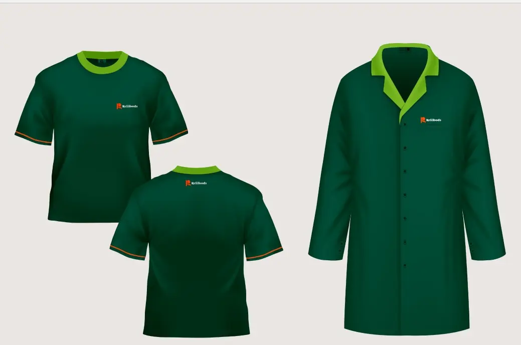
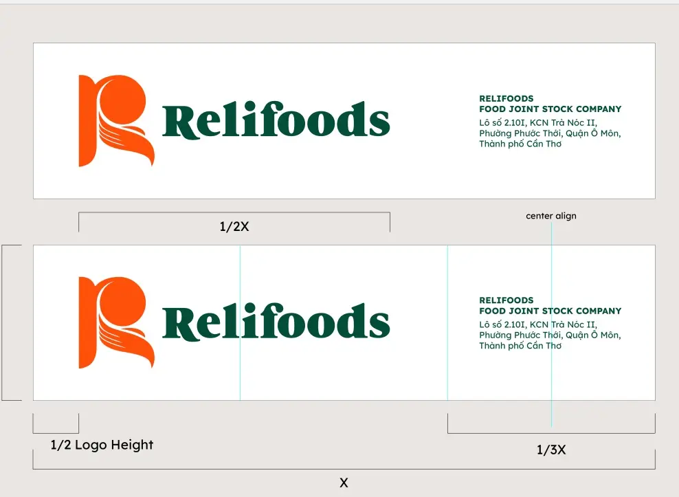
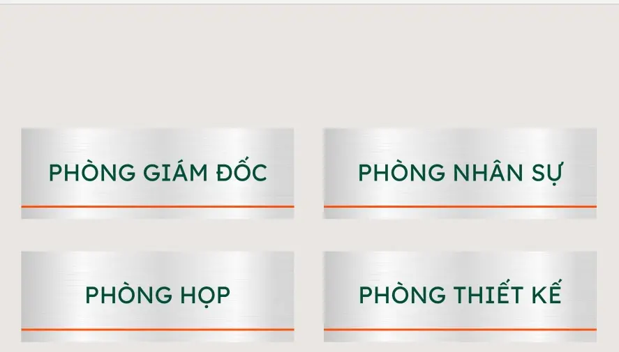
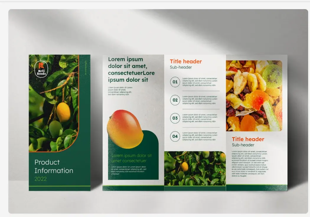
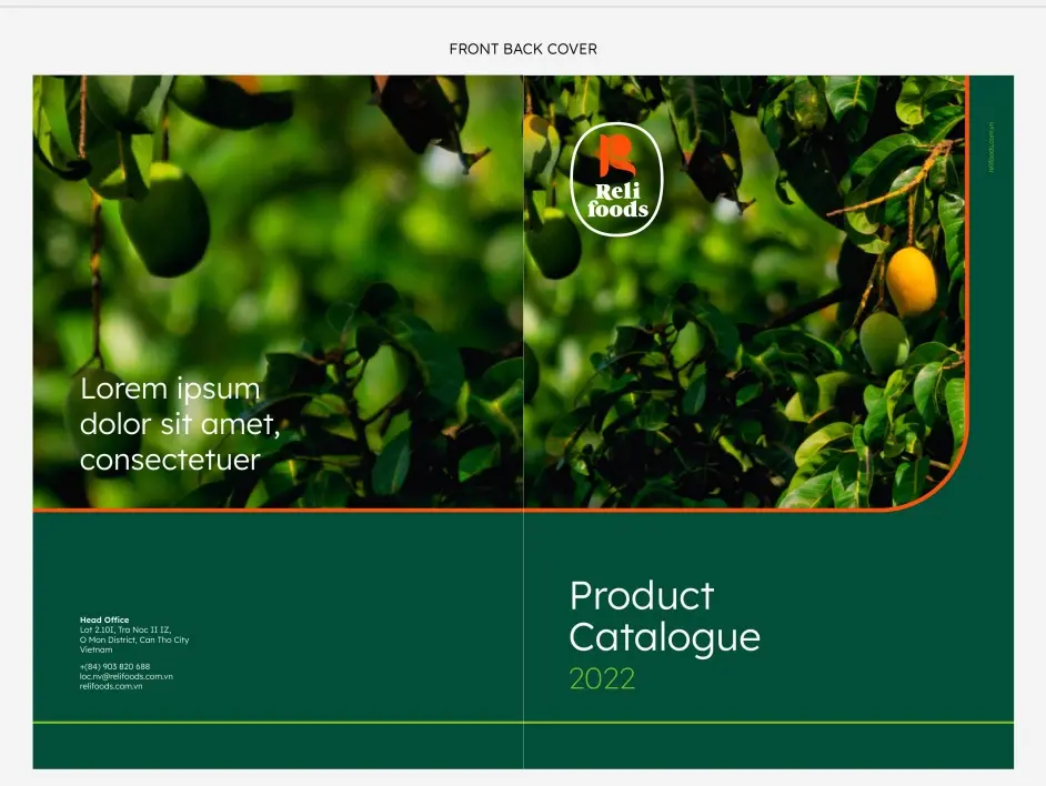
A full identity system delivered and rolled out from 2021 to 2023 — logo, pattern, stationery, uniforms, signage, print and product packaging.
THE WORK

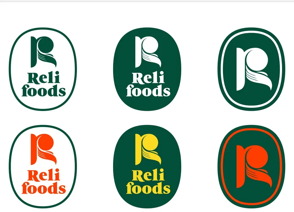
- Orange 021 C · 55%#FF500A
- 3305 C · 40%#024E38
- 368 C#7CBF2B
- 115 C#FDDB24
- 354 C#00AF3C
- 3248 C#76CAB9
Freshness above all else
Lexend — the whole system, one family
Lexend runs from Thin to Extra Bold. Semi Bold carries headlines, Regular carries body, and the same family covers signage, packaging and the standards manual so nothing has to be matched by eye.
NEXT PROJECT