Work — Gene Solutions · BFS Studio, Ho Chi Minh City

Gene Solutions
Project details

Client
Gene Solutions
Industry
Healthcare
Services
Brand Identity
Scope
Mark · guidelines · pattern · type · campaign · film
Year
2023–2026
Credits
BFS Studio
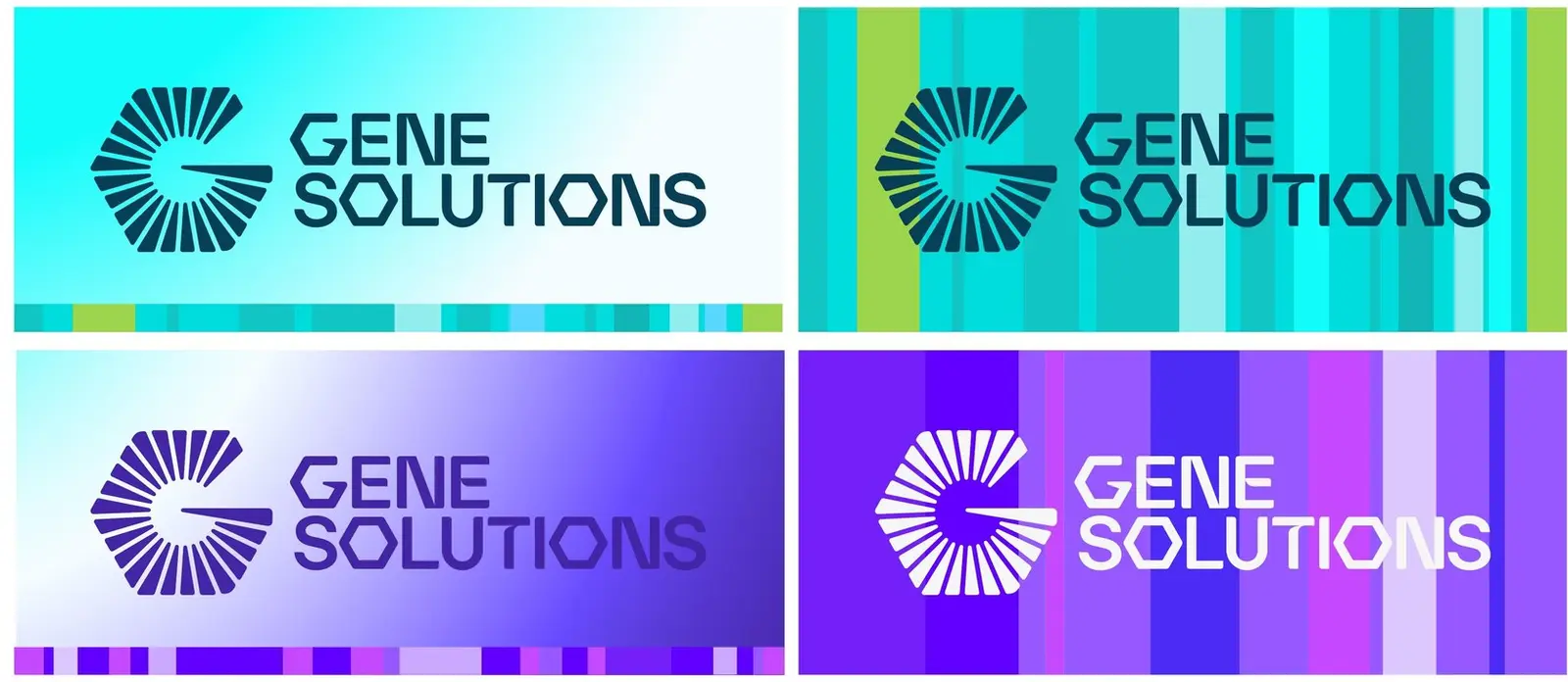
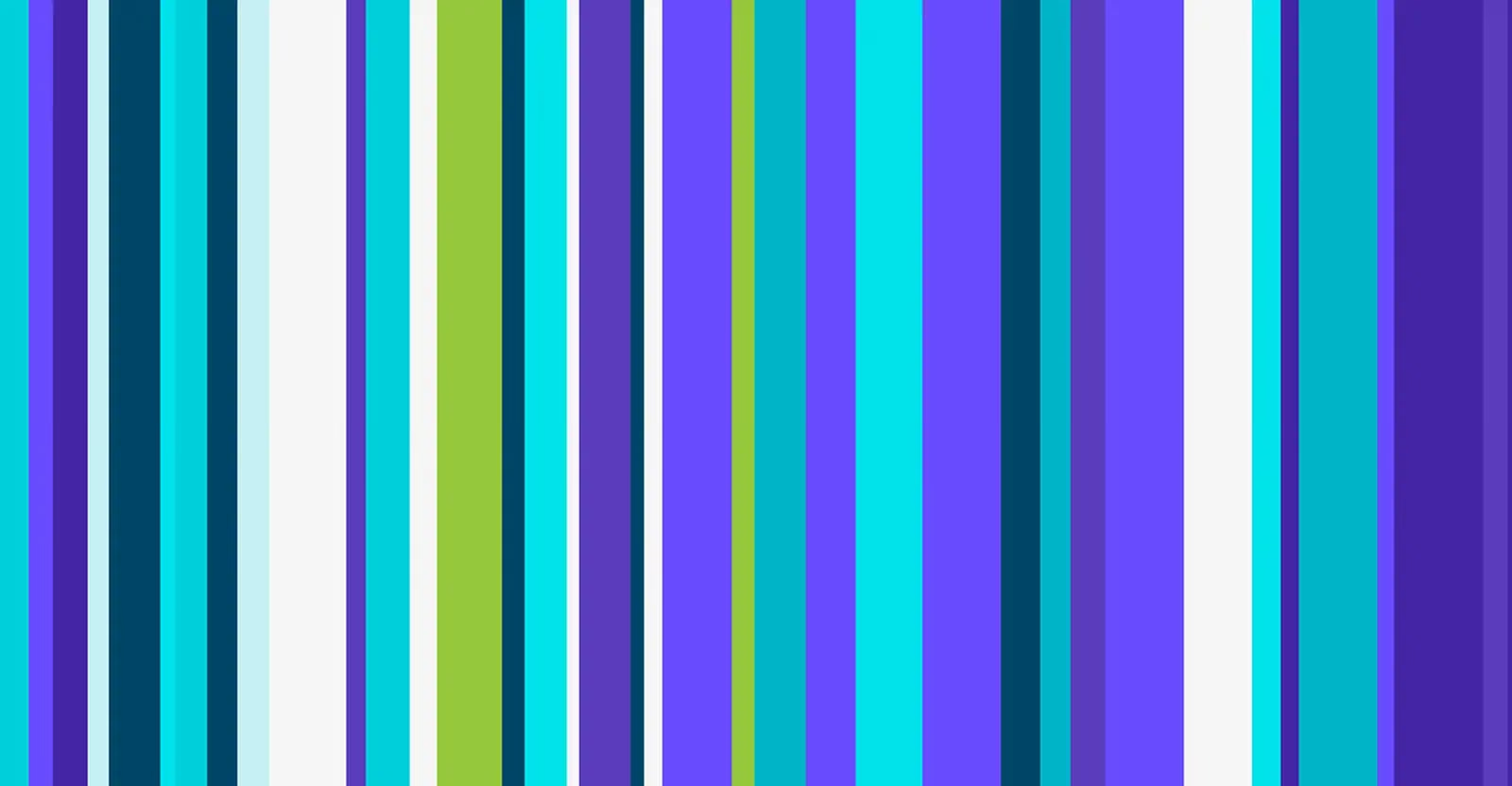
Gene Solutions brand pattern — vertical stripes in teal, green, violet and white
( 01 )

THE BRIEF

Gene Solutions had built Vietnam’s largest cell-free DNA testing capability and needed the brand to catch up. The identity had to hold together across clinical reports, hospital signage and consumer campaigns — and read clearly to a doctor and a patient in the same breath.

( 02 )

WHAT WE DID

We rebuilt the mark on a fixed construction grid, then wrote the system around it: two primary colours, a gradient family, a pattern derived from the mark itself, and a type hierarchy that survives a lab print-out. Every rule exists so the next person can apply it without asking us.

( 03 )

OUTCOME

A full rebrand delivered and rolled out from 2023: mark, colour, gradient, pattern, type and motion, plus the manifesto film and campaign kit.

( 04 )

THE WORK

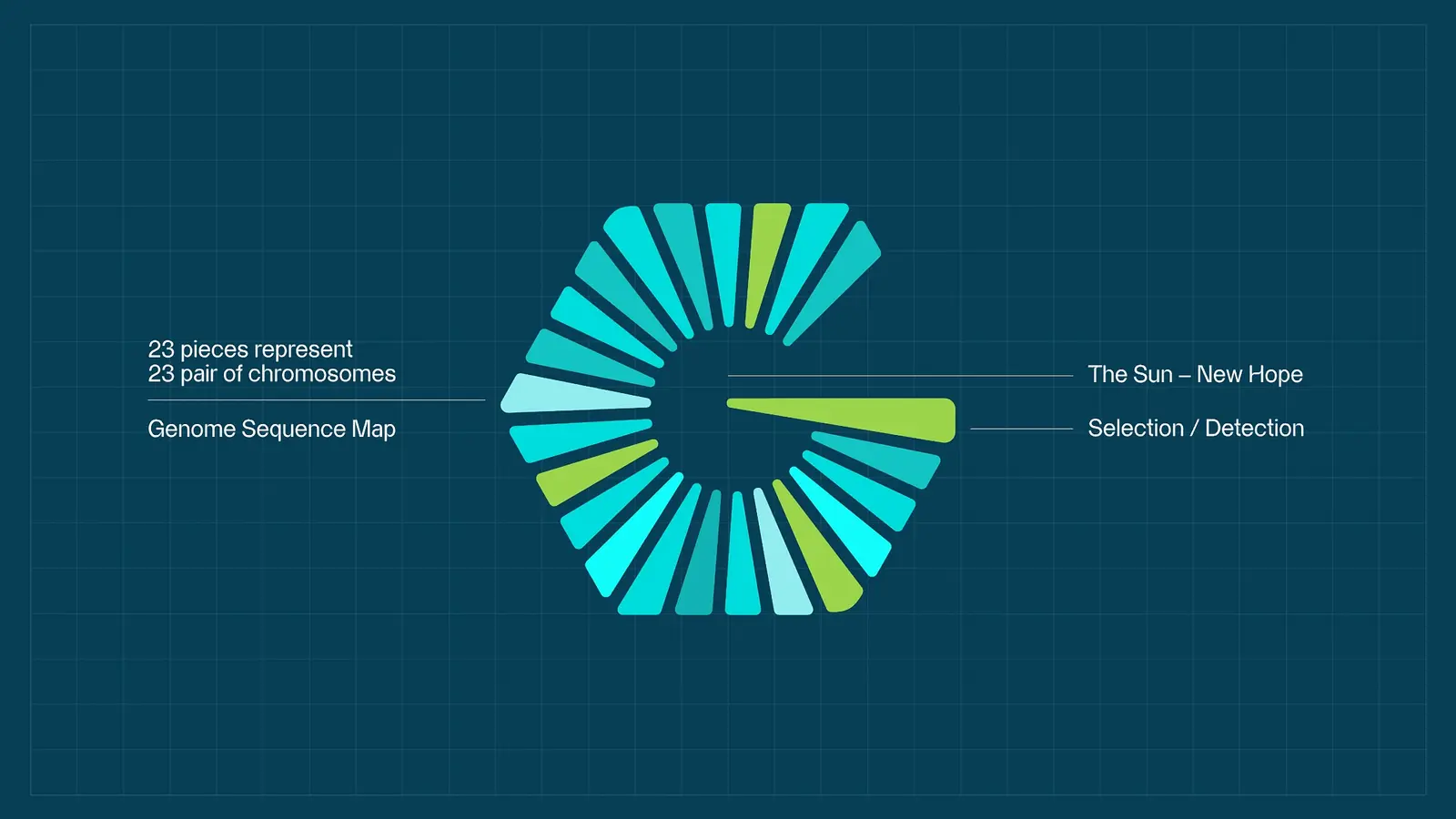
Diagram on deep navy explaining the mark: 25 blades standing for 23 pairs of chromosomes, the sun, and the act of selection
The idea — 23 pairs, one sun
The radial mark drawn blade by blade on a dark construction field
The mark, built blade by blade
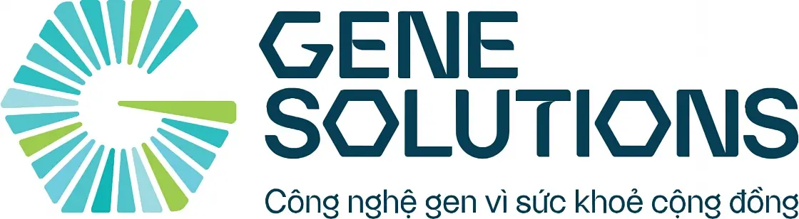
The primary Gene Solutions lockup — radial mark beside the wordmark with the Vietnamese tagline beneath
Primary lockup
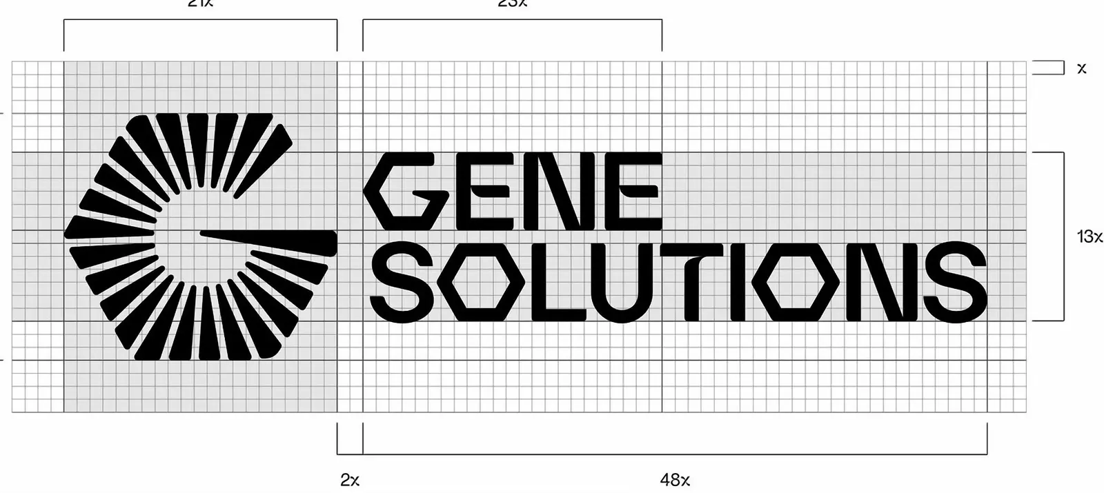
Construction drawing of the mark and wordmark on a modular grid, clearance measured in x-units
Construction grid
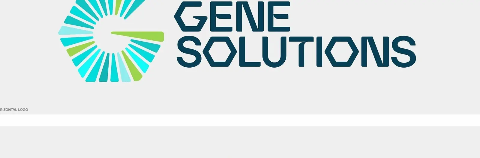
The horizontal lockup shown at its specified proportions
Horizontal format
The radial mark on its own, in full colour, at display size
The mark on its own
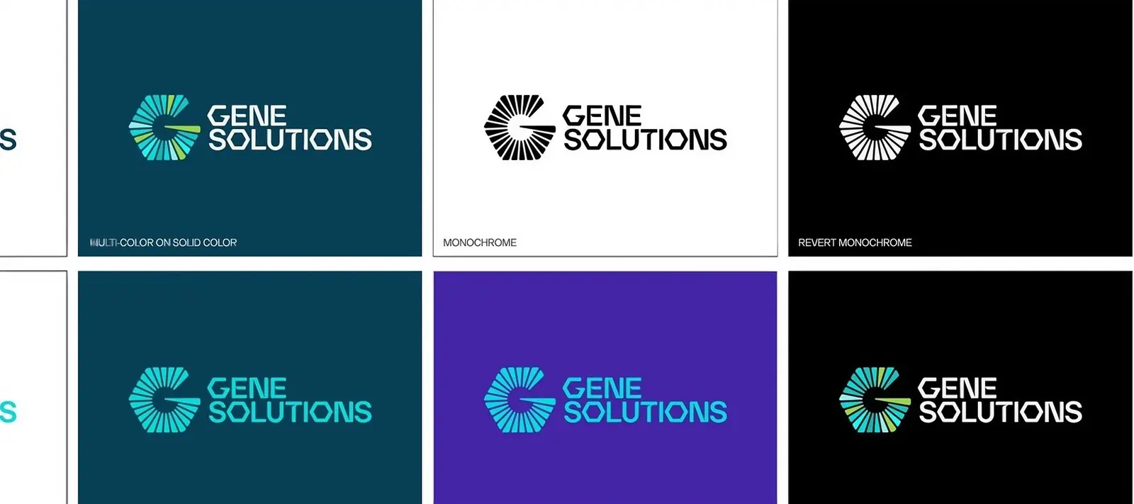
The lockup shown on white, teal, violet and black backgrounds
Logo on backgrounds
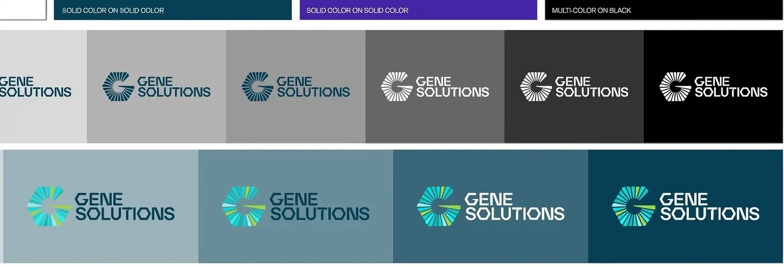
The lockup stepped down through six background tones to check contrast at every step
Contrast across the scale
  • Primary teal#00DCDC
  • Teal 60#63EAEB
  • Teal 30#A0EDEE
  • Primary purple#4425A6
  • Purple 60#8D7CC8
  • Purple 30#B1A8D3
Colour system
A cyan-to-violet gradient field from the brand system
Gradient system
The wordmark applied over the striped brand pattern in four colourways
Brand pattern in application
Two headline strips set over the brand pattern — Cell-free DNA testing, Leading Technology
Pattern behind live copy

Where science meets humanity

Leading in affordable cell-free DNA testing

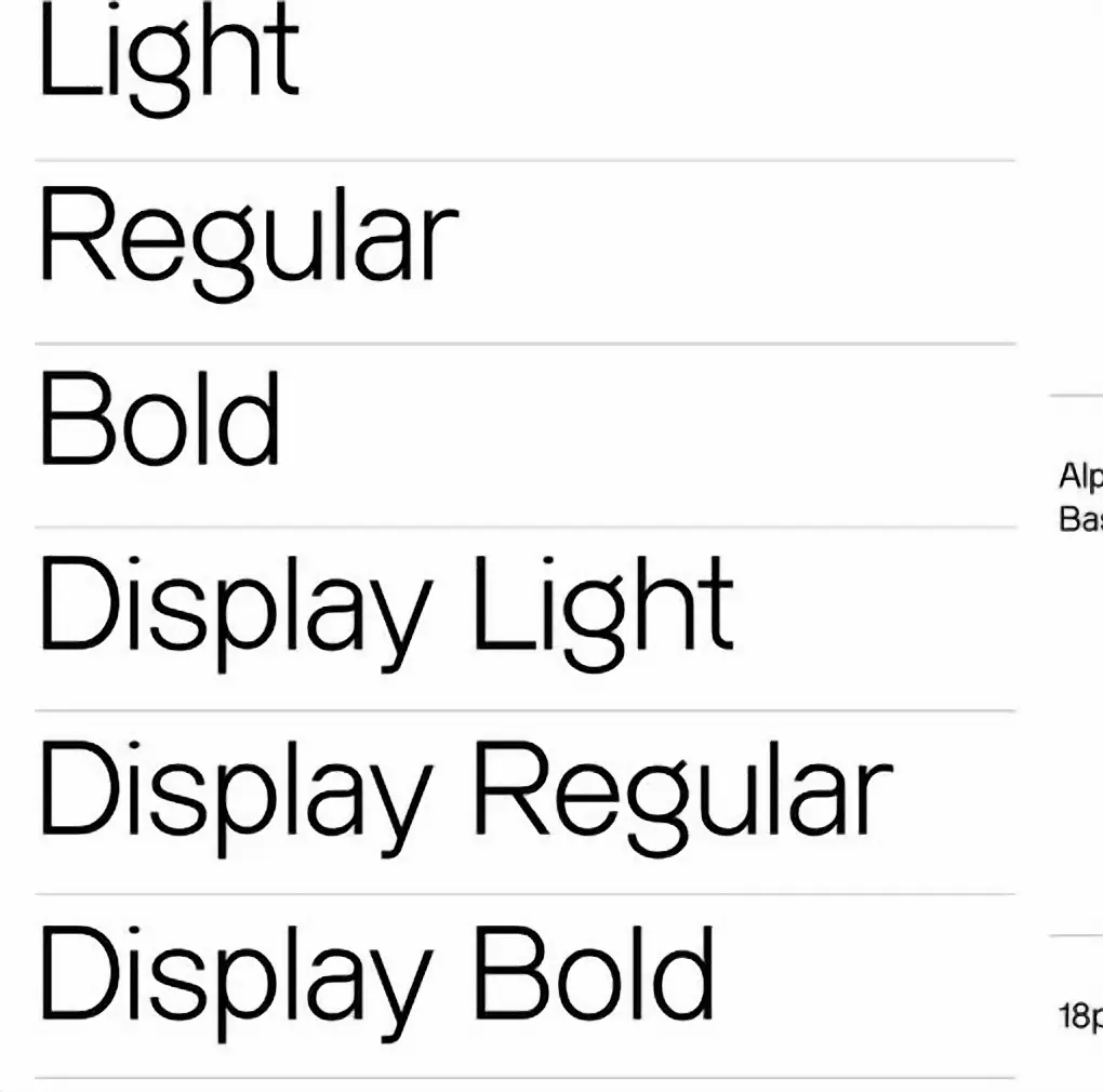
One hierarchy, three jobs: a line that carries a campaign, a heading that survives a lab report, and body copy that a patient reads once and understands.
Type hierarchy
Type specimen listing the weights of the brand face — Light through Display Bold
Weights
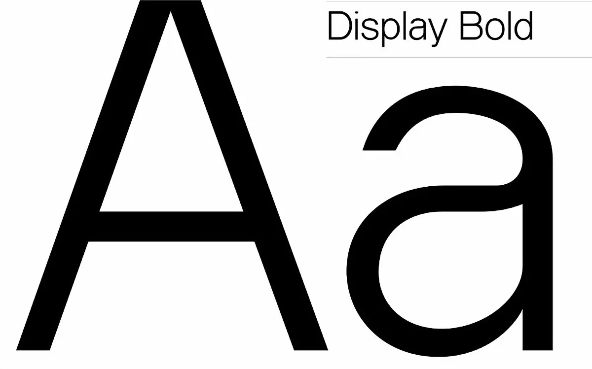
Display Bold specimen — a large lowercase and uppercase A
Display Bold
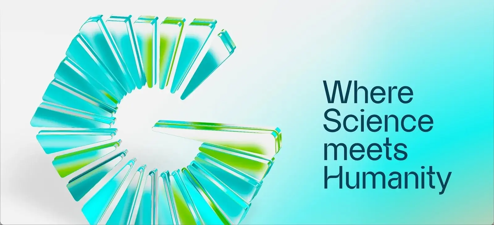
The 3D glass mark beside the campaign line Where Science meets Humanity
Key visual
Campaign key visual — a lab technician at work behind the chevron-cut headline panel
Campaign key visual
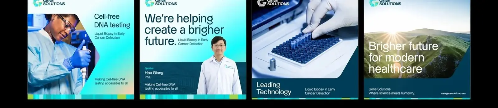
First row of the social kit — five posts pairing lab photography with the brand chevron
Social kit — row one
Second row of the social kit — five more posts in the same grid
Social kit — row two
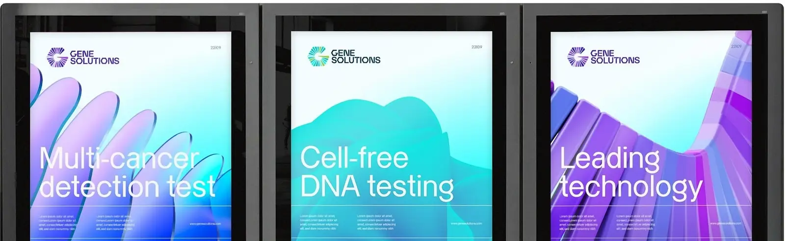
Three street billboards carrying the campaign in teal, cyan and violet
Out of home
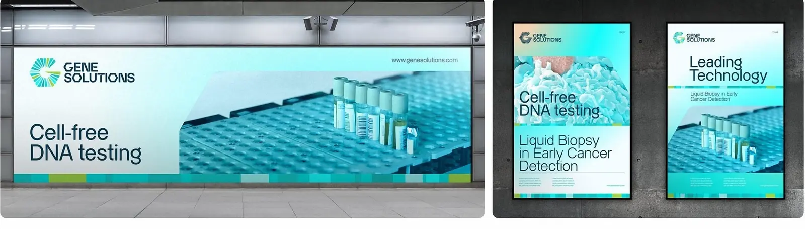
The identity applied across a hospital environment — wall graphic, poster frame and standing panel
In the environment
( 05 )

FILM

Next 10Vill Coffee × Đinh Văn Sơn
( 06 )

NEXT PROJECT

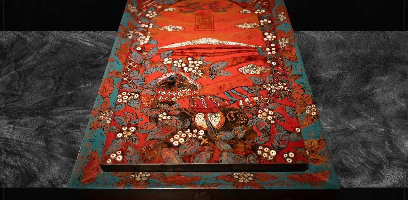
10Vill Coffee × Đinh Văn Sơn case study cover Forever Spring Boutique JSC 10Vill Coffee × Đinh Văn Sơn Branding & Marketing consultancy — Packaging — Key visual — Video production
( 07 )

START A PROJECT

Got a brief like this? Let’s give it a purpose.
START A PROJECT