Work — Santen Pharmaceutical · BFS Studio, Ho Chi Minh City

Santen— Eye Am Better
Project details

Client
Santen Pharmaceutical
Industry
Healthcare
Results
1.4M reach · 74K interactions · +724.8% organic reach · 193% of the views KPI
Year
2024–2025
Credits
BFS Studio
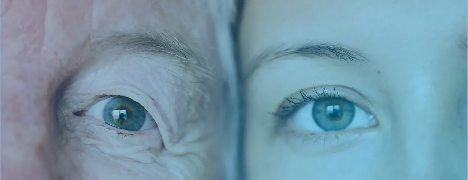
Macro photograph of a pair of eyes, iris lit in cyan
( 01 )

THE BRIEF

Santen is Japan’s No.1 eye-care brand, and in Vietnam it was still a pharmacy-counter purchase. OTC regulation limits what an eye drop is allowed to claim, so the usual product argument was closed off before we started. Two products — Sanlein 0.1 for dry eye and Sancoba for eye strain — needed a year of always-on social that built awareness without making a medical promise.

( 02 )

WHAT WE DID

We spoke to the feeling rather than the symptom: 70% emotional content against 30% functional, running on four pillars in a single feed. Two directions carried it — Keep Every Moment, where the eye is the keeper of what matters, and Eye Am Better, a pun that turns eye care into self-improvement. Four creators added 1.75M views on top of the owned feed, and the same idea went back to the pharmacy shelf as hanger, standee and shelf frame.

( 03 )

OUTCOME

1.4M reach with +724.8% organic growth and 193% of the views KPI. Numbers are the client’s own reporting, shared with permission.

( 04 )

THE WORK

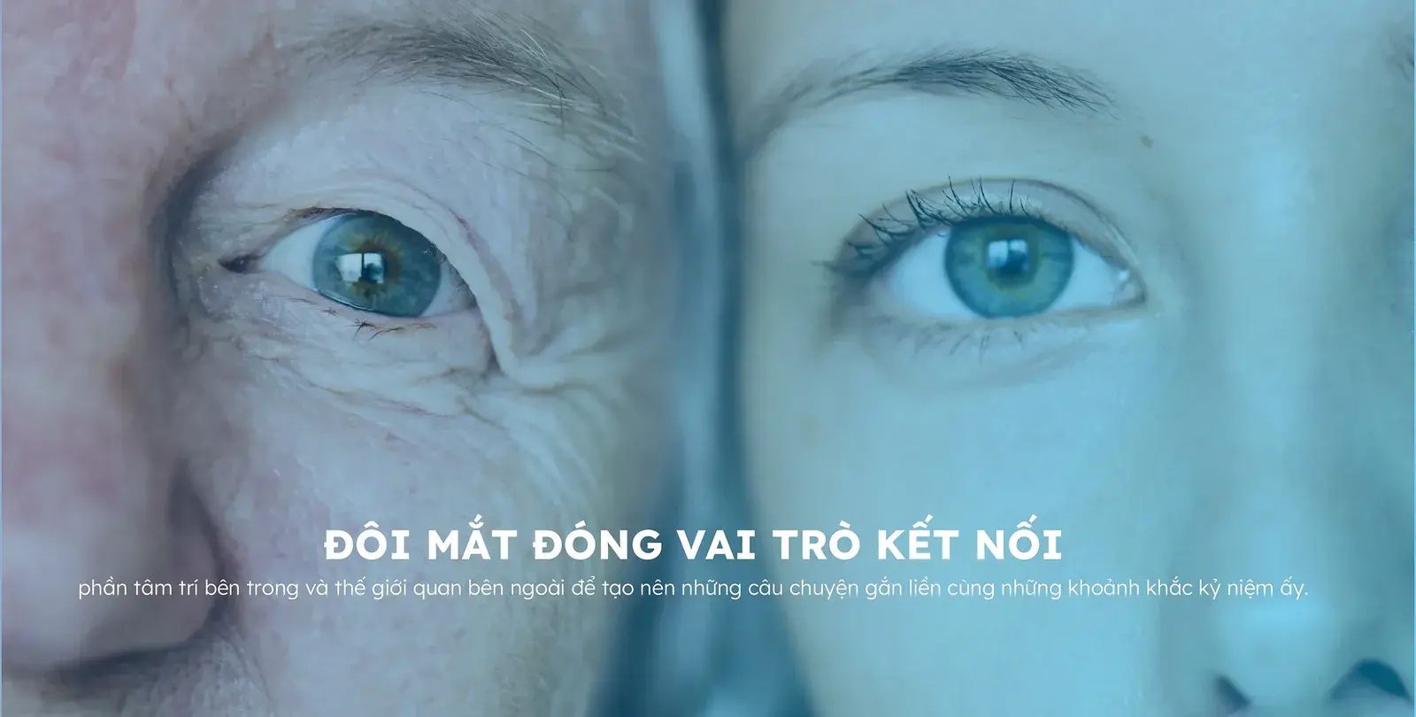
A wide strip of two eyes in close-up under the campaign line about sight as connection
Direction I — the eye as the keeper of what matters
A family running along the shore at sunset under the line about every moment being priceless
Moments the eye is asked to hold
Graduates throwing caps into the air, campaign line about growing up alongside
Growing up, kept
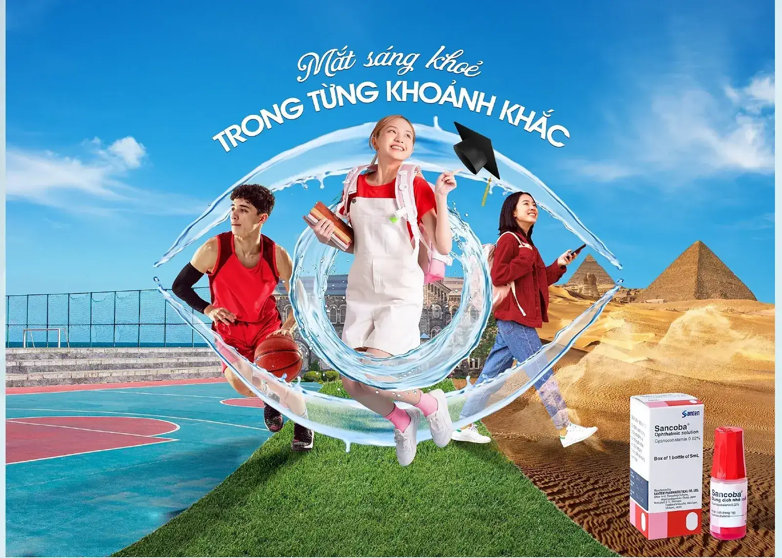
Key visual — three friends outdoors seen through a ribbon of light drawn as an eye, product pack lower right
Key visual — the ribbon of light
Key visual — a graduate framed by the same ribbon of light, product pack lower right
The same device, second execution
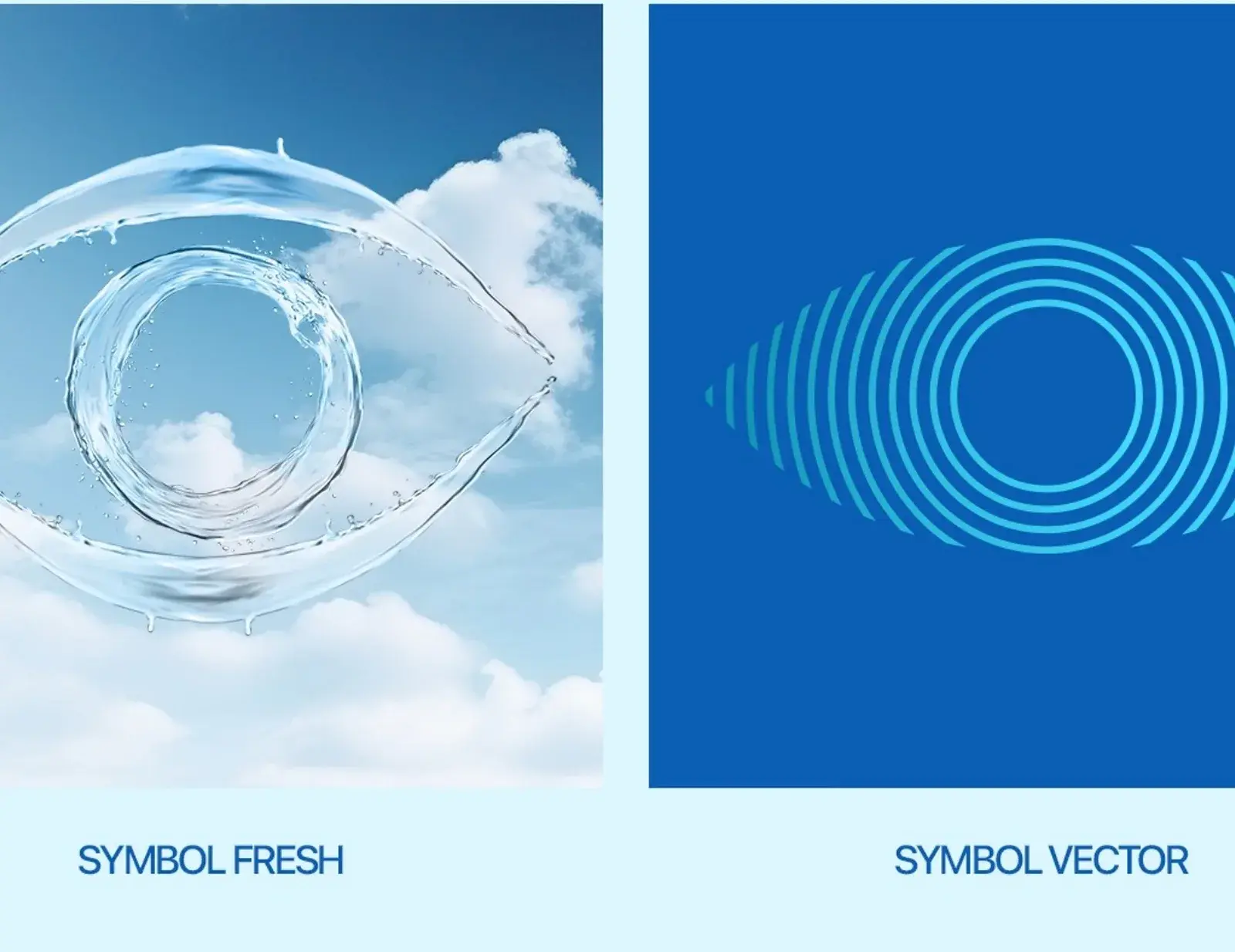
The brand device — an eye drawn from two strokes, shown as an outline and as a vector fan
An eye built from two strokes
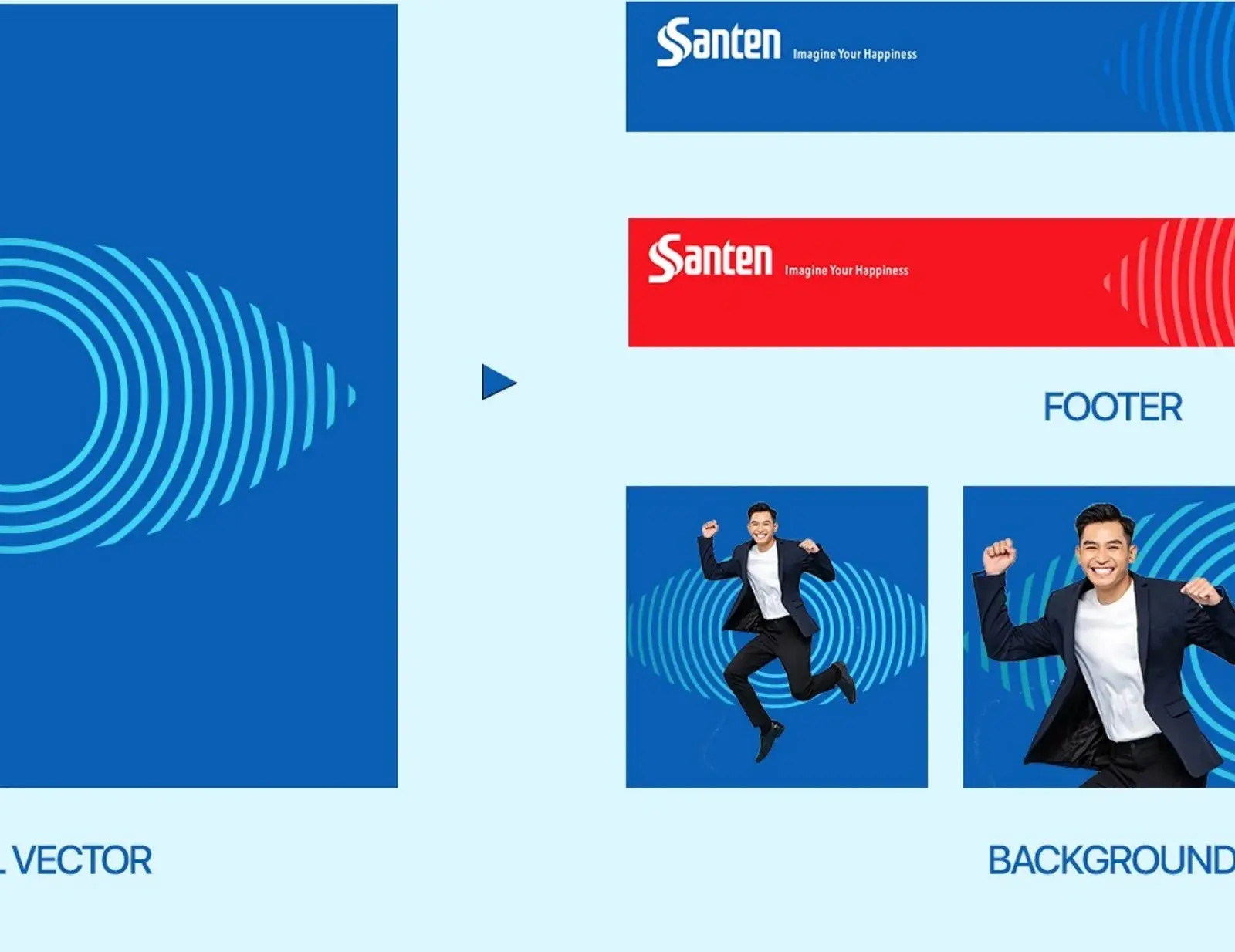
The device in application — used as header, footer and background mask across layouts
The mark in application
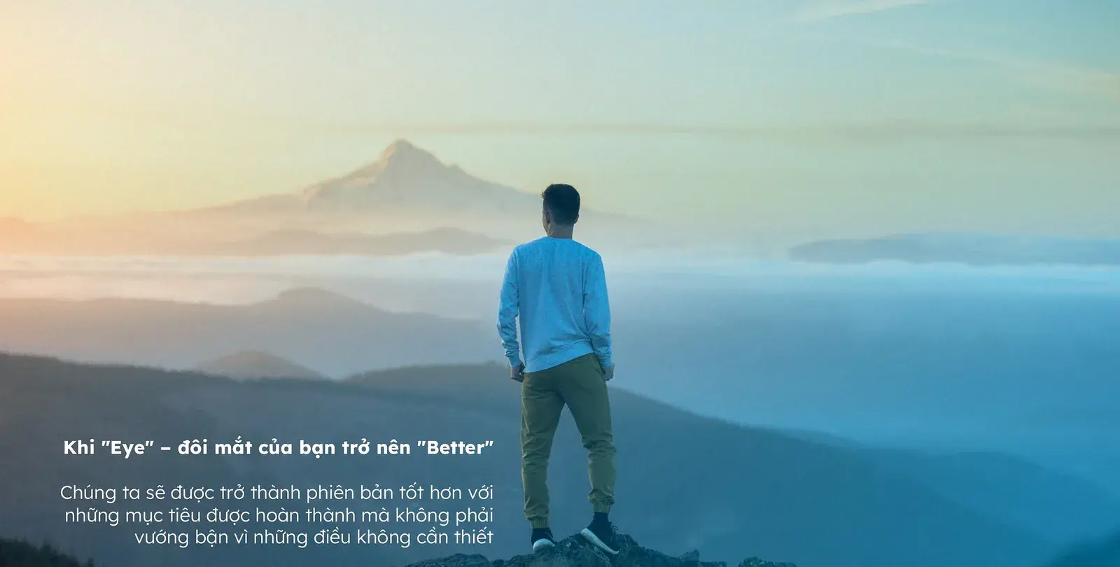
A mountain range at dawn under the campaign line about how we see the world
Direction II — Eye Am Better
A figure standing alone before a distant peak, the "better" idea as a summit
Every day the eye climbs — better is a summit, not a cure
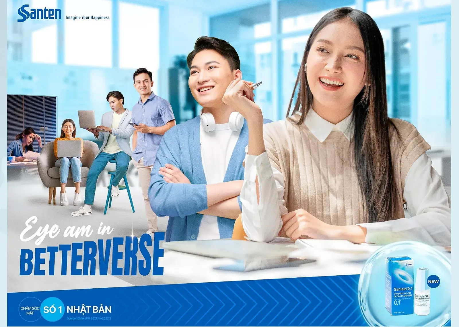
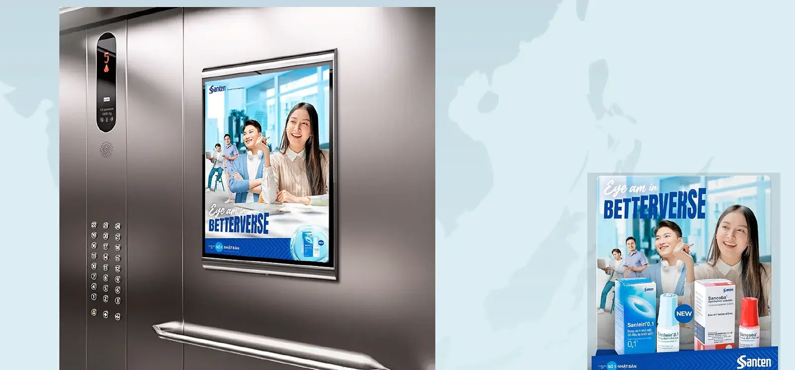
Key visual in Santen blue — colleagues in an office, Eye am in Betterverse lockup
Sanlein in Santen blue
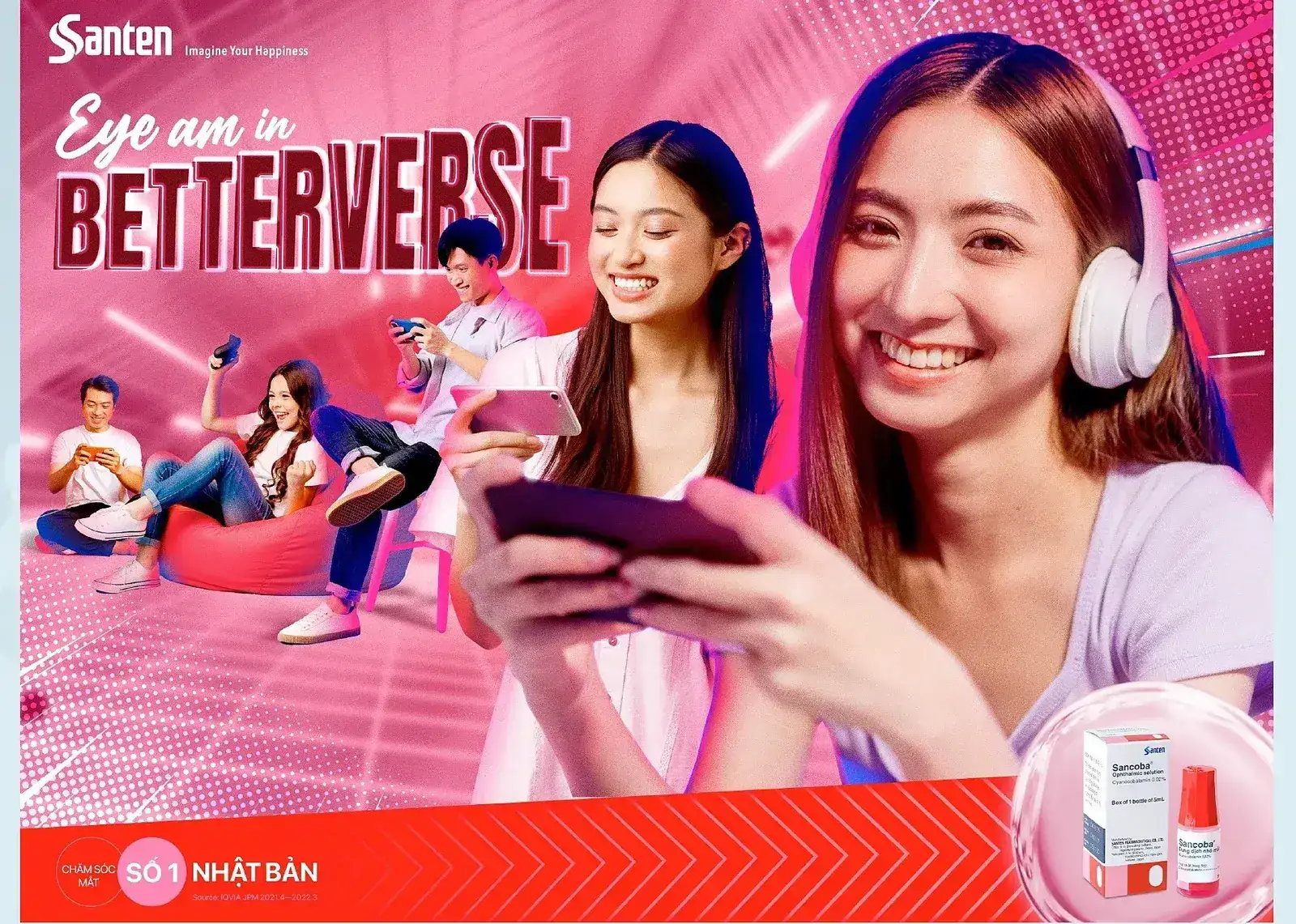
Key visual in magenta for Sancoba — the same layout with a young woman on a beanbag
Sancoba in magenta
The upward arrow motif repeated as a horizontal band of chevrons
The upward arrow — graphic shorthand for “better”

EYE AM BETTER

Anton for headlines, a neutral grotesque for everything else

Anton carries every headline: condensed enough to hold a long Vietnamese line with full diacritics, heavy enough to stay legible at thumbnail size in a feed. Everything that has to be read rather than shouted — claims, ingredients, directions, legal — sits beneath it in a neutral grotesque.

Type system
  • Santen blue#0096D2
  • Deep blue#00539A
  • Navy#062A45
  • Cyan#4FC3F0
  • Pale#E4F2FB
  • Sancoba magenta#E5177B
Two products, two colour fields
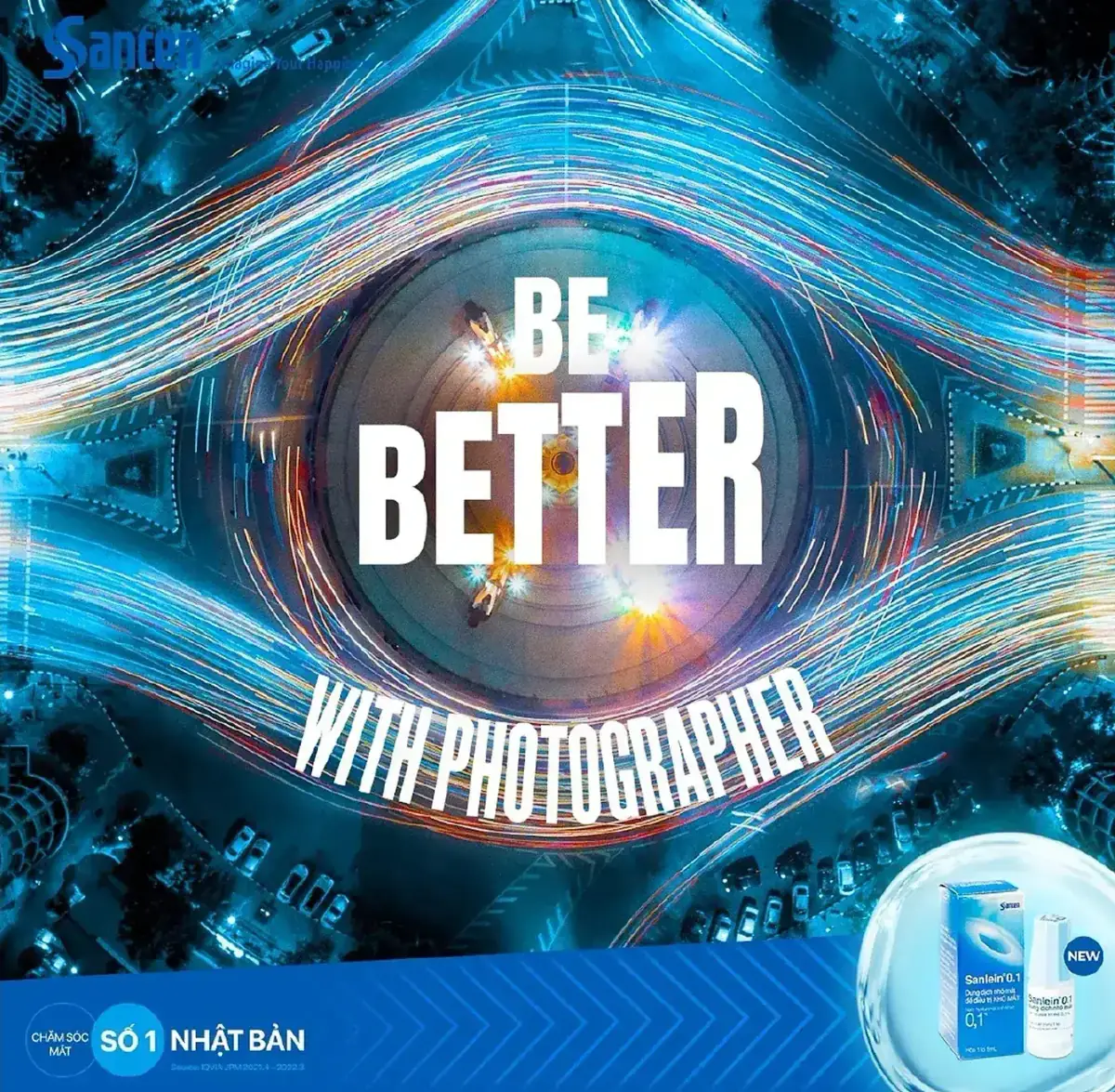
Post concept — Be Better with photographers, a lens flare eye on deep blue
Post concept — Be Better
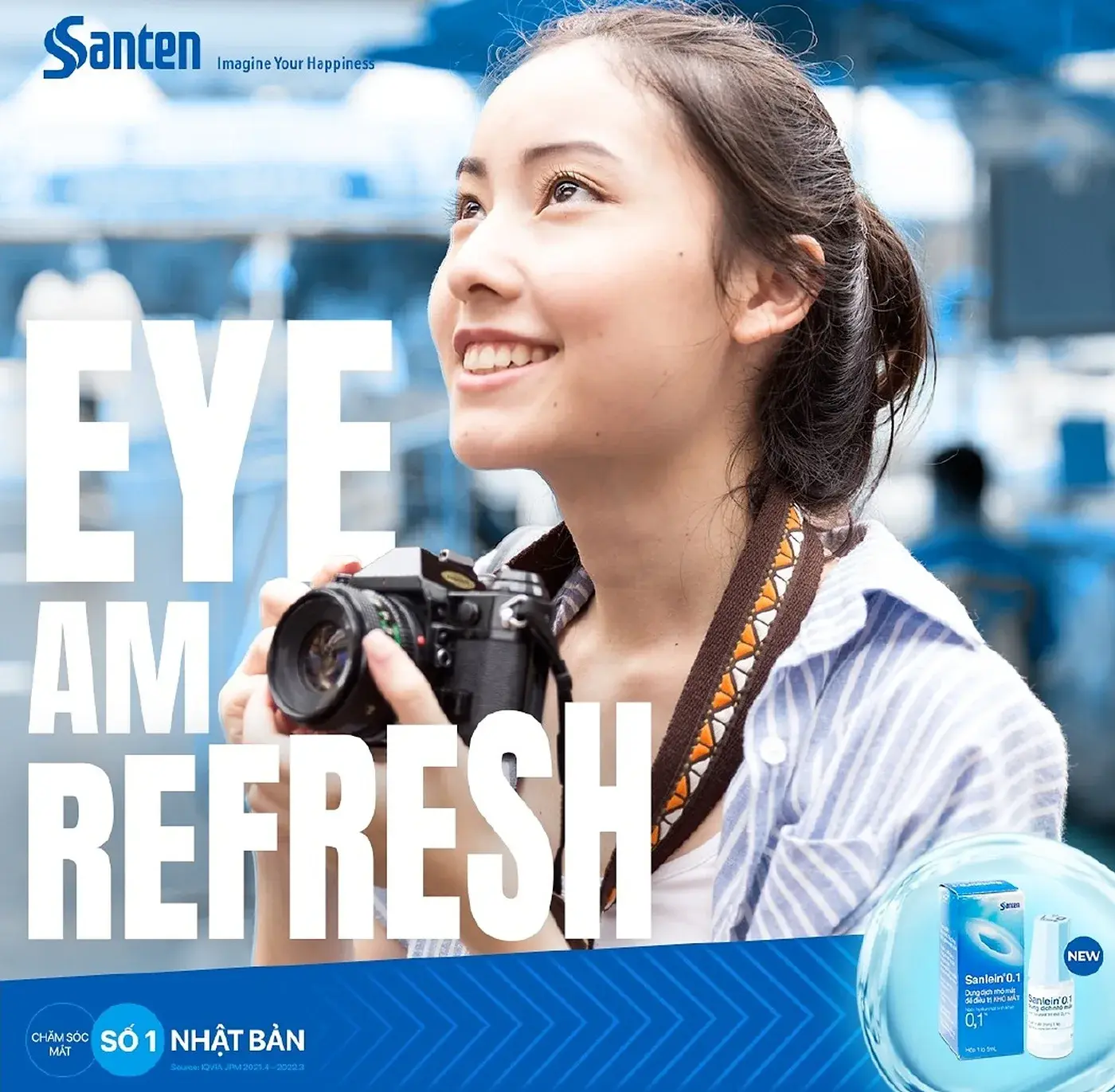
Post concept — Eye Am Refresh, a woman with a camera against blue
Post concept — Eye Am Refresh
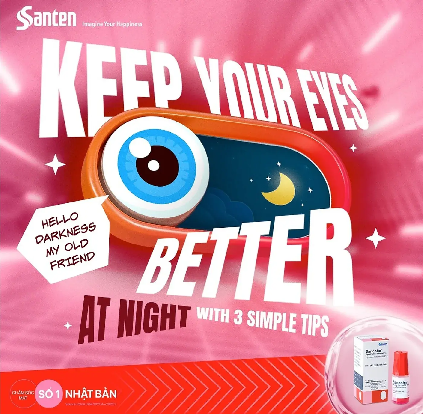
Post concept — Keep Your Eyes Better at Night, illustrated eye on magenta
Post concept — Keep Your Eyes Better
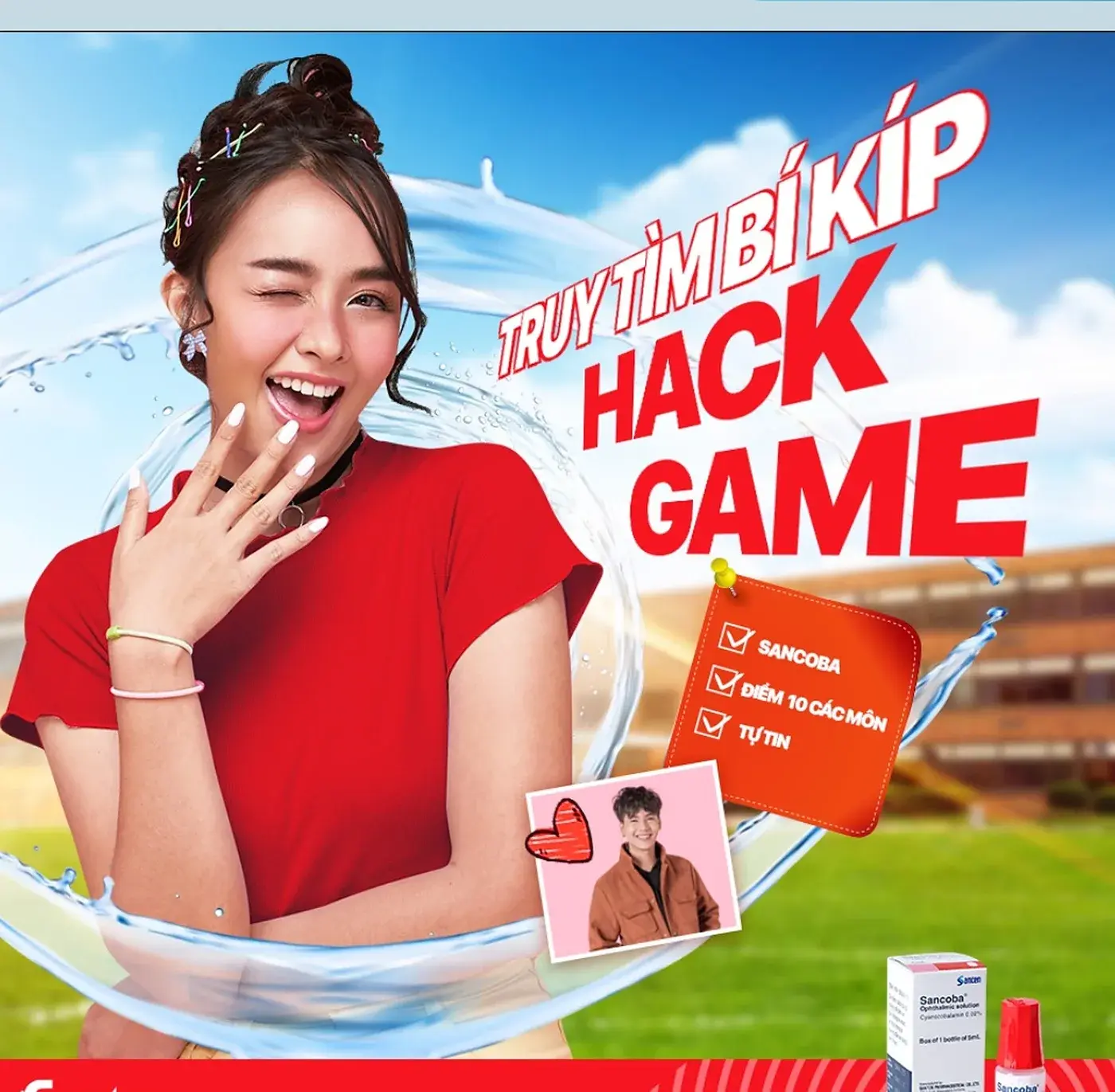
Post concept — a minigame post with a hack-game headline on red
Post concept — minigame
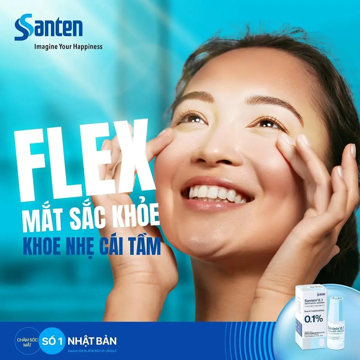
Published post — Flex your healthy eyes, portrait on Santen blue with the product
The feed, one year on
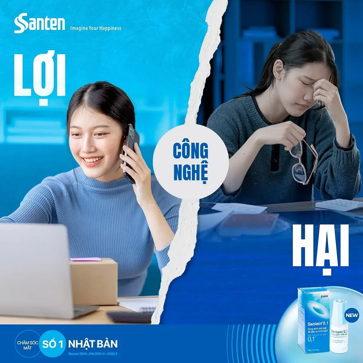
Published post — technology benefit and harm, split layout in blue
Functional content in the same frame
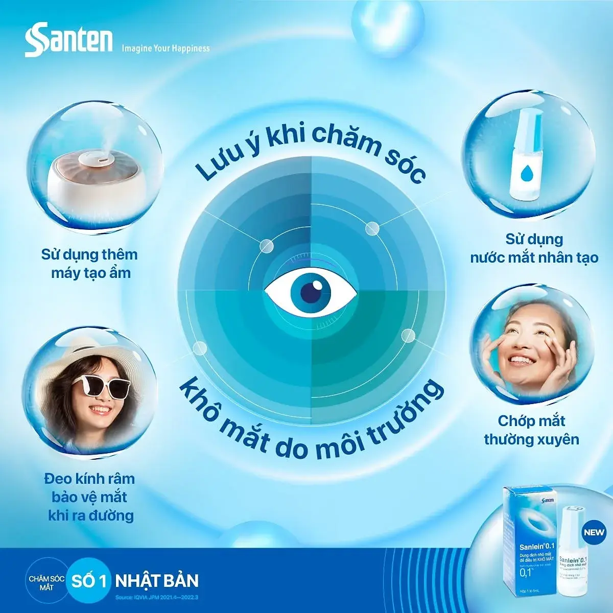
Published post — an eye-care checklist arranged around a central eye diagram
Care routine, one diagram
Published post — New Year 2024 lettering formed from water
Seasonal — New Year 2024
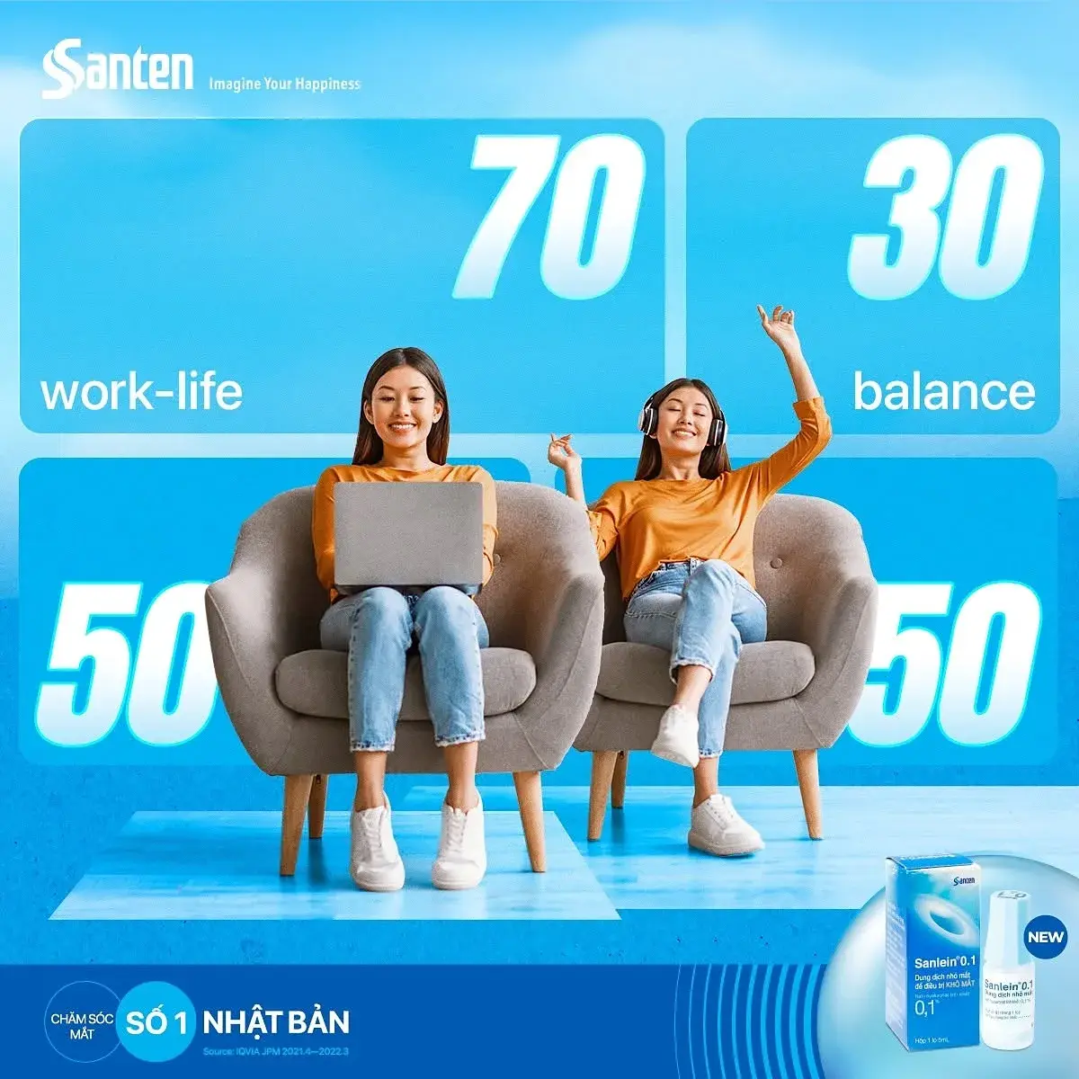
Published post — work-life balance shown as 70 / 30 and 50 / 50 figures
Work-life balance, in figures
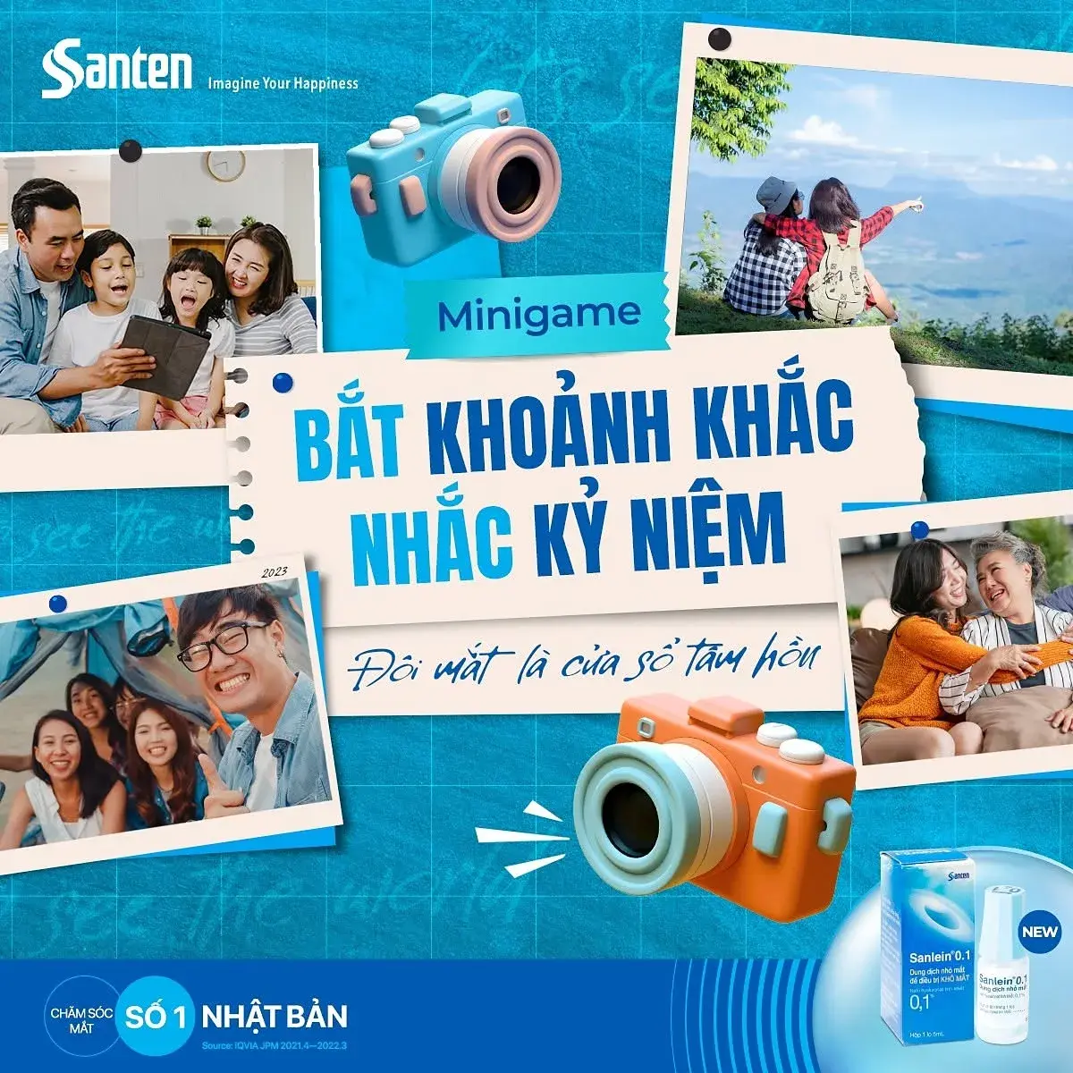
Published post — a minigame asking people to capture and share a moment
Community minigame
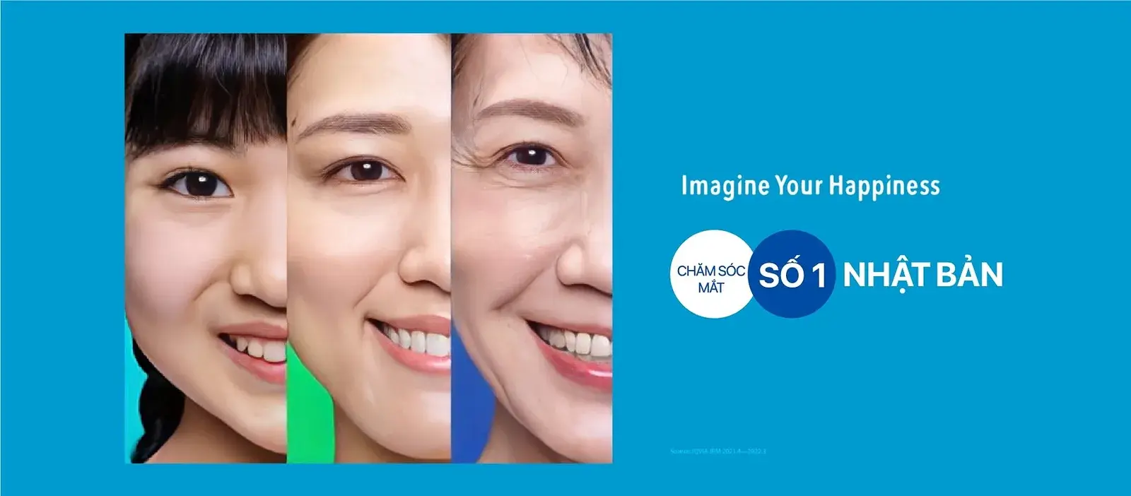
Campaign asset — a before-and-after portrait pair with the Santen endorsement
Campaign asset — before and after
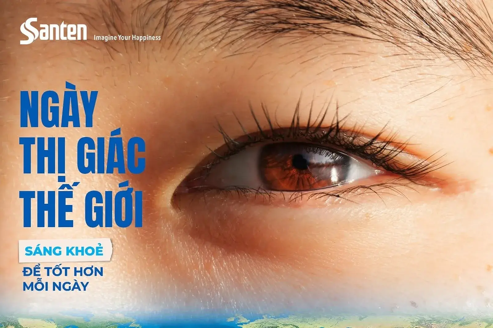
Campaign asset — World Sight Day, a close-up eye on deep blue
World Sight Day
Campaign asset — a ten-minute eye-exercise post with an illustrated arm and eye
Ten minutes of eye exercise
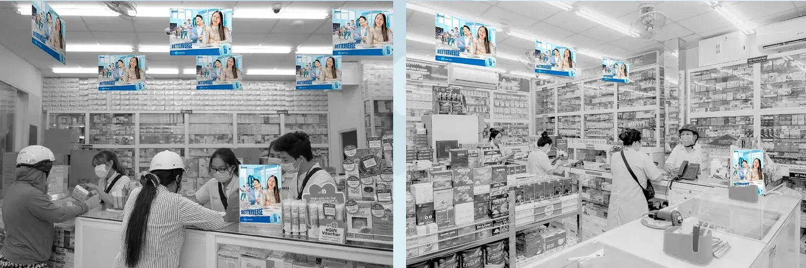
Pharmacy aisle with campaign hangers running along the shelf edge
Hanger at the shelf edge
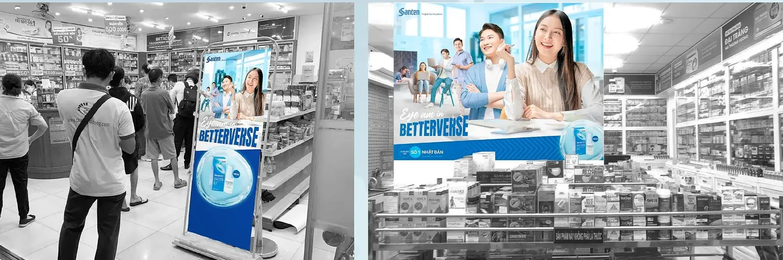
A campaign standee beside the shelf in a pharmacy
Standee in the pharmacy
Shelf frame and lift-door poster carrying the same campaign artwork
Shelf frame and lift-door poster
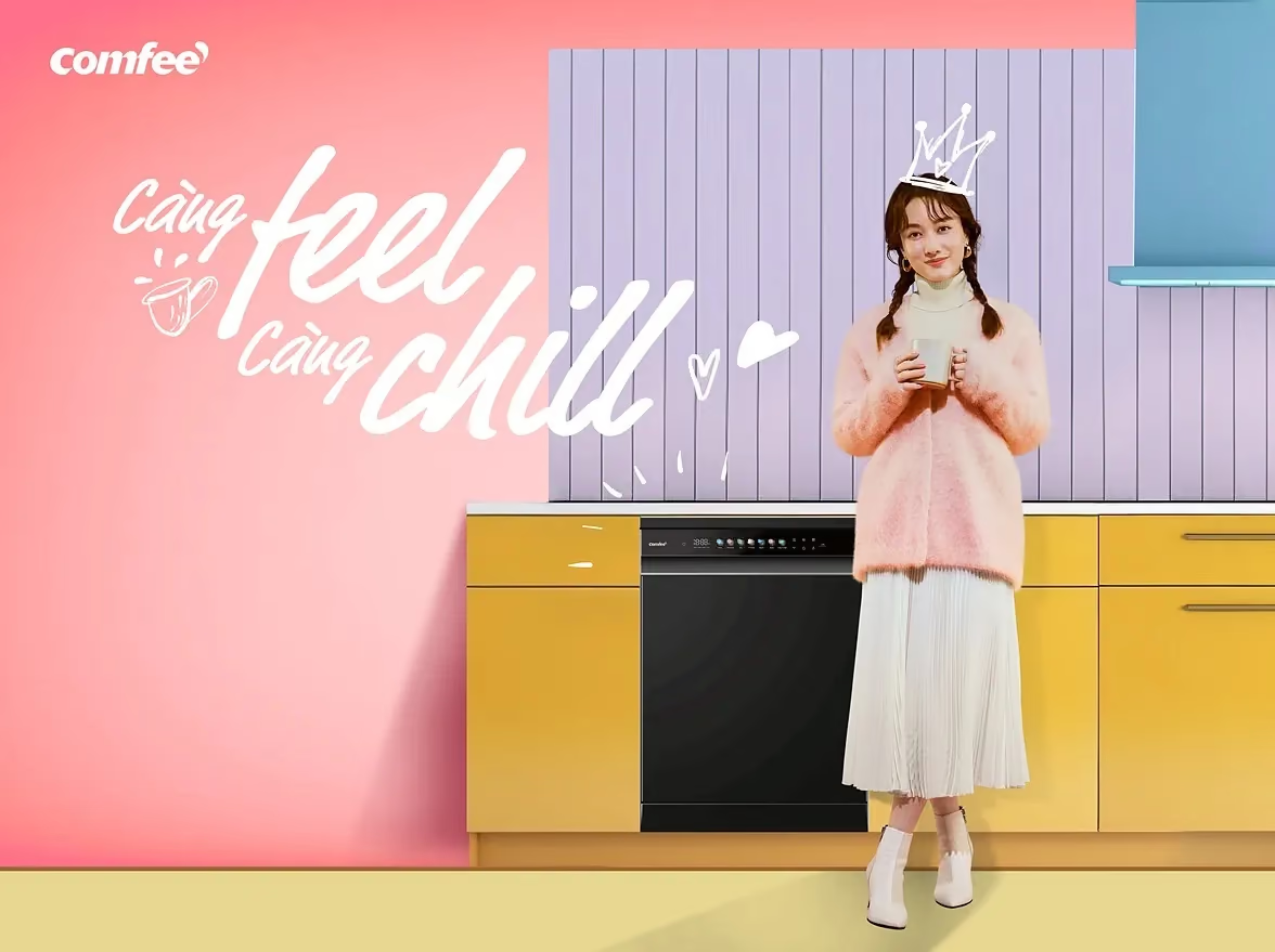
Next Comfee — is how i feel
( 05 )

NEXT PROJECT

Comfee — is how i feel case study cover Comfee Comfee— is how i feel Social visual/content & Media planning/executing
( 06 )

START A PROJECT

Got a brief like this? Let’s give it a purpose.
START A PROJECT