Work — Comfee · BFS Studio, Ho Chi Minh City
Comfee— is how i feel

THE BRIEF
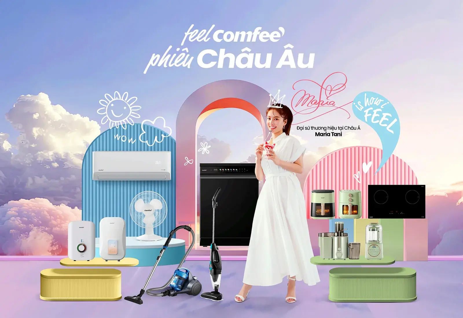
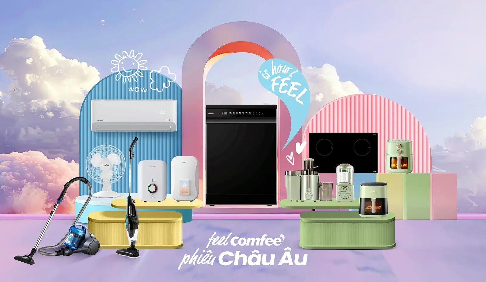
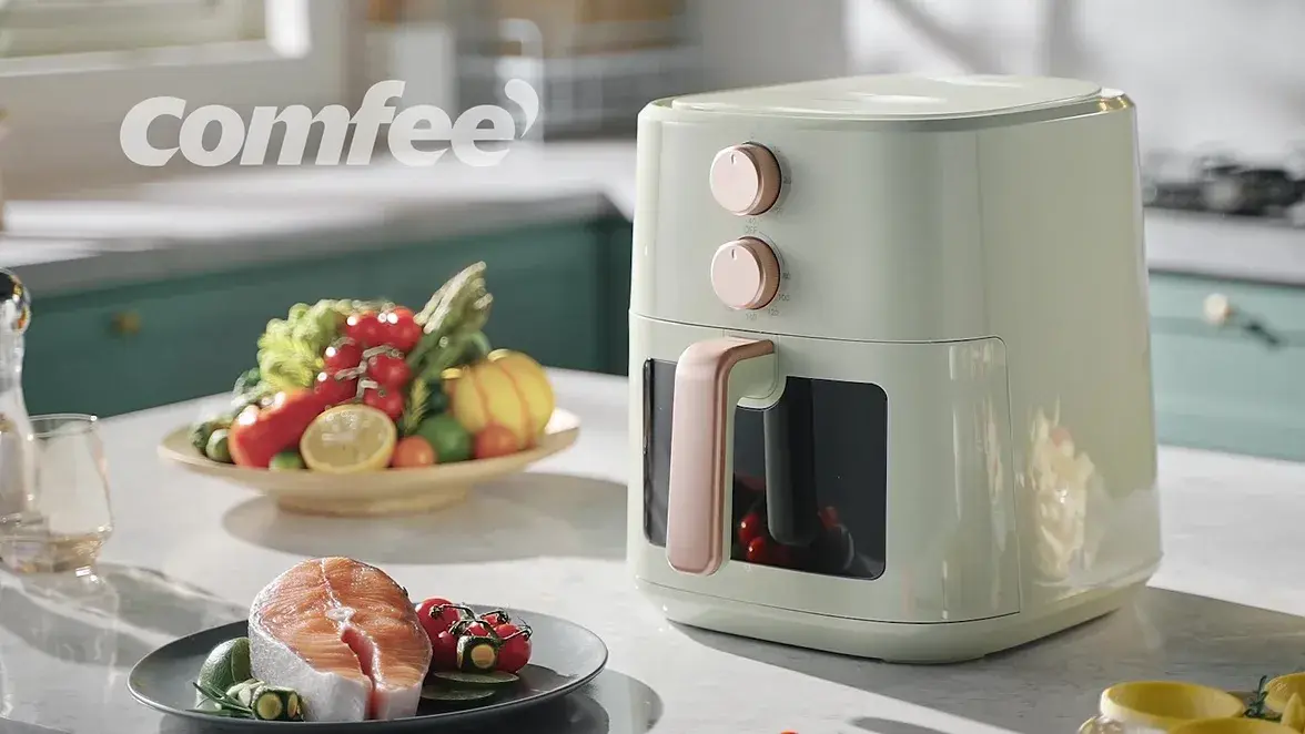
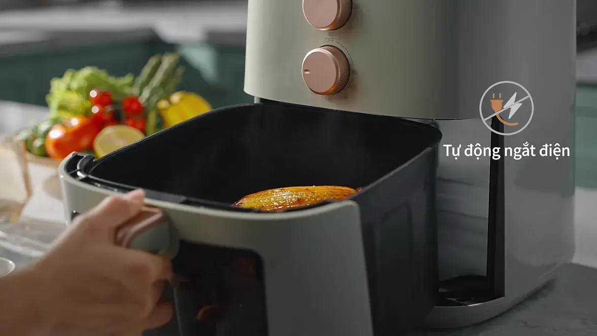
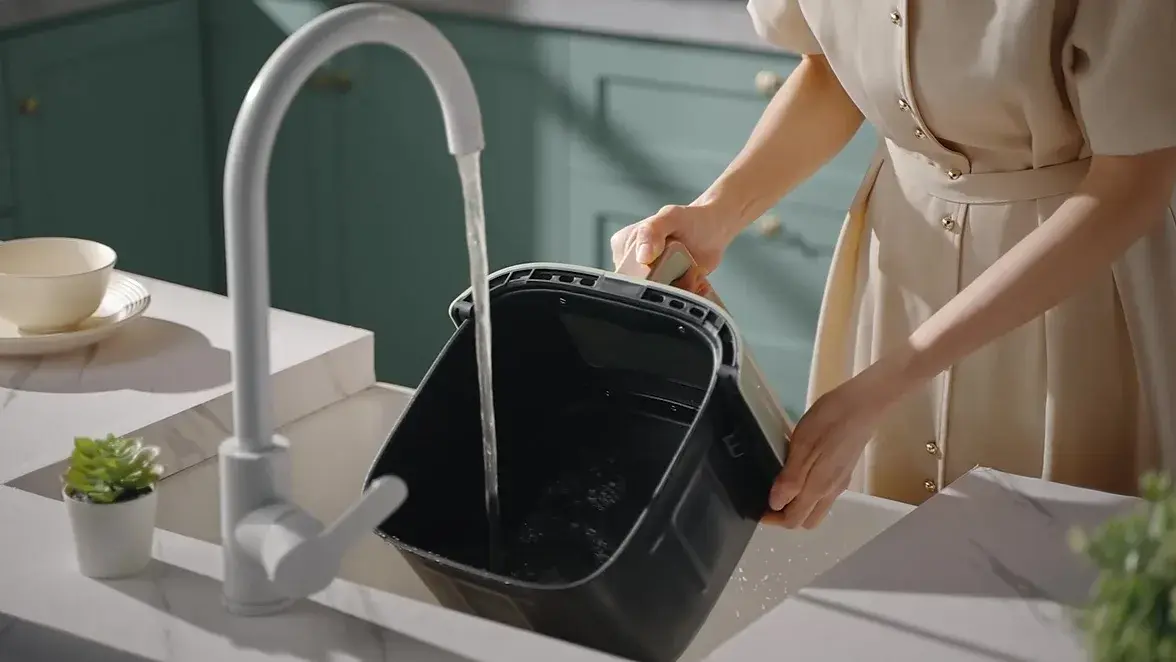
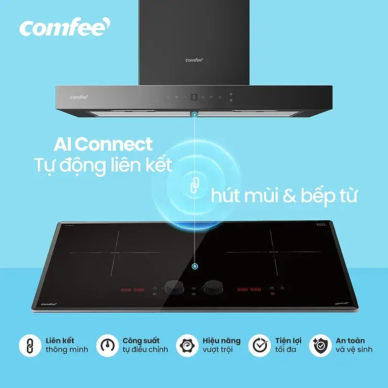
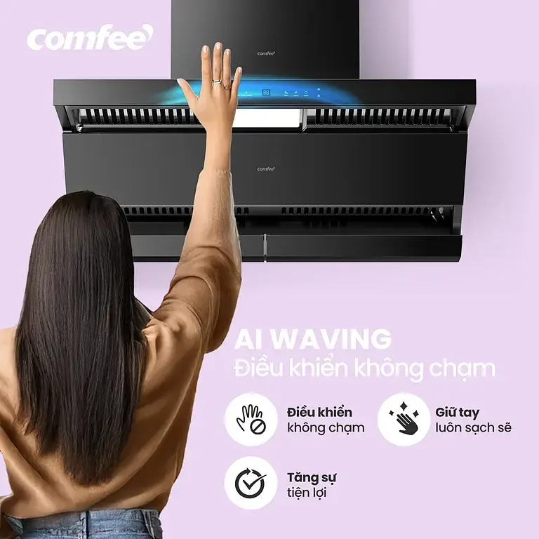
Home appliances are bought on spec and sold on discount, and a spec sheet will not stop a Gen Z feed. Comfee needed six months of always-on content across four platforms — plus an iTVC and a product film — that made a range hood, a dishwasher and an air fryer feel like something instead of measuring like something.
WHAT WE DID
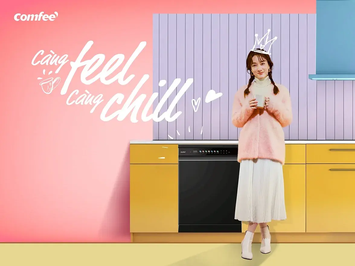
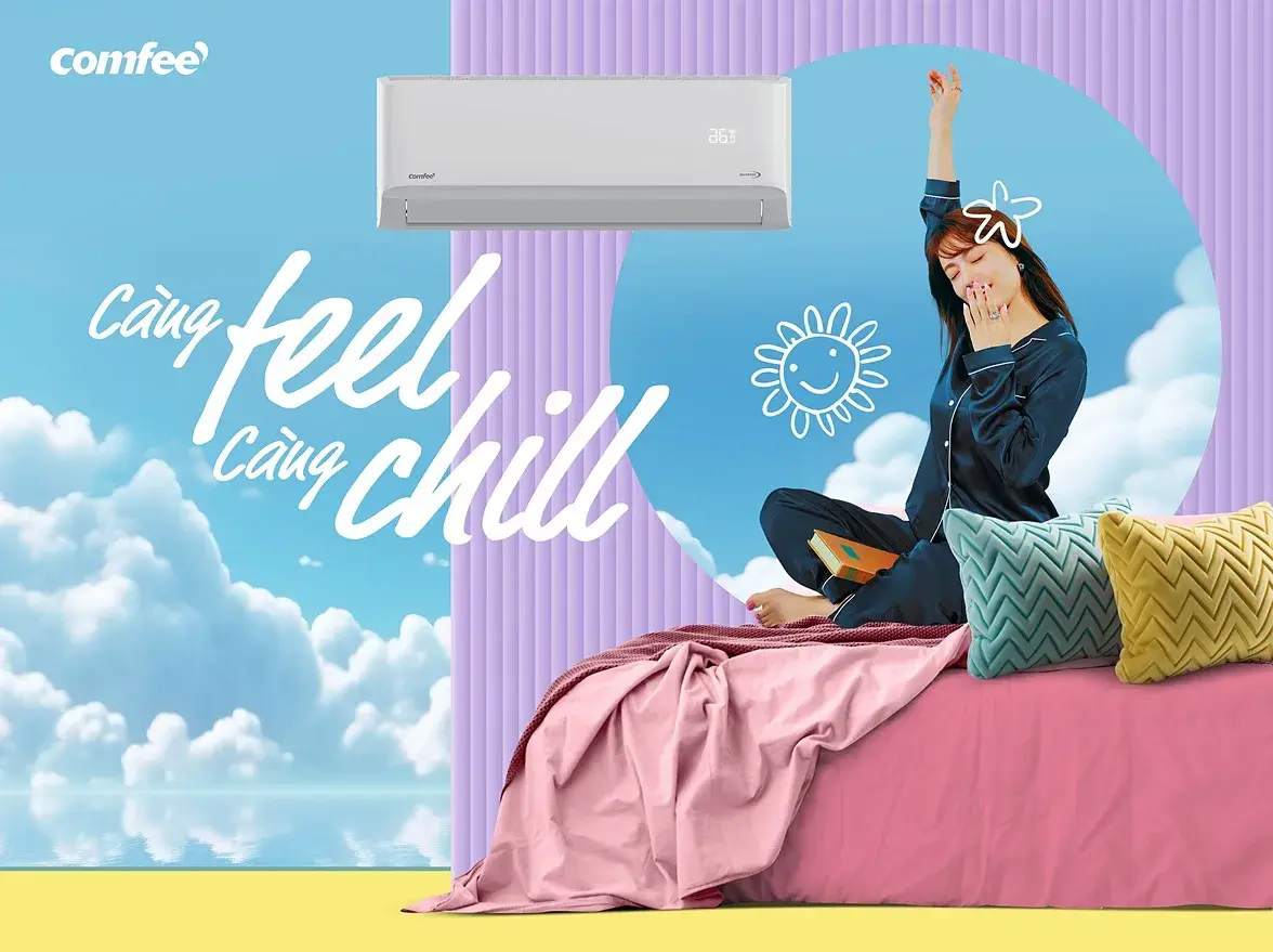
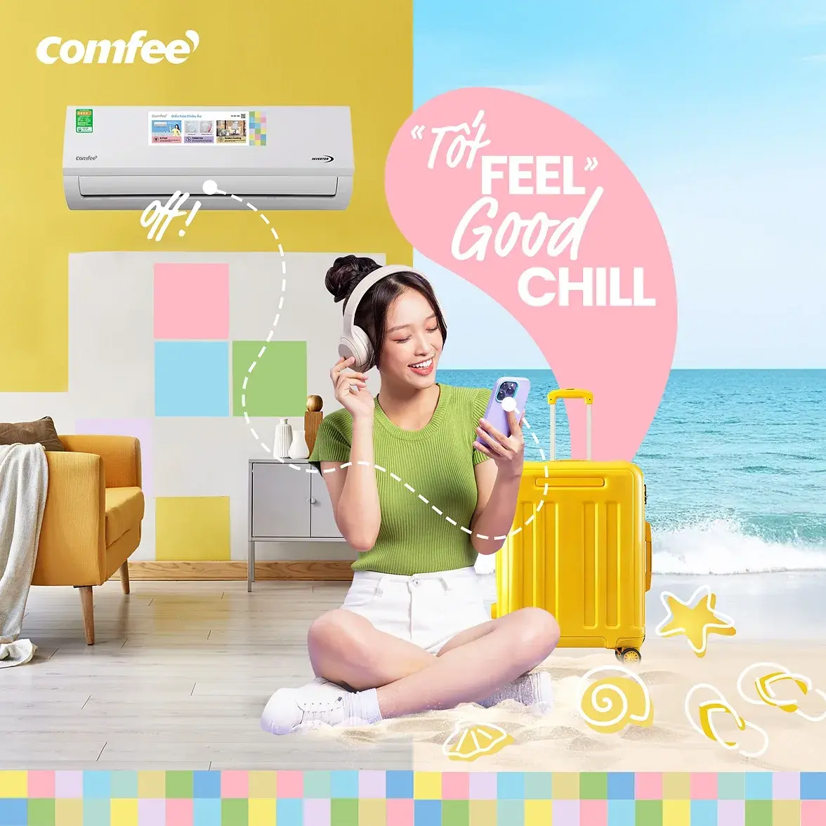
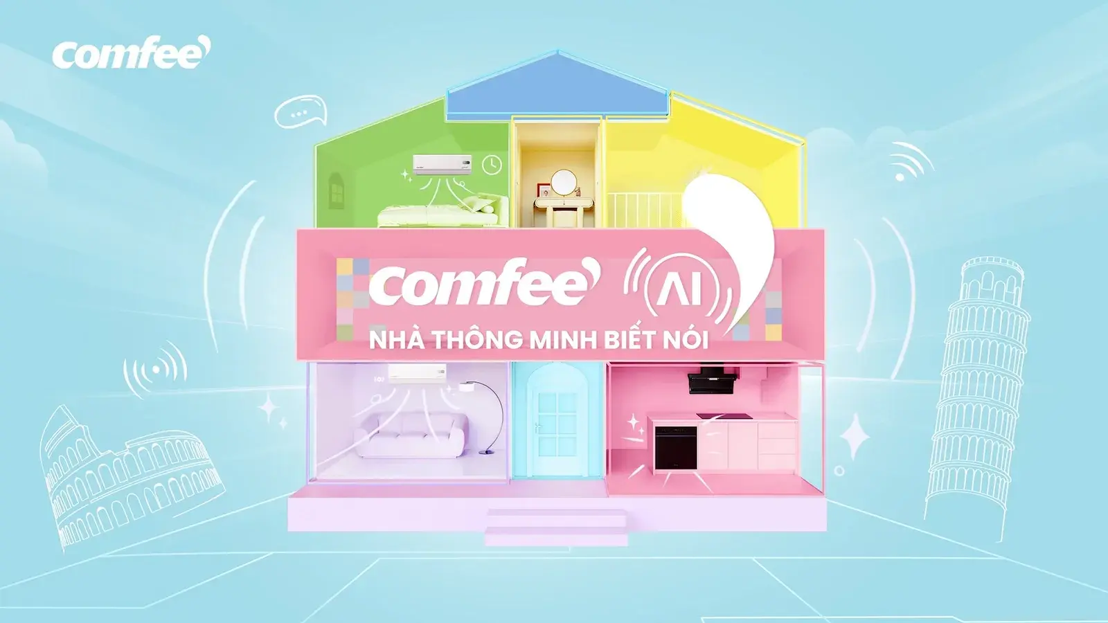
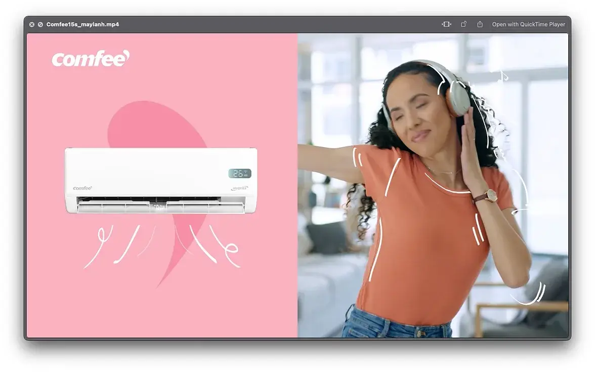
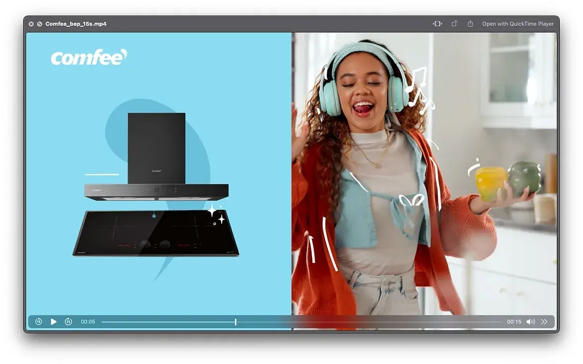
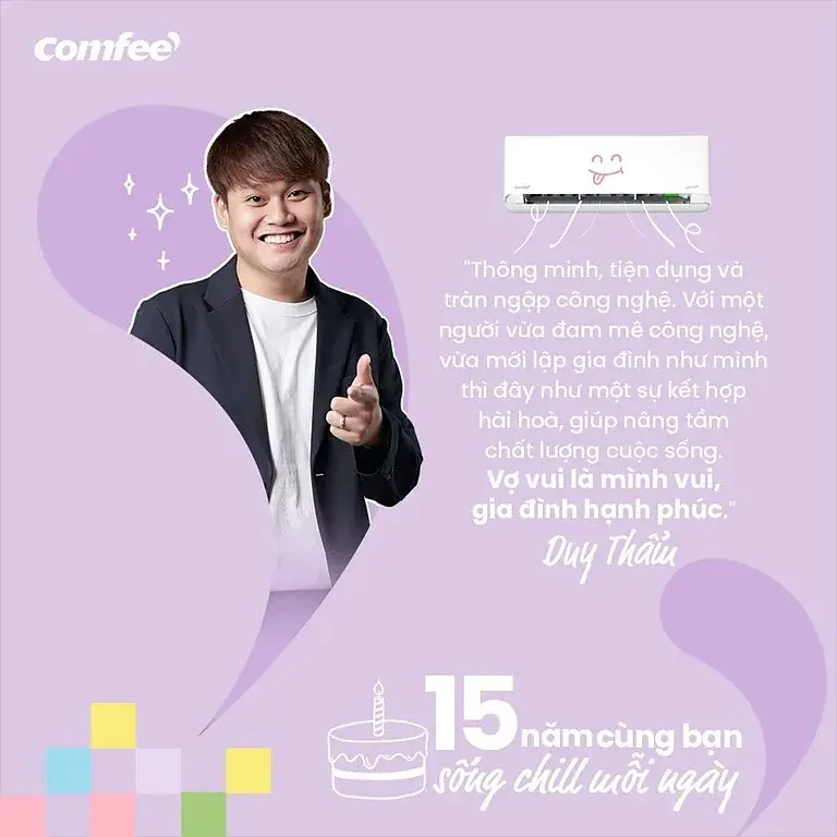
We turned the comma in the Comfee logo into a speech bubble: the appliance answers back, and each product gets its own colour and its own ending — cool, clean, fresh, crisp, warm, safe. One device generated the platform line, five product worlds, two seasonal campaigns, an AI smart-home iTVC with vertical cutdowns, a nine-card catalogue and eight TikTok creators. Every media line came in over target.
OUTCOME
6.98M impressions and a +476% engagement rate, with every media line landing over target. Numbers are the client’s own reporting, shared with permission.
THE WORK
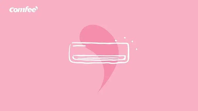
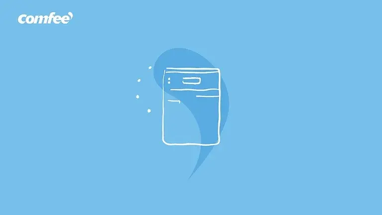
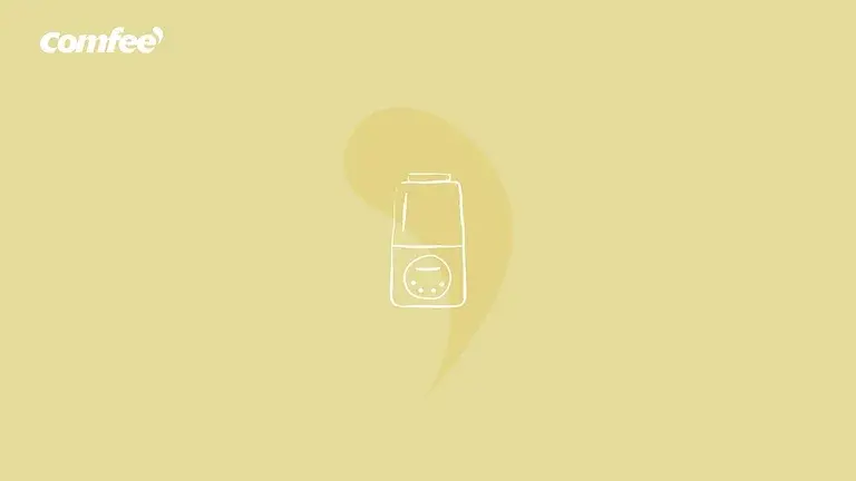
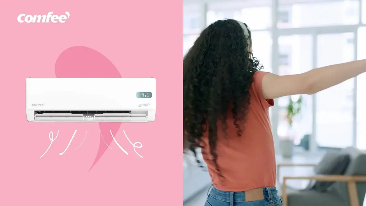
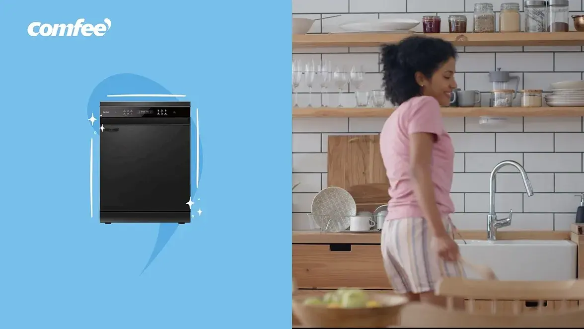
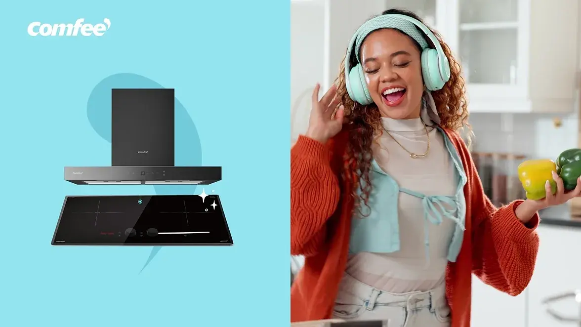
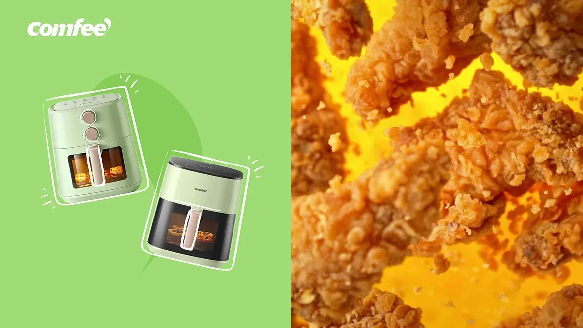
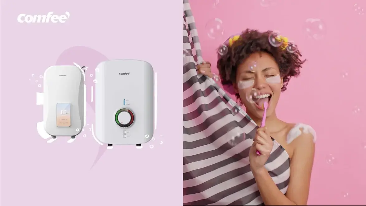
- cool#F9B0C4
- clean#77C0EB
- fresh#94E3F0
- crisp#9FDC75
- warm#EAD5E8
- safe#E5DC9B
is how i feel
Rounded geometric type, lowercase voice
The brand speaks the way a friend would, so the type never shouts: a rounded geometric face set in lowercase, weights kept light enough to sit inside a pastel field without punching through it. Product names, specs and legal copy run in the same family one step down.



FILM
NEXT PROJECT