Home appliances are bought on spec and sold on discount. That is a fine way to run a price list and a terrible way to run six months of content, because a spec sheet will not stop anybody in a feed. What stops a feed is a device — one idea the brand can perform over and over without repeating itself. Getting that device right is roughly 80% of the work; the key visual is what is left after.
A platform idea is not a tagline
A tagline is a sentence the brand says. A platform idea is a rule that generates new material without a new brief every time. The test is mechanical: can a junior designer make the thirty-first post from it without calling anyone?
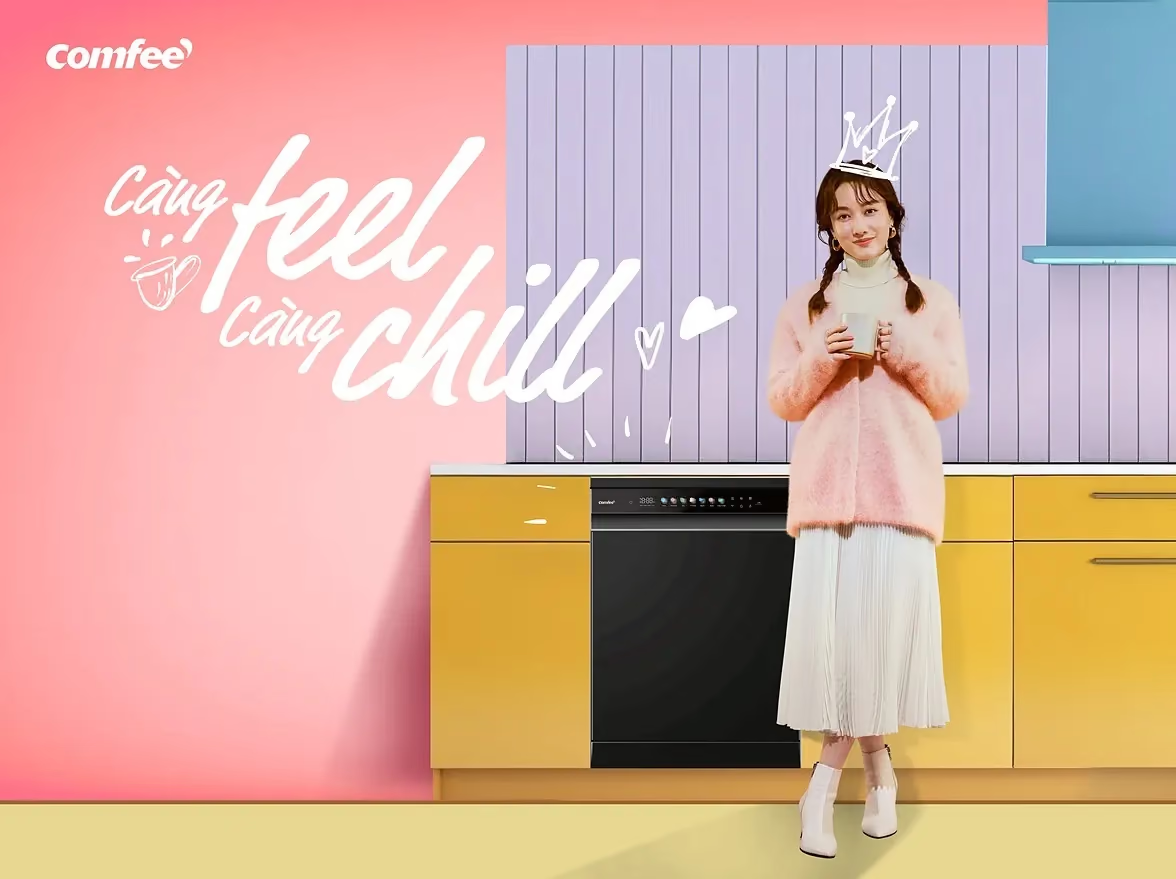
For Comfee the device came out of the logo itself. The comma in the wordmark became a speech bubble, so the appliance answers back — and suddenly a range hood, a dishwasher and an air fryer have something to say instead of something to measure. One device then generated the platform line, five product worlds, two seasonal campaigns, an AI smart-home iTVC with vertical cutdowns, a nine-card catalogue and eight creator briefs. Six months of always-on content across four platforms, reported by the client at 6.98M impressions and a +476% engagement rate.
Give every product its own ending, not its own campaign
The trap in an appliance range is that each product wants to be its own campaign, and six campaigns read as six brands. The fix is to vary one thing and lock everything else.
Each Comfee product got its own colour and its own ending — cool, clean, fresh, crisp, warm, safe. Same device, same frame, six payoffs. A shopper sees one brand with six moods rather than six brands with one logo.
Change one variable, keep the composition locked
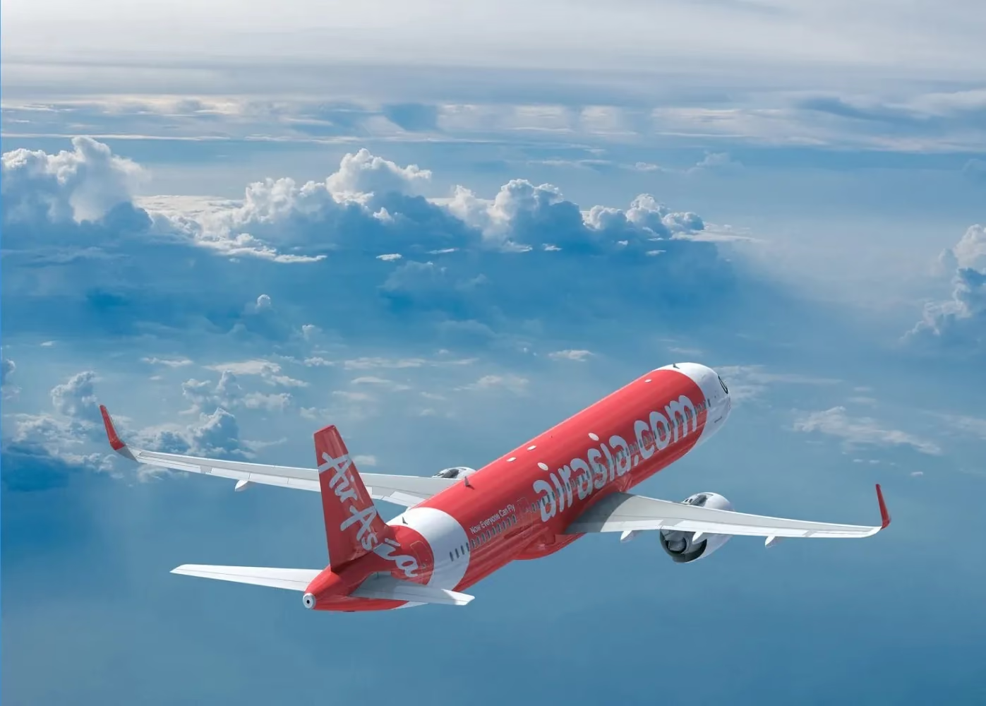
Airlines usually solve audience segmentation with five separate photographs, which produces five campaigns and no key visual. On AirAsia we built one composite and changed only the people: the aircraft, the composition and the badge stay exactly where they are while the cast swaps for families, friends, couples and solo travellers. Five sub-KVs, one image — and a six-second TVC that climbs through cloud and lands inside the same frame.
That is the difference between adaptation and re-invention. Adaptation costs a day. Re-invention costs the media plan.
Build the idea out of the product’s own material
The strongest devices are made of something the product actually produces, not something borrowed from a mood board.
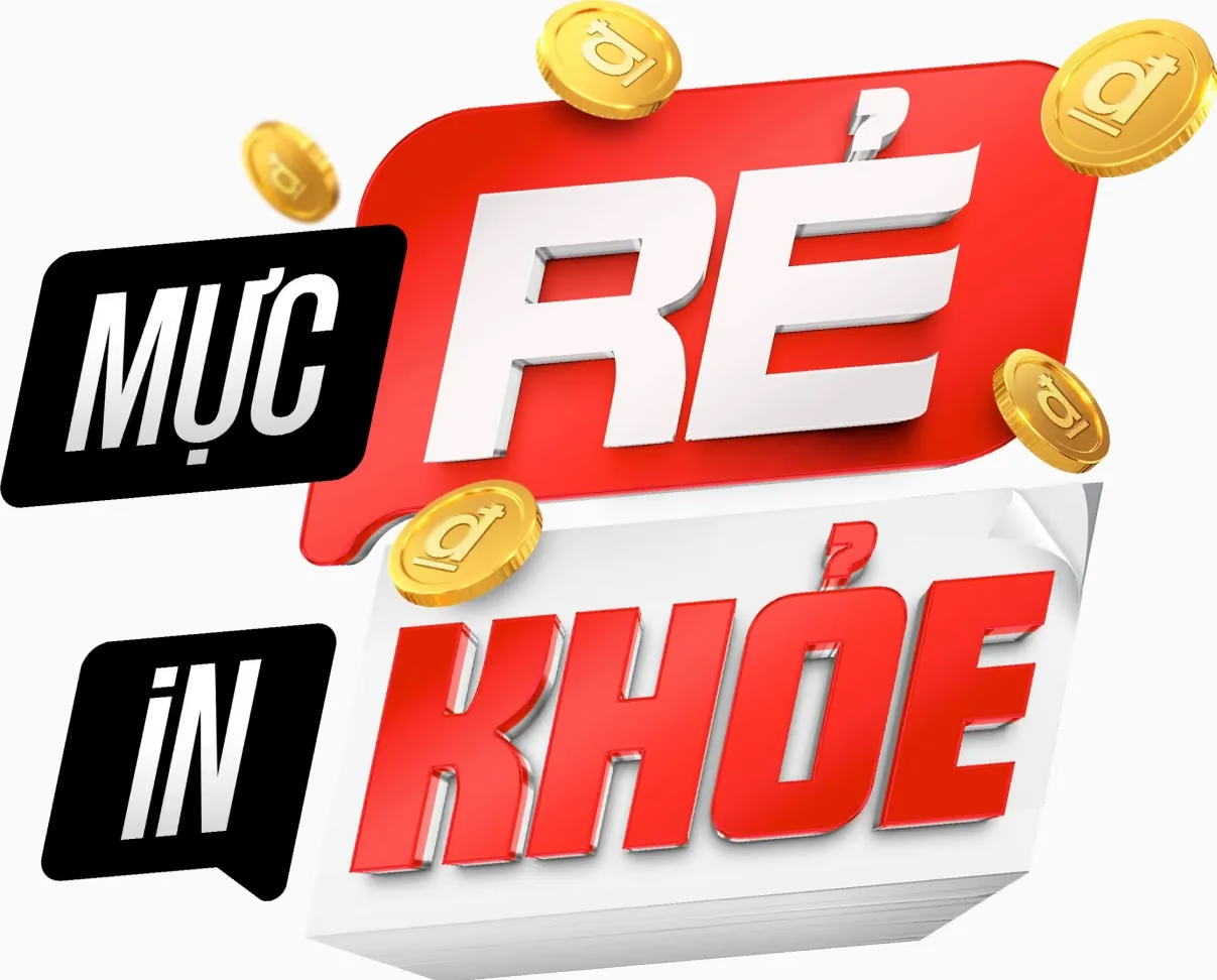
Brother is a printer brand, so the line was built from what a printer makes: KHOẺ standing on a stack of freshly printed paper, RẺ sitting inside a pile of coins, the toner cartridge holding the lockup together. One piece of artwork then adapted down through seven surfaces — billboard, building LED, a full bus wrap, a shelf wobbler, a sticker on a toner box — and out into two motion ratios, without redrawing a letter.
An idea made of the product’s own material also solves a problem nobody budgets for: it stays recognisable when it is shrunk to a wobbler.
Design for the smallest surface first
Most key visuals are approved at presentation size and die at post size. The practical order for an appliance brand:
- The vertical cutdown — nine of ten impressions will be here.
- The square post, in a feed next to competitors, at thumb distance.
- The in-store surface — a shelf talker or a box sticker, printed badly.
- The hero frame, last. If the idea works in the first three, this one is easy.
If the device only reads at 1920 pixels wide, it is a picture, not a platform.
What to test before committing the idea
- Can somebody outside the project name the device after seeing three posts?
- Does it generate the next post, or does it need a new concept each time?
- Does every product get a variant without a new shoot?
- Does it survive black-and-white, and 400 pixels wide?
Four yeses and the brand has six months of content. Anything less and it has a launch.