Most brand mascots die quietly. They are commissioned for a launch, rendered in three hero poses, and then the second campaign needs a pose nobody modelled — so the team either pays for another render or quietly drops the character.
The ones that survive were never treated as artwork. They were built as a system, in the same way a logo is.
Start from the job, not from the drawing
Home Credit did not ask for a character because characters are charming. Consumer finance is a category people approach warily, and a logo cannot smile at anyone. The brand needed a face that could carry a promotion, explain a product, and apologise for a delay — without changing tone between those three jobs.
That brief decides the design before any sketching. A character who can only be excited cannot apologise. One who is purely cute cannot explain an interest rate.
Put the brand inside the character, not next to it
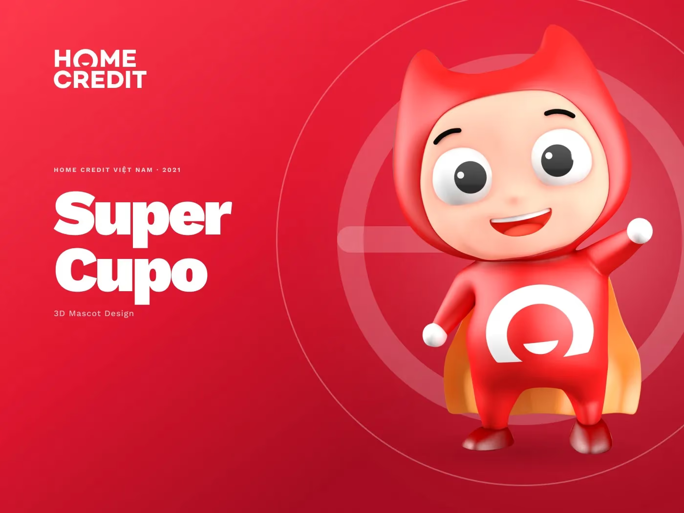
SuperCupo is a pint-sized superhero in a red cape who wears the brand’s own circular mark on his chest. That is not a decorative choice — it means he is never off-brand. Wherever he appears, the identity arrives with him, so no layout has to reserve space for a logo lockup beside the character.
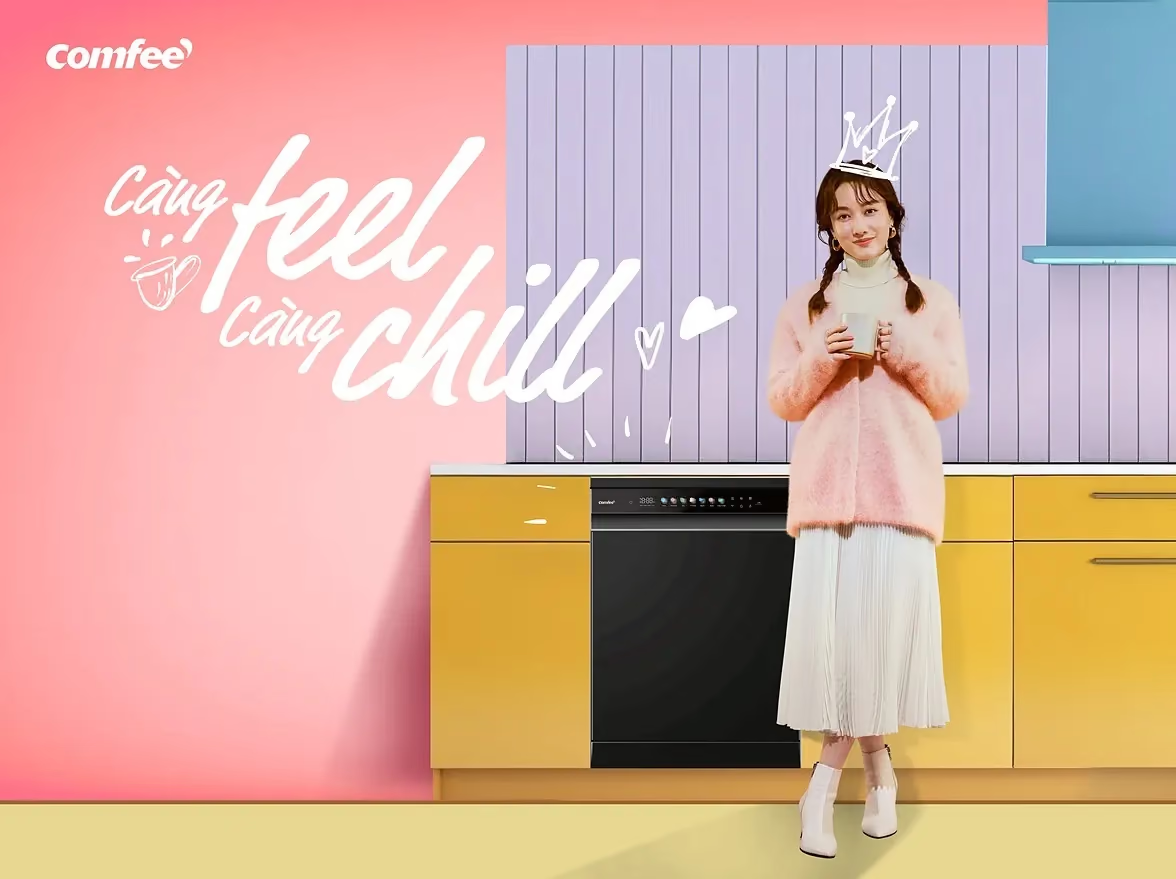
The same instinct shows up in other brands’ devices: Comfee turned the comma in its own logo into a speech bubble so the appliance could answer back. The brand asset generates the character rather than being applied to it afterwards.
The expression set is the actual deliverable
Here is the part that gets cut from budgets and should not be.
For SuperCupo we sculpted and rendered, and then built an eight-pose expression set. That set is what allows the character to be dropped into an app screen, a web banner or a social post without a new render every time.
Eight poses is a small number chosen deliberately: enough to cover the emotional range the brief demanded, few enough that a marketing team can actually remember what exists. A library of sixty poses nobody can find is the same as no library.
Think of it exactly like a logo suite — primary, knockout, monochrome, minimum size. Nobody would ship a logo as a single JPEG. Mascots get shipped that way all the time.
Design for the surfaces you will not be in the room for
A 3D character has a specific failure mode: it looks superb at hero size in the pitch deck and turns to mush at 64px in an app.
So the checks are mechanical, and they happen before final render:
- Silhouette at 10% size. If you cannot tell who it is from the outline alone, the shapes are too busy.
- One flat colour. The character has to survive a single-colour print and a low-bandwidth placement.
- Cropped to the head. Half the real placements are square avatars.
The only test that matters
SuperCupo was built in 2021. He is still running in market today — five years later, across app screens, banners and social posts, without a rebuild.
That is the difference between a mascot and an illustration: an illustration is finished when it is delivered, and a mascot is finished when the next person can use it without you.
How a mascot enters a quote, from the pose set to the rig, is covered in what drives the cost of branding, packaging or mascot design in Vietnam.
What to look for in the character itself, from the model sheet to the page of rules, is in what makes a good brand mascot character.