A mascot is usually approved from one image, the front-facing hero render. That image says the least about whether the character will last. The qualities that matter show up elsewhere: on the model sheet, in the turnaround, in the list of poses and on the page of rules. We design brand mascots in Ho Chi Minh City, mostly in 3D, and would ask to see them in this order. How a mascot is built to outlast its launch campaign is covered in from clay to cape, so here the subject is the character itself.
The job decides the body
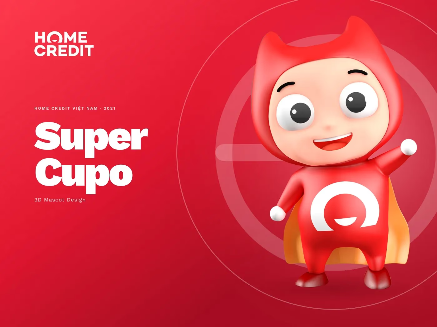
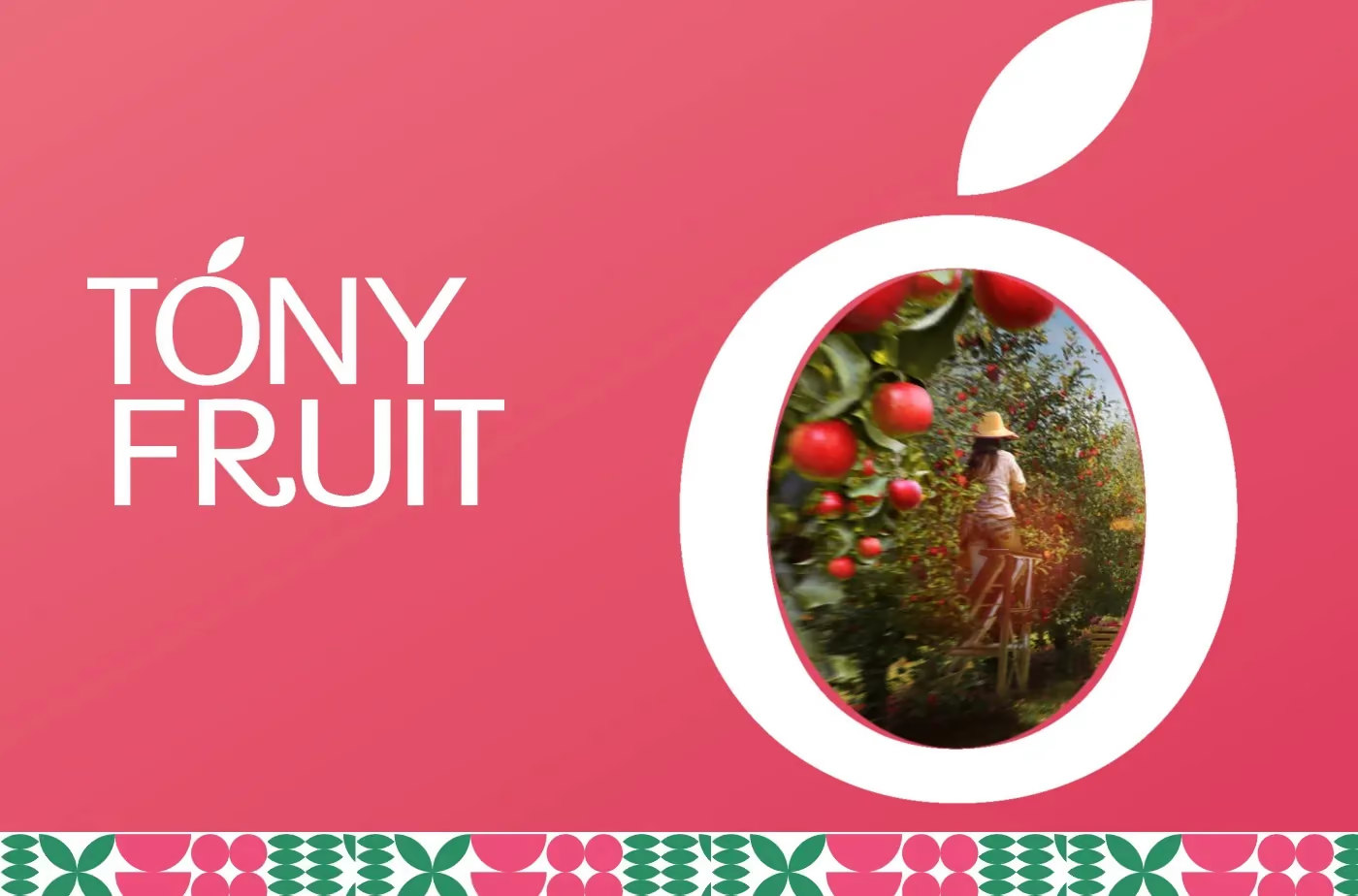
A character is hired to do something, and the work shapes it. Home Credit’s SuperCupo has to promote, explain and apologise in a category where people are wary, so he is a pint-sized superhero who can point, wave, wait and fly, with the brand’s circular mark on his chest. In the Tóny Fruit identity the mascot has a narrower job, the greeting, at child height. It is a round pink apple with arms, legs and a leaf, which echoes the apple silhouette of the mark. The two bodies differ because the jobs do. If a brief cannot say what the character will be asked to do in an ordinary week, the design has nothing to be judged against.
Proportions are fixed on paper
The model sheet records what must not change: how many heads tall the character is, how large the head is against the body, where the eyes sit, how many fingers there are. It is the stage most often shortened, and shortening it costs the most. A proportion corrected on paper takes half a morning, while the same correction after the character has been modelled and rigged means rebuilding most of the model.
Look at it from the side
Ask for the turnaround as well as the hero render. Many characters are charming from the front and lose their shape in profile. Real layouts rarely allow a front view every time. A banner crops the figure, a standee is passed from the side, and a social post may need the character to look towards the copy. That is why the turnaround is the better test: a character that holds up only from the front can only be used from the front.
Poses are a vocabulary
The names of SuperCupo’s eight poses read like the buttons of an app: hello, yes, waiting, this way, celebrating, thinking, asking and flying. In the case study they appear on an app screen, a Facebook cover and web banners for homecredit.vn. That makes a useful test for any pose set you are shown: take each pose and ask what the brand would say with it, and how often. We deliver eight to twelve at launch, together with the model sheet, so that another studio can add more later without redrawing the character. If the character speaks, its lines will be in Vietnamese, and the lettering in a speech bubble has to carry stacked diacritics at a small size.
Flat or modelled
Not every character needs the third dimension. We draw flat mascots as well, and for a character that will mostly appear as an avatar or a sticker a flat drawing can serve better. A modelled character earns its place when it has to sit beside a product, appear on packaging or move, because it can be lit and turned to suit each layout. The choice changes what is delivered and what each new pose involves, and what drives the cost of branding, packaging or mascot design in Vietnam goes through how that reaches a quote.
Rules for other people’s hands
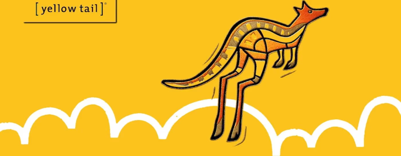
Sooner or later the character is used by people who never met whoever drew it, and a short page of rules is what they will have. It says which pose suits which job, how the character sits next to the logo, and what must never be changed. The guidelines for yellow tail show the format: the ’Roo has a page of its own, “Our ’Roo, the mascot and its rules”, and the brand’s other asset, the Hop, comes with approved and rejected crops.
Before you approve a mascot, ask to see the model sheet, the turnaround and the pose list, and leave the hero render until last. What we hand over is listed on the 3D mascot page, and the SuperCupo case shows a full set in use.