A healthcare brand in Vietnam is read by four audiences before it ever reaches a consumer: a doctor, a pharmacist, a hospital procurement officer and a regulator. Each of them is looking for a reason to trust the company, and none of them is looking at your typography. That is the whole brief. Style is what you spend after trust is established, not the thing you lead with.
Trust is a system problem, not a logo problem
Most healthcare rebrands in this market start in the wrong place — a new mark, a new colour, a launch post. The mark is the smallest part of the problem. The real question is whether the same identity holds together across a black-and-white lab print-out, a hospital corridor sign, a consent form, a sales-rep deck and a Facebook ad — because a patient meets the brand in all five places within one week, and any gap between them reads as carelessness about the medicine itself.
For Gene Solutions the capability was already there: Vietnam’s largest cell-free DNA testing operation. The identity had to catch up to it. We rebuilt the mark on a fixed construction grid, then wrote the system around it — two primary colours, a gradient family, a pattern derived from the mark, and a type hierarchy that still works when it comes out of a lab printer at low resolution. Every rule in the guideline exists because someone downstream will have to apply it under conditions nobody in the studio controls.
The test for a healthcare identity is not the presentation deck. It is the worst-quality surface it will ever appear on.
Regulation removes the easy argument — plan for that
In over-the-counter healthcare, what a product is allowed to claim is decided before the creative brief. An eye drop cannot promise what an eye drop obviously does. So the product argument — the one every consumer-goods playbook starts with — is closed off on day one, and a campaign built on it will simply not clear review.
Santen is Japan’s No.1 eye-care brand and in Vietnam it was still a pharmacy-counter purchase: bought on the pharmacist’s recommendation, not on brand preference. Instead of arguing about the product, we spoke to the feeling around it, with a deliberate split of 70% emotional content against 30% functional, running on four pillars inside a single feed. The functional 30% is not filler — it is the part that earns the right to the other 70%.
That campaign reported 1.4M reach, +724.8% organic growth and 193% of the views KPI. Those are the client’s own figures, shared with permission — which is itself part of the discipline: in this category, never publish a number you cannot attribute.
Design the clinical artefact before the campaign
A practical sequence we use, in this order:
- The document. Report, label, insert, consent form. If the type hierarchy fails here, nothing downstream is safe.
- The wayfinding. Corridor, counter, room. Fixed distances, fixed lighting, no art direction.
- The retail surface. Shelf, gondola, storefront.
- The campaign. Only now — and built from parts that already exist.
Doing it in reverse is how brands end up with a beautiful key visual and a guideline that nobody in the field can follow.
Retail is where a healthcare brand gets tested
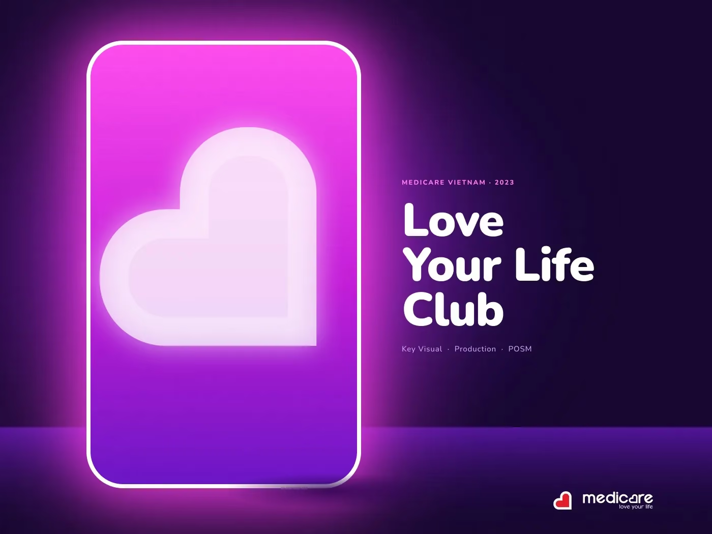
Pharmacy retail is a harder room than a feed. A membership programme is a list of benefits, and a list of benefits is the hardest thing in retail to make anyone feel. For MediCare we turned the Love Your Life Club into a place you walk into: one neon doorway, one heart, one cast. Because the doorway was shot as a built set rather than illustrated, the same asset became a key visual, a gondola header, a security-gate wrap and an entire shopfront without being redrawn each time.
That is the economics of healthcare branding at retail — you are not buying one image, you are buying an asset that survives thirty adaptations by different suppliers over two years.
What we check before sign-off
- Does the mark hold at 12 mm on a box, in one colour, on uncoated stock?
- Does the type hierarchy survive a fax-quality print of a lab result?
- Can a sales rep rebuild a compliant slide without a designer?
- Is every claim in the artwork traceable to something the regulator has seen?
- Does the campaign reuse assets built in step one, or invent new ones?
None of those questions is about taste. They are the reason a healthcare brand still looks credible in year three, which is the only timescale that matters in this category. Style is easy to add later. Trust is not.