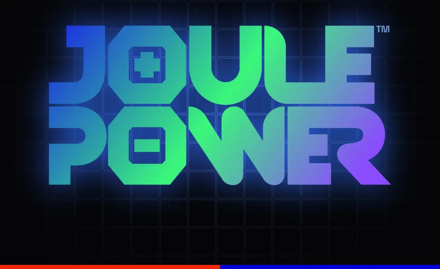
The people who sign off a solar or battery-storage purchase are mostly engineers and finance teams. They read warranties and payback tables and they put datasheets side by side. In that setting an identity is judged first on whether it looks like a company that will still be around when the warranty runs out, and only after that on whether it looks good. We built the identity for Joule Power, a Vietnamese solar and battery-storage company, in 2023, and the brief set most of the terms for what follows.
Where the category’s look runs out
As the brief described it, the identities in the category were almost all a blue gradient and a leaf. Both are easy to defend in a meeting and neither says anything about who is behind the logo. Joule Power wanted a mark that would say energy without borrowing that vocabulary, and the mark had to work at two very different sizes: on a warranty sticker and on the side of a shipping container. A mark that is clever at one of those sizes and mush at the other has failed the brief, however good the presentation board looks.
Putting the battery inside the name
The idea came from the name. JOULE and POWER each contain an O, and we turned the two letters into cells, one carrying a plus and the other a minus. The wordmark now says what the company sells, and nobody has to learn a symbol to read it.
The drawing started from a reference board with three sources on it: photovoltaic cells, an electric arc and a plasma ball. The icon studies came from the same three. Using the company’s own technology as raw material kept the shapes specific to Joule Power, where a lightning bolt could belong to any company in the category.
A grid taken from the panel
A wordmark alone cannot carry container livery, site signage, uniforms and stationery, so the rest of the system comes from the module grid of a photovoltaic panel, repeated. It became a pattern, the frame of a poster and the skin of a battery container. Because it comes from the product, a surface needs no photograph to feel like Joule Power. The same grid sits on a bus shelter and on a battery cabinet, which have little else in common.
Two colour routes, judged on the same object
The mark and the grid stayed fixed across two colour routes, Lava Orange with black and warm grey, and Electric Blue with mint. Each route was built out in full, with logo versions, a palette, a gradient for screens and applications on posters, a bus shelter, stationery, uniforms, and a container and a cabinet for battery energy storage (BESS). Putting both routes on the same container and the same cabinet meant the client could see what each colour did to real equipment before choosing, so the decision was about temperature and the mark was already settled. The blue route was the one taken forward.
What gets handed over
In an engineering business the identity is used by people who never meet the designer, in documents and on equipment. What they receive has to be specific: the logo versions and when each applies, the construction grid, the palette and the screen gradient, and worked examples on the sort of document and hardware they handle every week. For Joule Power the delivery came with applications ready for spec sheets and site signage.
What to ask before approving one
Ask to see the mark at sticker size and at container size on the same page, so that reduction and enlargement are both on the table. Ask for the same piece of equipment in more than one colour direction while the choice is still open. And ask who will be holding the guidelines in two years, because that person decides what the rules need to say.
The energy and tech branding page lists what we deliver for this sector, and the Joule Power case shows both routes in full. For how to judge a studio before a project like this starts, see what to ask a creative agency in Vietnam before you hire them.