Work — Pernod Ricard · BFS Studio, Ho Chi Minh City
Aberlour— A Door, Not a Colour
THE BRIEF
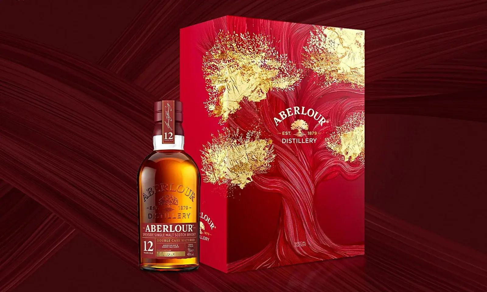
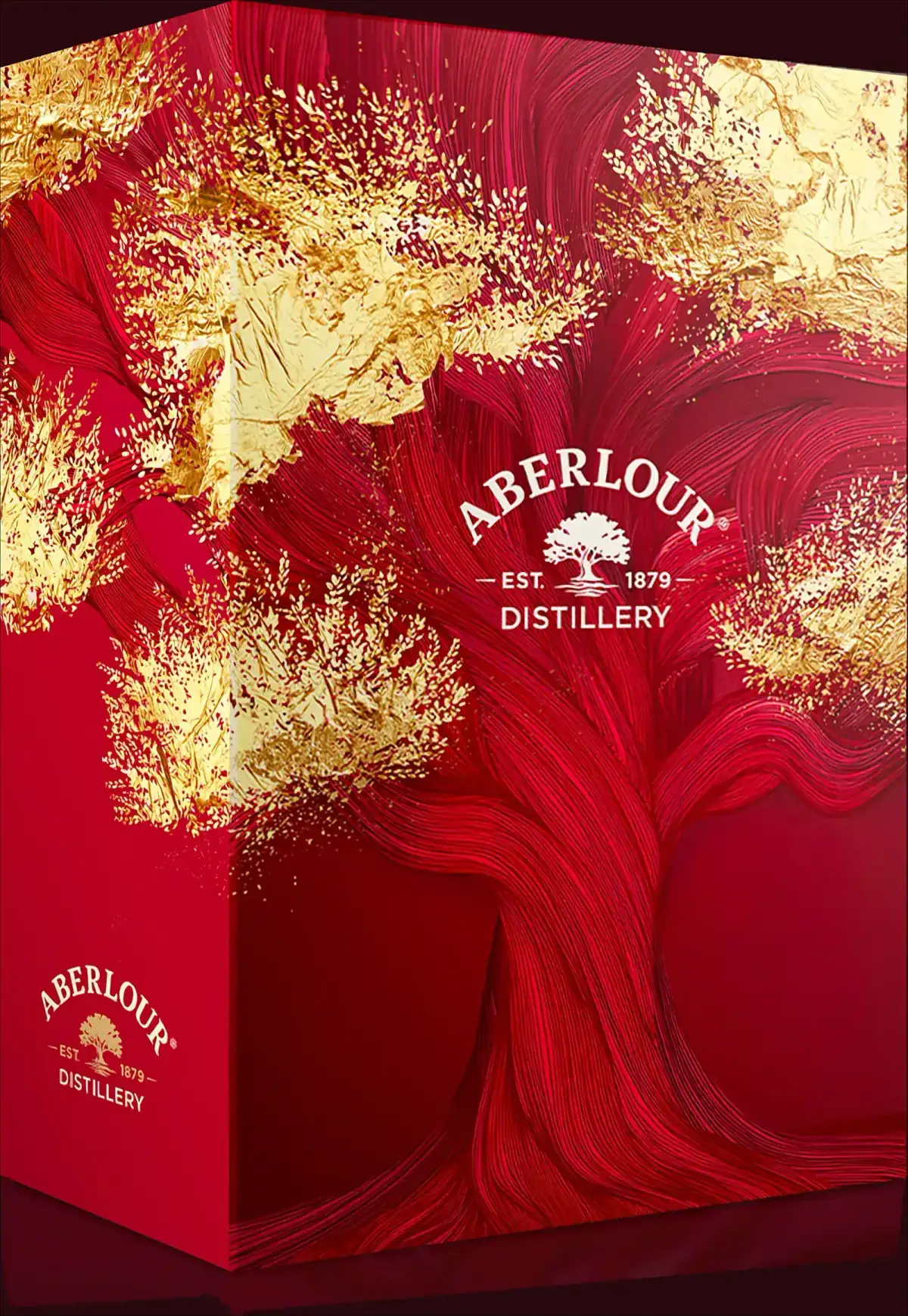
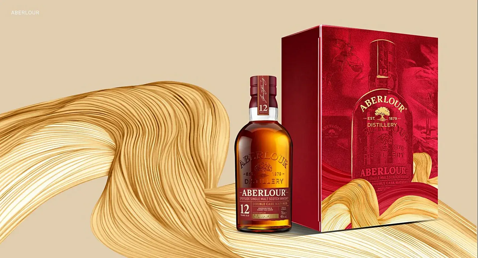
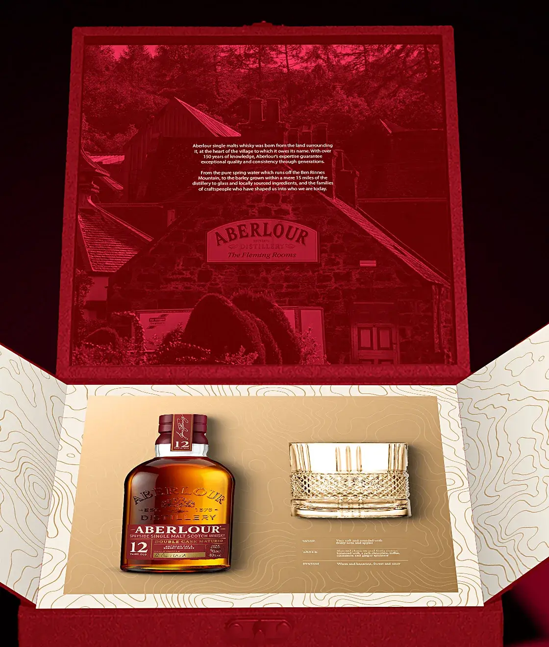
A Tết special edition for Aberlour 12 Double Cask Matured. Aberlour’s identity is not a look — it is a place: an oak, a river, a village, and a red that most people read as just the brand colour. The pack had to feel like Tết without adding a single decorative element the brand does not already own.
WHAT WE DID
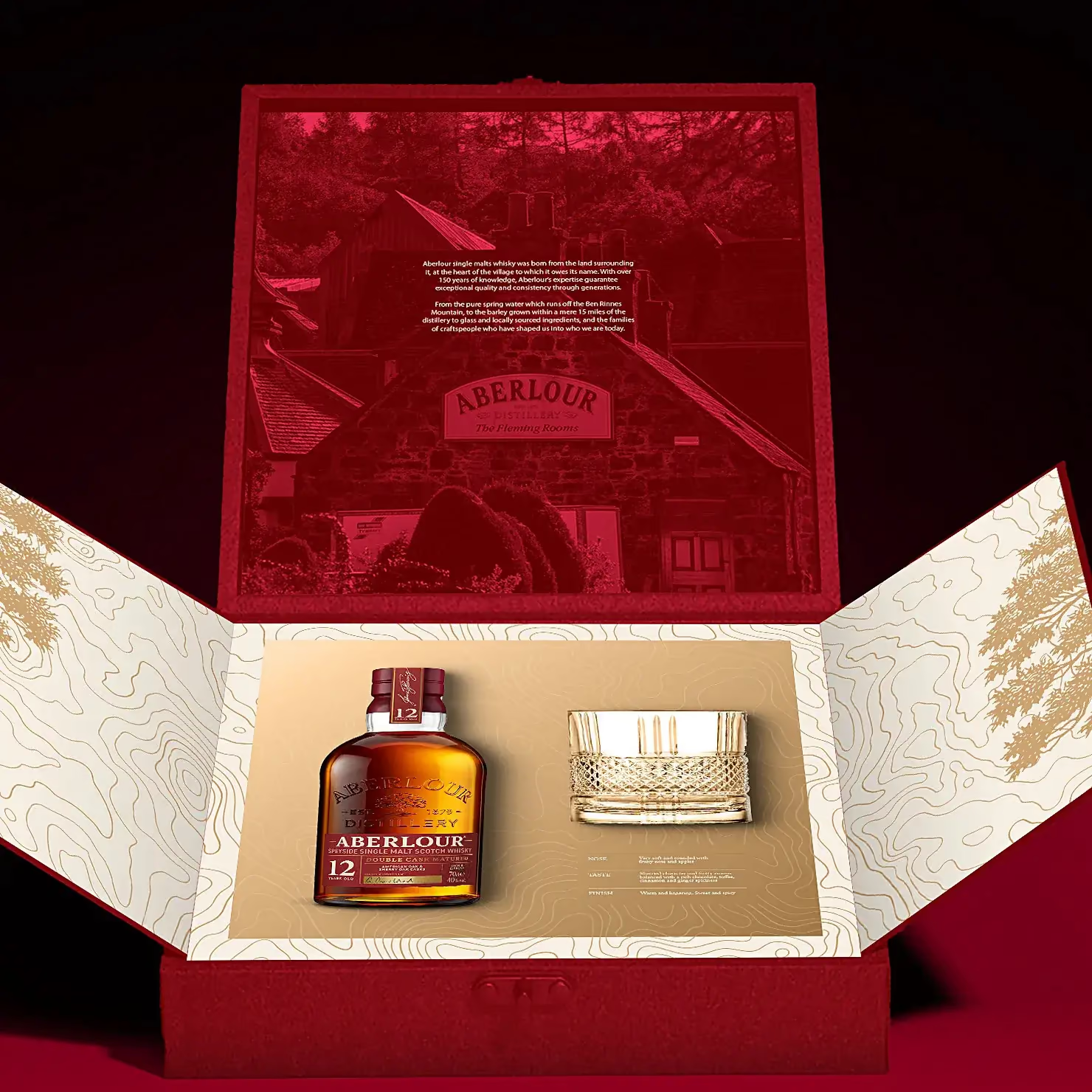
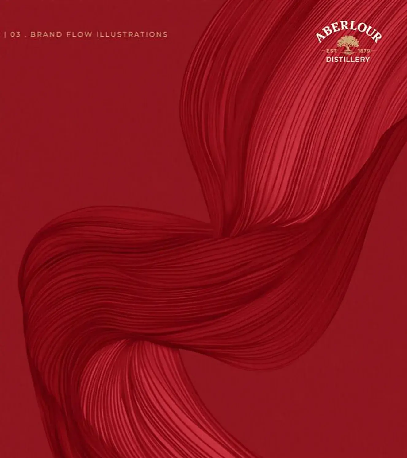
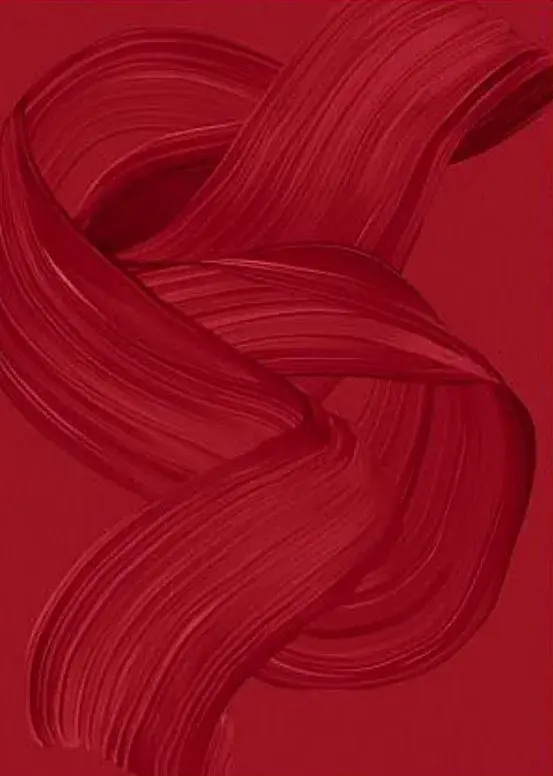
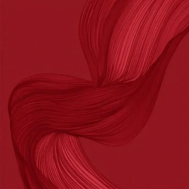
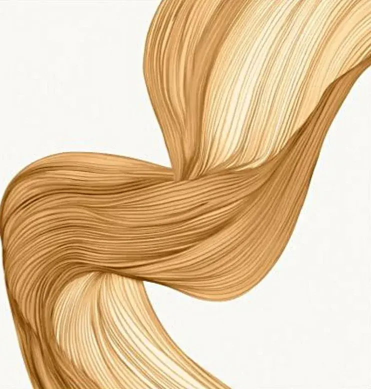
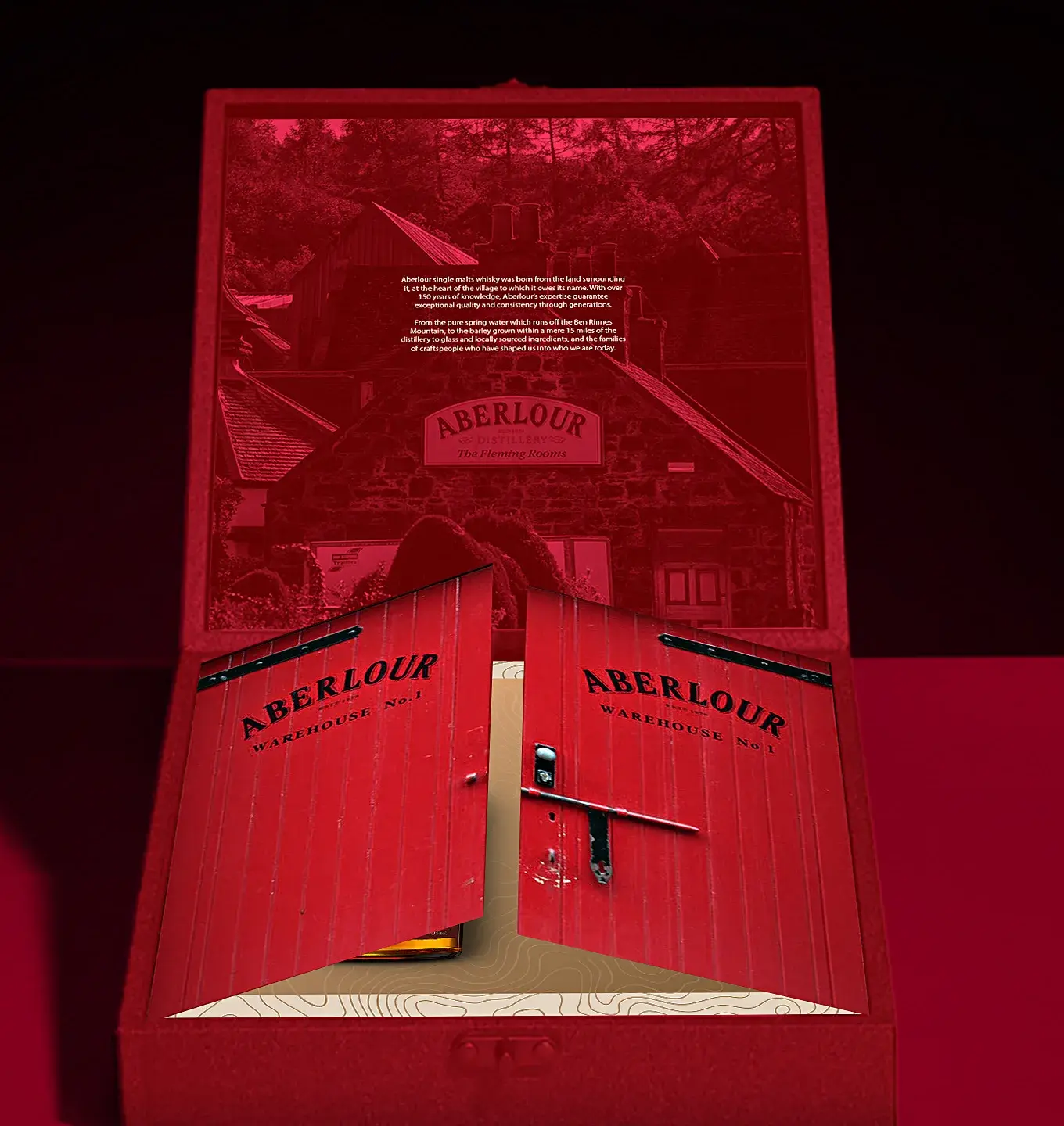
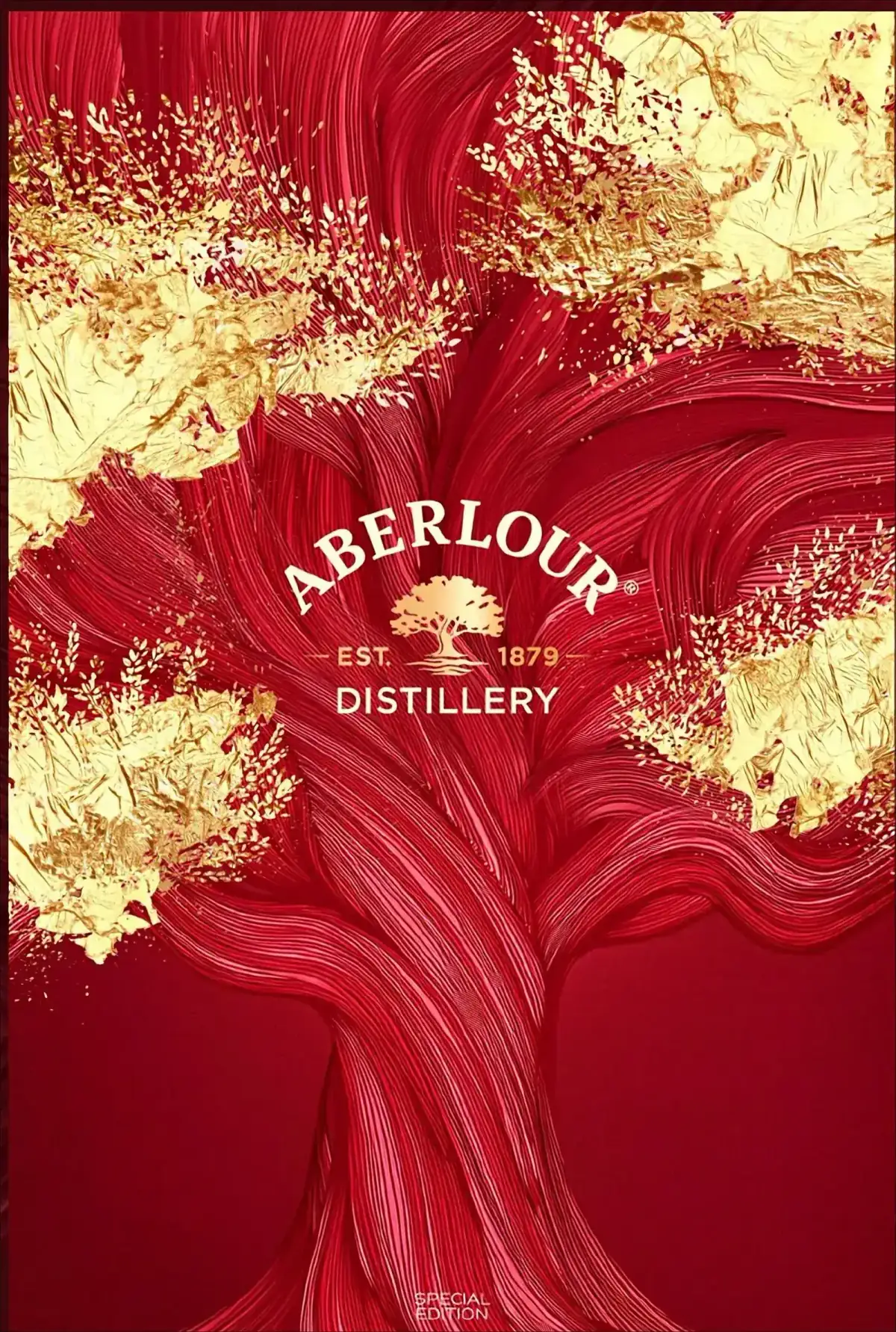
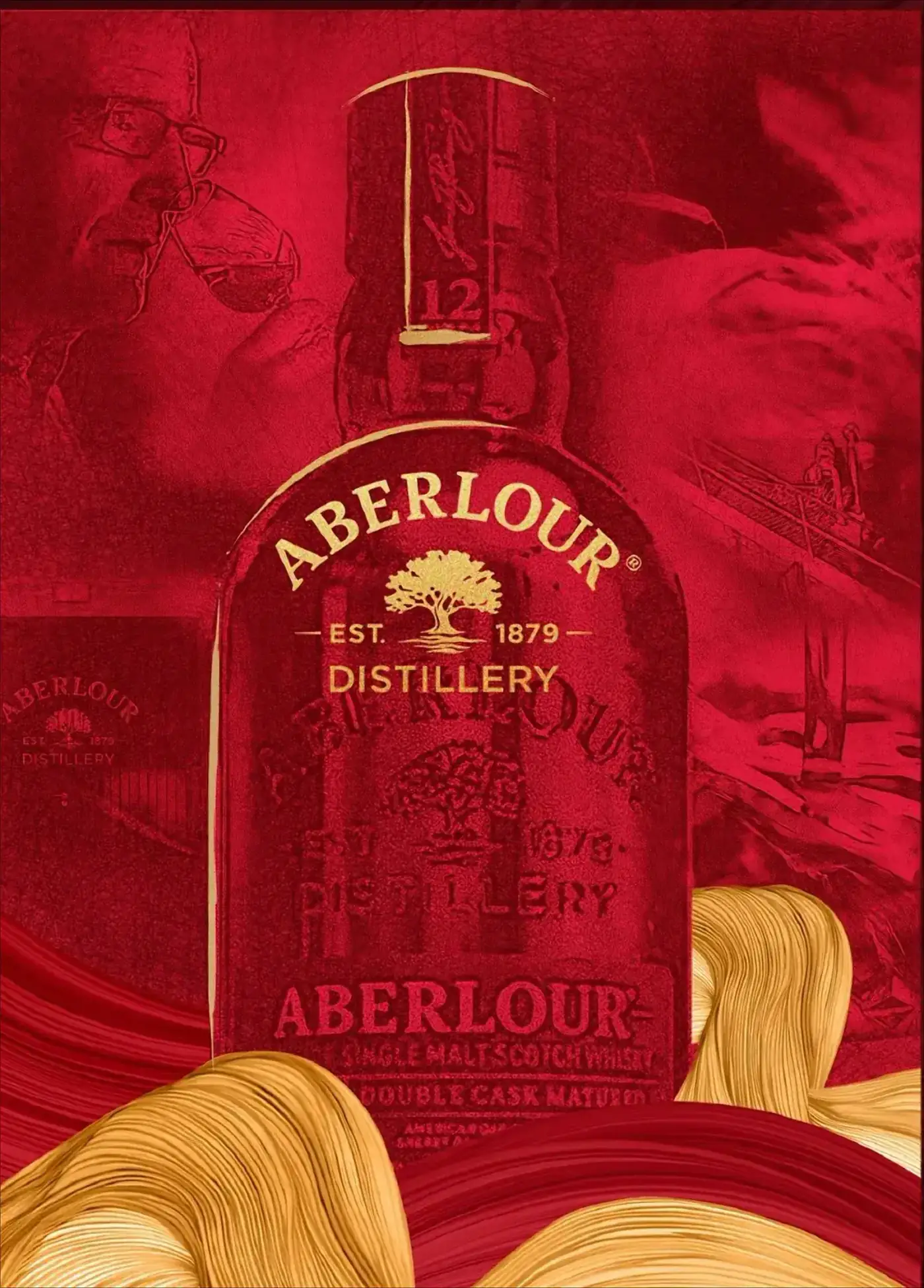
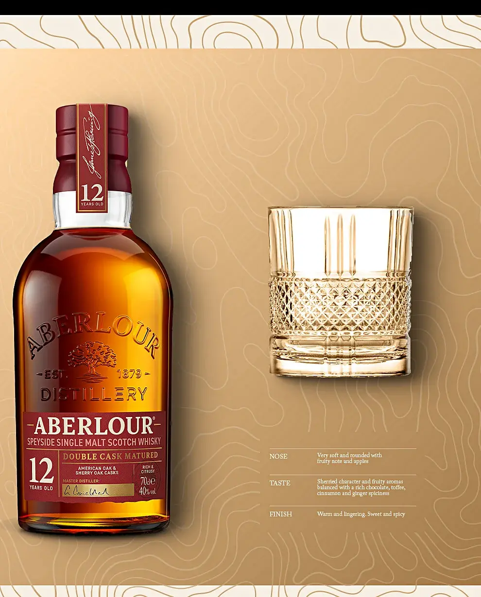
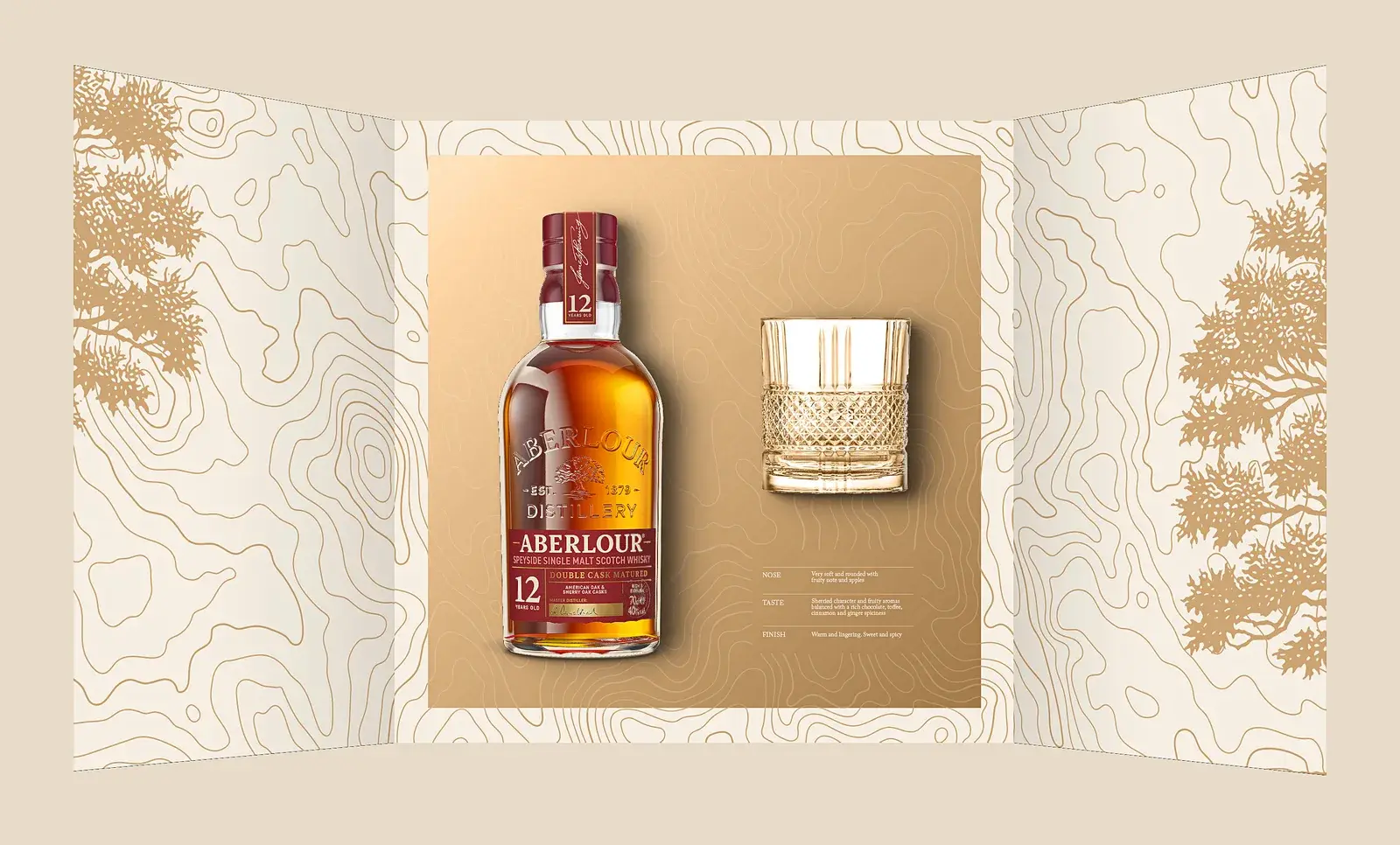
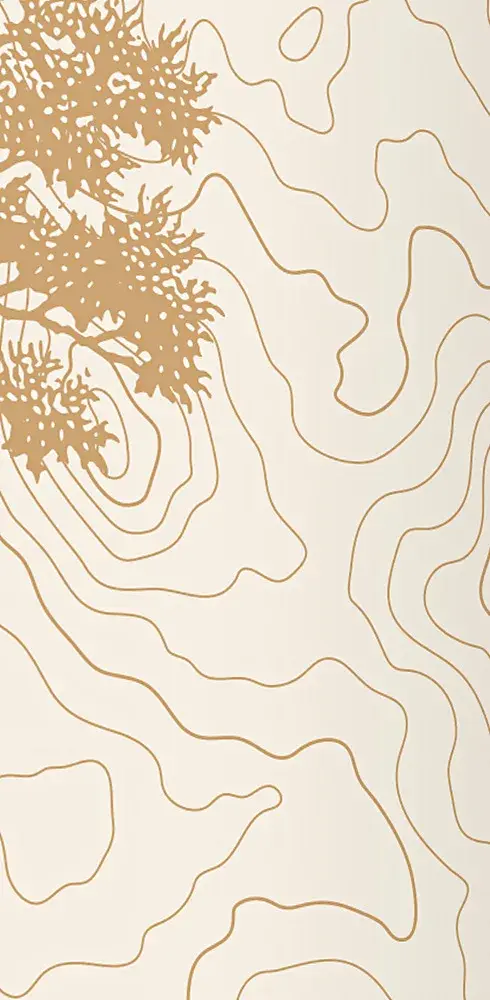
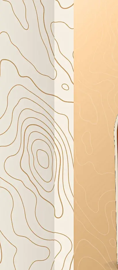
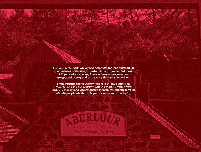
We stopped using red as a surface and started using it as a threshold. Aberlour Red is the colour of the doors on Warehouse No.1, so the box is not printed red — it is a red door. Closed, it is the warehouse front. Open, both leaves swing outward and the interior turns to Mineral Beige with gold contour lines, the Liquid Flow the brand already owns running through it. Two routes were drawn on that structure: the oak grown out of the Flow, and the whole distillery engraved in line.
OUTCOME
Delivered as Aberlour’s Vietnam Tết programme for 2025 — structure, artwork and mockups, all drawn inside the global brand book.
THE WORK
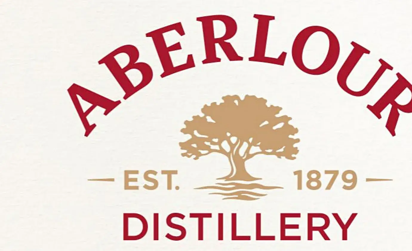
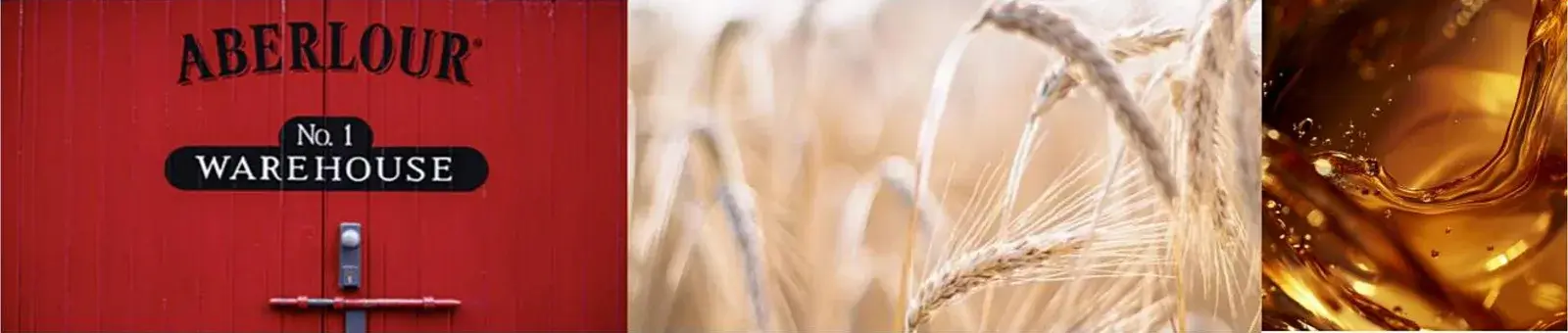
- Aberlour Red · 187 C · 40%#B0172E
- Mineral Beige · 9224 C · 40%#F6EEE2
- Gold · 7508 C · 15%#CEA574
- Deep red#7A0F1F
- Cellar dark#2A0810

NEXT PROJECT