A global brand book does not bend for a local season, and it should not have to. That is the constraint every Lunar New Year programme starts from, and the reason most of them fail in the same way: the local team, told they cannot touch the brand, reaches for the only thing left — peach blossom, gold, a zodiac animal — and ships a pack that could belong to any brand in the category.
Across nine projects for Pernod Ricard houses there is a pattern that avoids that, and it is not a style. It is where you start.
Start from an asset the brand already owns
Every one of these packs began with something already in the brand book, then let the season change the material rather than the identity.
- Ballantine’s — the chevron, reread as dragon scales. Same shape the brand has used for decades; a new reading of it.
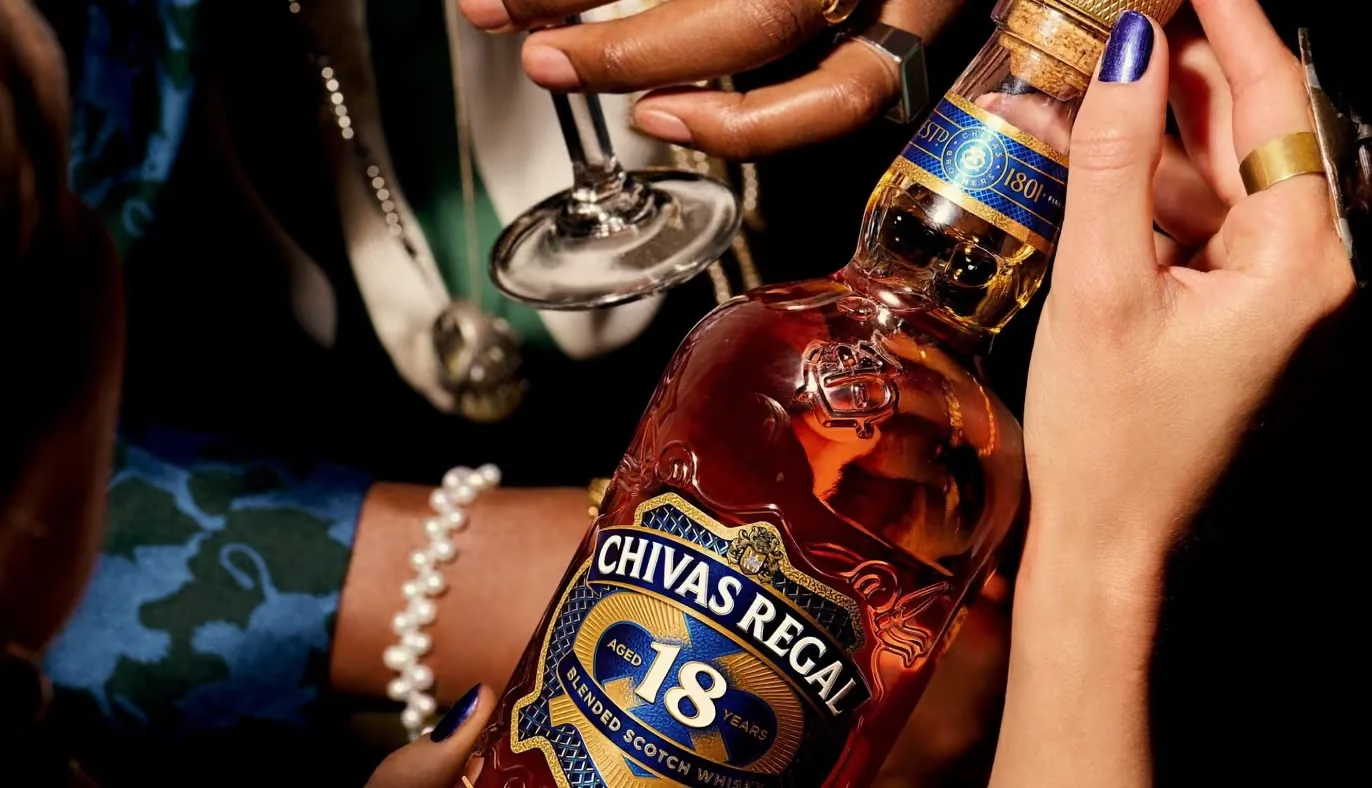
- Chivas Regal — the Luckenbooth crest, cut as a gemstone for Tết 2025 and looked through as a kaleidoscope for 2026: eight gift packs across the two seasons.
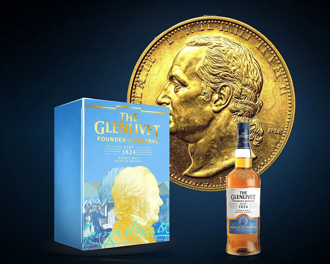
- The Glenlivet — the founder. George Smith carried three consecutive seasons: 2023, 2024 and the 200-year edition in 2025.
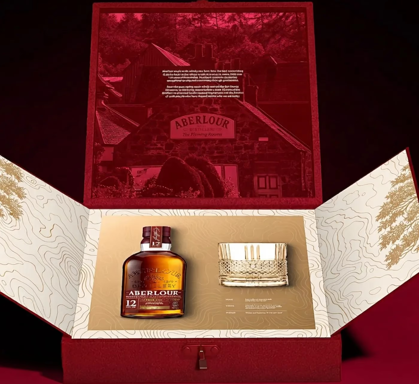
- Aberlour — the brand red, reread as a doorway rather than a colour, opening onto an interior.
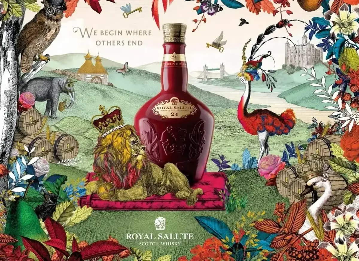
- Royal Salute — royal architecture, folded flat into a two-tier pack.
None of these ask the global team to approve a new brand element. They ask them to approve a new use of an existing one, which is a far shorter conversation and a far stronger pack.
Design the tier ladder, not one box
A house rarely ships one Tết pack. It ships a ladder — an entry SKU that has to move volume, and a prestige SKU that has to look like the top of the range.
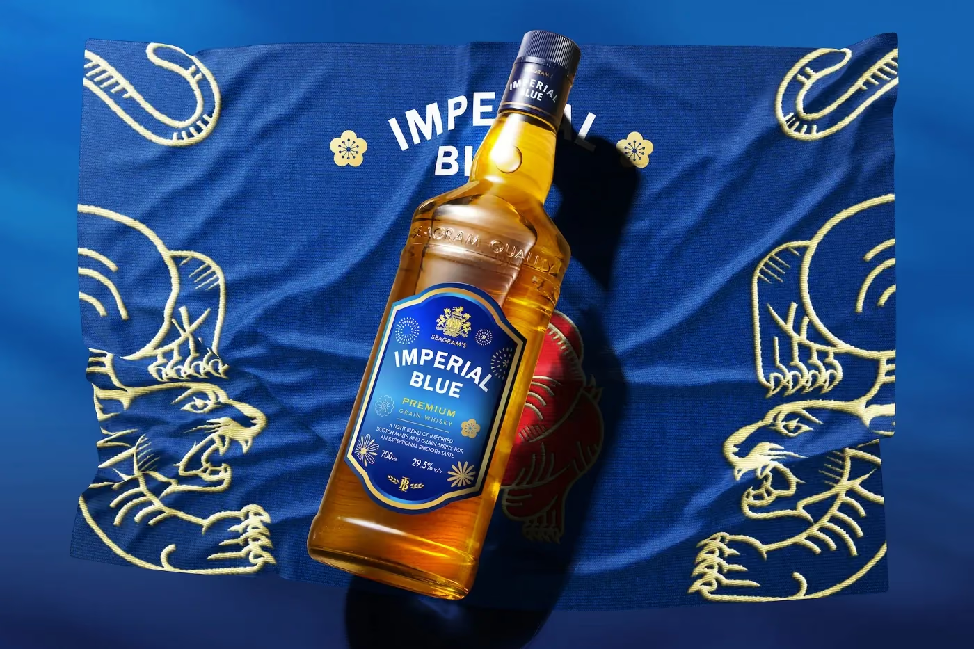
Royal Salute ran RS21 and RS24 on one construction so the two tiers read as one family at a distance and as two products up close. Imperial Blue went the other direction: a single mainstream carton designed so a row of them on a shelf reads as one continuous scene rather than eight repeats of the same face.
Deciding the ladder before the idea saves a round of work. Deciding it after means redrawing.
The calendar belongs to the printer
Six to eight months, every time. Rigid boxes, foil and lacquer queue at the same Vietnamese printers in the same weeks, and a global approval cycle sitting on top of that is what actually kills schedules — not design.
The practical move is to front-load the approvals that involve headquarters (concept, brand-asset usage) and leave only local decisions (material, finish, print run) for the months when the printer is the constraint.
What travels, and what does not
Across six seasons, the things that travelled well were structural: a construction, a grid, a way of reading an existing asset. The things that did not travel were literal — a specific flower, a specific animal, a colour borrowed from another brand’s Tết pack.
If the pack still works when you take the season off it, the season was added properly.
The other side of the same question — what the pack is asked to do in Vietnam that it is not asked to do at home — is in how spirits packaging in Vietnam differs from the same brand abroad.
For a programme like this, an agency also has to be able to work inside a global brand book. What to ask a creative agency in Vietnam before you hire them explains how to check that.