Every Tết brief in Vietnam arrives with the same four things attached to it: red, gold, blossom, a zodiac animal. Use all four and the pack works — it reads as Tết from the end of the aisle. It also reads as everyone else. A shopper standing in front of five gift boxes can tell you it is Lunar New Year; they often cannot tell you which house made which box.
The way out is not to invent a new festive language. It is to notice that the brand already owns geometry, and that geometry can be made to feel like Tết without a single borrowed ornament.
Find the shape the brand cannot give up
Every serious brand has one form its guidelines will not let you touch. That form is usually treated as the constraint. It is actually the material.
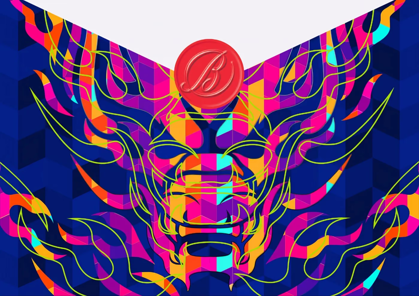
For Ballantine’s, that form is the chevron — lifted from the bottle itself, and explicitly not to be decorated. 2024 was the Year of the Dragon, and a dragon is scales; a chevron is a scale. Nothing had to be added: the tile was taken to brand scale, faceted so it released light, and then resolved into a dragon face. One object was allowed to break the tessellation — the wax seal — because a system that never breaks reads as wallpaper. How that dragon sits beside Imperial Blue’s tiger, and what a goat asks in 2027, is in what to do with the zodiac animal on a Lunar New Year pack.
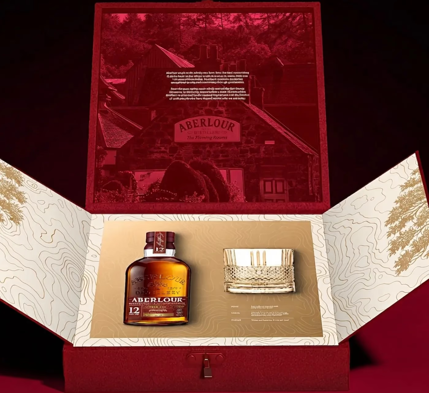
For Aberlour, the form was a colour everyone had stopped looking at. Aberlour Red is not a brand colour in the abstract: it is the colour of the doors on Warehouse No.1. So the box was not printed red — it was built as a red door. Closed, it is the warehouse front. Open, both leaves swing outward and the interior turns to Mineral Beige with gold contour lines and the brand’s own Liquid Flow running through it.
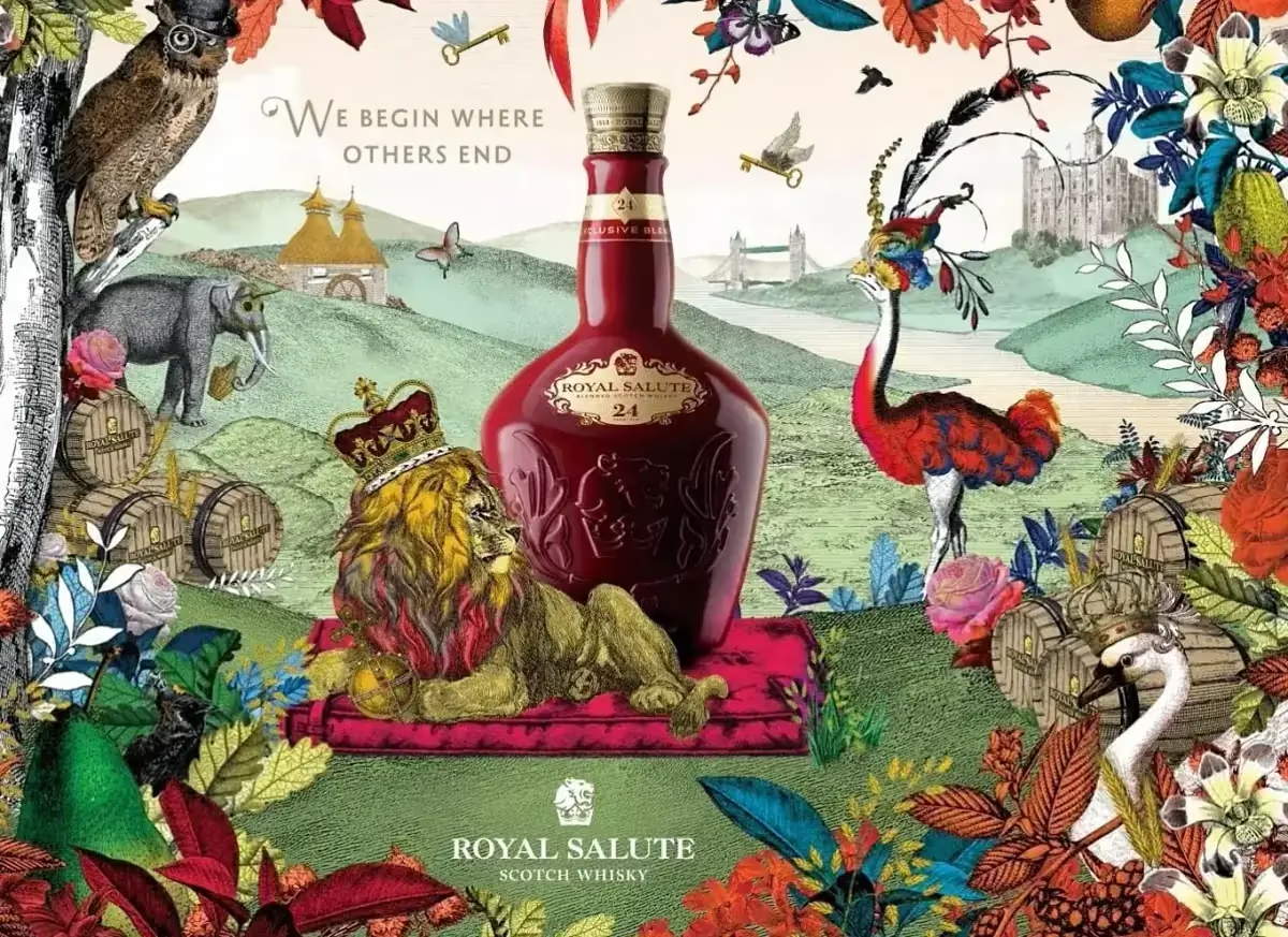
For Royal Salute, the form was architecture. A brand born from a coronation cannot arrive dressed like everyone else without losing exactly what it sells. So each member of British royal architecture was transcribed onto the panel: gate finial to the apex, wrought scrollwork to the shoulders, the twenty-one gun salute to the base, cornice moulding to the running border, state-room pilaster to the vertical edges.
Let tier come from proportion, not from more
The second trap is the tier ladder. Two expressions have to be told apart instantly on a shelf, and the reflex is to give the higher one more: more foil, more emboss, more ornament. That reads as more expensive, which is not the same as higher.
Royal Salute solved it with proportion — RS24 gets a taller frame and a gold podium, RS21 stays in blue — so neither tier looks like the lesser version of the other. Ballantine’s 18 keeps the identical construction and swaps material: gold hexagons, botanicals, a kumquat that reads as Glenburgie citrus and as Tết at the same time.
Same geometry, different register. That is what a range looks like when it was designed as one system rather than three separate briefs.
The test the work has to pass
Ask two questions before the artwork goes to the printer.
Cover the logo. Can you still name the brand? If the answer is no, the festivity was applied on top and any competitor could have shipped the same box.
Show it to someone who does not celebrate Tết. Do they read it as festive? If the answer is also no, the geometry stayed too literal and the seasonal job never got done.
The three packs above pass both, and none of them contains a blossom. Royal Salute’s construction was strong enough to carry both Tết 2022 and Tết 2023 without being redrawn — which is the real argument for this approach. Ornament has to be replaced every year. A construction gets renewed.