Packaging design for a food, spirits or gift brand in Ho Chi Minh City involves more decisions than drawing the front of a pack. Three projects from our studio each turned on a different one. The first held a construction steady across a range, the second let a material lead the idea, and the third wrote rules for people who are not designers.
One construction for a whole range
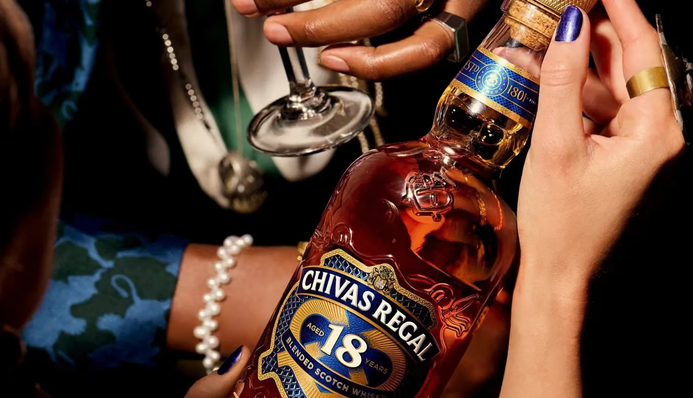
The brief for Chivas Regal Bảo Ngọc Vạn Hoa asked for a Tết gift range that reads as one family across every expression, from the 12 to the 18 Blue Signature. Each pack still had to separate at arm’s length. The global brief said gemstone, and five different stones side by side can easily become five unrelated boxes.
In 2025 we fixed one construction across the range and changed only the stone on the face, from ruby to diamond and ice. Each stone was chosen from the cask. The shared construction kept the five packs reading as one family. In 2026 we folded each pack’s own face into a kaleidoscope rosette, so the second season was built out of the first.
For a range, the construction is the part to settle first and keep longest. Once it holds, a new expression or a new season does not mean redrawing from scratch. How the choice between a rigid box and a folding carton changes by tier is laid out in our nine-month Tết playbook for spirits.
When the material decides the idea
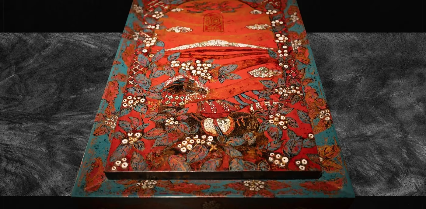
The gift box for 10Vill Coffee with the lacquer artist Đinh Văn Sơn worked in the opposite order. The material came first: lacquer and eggshell inlay, made by hand over six months, through seven prototypes and more than 200 roasted eggshells. We supplied the concept and the directional artwork, and the artist made the piece. It took Gold at the MUSE Design Awards 2026 in the Packaging Design, Limited Edition category.
Artwork for a piece like this is drawn for an artist’s hand. Every line has to allow for the material that will sit under it, starting with the first sketch. The craft behind those six months has its own article: Vietnamese lacquer and eggshell inlay in packaging design.
Packaging used by people who are not designers
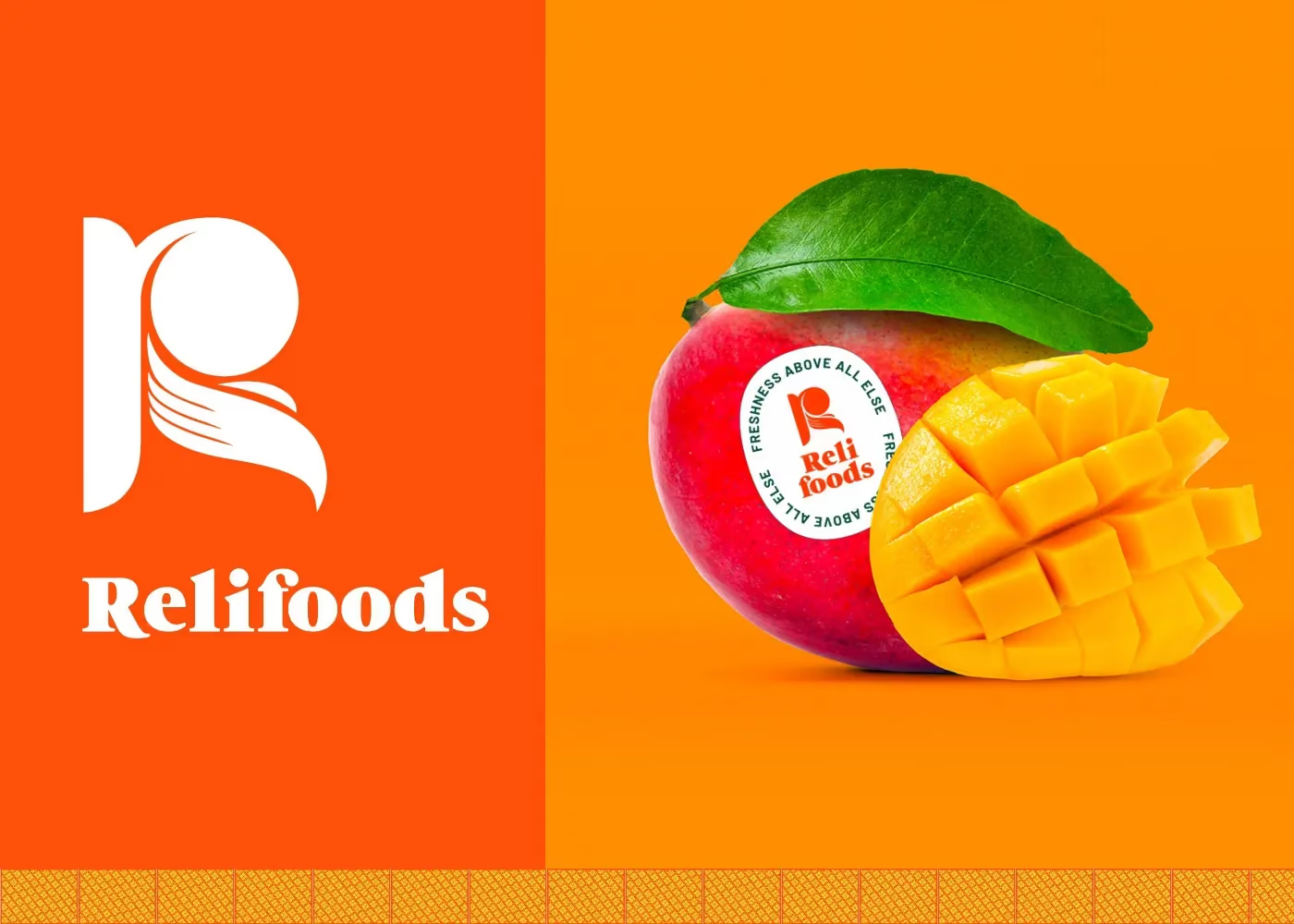
Relifoods grows and exports fruit, so its identity had to travel from the export carton to the reception counter to the sticker on a single mango. The people applying it are farm staff. For Relifoods, the question was whether the rules were clear enough to be followed correctly when nobody was there to explain them.
The R is drawn as a hand holding a piece of fruit. Around it sit a round stamp carrying “Freshness above all else”, a two-colour discipline held at 55 / 40, and a four-tone pattern built from the same hand. The stamp has six approved versions: solid, reversed, outlined, in green and in orange. The standards manual runs to more than 60 applications, from the shipping carton, packing tape and sticker in the pattern to juice packs and produce trays carrying the stamp.
On packaging like this, the rulebook is part of the design. Colour, proportion, stamp placement and minimum size all have to be written down, because the people using the pack every day will not call the studio each time they put a sticker on a tray.
From file to first sheet
We do not run presses. Our part is writing the specification, standing at the printer and approving the first sheet. For spirits, how to design a spirits bottle label for Vietnam goes into that stage.
A packaging project with us runs from the dieline and artwork for the whole range through 3D visuals and physical mock-ups to print files and press approval. The full list of deliverables and the usual questions are on the packaging design service page.