Work — HABECO · BFS Studio, Ho Chi Minh City
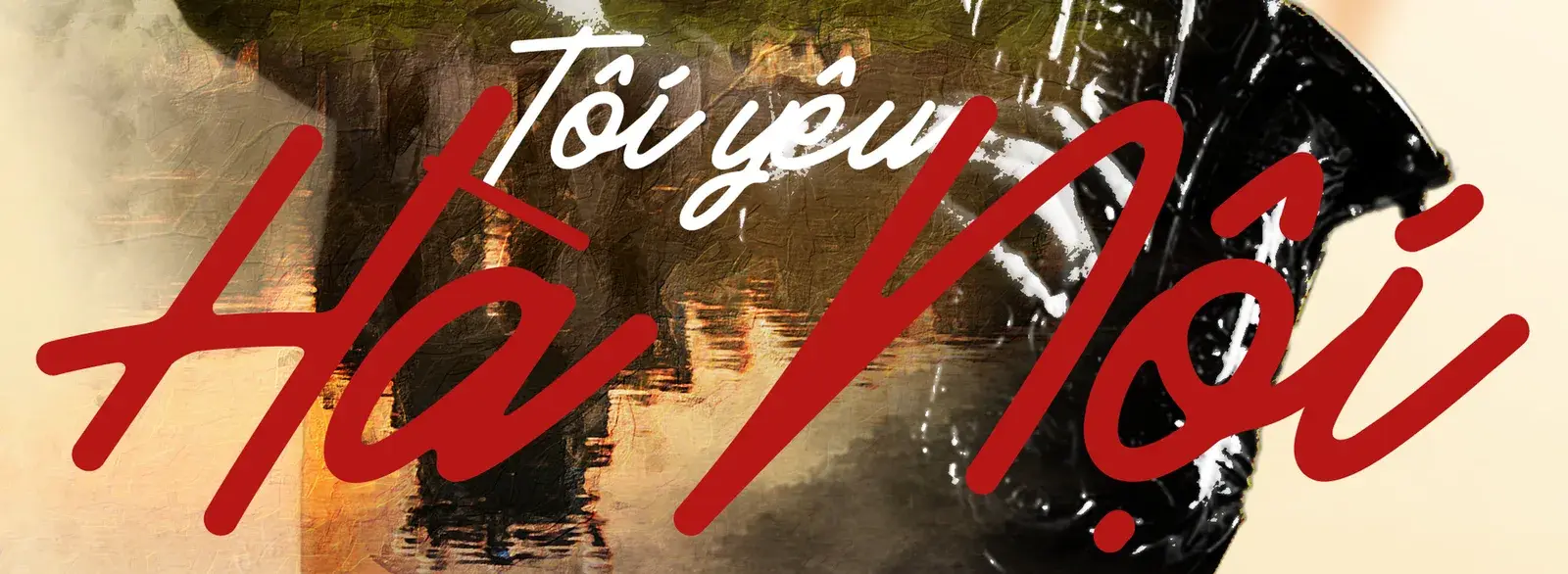
Bia Hà Nội— Tôi yêu Hà Nội

THE BRIEF
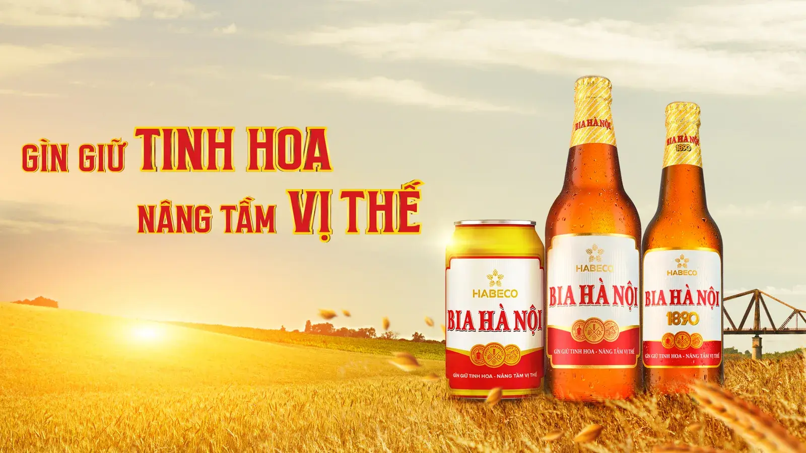
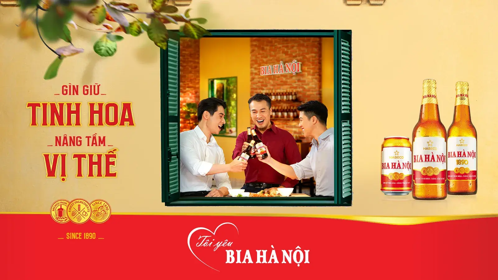
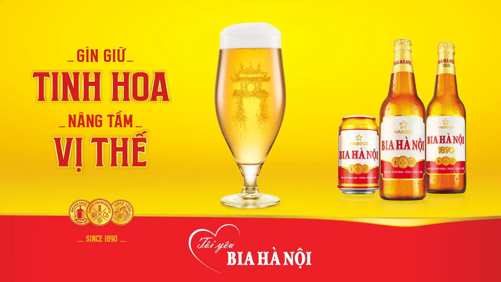
Bia Hà Nội has brewed since 1890 and is a shared memory rather than a product decision — which is exactly the problem when you have to post every week for a year. The brand needed a visual direction and a content system that could carry a summer of street drinking and a Tết of family tables without becoming two different brands.
WHAT WE DID
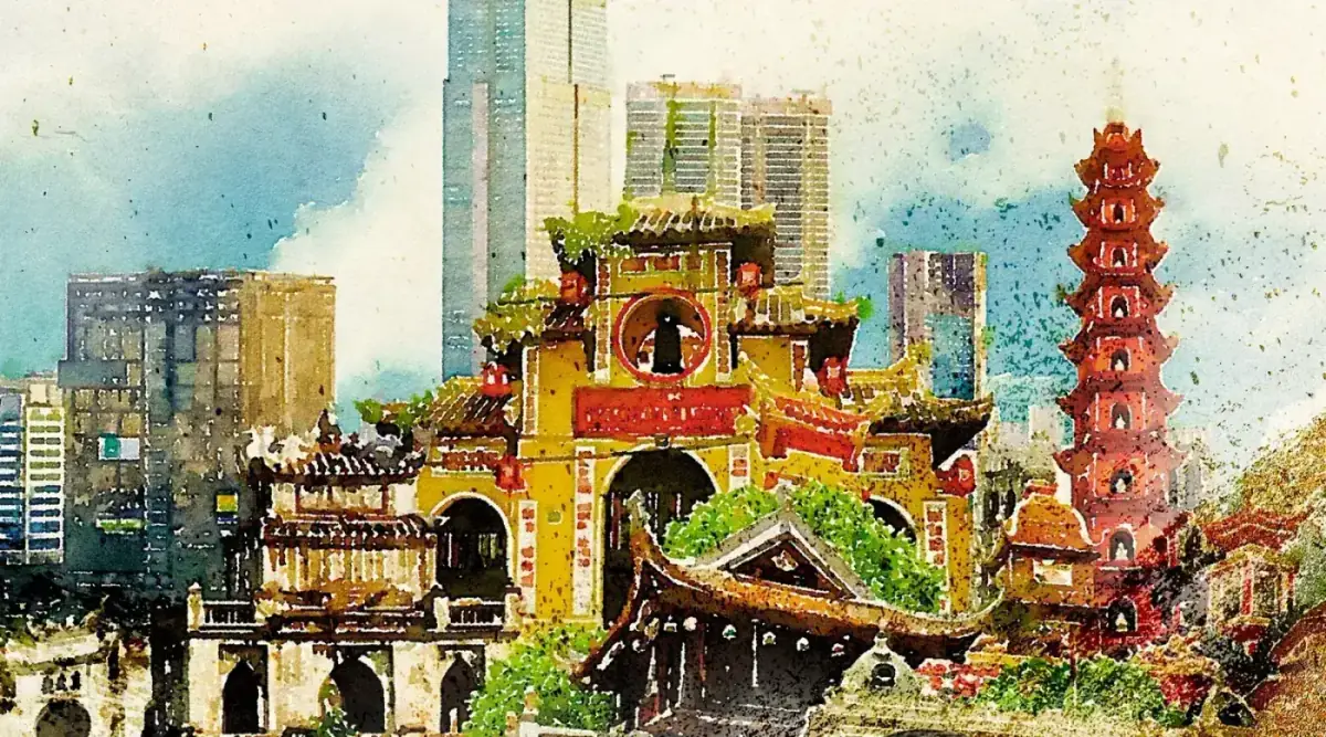
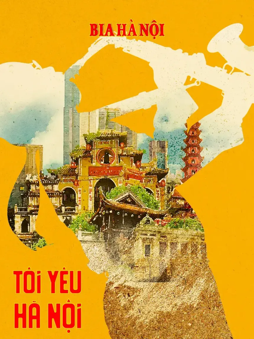
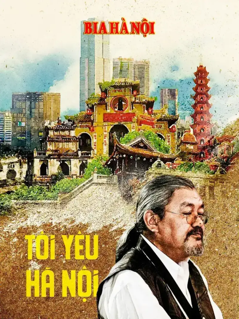
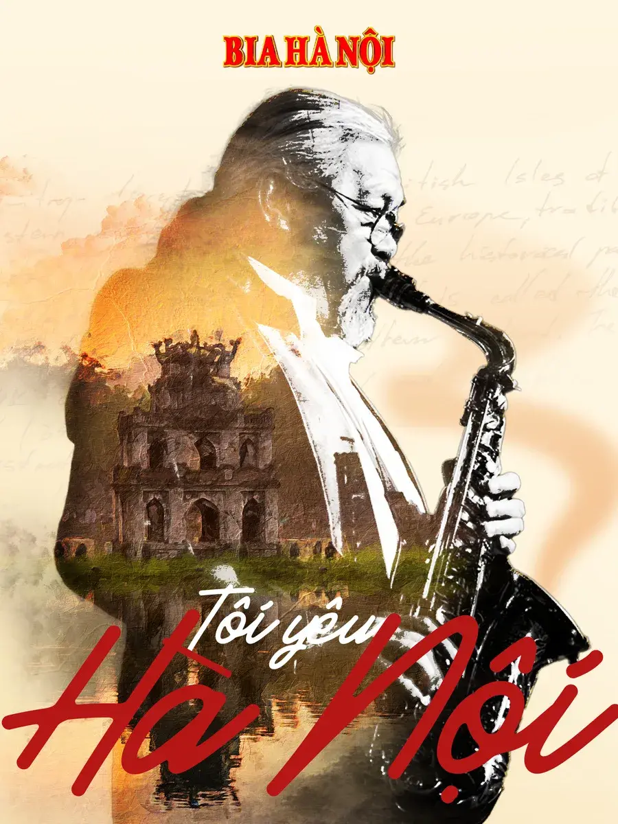
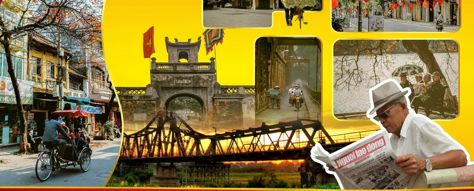
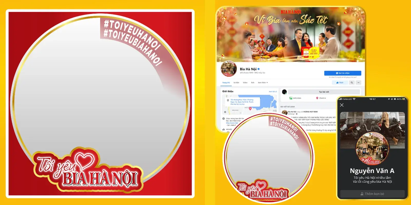
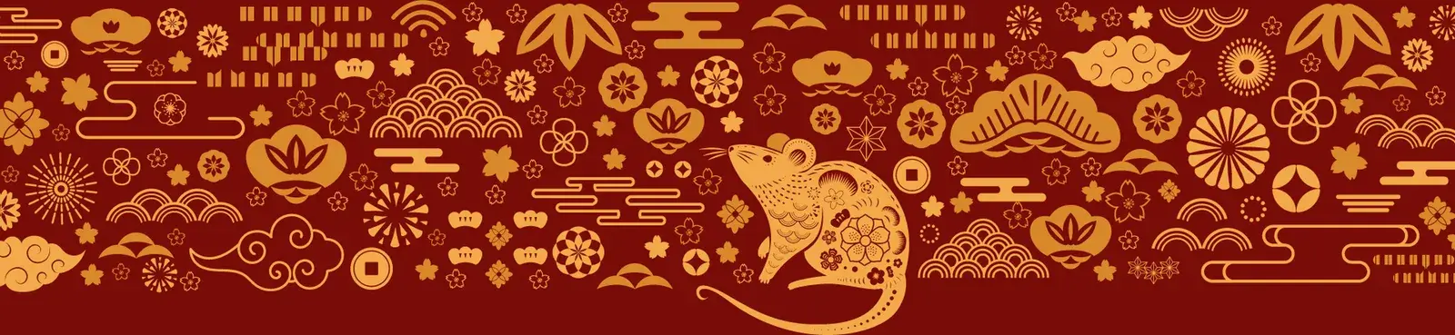
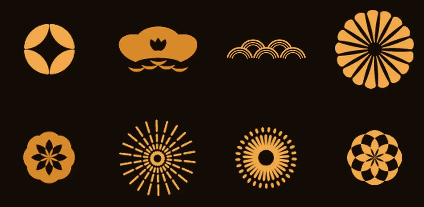
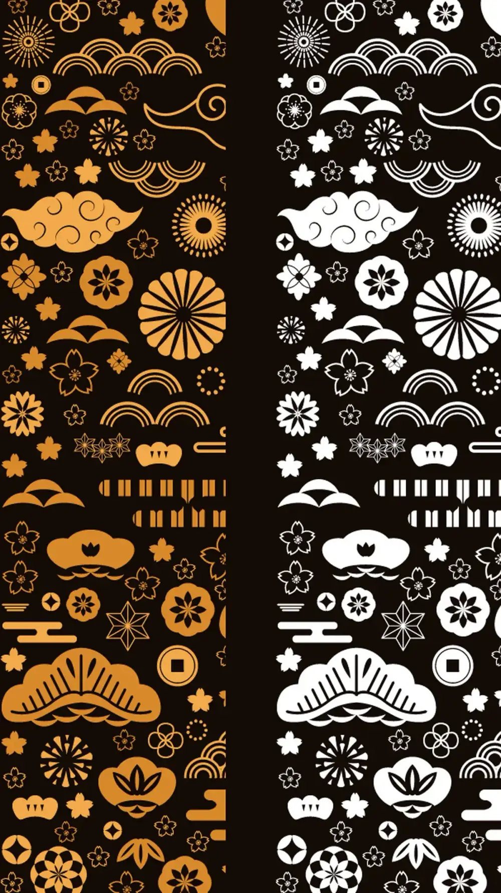
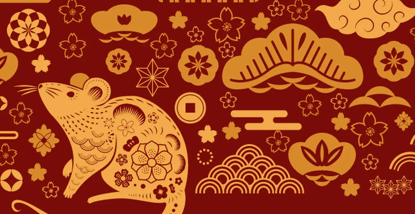
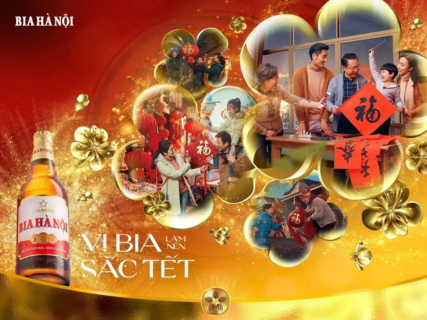
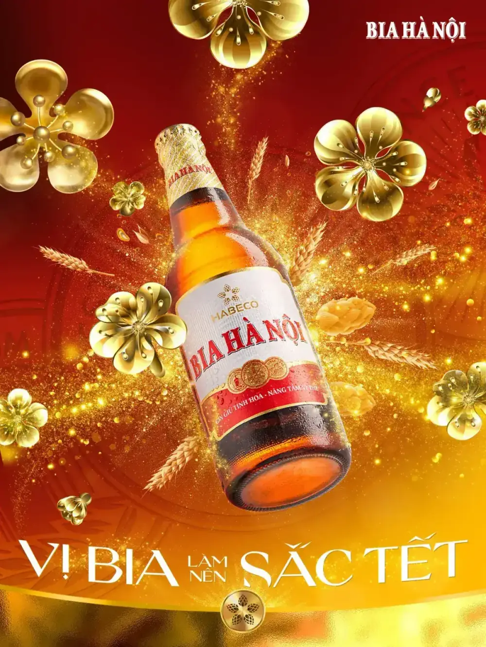
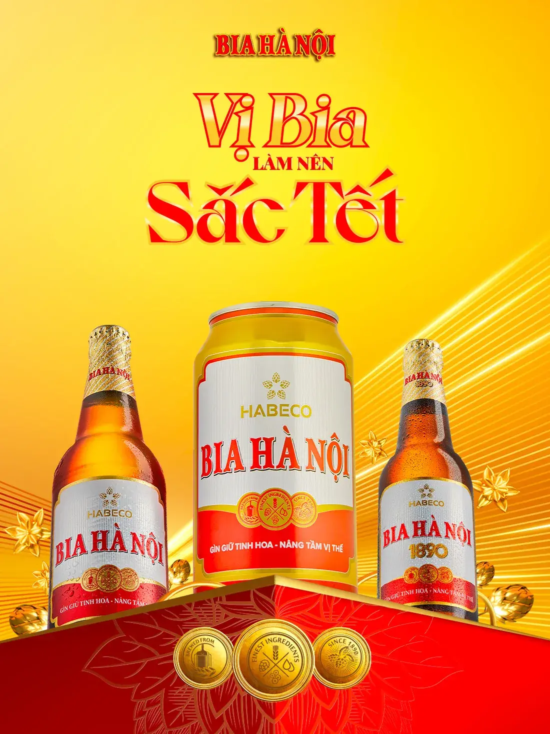
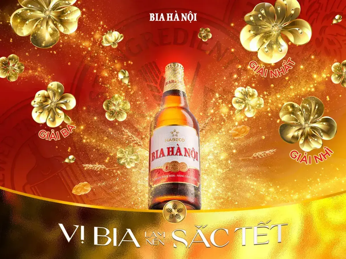
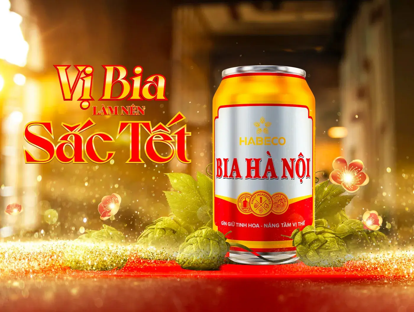
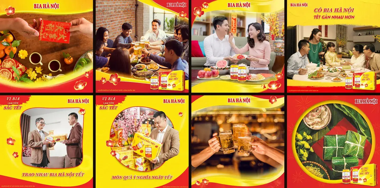
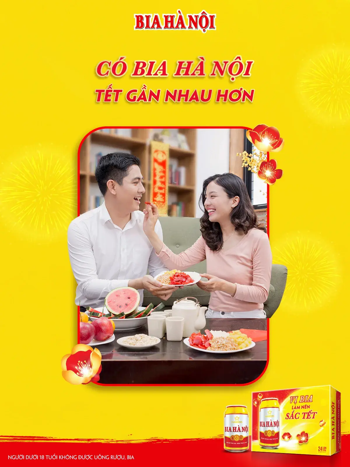
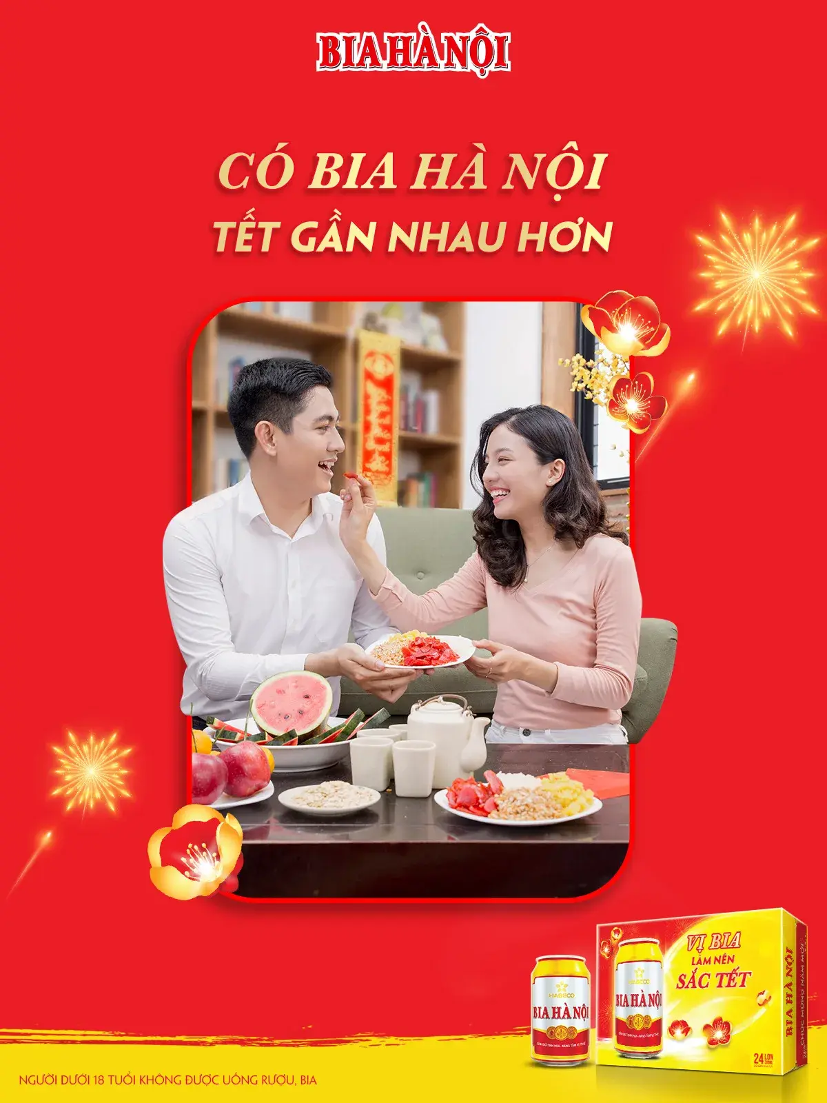
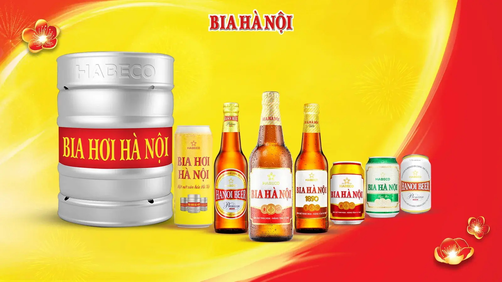
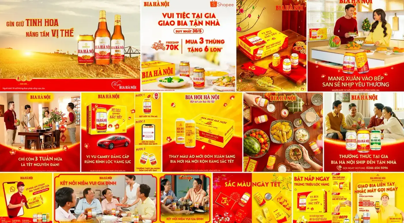
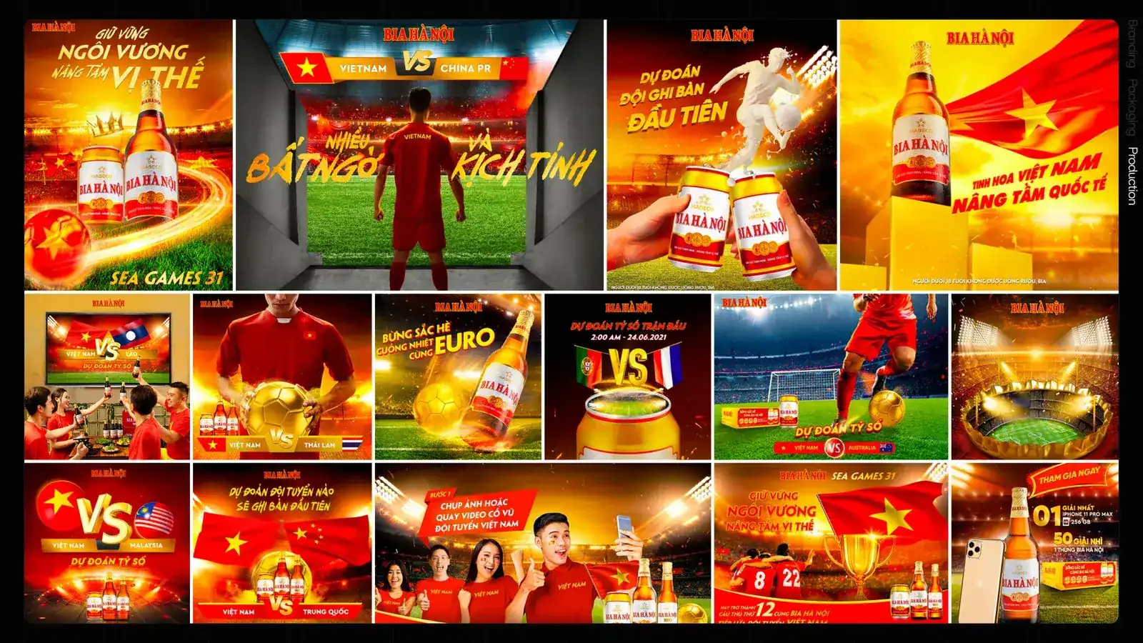
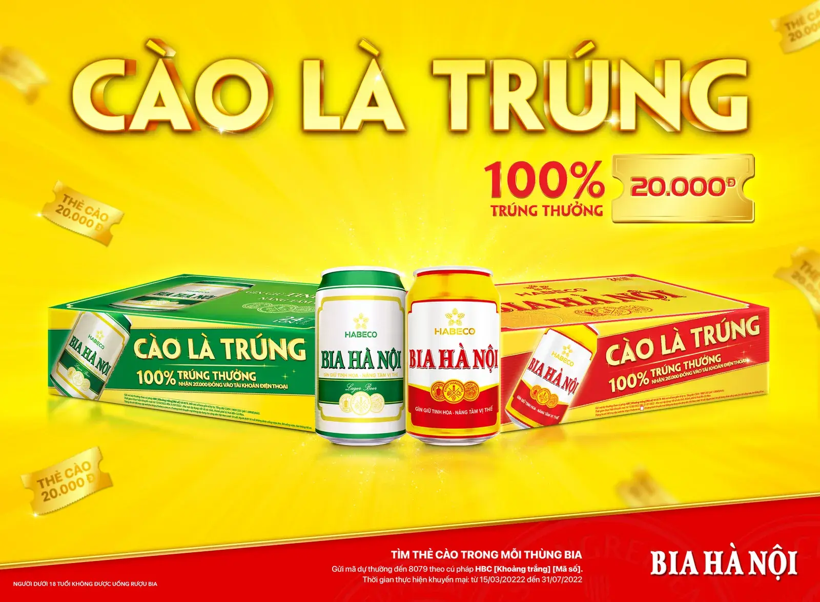
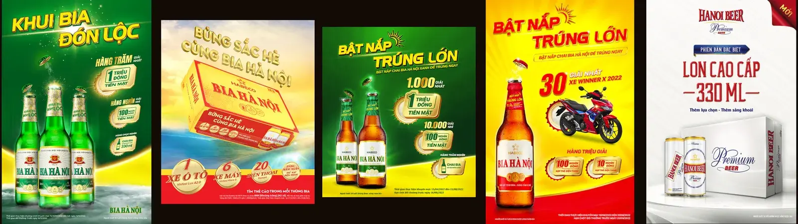
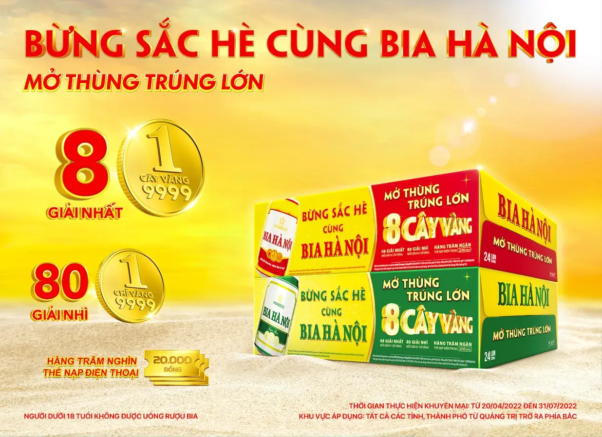
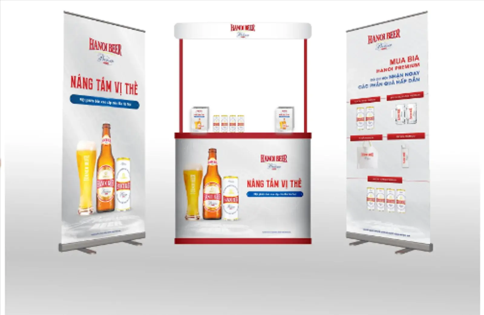
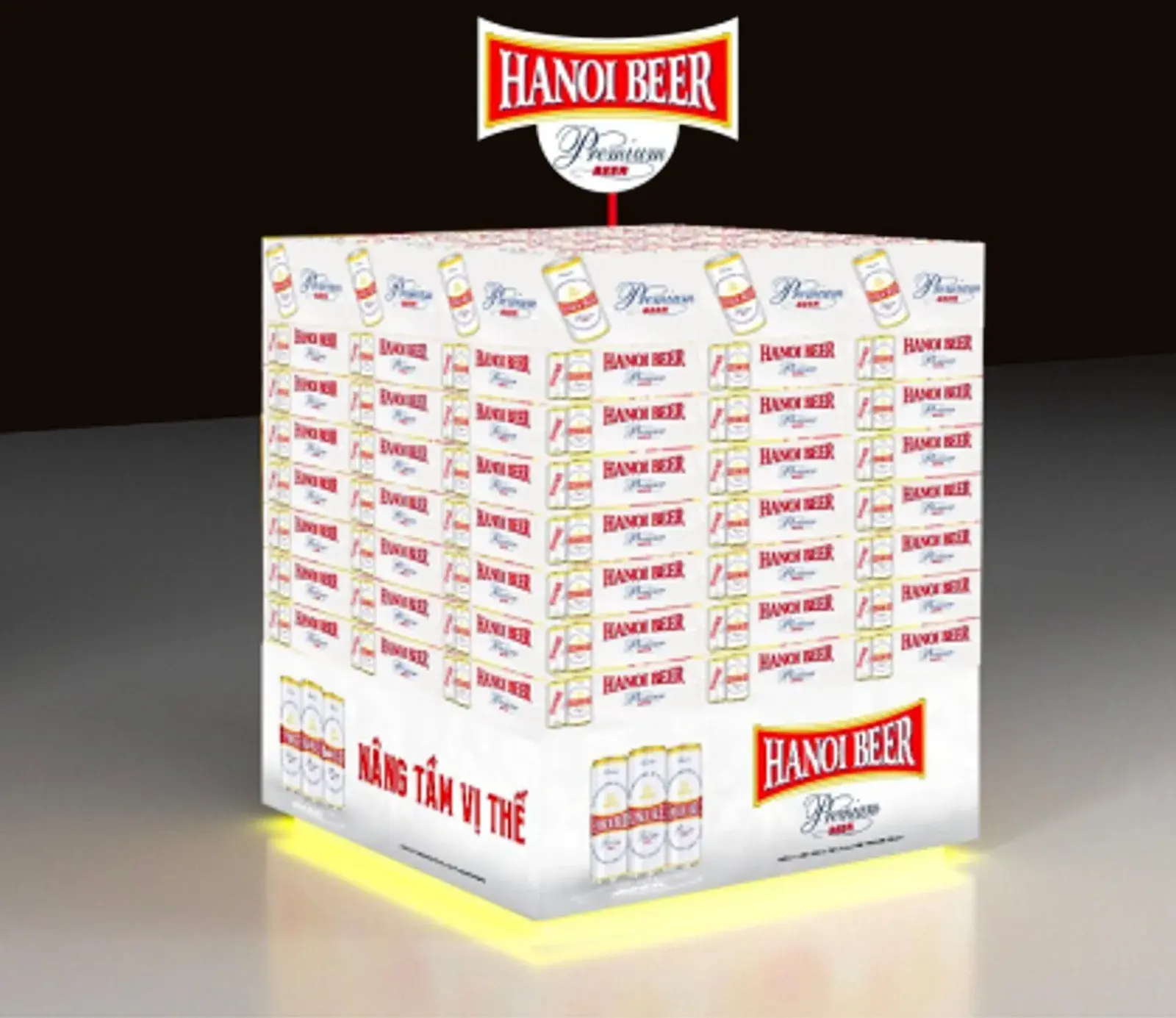
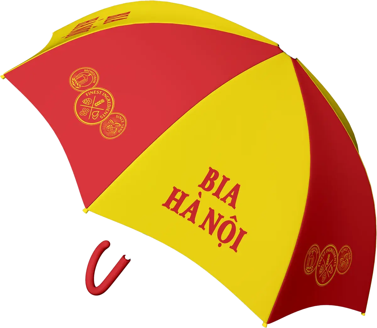
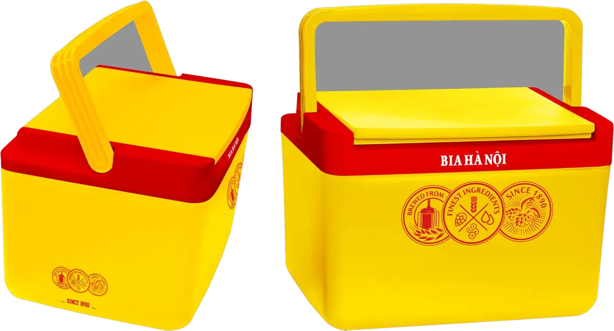
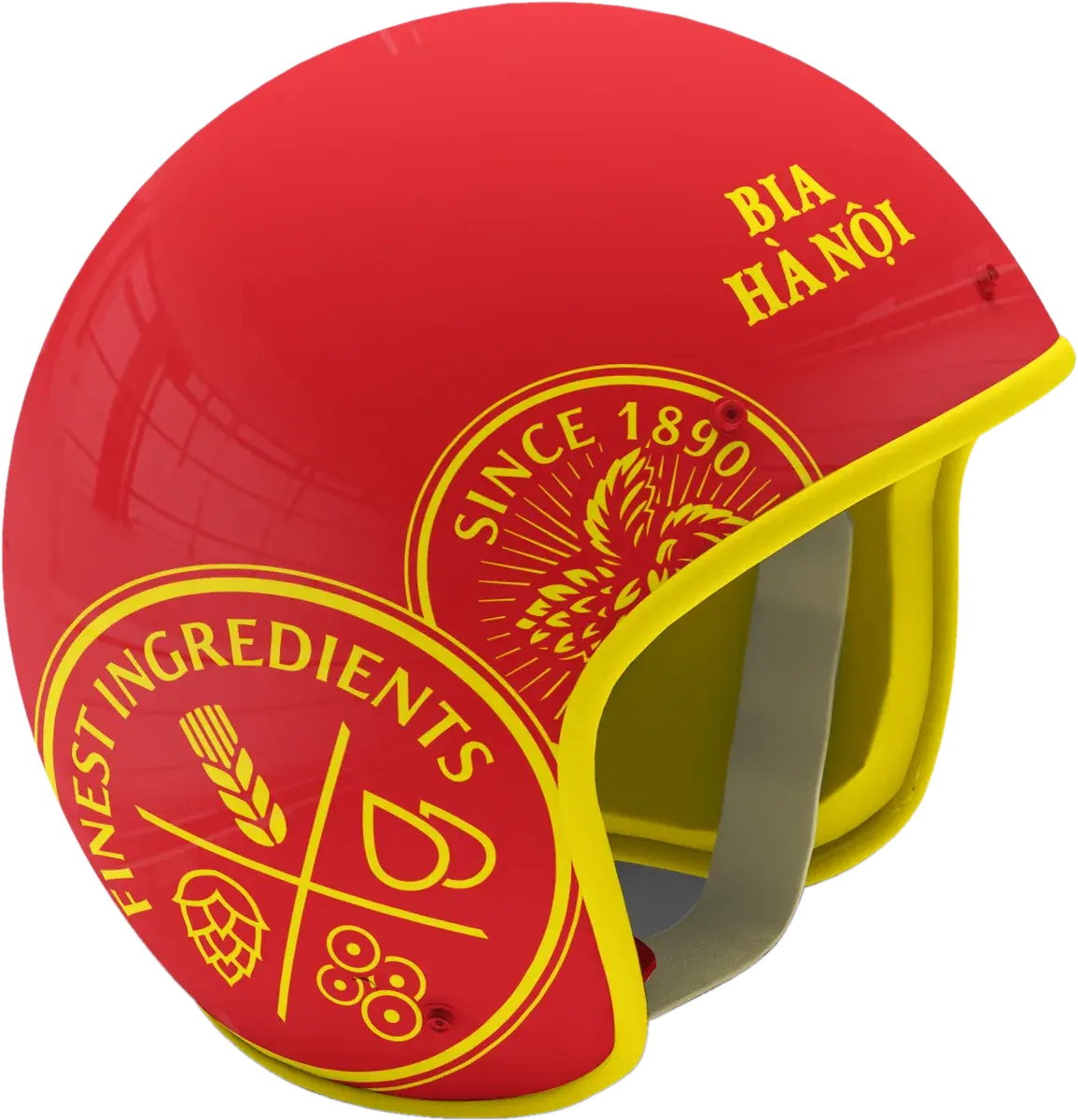
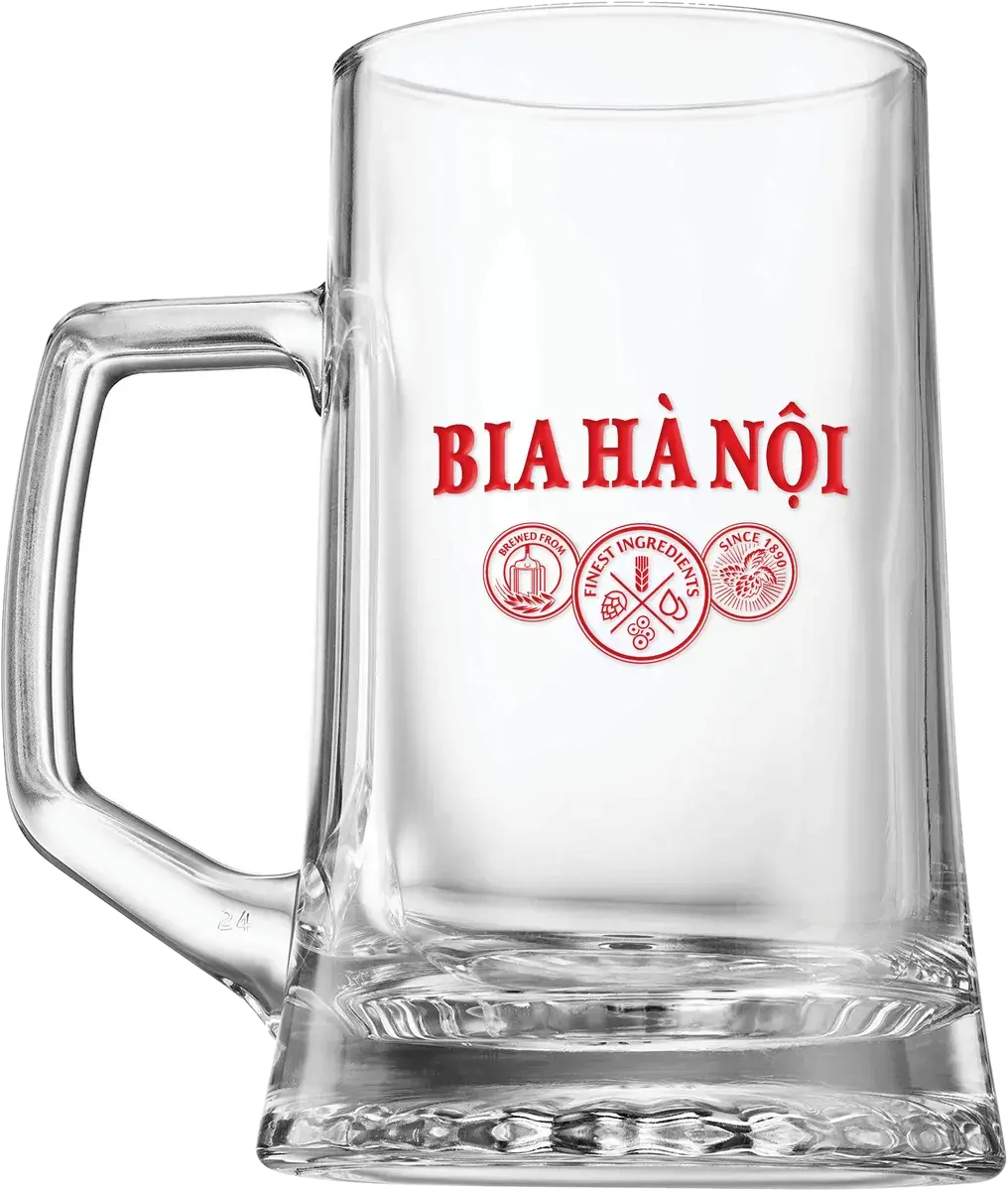
We started from the city, not the bottle. A watercolour Hanoi — old quarter, Ô Quan Chưởng, Trấn Quốc, Long Biên and the new towers on one sheet — became the base of the “Tôi yêu Hà Nội” line. For Tết a gold motif set of clouds, chrysanthemum, apricot blossom, coins and mountains ran from post frame to gift packaging, and the beer foam itself became the picture frame. Same identity, different tempo: thematic key visuals, promotion mechanics, a year of always-on content, POSM and the merchandise that ends up on the table.
OUTCOME
Ran as an always-on social programme through 2021–2022, including the “Tôi yêu Hà Nội” platform, Tết content, promotion key visuals, POSM and branded merchandise.
THE WORK
Vị bia làm nên sắc Tết
A serif for the memory, a condensed sans for the shout
Baskerville carries the lines that want to sound like the city remembering itself; Bebas Neue carries everything that has to be read across a street — promotion mechanics, prices, dates. Both hold full Vietnamese diacritics at poster scale and at post scale.
NEXT PROJECT