Wine has a harder Tết problem than spirits. A whisky gift box can lean on weight, metal and architecture; wine arrives in a lighter, friendlier register, and the category’s Tết shelf is mostly red cartons with blossom printed on them. Two very different projects found two ways out — one in structure, one in light.
Use the brand’s punctuation as the mechanism
[ yellow tail ] owns two things and almost nothing else: the ‘Roo and the Hop, plus the square brackets its name sits inside. A Tết 2026 gift carton had to feel like a Vietnamese new-year wish without borrowing the red-and-blossom vocabulary, and without inventing an asset the brand does not own.
The logo is a name held inside brackets — so we opened them and let four Vietnamese wishes fill the blank, each closed by the same word: HƠN, “more”. The brand’s own punctuation became the wish machine, which is why the pack cannot be copy-pasted by a competitor: nobody else has those brackets.
Then the Hop stopped being a mark and became architecture. One continuous arc crosses all four faces, so a row of cartons on a shelf reads as a single wave rather than as four repeated logos. That is a decision you can only make if you have looked at the shelf, not just at the dieline.
Or let the product be the light source
Sometimes the gift is not a carton at all — it is a bottle that has to look expensive in a photograph, not in a description.
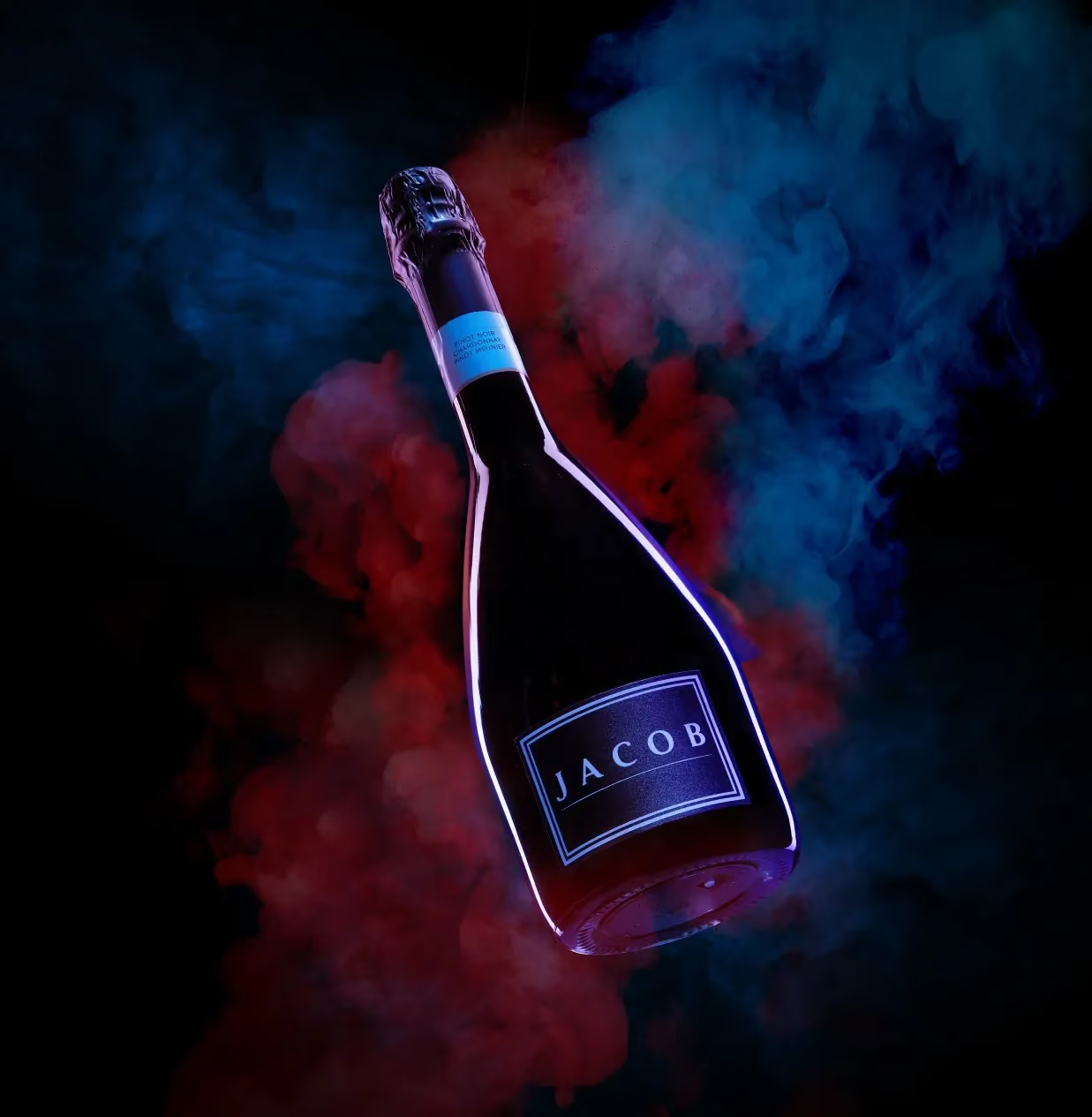
For Jacob’s Creek, the sparkling cuvée and gift set already had the answer built in: the label glows, a cyan outline on a dark bottle. So one rule ran the entire shoot — the label is the light source. Everything else exists to carry that light further: a single hard key raked along the label edge, black acrylic under everything for a full mirror, and a set list kept to crushed ice, cut cubes, dry-ice smoke, blue satin and marble.
Near-black, electric blue, one gold accent, and nothing else. No festive props at all — and the images still work for a gifting season, because “expensive and special” is what the season is actually asking for.
What both approaches have in common
Neither pack starts from the season. Both start from something the brand already owns and then ask what it can be made to do in January.
That is the same logic behind The Glenlivet’s three Tết editions, where the founder’s own portrait coin became the moon — and it is the reason those systems can be renewed year after year while a printed blossom has to be replaced.
Three checks before the artwork ships
Cover the logo — is it still your brand? If not, the design borrowed rather than built.
Line up four cartons — does the shelf get better or noisier? Wine sells in rows. Most Tết packs are designed as single objects and photograph as a mess.
Would the photograph work without any seasonal props? If the product only looks special because of what is around it, the packaging is doing none of the work.
![[ yellow tail ] — Tết 2026 — case study](/images/covers-v2/yellow-tail.avif)