Fruit is judged by eye, and quickly, long before anyone reads a label. Fruit packaging design therefore starts with one question that the pack has to answer fast: where did this come from, and how recently was it picked? Everything else, from the board to the print finish, is there to keep that answer believable on a shelf and in transit.
Show the orchard, not a paragraph about it
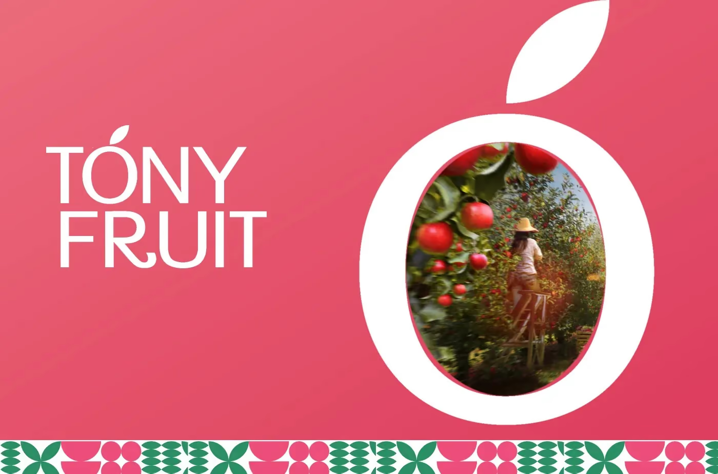
Tóny Fruit imports fruit from orchards on four continents and sells it in Vietnamese supermarkets. The brief was to say picked this week, from there, without a paragraph of explanation. We built the key visuals around one line, Fruit Garden of the World, and each one puts a real orchard behind the wordmark. The packaging carries the same orchard. The identity also has a handwritten line, Tươi như vừa hái tận vườn (fresh as if just picked from the garden), set in green script.
Words like fresh and premium appear on every fruit pack, so they prove little. A photograph of a particular place is evidence, which is why it works harder than an adjective. It only holds when it is true: the image has to come from the orchard the fruit came from, and a grower who cannot show their own farm is better off with a plain pack than with stock scenery.
One system, from the gift box to the shelf tag
A supermarket sells the same fruit loose, in trays, in gift boxes and under shelf tags, and the shopper should read all of them as one brand. For Tóny Fruit the gift box lid pairs a hand, a branch pattern and the wordmark on white, the packing tape repeats the mark on pink, and a thank-you card goes into the box. A round pink apple mascot handles the greeting at child height. The branch pattern is a strip of apples and leaves, so it can be cut to any length and sit on tape, on a box edge or on a tag without being redrawn, and the system stays intact all the way down to the shelf tags.
The practical rule behind this is to decide early what repeats and what changes. Here the wordmark, the pattern and the colours repeat, and the photograph is what changes from one visual to the next. Anything that has to be redrawn for every format will drift by the third format.
What the pack has to survive
Fruit lives in cold, damp rooms, and a pack that looks right on a desk can fail there. Paperboard and corrugated lose stiffness as they absorb moisture, so for chilled fruit it is worth asking the printer about coated boards or a moisture-resistant liner, and testing a sample in the real cold room rather than at the printer. Fresh fruit also gives off moisture and gas as it ripens, which is why cartons and trays often carry ventilation holes. Those holes weaken a stack, so the structure and the artwork need to be settled together, and a logo should never sit where a hole will be punched.
Labels and tags behave differently on cold, damp surfaces: an adhesive that holds in the office can lift on fruit skin or on a plastic tray that fogs, so test the real material. Gift boxes have the opposite problem, because fruit is heavy and uneven. The insert, the base board and any handle have to carry the weight, and the first sample should be filled with real fruit.
BFS designs packaging systems like this for food, drinks and FMCG brands in Vietnam, and we begin with structure before any artwork, as described in packaging design in three projects. What moves the cost of that work is covered in what drives the cost of packaging design in Vietnam, and the packaging design service page lists what we deliver.