A coffee brand does not need one pack. It needs three, and they answer to different rooms: a retail bag that has to win at arm’s length on a crowded shelf, a gift box that gets one chance in somebody’s hands, and an export carton that nobody photographs but everybody in the supply chain reads. Designing one and stretching it to cover the other two is the most common way Vietnamese coffee packaging goes wrong.
The shelf rewards legibility before beauty
At 250 grams on a supermarket shelf, a bag competes with twenty others at a distance of about one metre, under lighting nobody chose. What reads at that distance is a shape, a colour block and one word. What does not read is a paragraph about terroir, a watercolour landscape, or a logo drawn to be admired at 100%.
The practical test is unglamorous: print the front at real size, tape it to a shelf next to four competitors, walk three metres back. If the only thing telling you the brand is the logo, the pack is not finished.
Provenance has to be provable, not decorative
Vietnam is one of the largest coffee exporters on earth and most of that volume leaves the country anonymous — sold by the tonne, re-branded elsewhere. A producer brand exists to reverse that, so the pack has to carry proof, not mood.
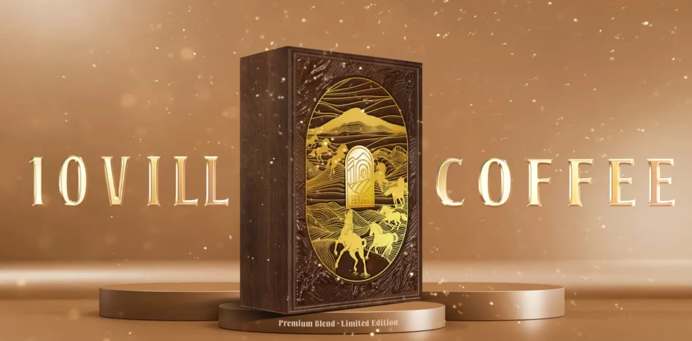
For 10Vill Coffee the origin argument is specific: Hamlet 10, red basalt soil, an R&D centre. The system turns that into things a buyer can check — ten defined sensory dimensions, a flavour compass, a traceability story that runs from the plot to the cup. Provenance drawn as a generic mountain range is decoration; provenance drawn as a place with a name is an argument.
Three tiers, one architecture
Classic, premium, export signature: the range has to separate on shelf while staying one family. The way to get both is to fix the architecture and vary only one layer — colour, material or a single graphic element.
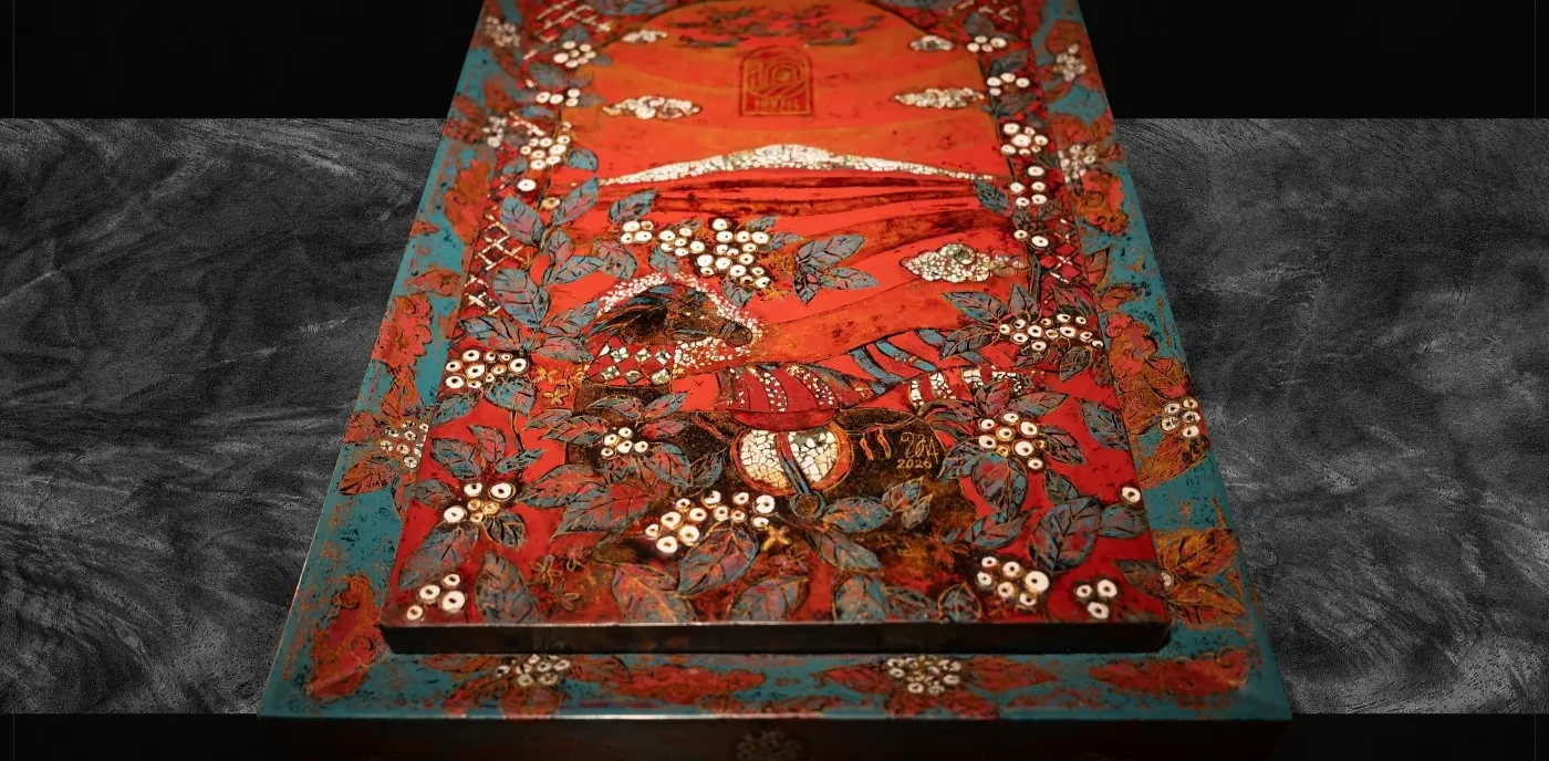
Fixing the structure is also what makes the top tier possible. The lacquer gift box made with artist Đinh Văn Sơn — 200 roasted eggshells, seven prototypes, six months, Gold at the MUSE Design Awards 2026 — sits on top of the same system rather than beside it. That box is not the range; it is the argument for the range, and it earns its cost by being photographed.
Material decides more than the artwork does
Coffee packaging is a barrier problem before it is a graphics problem. Whole bean and ground need a degassing valve and an aroma barrier; a kraft look means a laminate structure that has to be specified, not implied; a matte finish shows every scuff after three weeks of handling.
Get this order wrong and the artwork gets redrawn: a design approved on a flat rectangle meets the real dieline and loses a third of its front panel to the gusset. Structure first, artwork second.
The export carton is a design surface too
The box that ships is the one buyers and distributors see most often, and it is usually the one nobody designs. It does not need beauty; it needs the brand to be recognisable in a warehouse, and the information a customs officer and a distributor both need in the places they look.
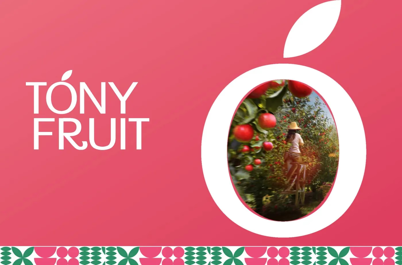
Tóny Fruit treats the shipping carton as part of the system for the same reason: the identity has to survive from the export box to the supermarket shelf to the sticker on a single piece of fruit. A brand that only exists at retail size is a brand that disappears everywhere else.
What to settle before design starts
- Which formats ship this year — retail, gifting, export, or all three?
- What is the barrier requirement, and does the finish survive handling?
- What proves provenance, and can a buyer verify it?
- Which layer changes between tiers, and which one never changes?
Answer those four and the artwork gets easier. Skip them and the artwork gets redrawn — usually in the month the printer’s slot was booked.
More on the identity side of the same project in coffee brand identity in Vietnam, and the full F&B track in food and beverage.