Vietnam is one of the largest coffee exporters on earth, and almost all of that volume leaves the country anonymous — sold by the tonne, re-branded somewhere else, returned to the shelf under another name.
A producer brand starting from a single hamlet inherits none of that scale. No equity, no visual language, and no reason for anyone to pay a specialty price. The question is not “what should the logo look like”. It is: what would make three intangible things legible at once?
The three intangibles
Provenance — where it grew, and why that matters. Easy to claim, hard to make felt.
Science — cultivar, altitude, processing, roast. The part that convinces a buyer, and the part that bores everyone else.
Craft — the human hand in it. The part that convinces a gift-giver.
Most coffee brands pick one and lose the other two. A logo cannot carry all three; a system can.
Find the number the brand already owns
For 10Vill Coffee the number 10 already belonged to the brand twice: Hamlet 10, the origin, and in Eastern numerology the figure of completeness.
We made it belong a third time — ten sensory dimensions of a complete cup, drawn as a Flavour Compass that a farmer, a roaster and a buyer can all read the same way. That is the whole trick: one device that says provenance to a consumer, science to a buyer, and completeness to someone choosing a gift.
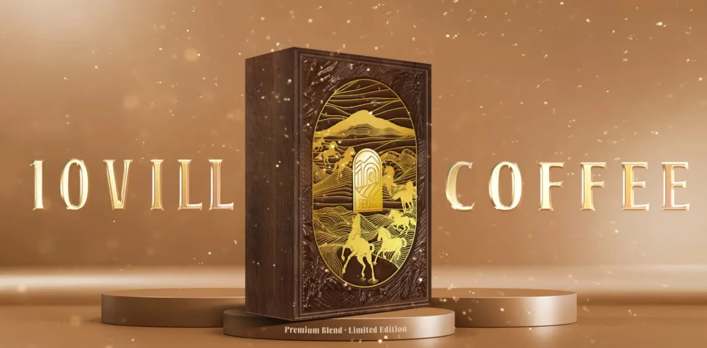
Around it came the line Thập Vị Tinh Hoa, a single-line arch mark, the full guideline system, a three-tier packaging architecture, the brand film, the launch event and a ten-chapter website.
The system has to stretch, not scale
A coffee identity has an unusually wide range to cover: a 250g retail bag, a gala stage, an export carton, a website. Those are not the same design problem at different sizes — they are different problems.
What holds them together is a construction, not an image. The arch mark works at the width of a bag seam and at the width of a stage; the compass reads as an icon at 24px and as a diagram at A2. Anything that only works at one size is decoration.
Let the top tier be genuinely different
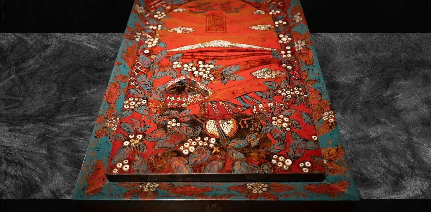
The last move is the one most brands skip. Above the retail range, the lacquer gift box made with Đinh Văn Sơn is not a premium version of the packaging — it is a different object, made by hand over six months, and it won MUSE Gold.
That box does not sell in volume. It does something the volume products cannot: it proves the brand means what it says about craft, and everything below it in the range borrows that credibility.