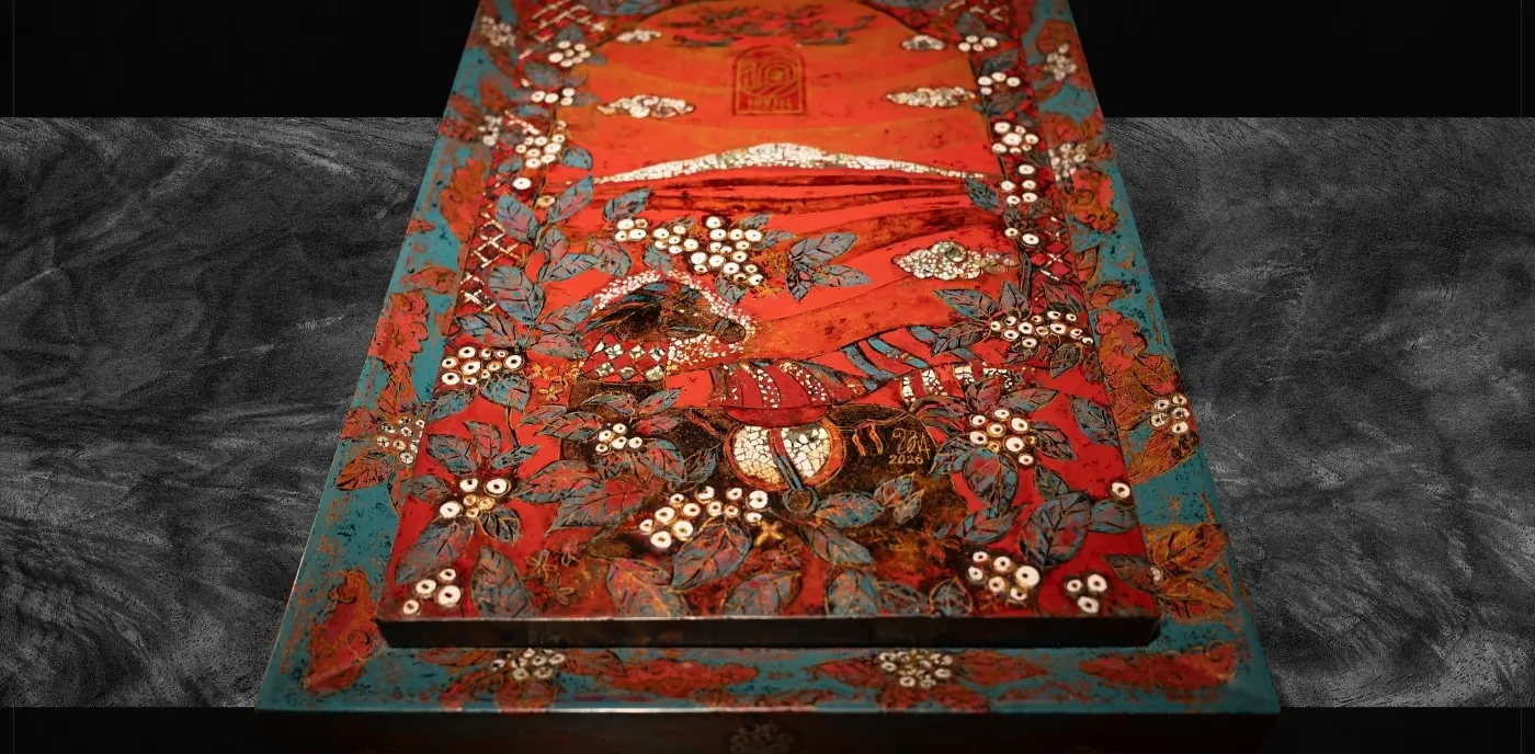
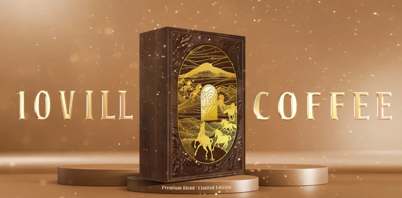
Most gift boxes are printed. This one was made.
10Vill Coffee wanted a box that could sit next to a collector’s piece rather than a retail SKU, and the way to get there was not a heavier board or a shinier foil. It was to hand the surface to someone who works in lacquer — the artist Đinh Văn Sơn — and to design for his hand instead of a printing machine.
It took six months, more than two hundred roasted eggshells and seven prototypes. It won MUSE Design Awards Gold in 2026.
Designing for a hand changes the drawing
A print file assumes perfect registration and infinite repetition. Lacquer inlay assumes neither. Every shell fragment is placed by hand; no two boxes are pixel-identical, and the artwork has to be drawn so that this reads as craft rather than as error.
Practically, that meant three things:
- Motif over pattern. We drew the coffee cherry as an inlay motif with room around it, not as a repeating field. A tight repeat would have made every small deviation look like a mistake.
- Contrast that survives the material. Eggshell against black lacquer is the highest-contrast pairing in the craft, and it is legible at arm’s length — which a gift box has to be, because it is seen on a table before it is held.
- One surface, not panels. The structure was set so the lid reads as a single painted plane. The moment a lid looks like a printed panel glued onto a box, the whole object drops a category.
The material sets the palette, not the other way round
We sampled the colours directly from the finished lacquer work rather than specifying them upfront: vermilion, turquoise, gold leaf, eggshell white, coffee wood. The dark chapters sit on true lacquer black; the light ones sit on warm ivory paper, never pure white — with a craft object, pure white reads as clinical and kills the warmth the material spent six months earning.
Reusing coffee wood for the structural parts closed the loop: the same plant that produced the beans produced the box that carries them.
Six months is a schedule, not a delay
The craft timeline is the project timeline, and it does not compress:
- Concept and motif drawing.
- Prototype rounds — seven, in this case, because inlay density and shell tone both had to be found by making.
- Shell preparation: roasting, cracking, sorting by tone. Two hundred-plus shells is not a figure of speech; it is the raw material count.
- Lacquer layers, each one cured before the next.
- Inlay placement, by hand, one fragment at a time.
- Polishing back to reveal the shell.
A brand planning something like this for Tết needs to start a full season earlier than a printed pack. That is the real cost — not the material.
Photograph it as an object
The last decision mattered as much as the first: we shot the box as an artefact, not as packaging. Raking light across the surface, macro on the shell edges, the artist’s hands in frame. A studio pack shot on white would have flattened six months of work into a product listing.
If the making is the story, the photography has to admit it.
The craft itself, and what it asks of a brand that wants to use it, is covered in Vietnamese lacquer and eggshell inlay in packaging design.