Work — Hoàng Anh Food · BFS Studio, Ho Chi Minh City
Hoàng Anh— Authentic Taste of Life

THE BRIEF
Hoàng Anh supplies flavours and food ingredients to Vietnam’s food and beverage industry. The old mark — six strokes spiralling inward — had aged, and the business had grown two distinct halves that customers could not tell apart from the outside.
WHAT WE DID
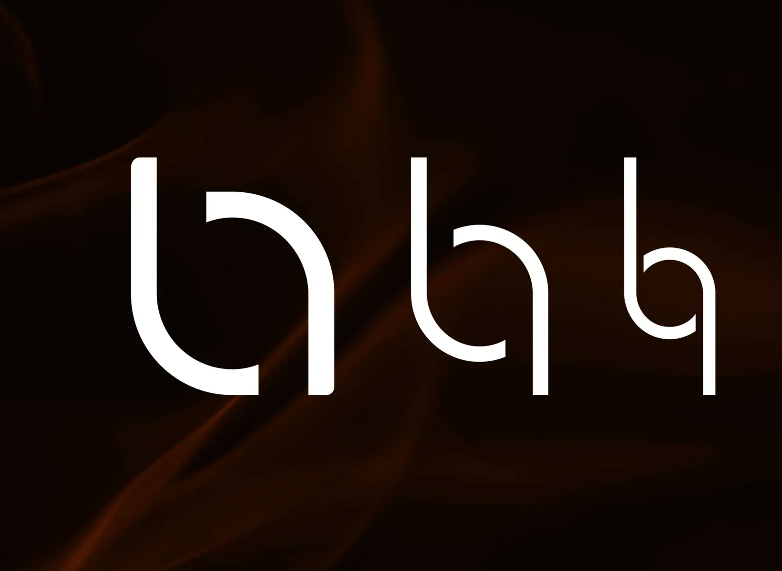
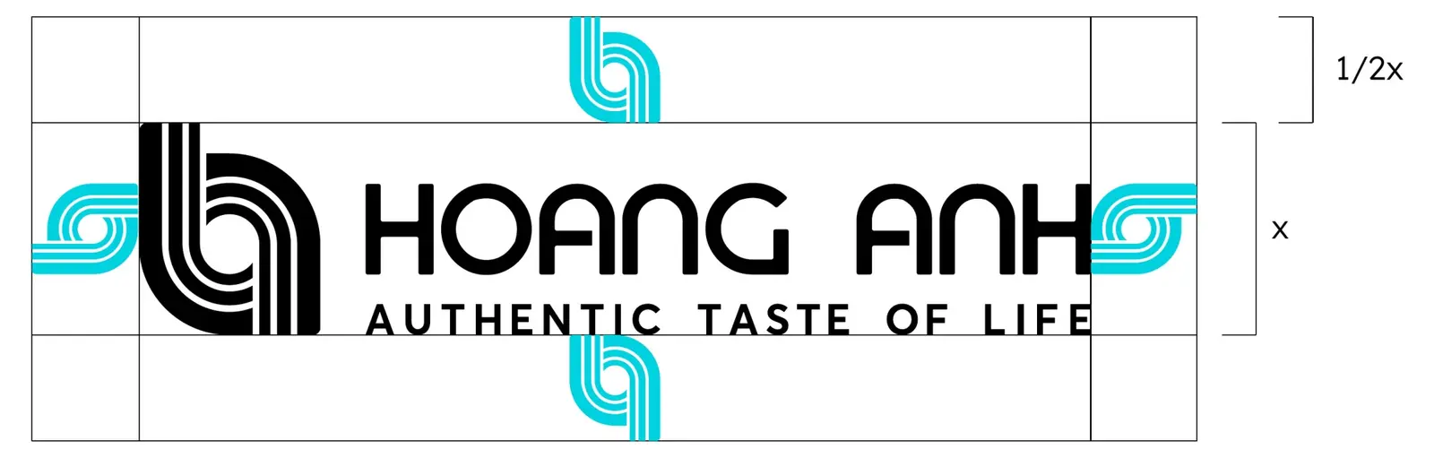
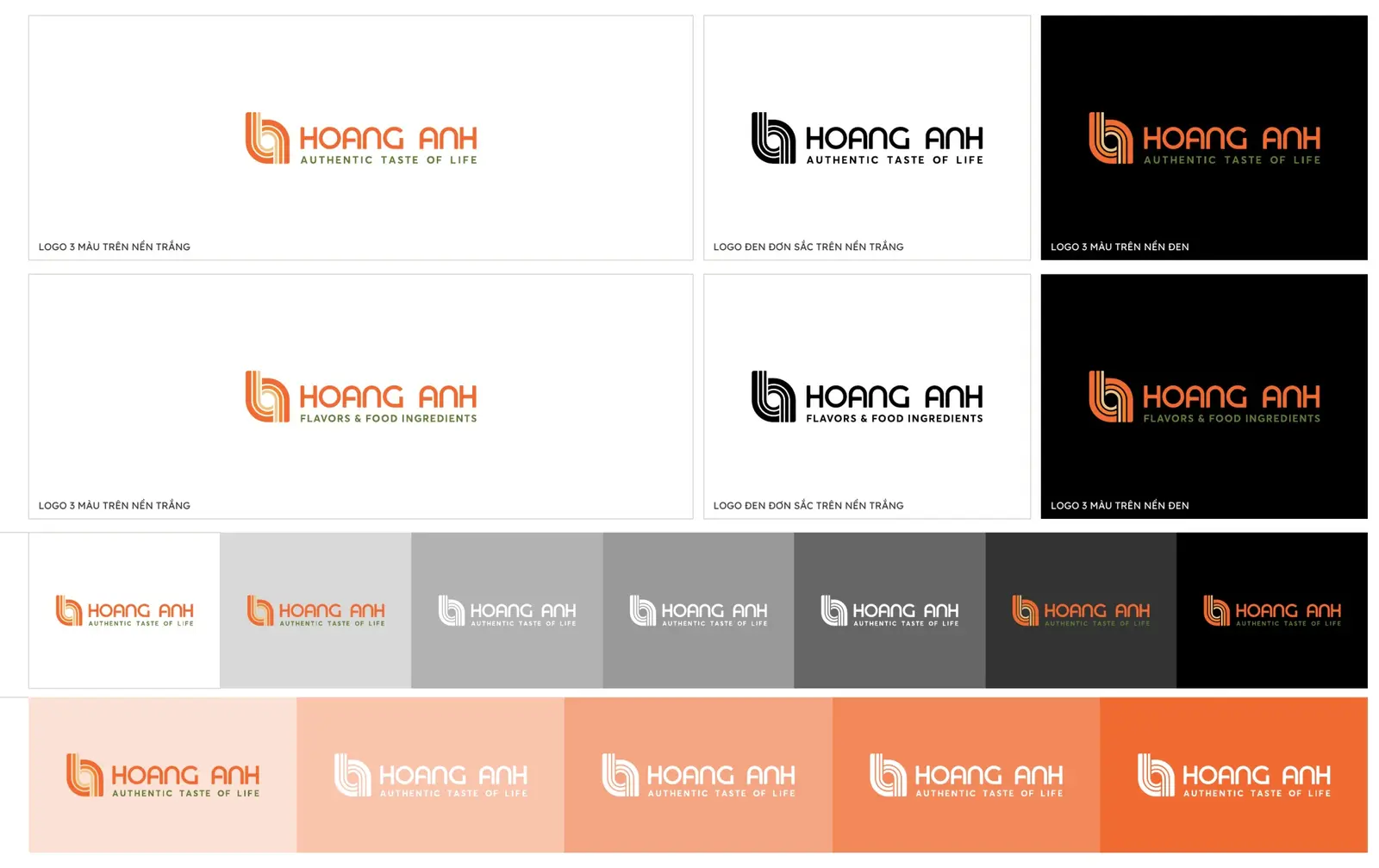
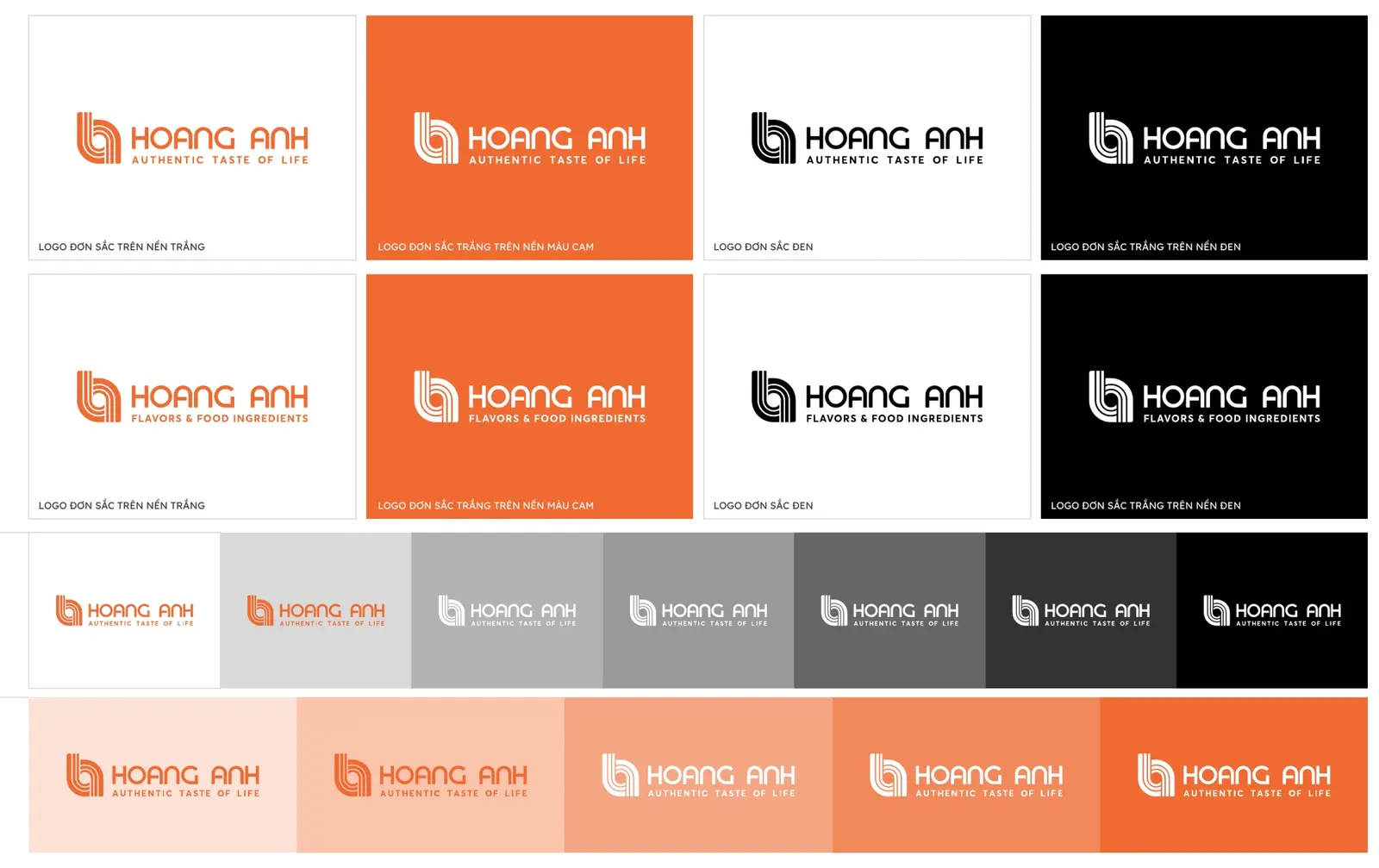
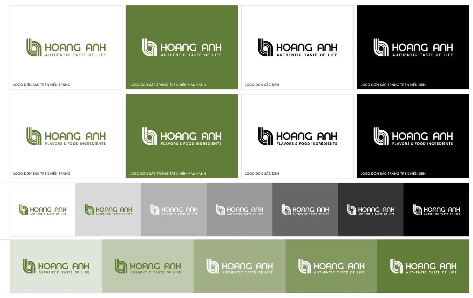
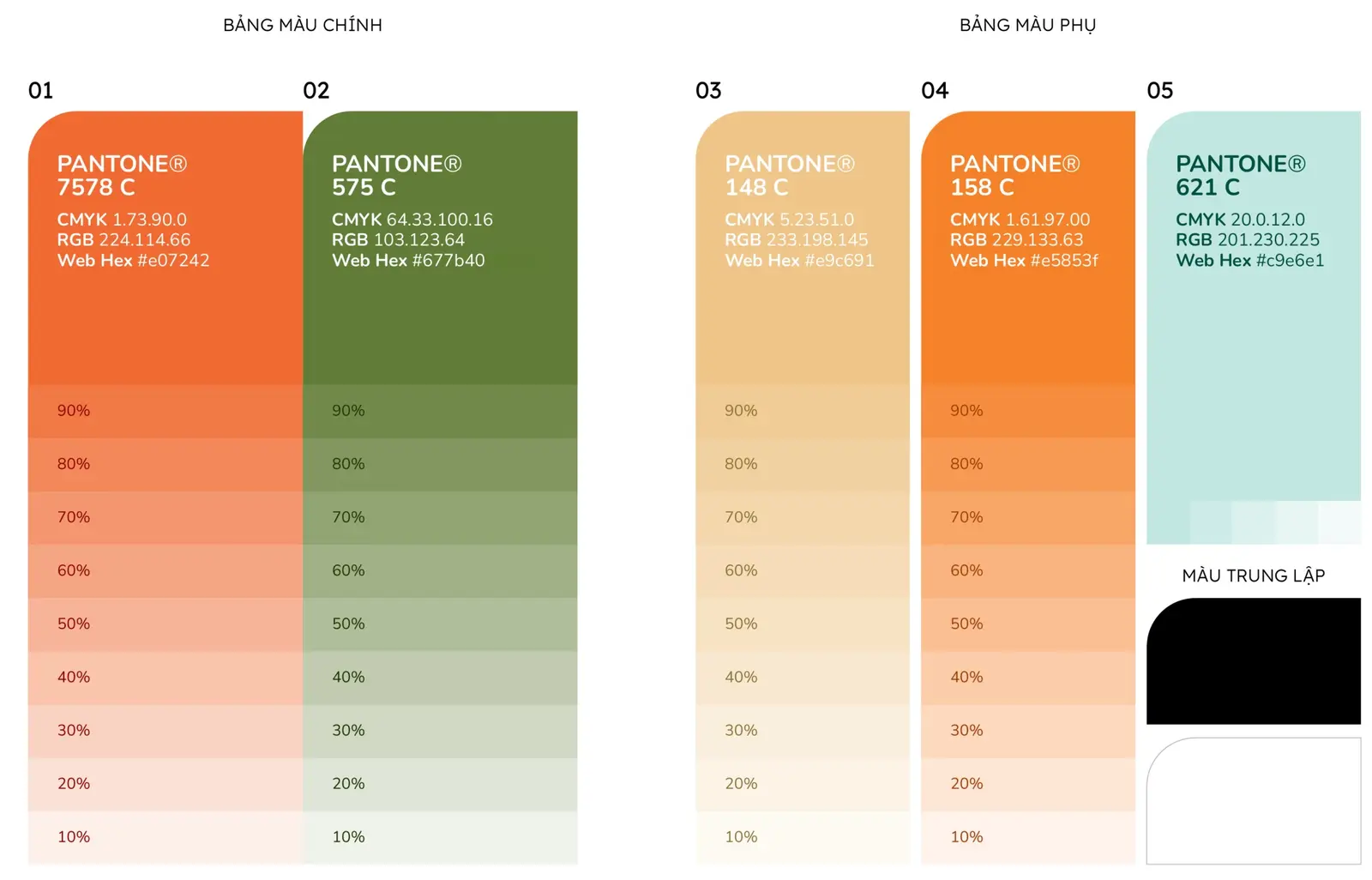
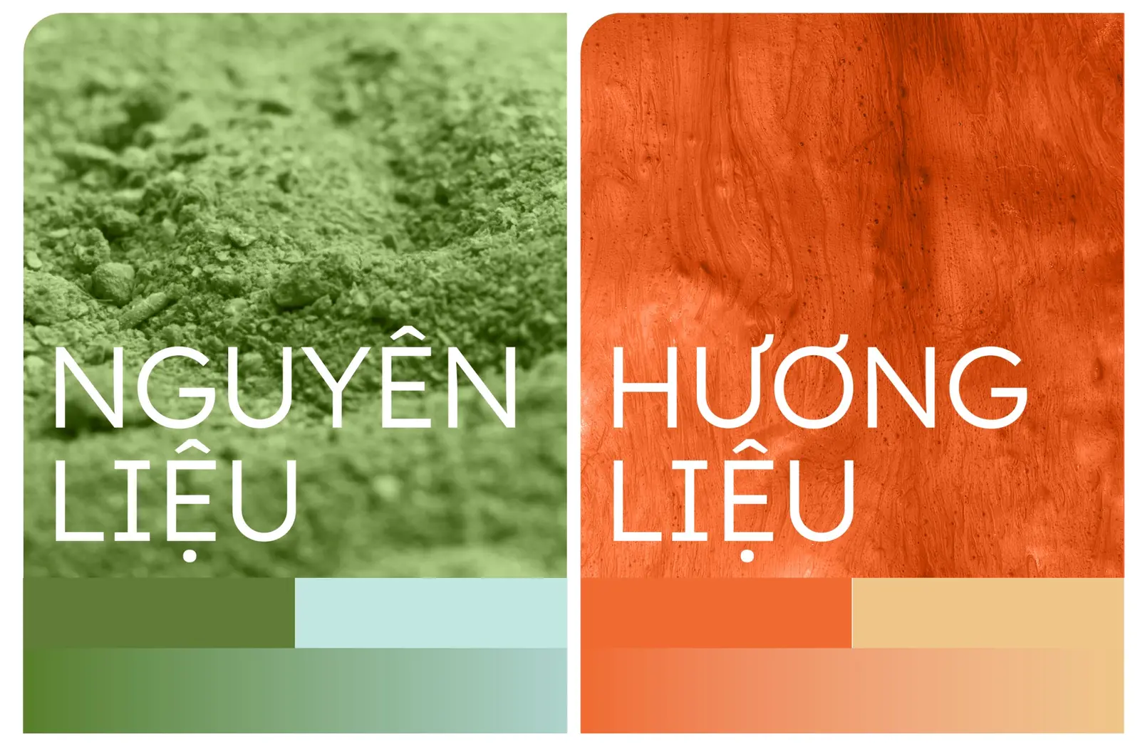
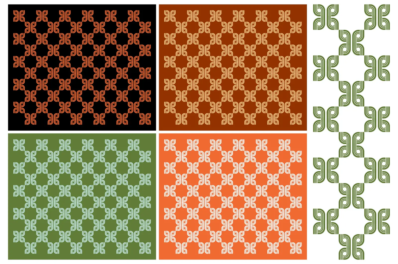
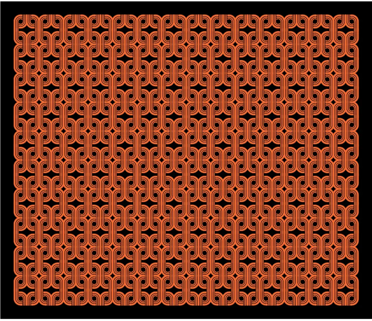
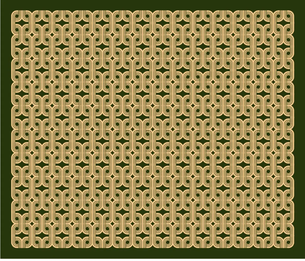
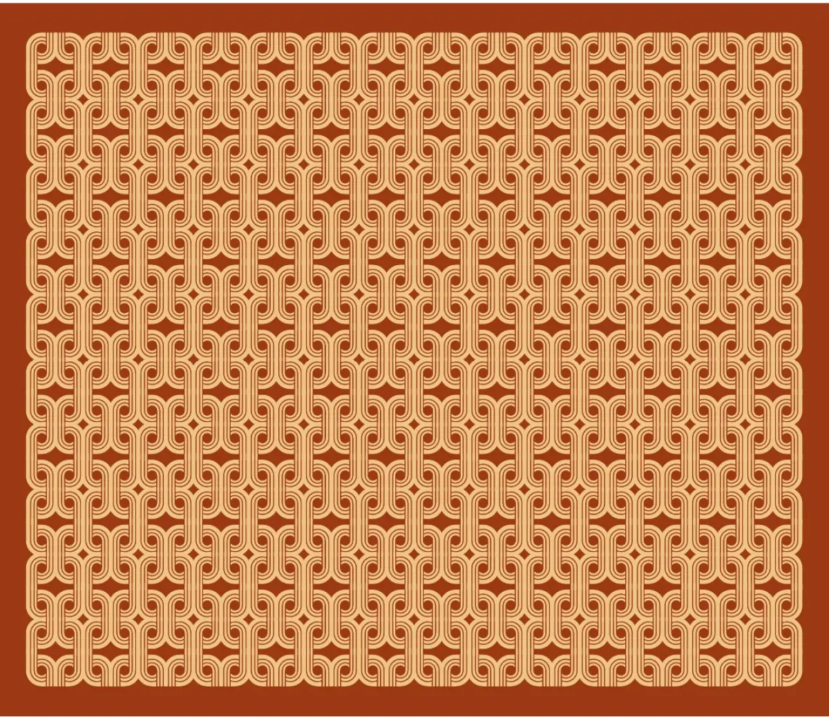
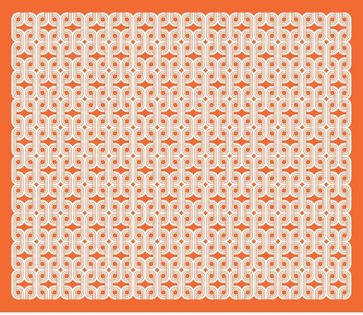
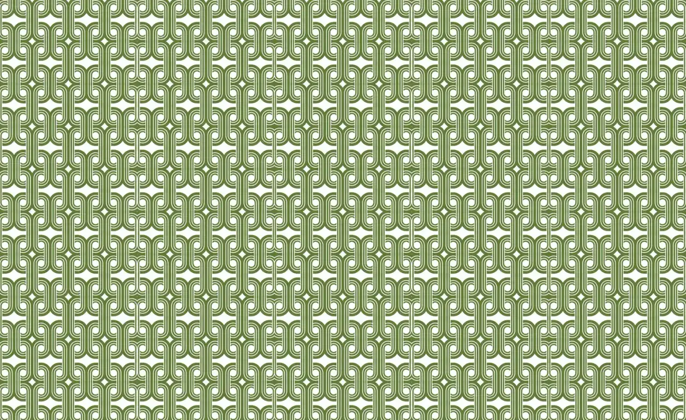
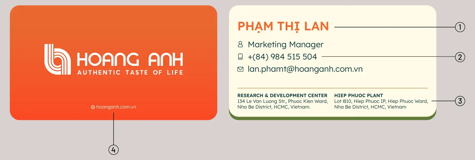
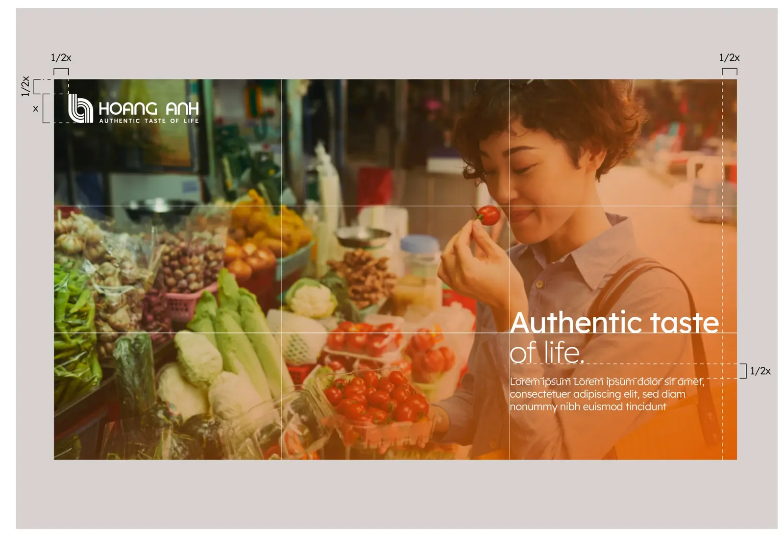
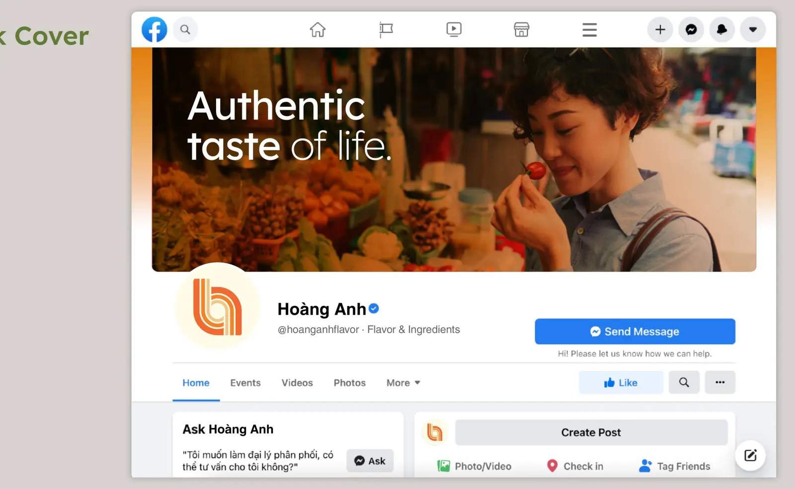
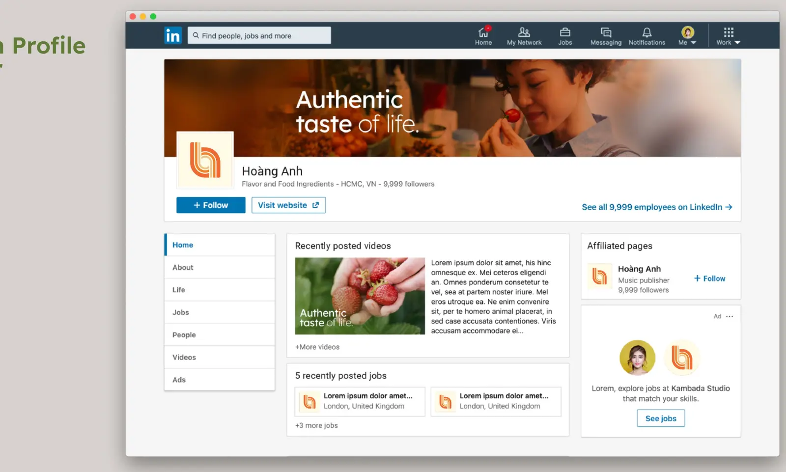
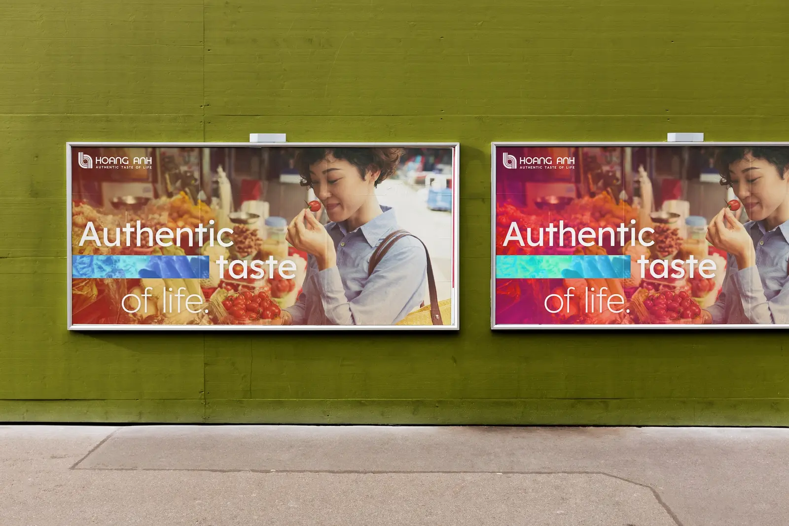
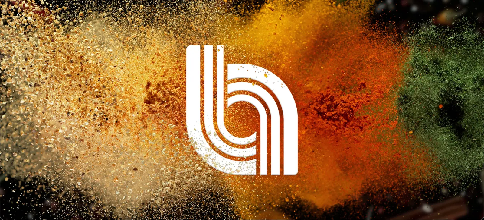
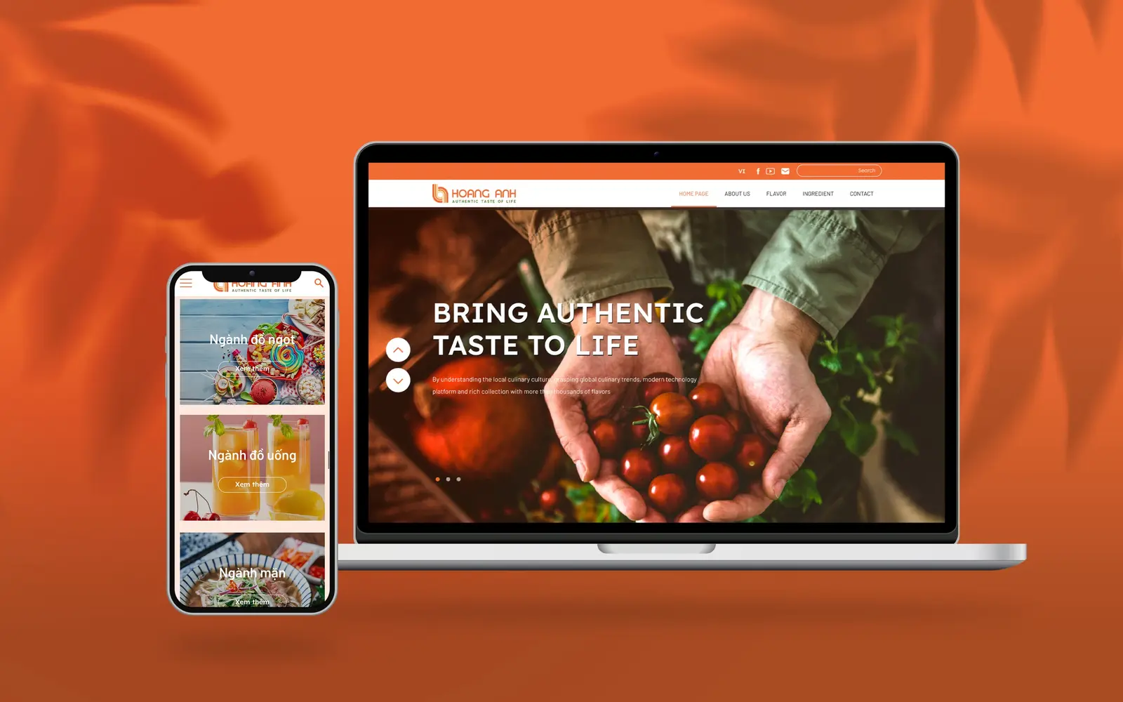
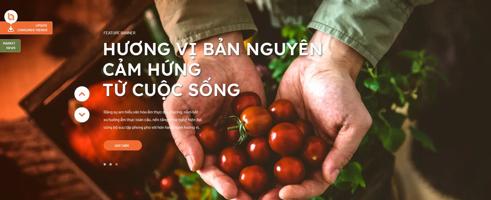
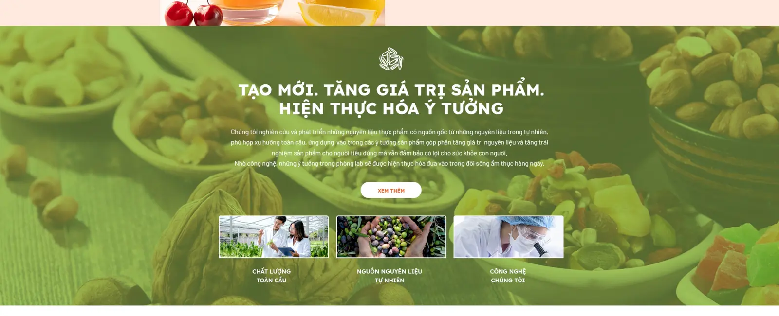
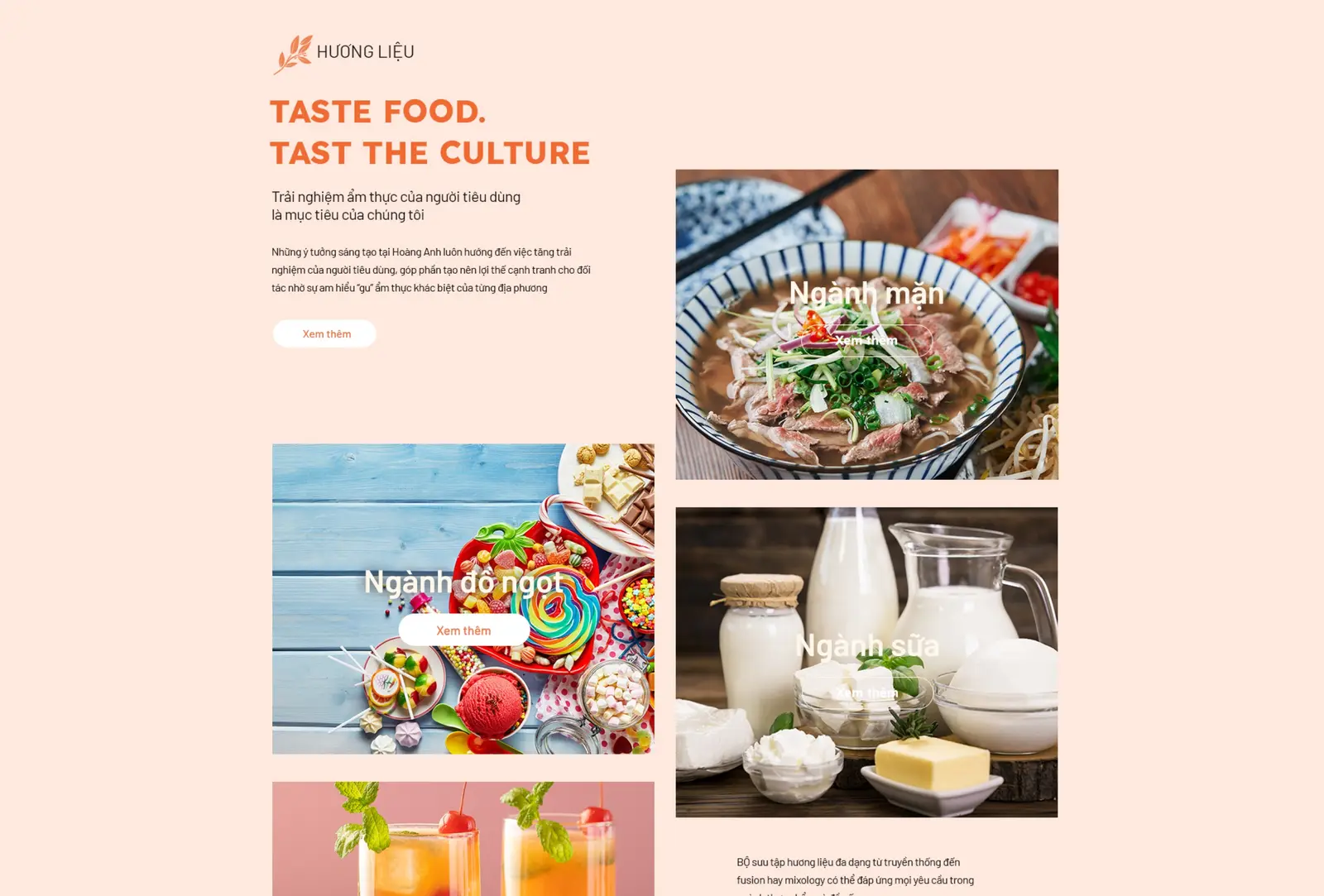
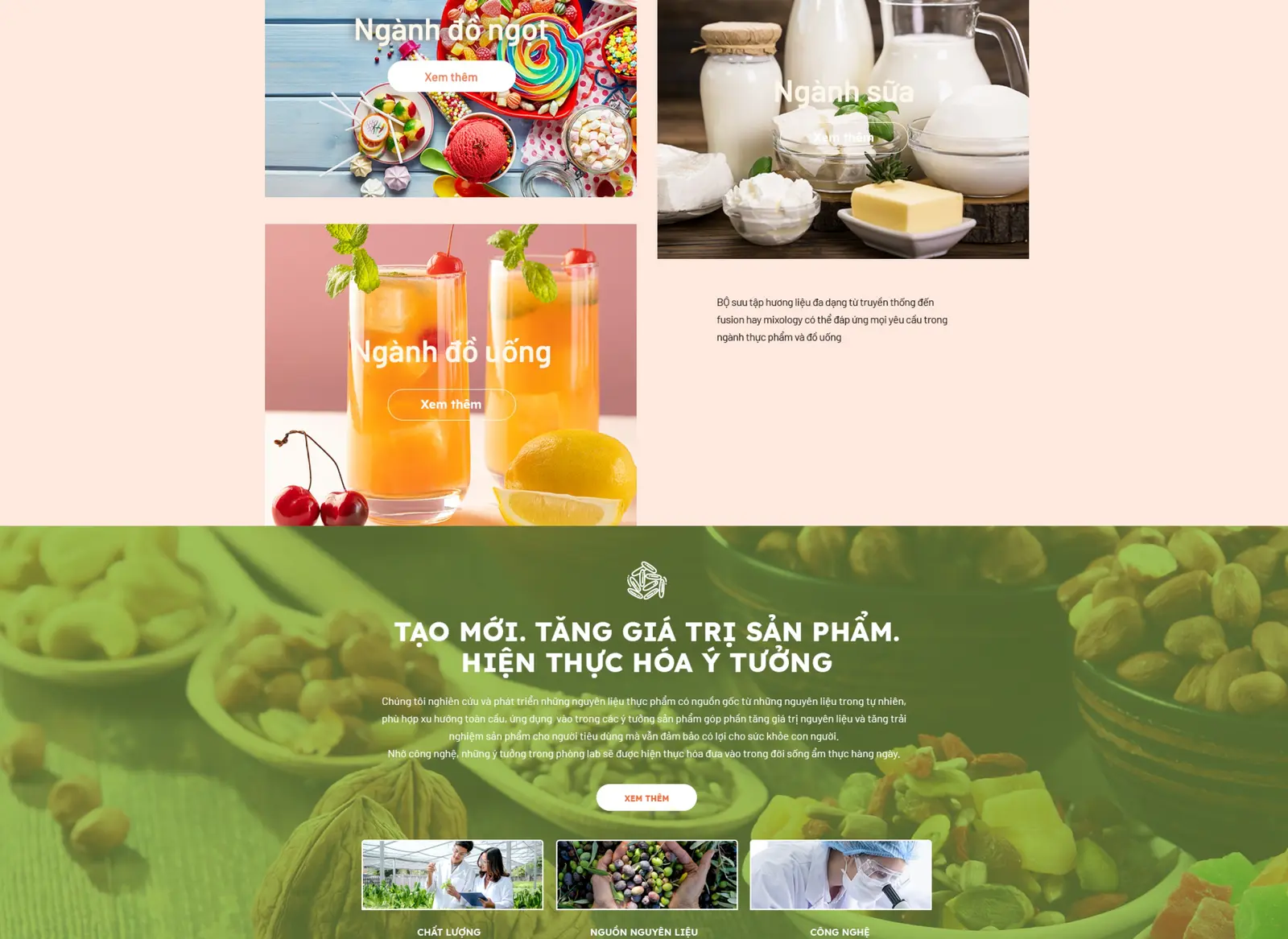
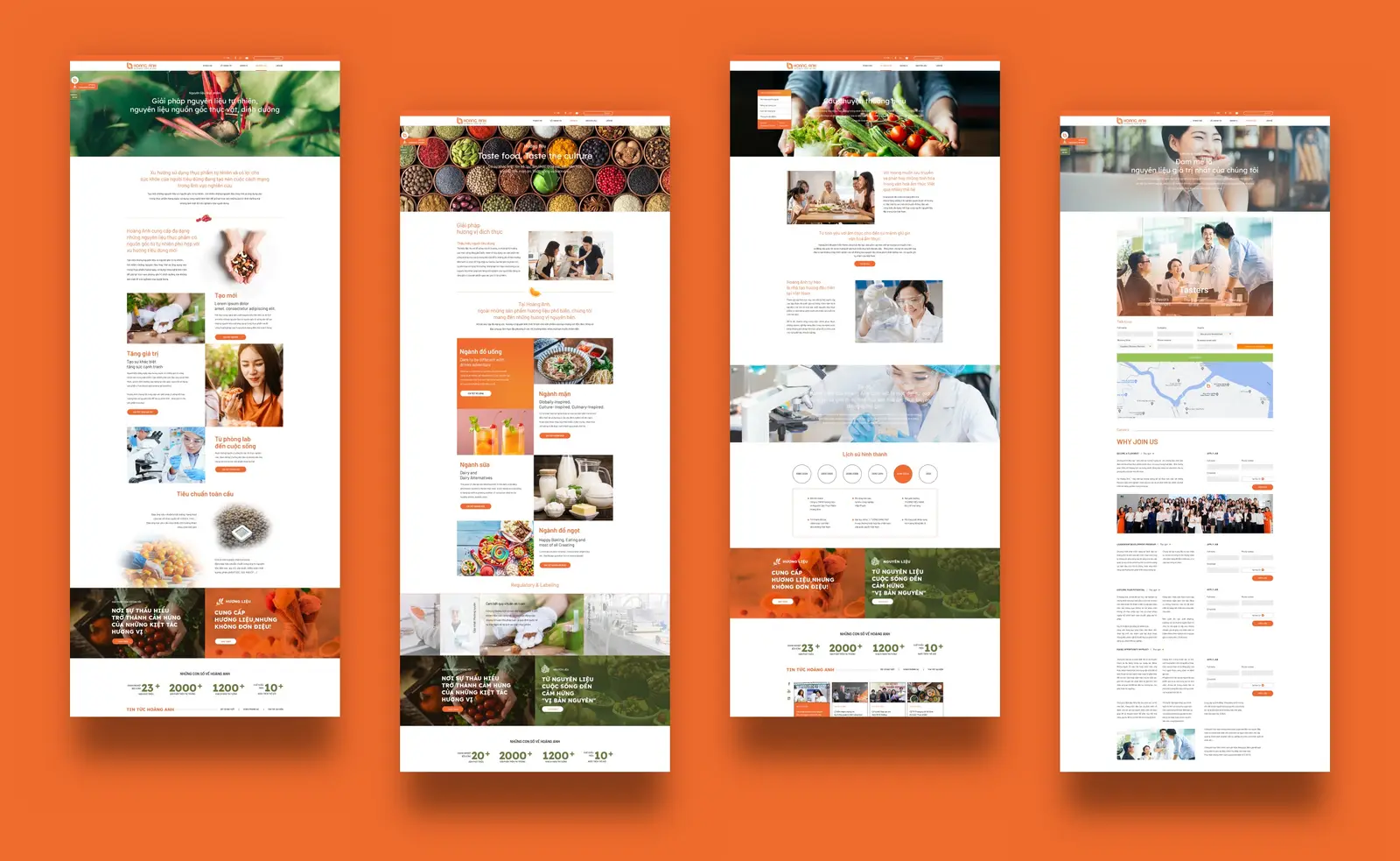
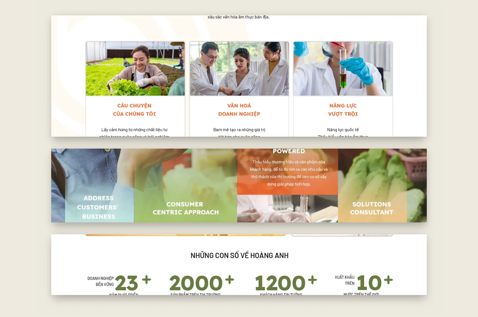
We kept the origin and rebuilt it. The spiral became an interlocking H and A, stepping in and out so the eye reads depth, radiating from a central circle that stands for people. Two colour families then split the business in half — orange for flavours, green for raw ingredients — and the same stroke was woven into a lattice that runs across packaging, backdrops, uniforms and a full five-section website.
OUTCOME
An identity and packaging system delivered for a food producer — two colour families splitting the range, one shape held across packaging, uniforms and a five-section website.
THE WORK


NEXT PROJECT